Vol. 2. 2020
This publication contains selected logos developed between 2012 and 2019. The logos sorted randomly. This work not planned to reflect the development progress of the designer and it's skills, but present the designer's work as a whole.
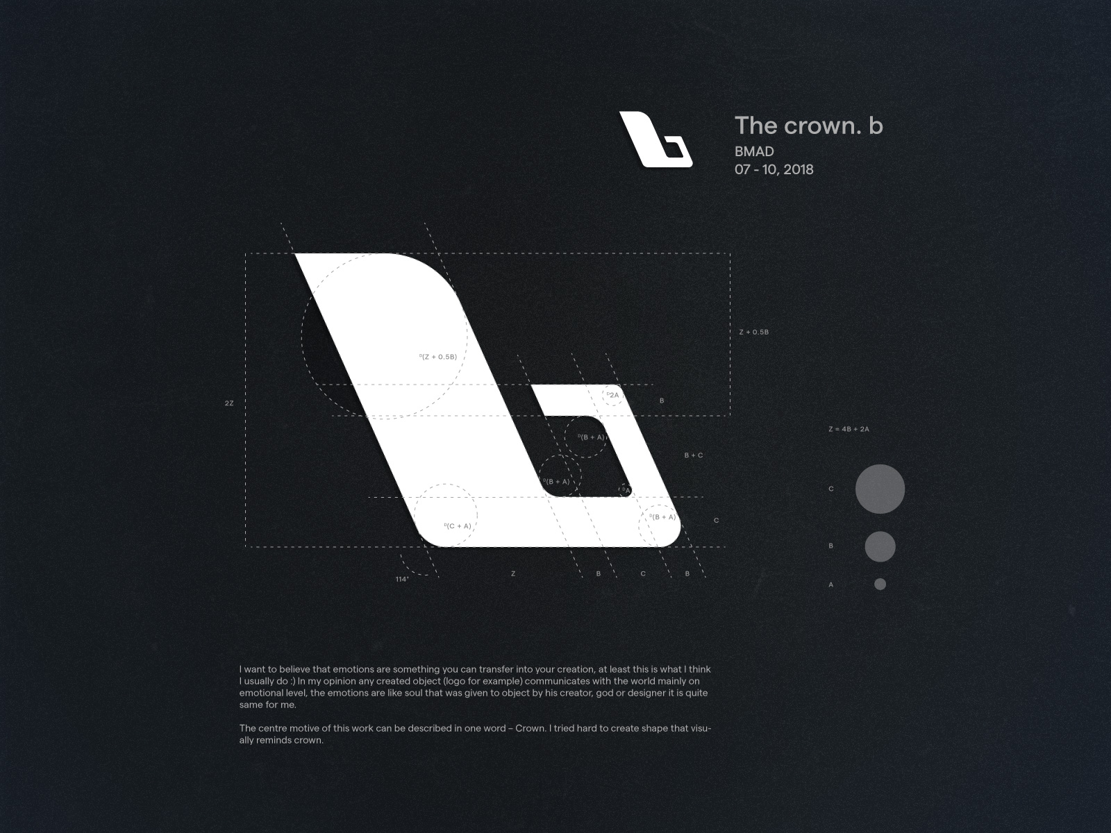
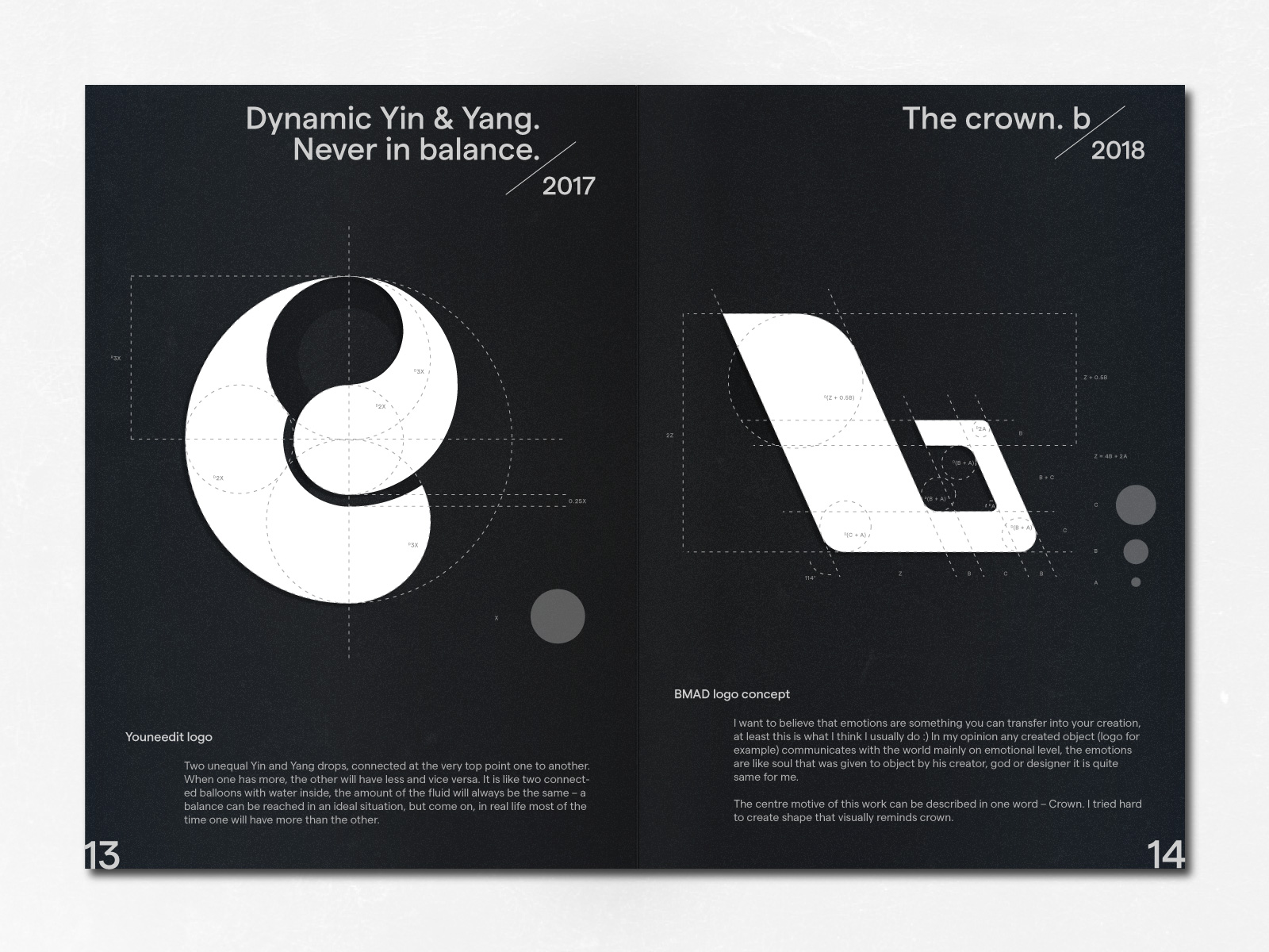
The crown. b / BMAD / 07 - 10, 2018
I want to believe that emotions are something you can transfer into your creation, at least this is what I think I usually do :) In my opinion any created object (logo for example) communicates with the world mainly on emotional level, the emotions are like soul that was given to object by his creator, god or designer it is quite same for me.
The centre motive of this work can be described in one word – Crown. I tried hard to create shape that visually reminds crown.
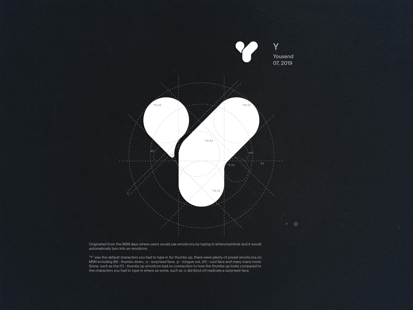
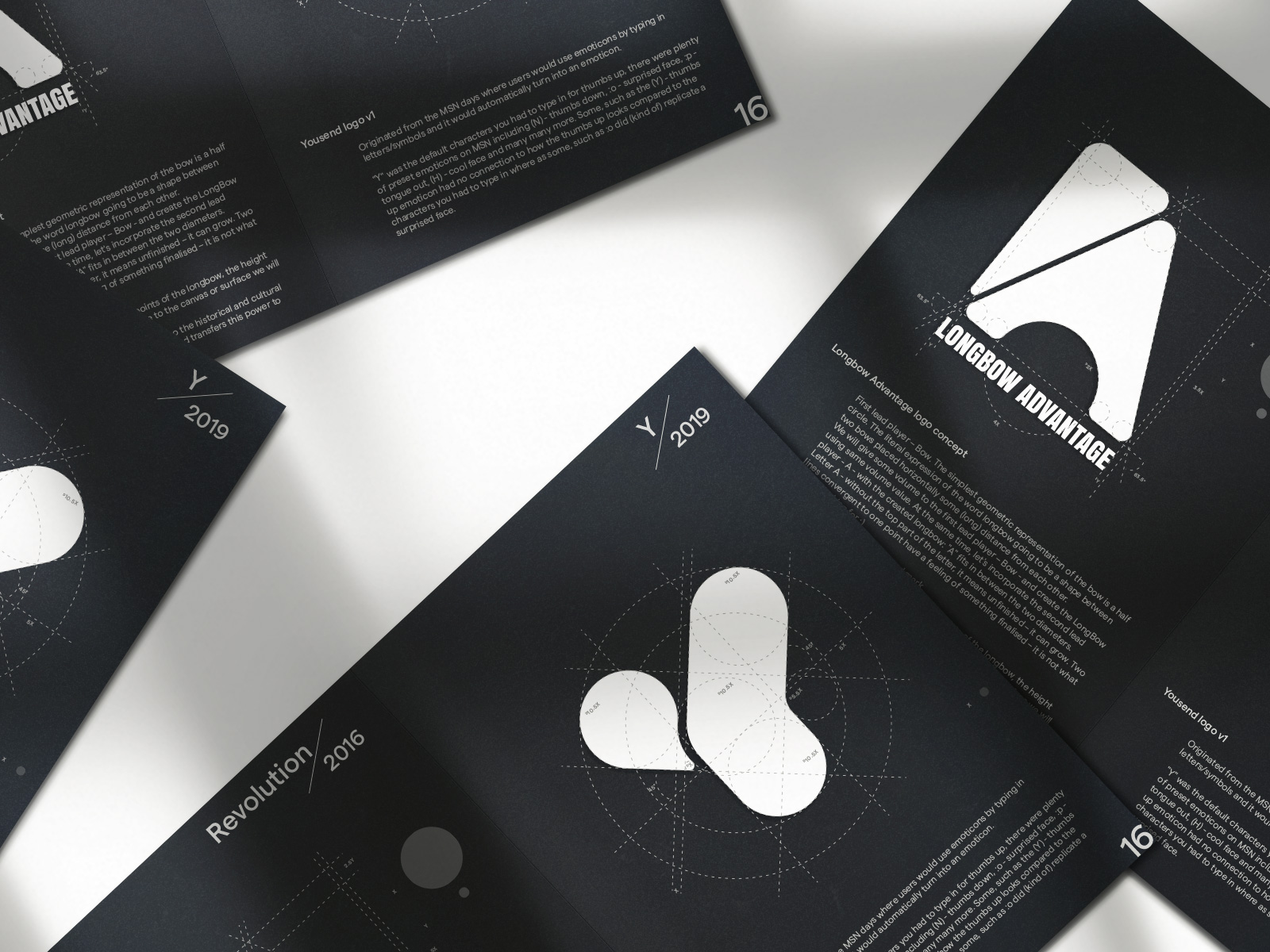
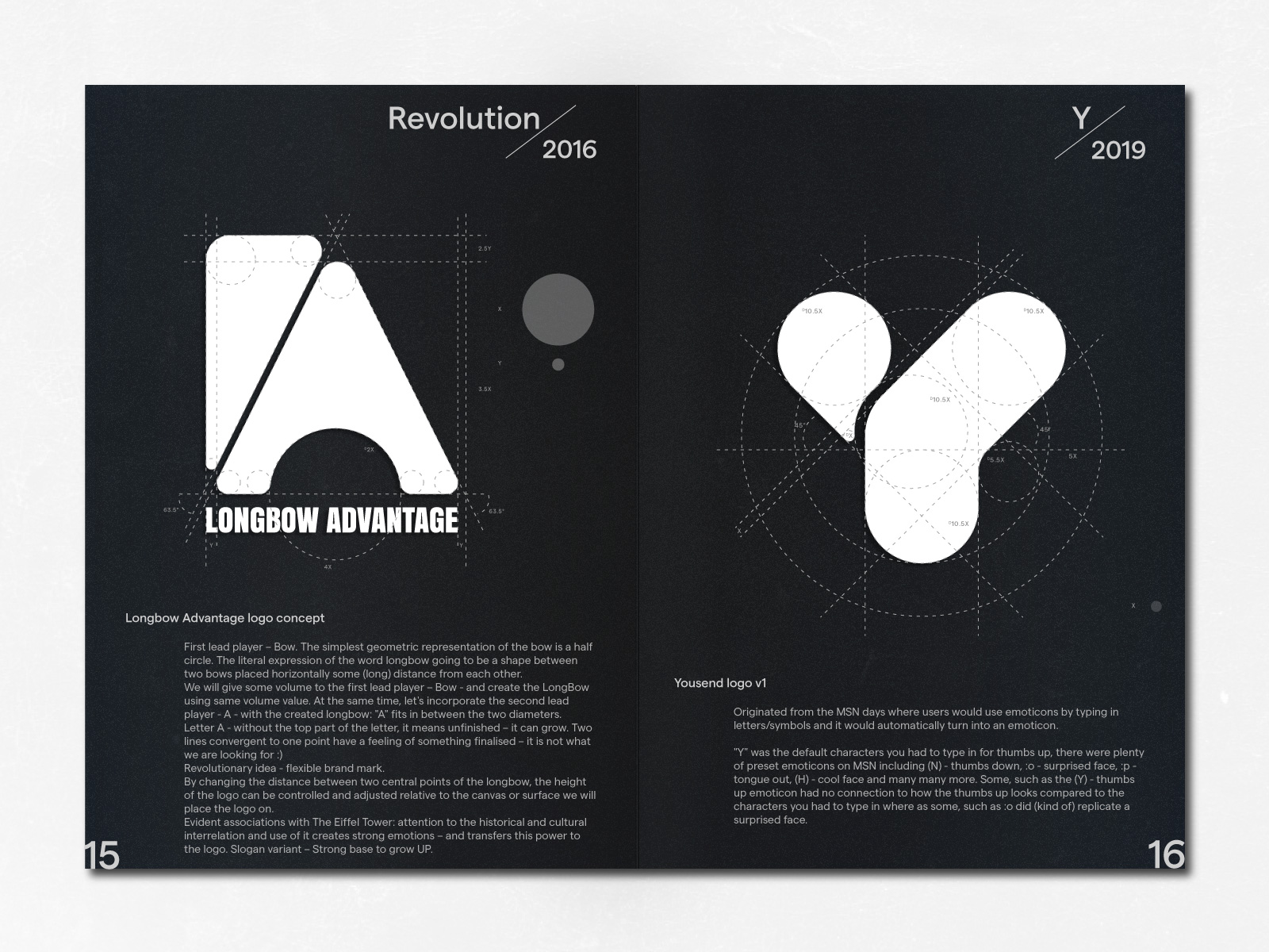
Y / Yousend v1 / 07, 2019
Originated from the MSN days where users would use emoticons by typing in letters/symbols and it would automatically turn into an emoticon
"Y" was the default characters you had to type in for thumbs up, there were plenty of preset emoticons on MSN including (N) - thumbs down, :o - surprised face, :p - tongue out, (H) - cool face and many many more. Some, such as the (Y) - thumbs up emoticon had no connection to how the thumbs up looks compared to the characters you had to type in where as some, such as :o did (kind of) replicate a surprised face.
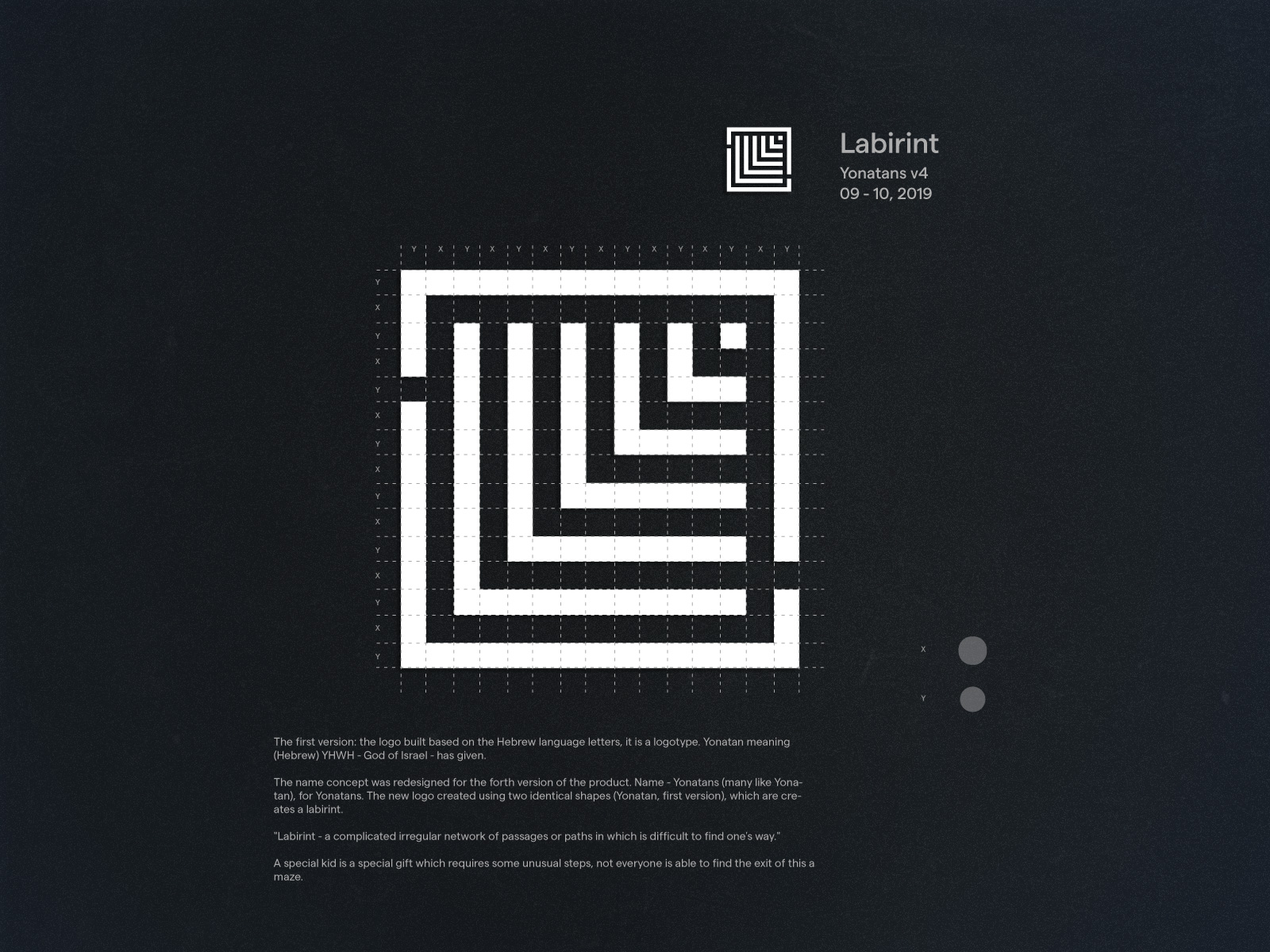
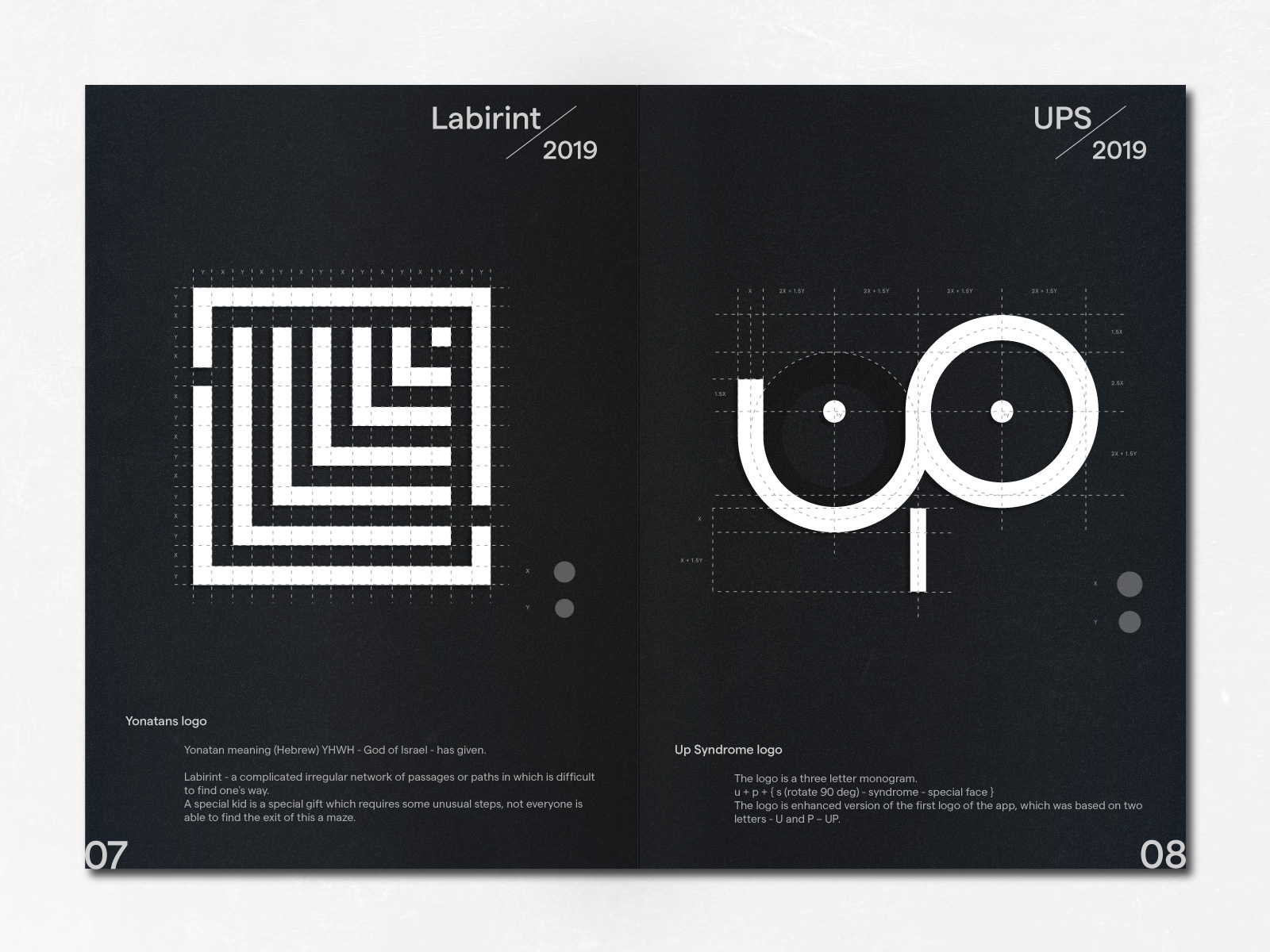
Labirint / Yonatans v4 / 09 - 10, 2019
The first version: the logo built based on the Hebrew language letters, it is a logotype. Yonatan meaning (Hebrew) YHWH - God of Israel - has given.
The name concept was redesigned for the forth version of the product. Name - Yonatans (many like Yonatan), for Yonatans. The new logo created using two identical shapes (Yonatan, first version), which are creates a labirint.
"Labirint - a complicated irregular network of passages or paths in which is difficult to find one's way."
A special kid is a special gift which requires some unusual steps, not everyone is able to find the exit of this a maze.
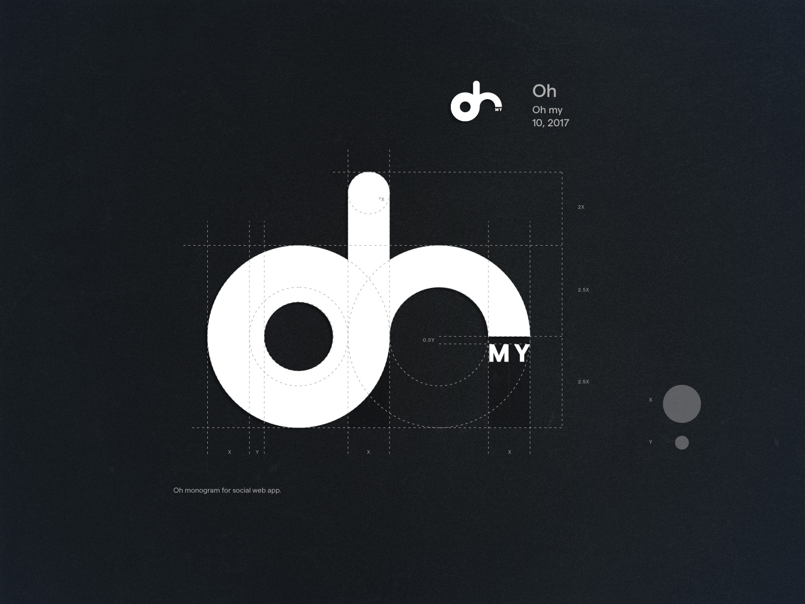
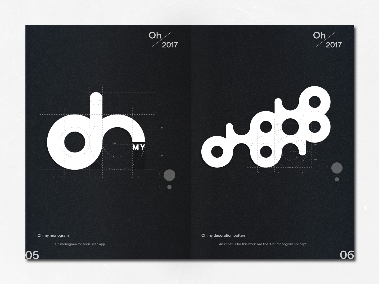
Oh / Oh my / 10, 2017
Oh monogram for social web app.
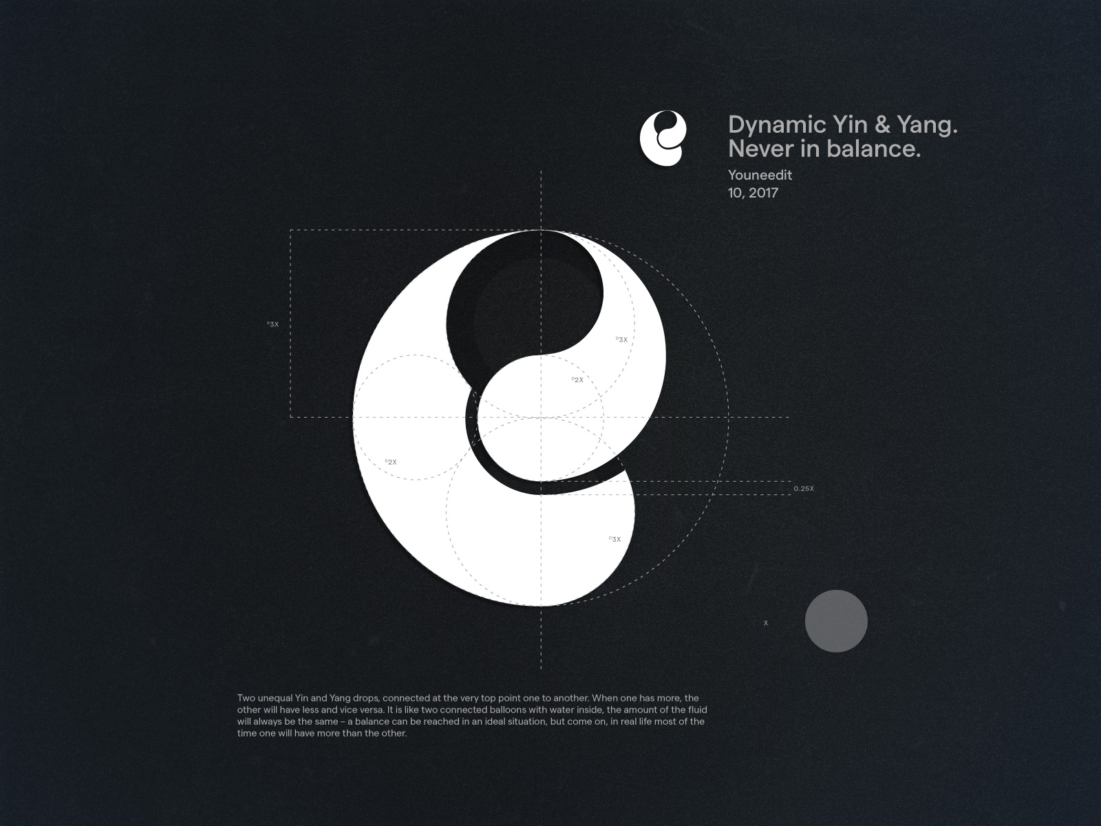
Dynamic Yin & Yang. Never in balance / Youneedit / 10, 2017
Two unequal Yin and Yang drops, connected at the very top point one to another. When one has more, the other will have less and vice versa. It is like two connected balloons with water inside, the amount of the fluid will always be the same – a balance can be reached in an ideal situation, but come on, in real life most of the time one will have more than the other.
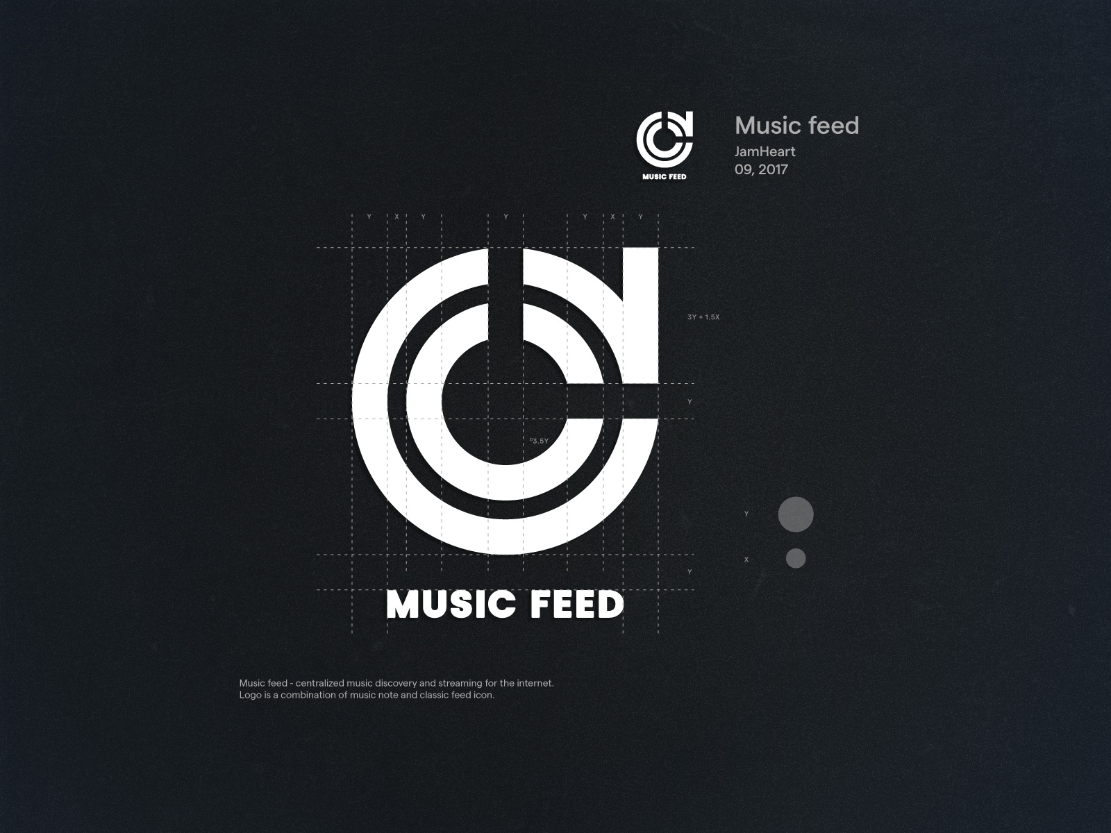
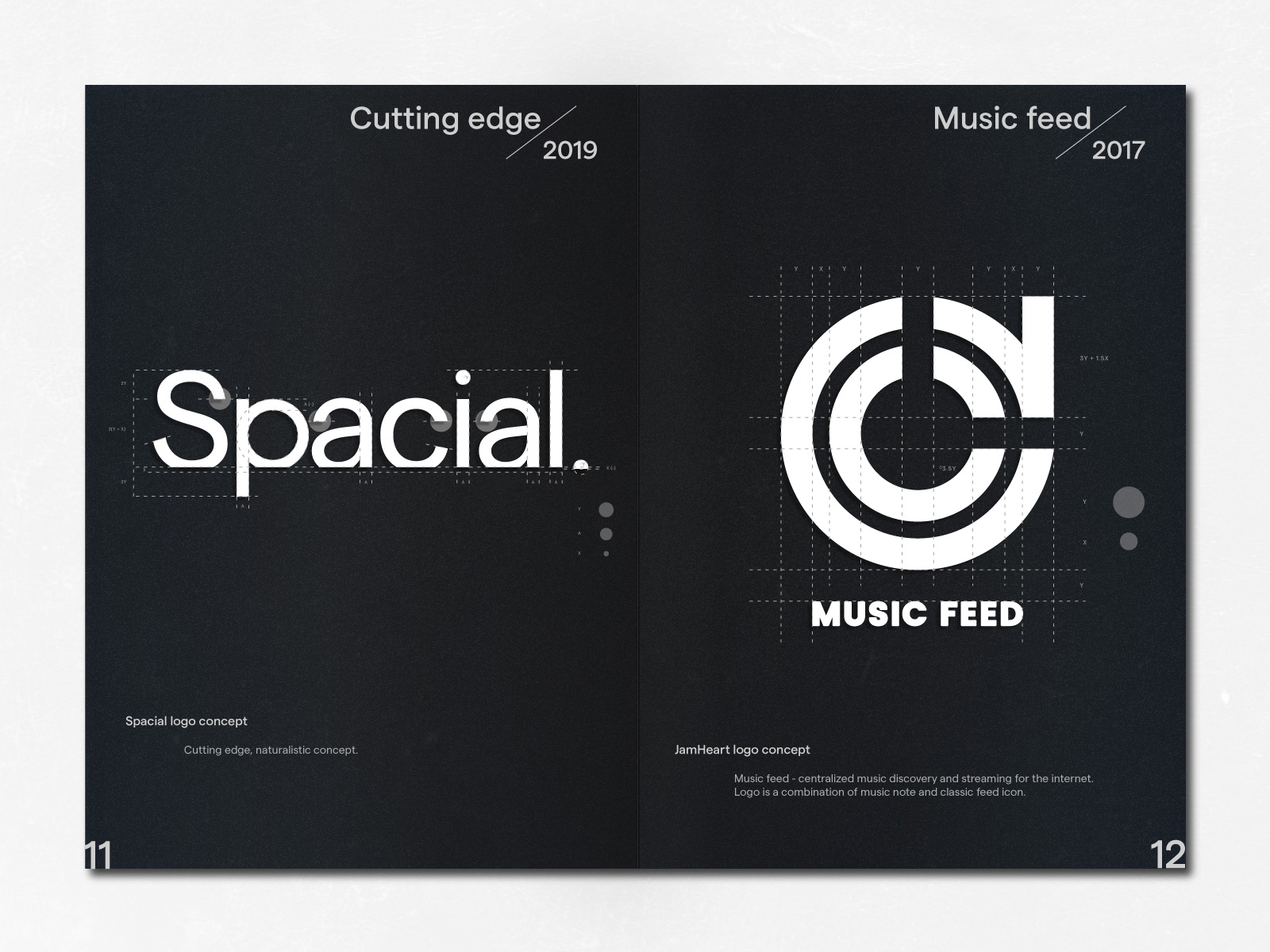
Music feed / JamHeart / 09, 2017
Music feed - centralized music discovery and streaming for the internet. Logo is a combination of music note and classic feed icon.
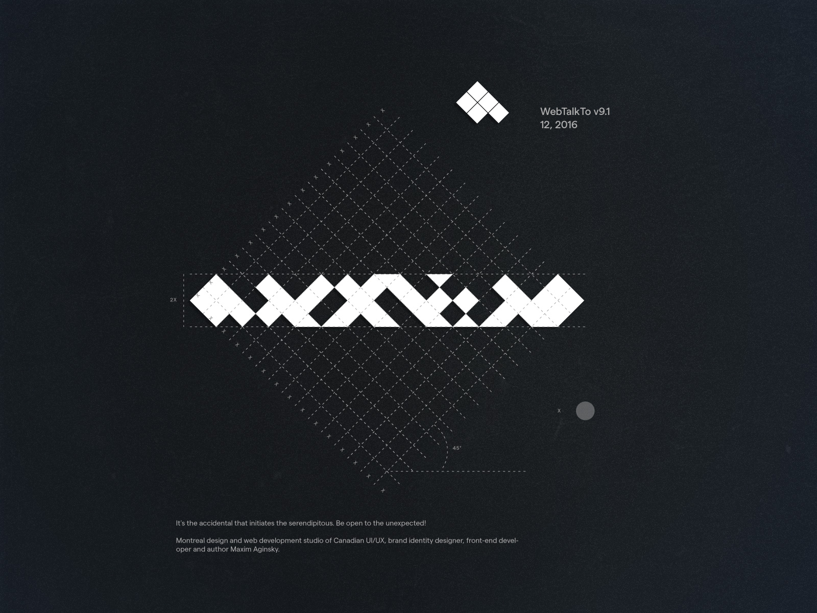
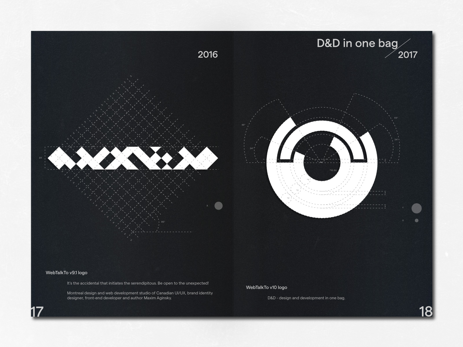
WebTalkTo v9.1 / 12, 2016
It's the accidental that initiates the serendipitous. Be open to the unexpected!
Montreal design and web development studio of Canadian UI/UX, brand identity designer, front-end developer and author Maxim Aginsky.
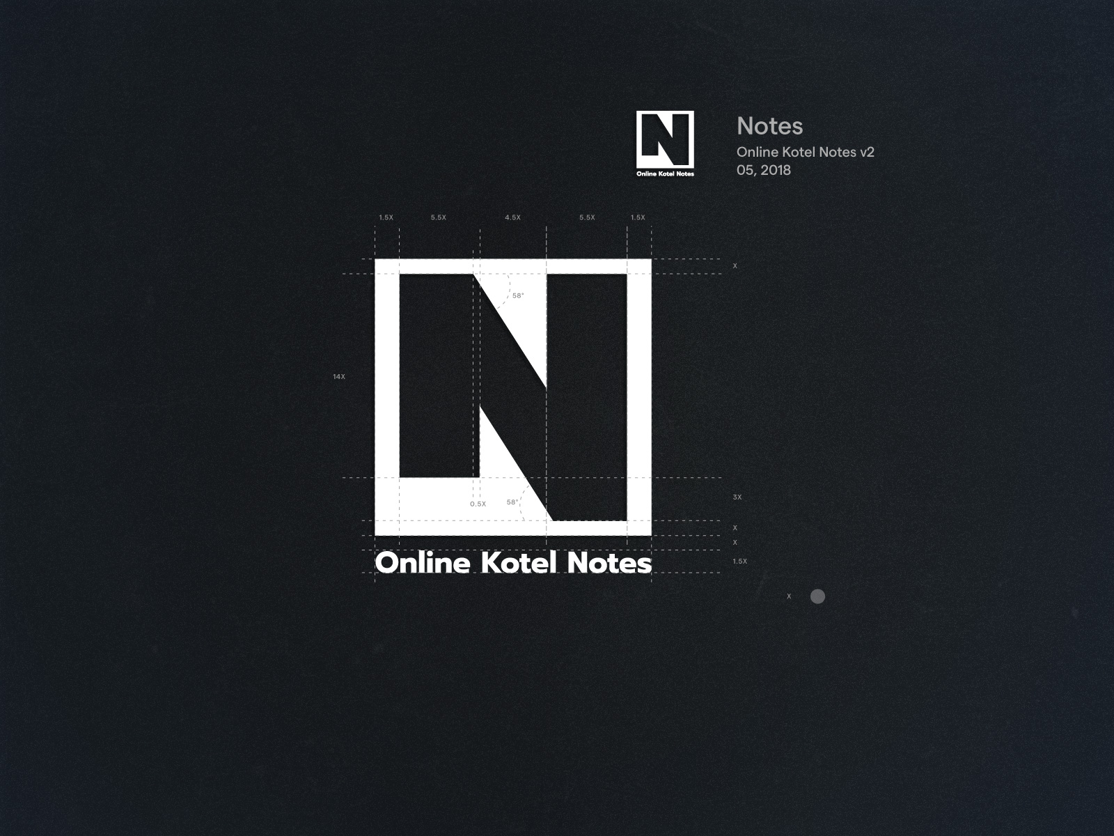
Notes / Online Kotel Notes v2 / 05, 2018
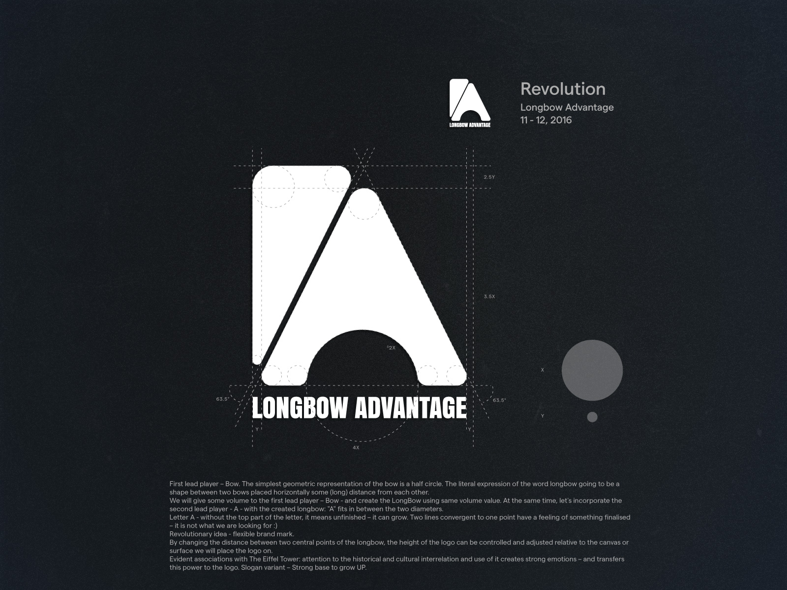
Revolution / Longbow Advantage / 11 - 12, 2016
First lead player – Bow. The simplest geometric representation of the bow is a half circle. The literal expression of the word longbow going to be a shape between two bows placed horizontally some (long) distance from each other.
We will give some volume to the first lead player – Bow - and create the LongBow using same volume value. At the same time, let's incorporate the second lead player - A - with the created longbow: "A" fits in between the two diameters.
Letter A - without the top part of the letter, it means unfinished – it can grow. Two lines convergent to one point have a feeling of something finalised – it is not what we are looking for :)
Revolutionary idea - flexible brand mark.
By changing the distance between two central points of the longbow, the height of the logo can be controlled and adjusted relative to the canvas or surface we will place the logo on.
Evident associations with The Eiffel Tower: attention to the historical and cultural interrelation and use of it creates strong emotions – and transfers this power to the logo. Slogan variant – Strong base to grow UP.
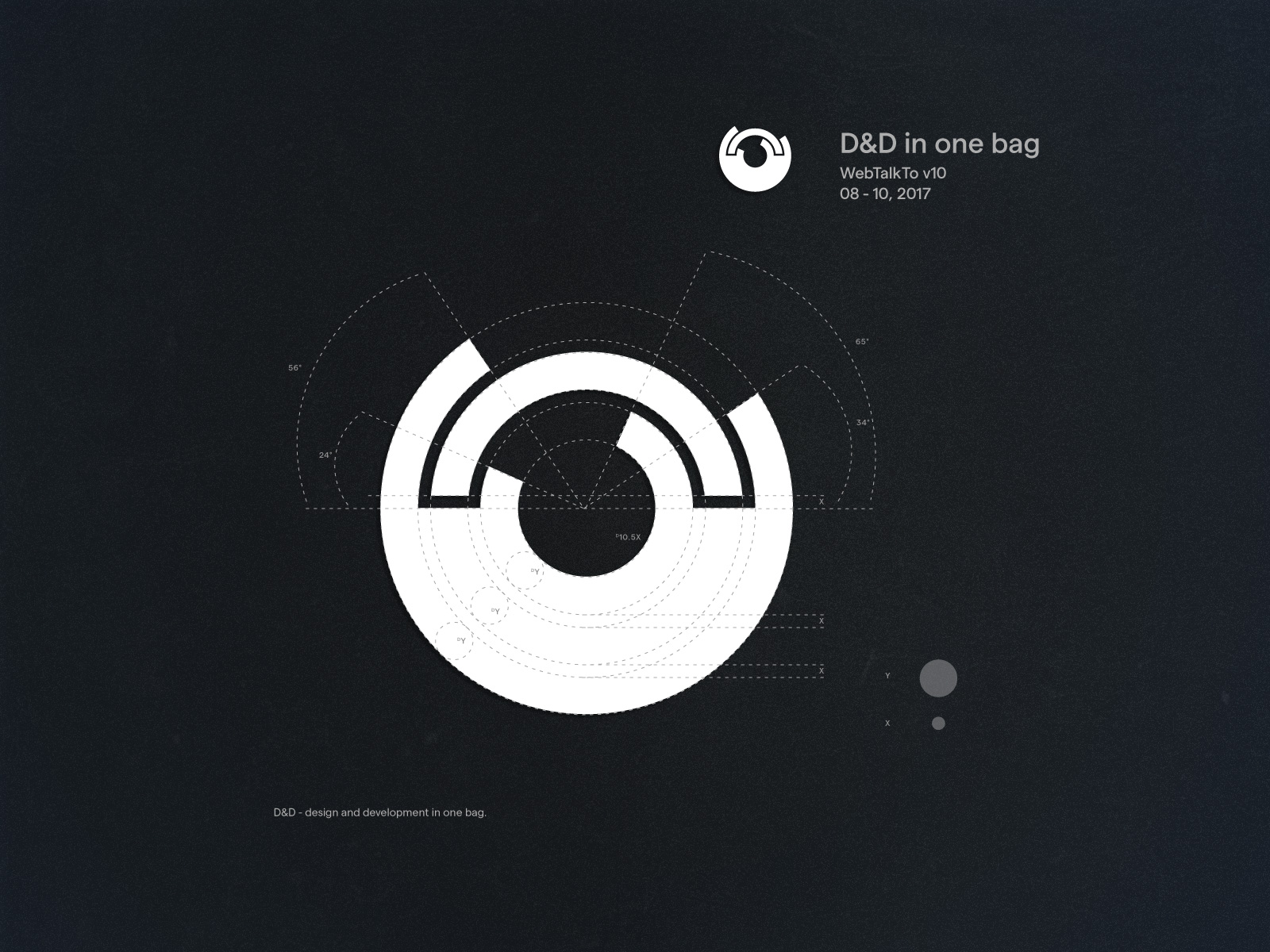
D&D in one bag / WebTalkTo v10 / 08 - 10, 2017
D&D - design and development in one bag.
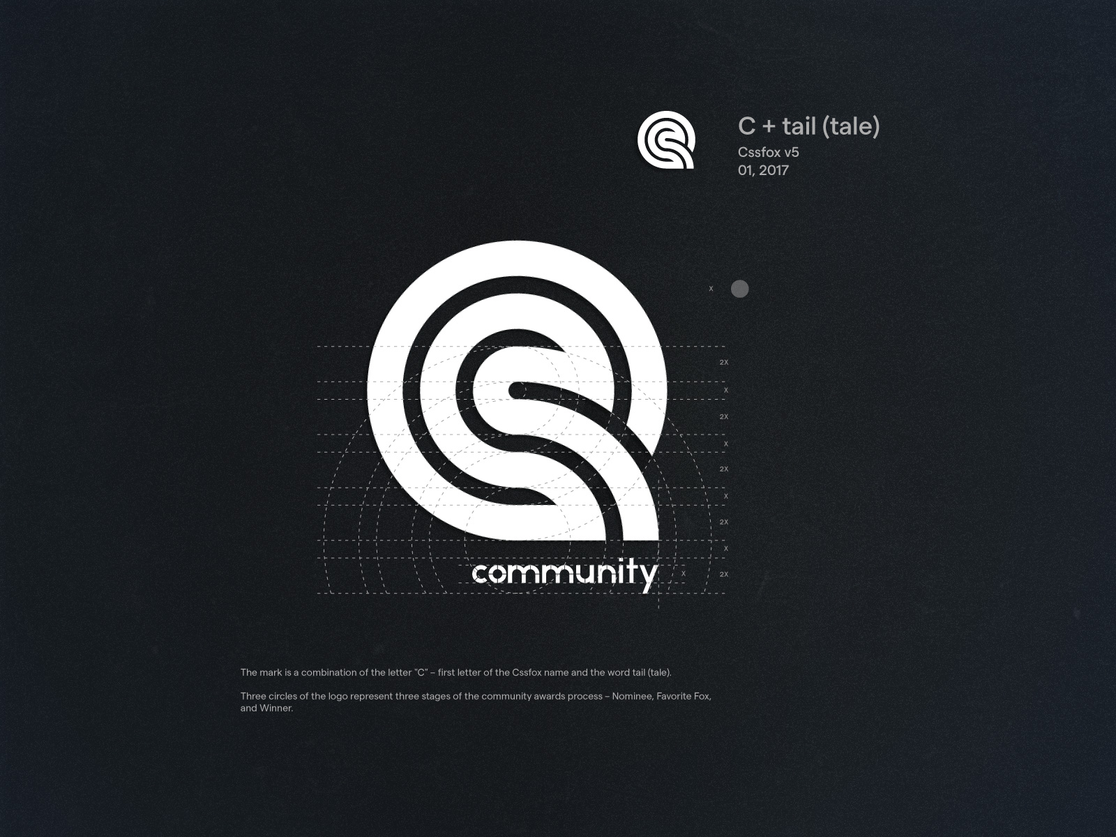
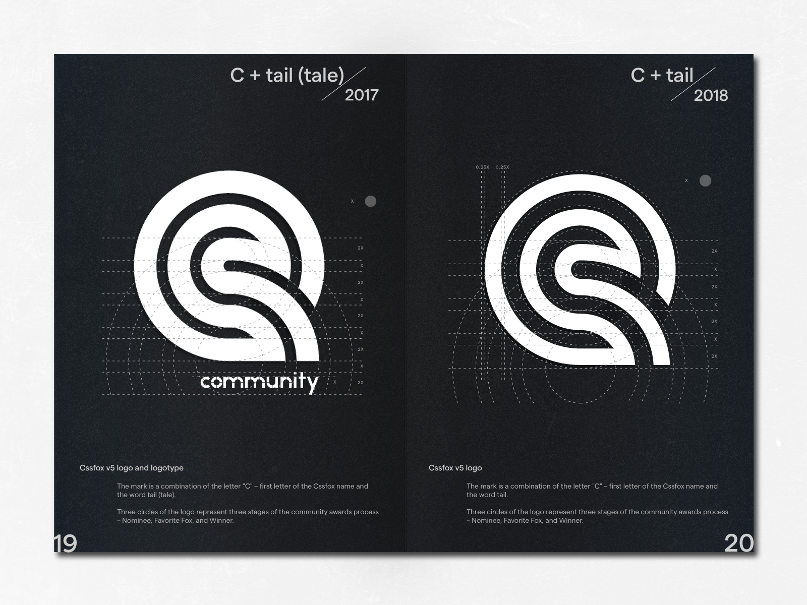
C + tail (tale) / Cssfox v5 / 01, 2017
The mark is a combination of the letter "C" – first letter of the Cssfox name and the word tail (tale).
Three circles of the logo represent three stages of the community awards process – Nominee, Favorite Fox, and Winner.
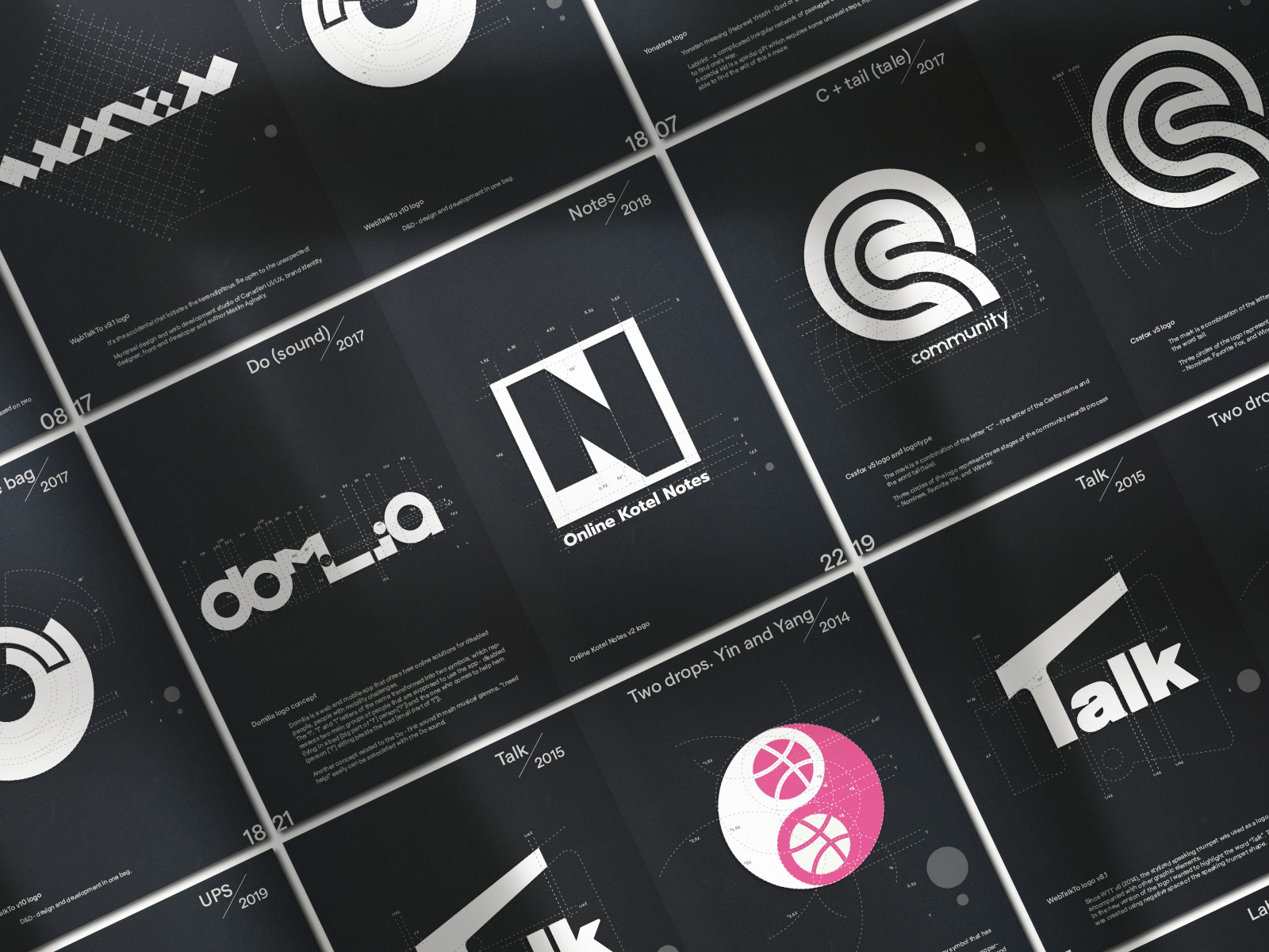
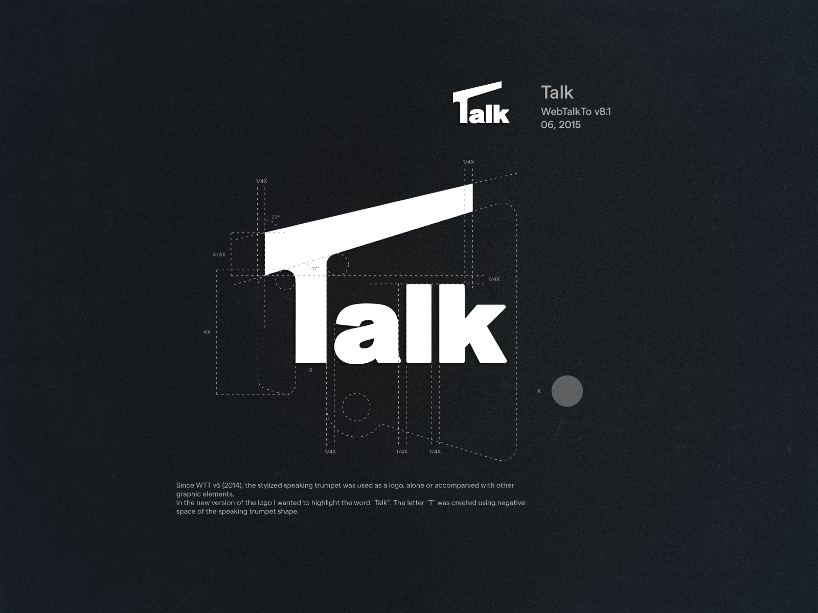
Talk / WebTalkTo v8.1 / 06, 2015
Since WTT v6 (2014), the stylized speaking trumpet was used as a logo, alone or accompanied with other graphic elements.
In the new version of the logo I wanted to highlight the word "Talk". The letter "T" was created using negative space of the speaking trumpet shape.
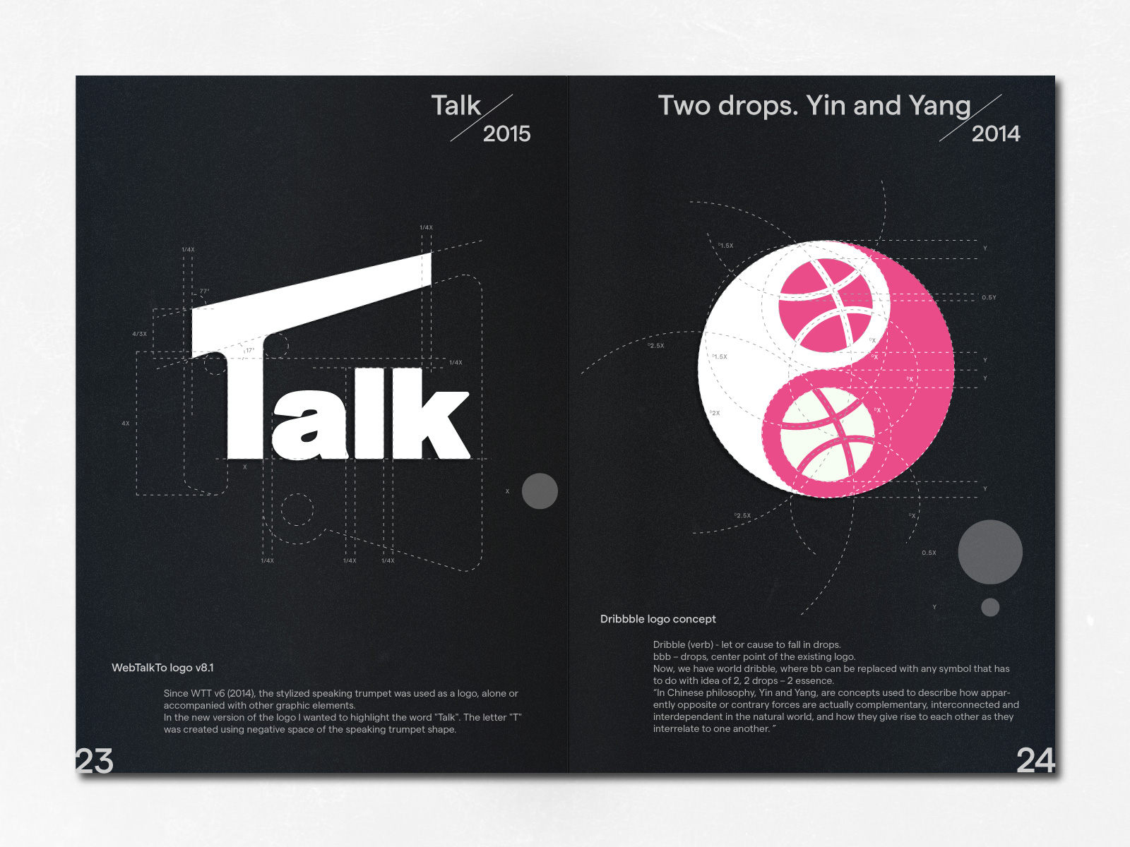
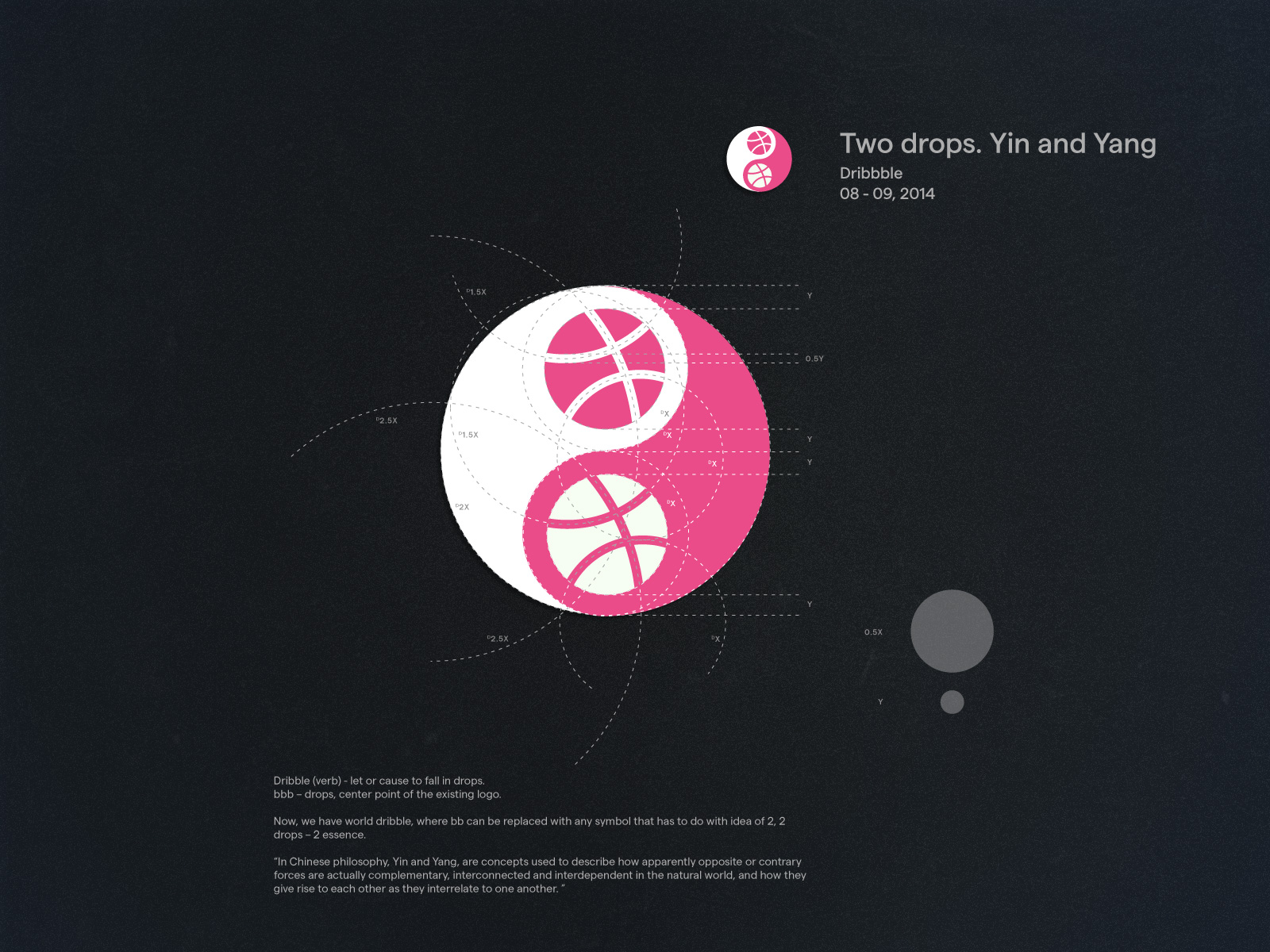
Two drops. Yin and Yang / Dribbble / 08 - 09, 2014
Dribble (verb) - let or cause to fall in drops. bbb – drops, center point of the existing logo.
Now, we have world dribble, where bb can be replaced with any symbol that has to do with idea of 2, 2 drops – 2 essence.
“In Chinese philosophy, Yin and Yang, are concepts used to describe how apparently opposite or contrary forces are actually complementary, interconnected and interdependent in the natural world, and how they give rise to each other as they interrelate to one another.”
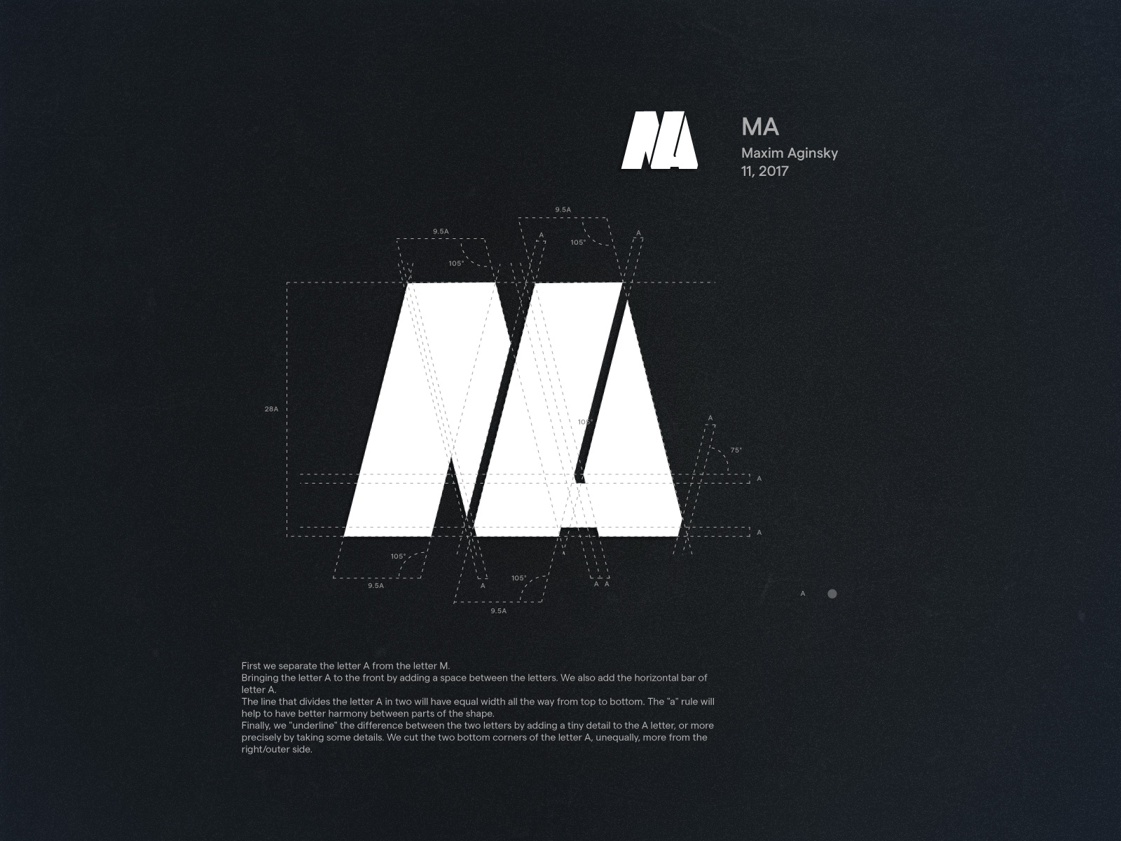
MA / Maxim Aginsky / 11, 2017
First we separate the letter A from the letter M.
Bringing the letter A to the front by adding a space between the letters. We also add the horizontal bar of letter A.
The line that divides the letter A in two will have equal width all the way from top to bottom. The "a" rule will help to have better harmony between parts of the shape.
Finally, we "underline" the difference between the two letters by adding a tiny detail to the A letter, or more precisely by taking some details. We cut the two bottom corners of the letter A, unequally, more from the right/outer side.