The Longbow Advantage logo and slogan.
Illustration September 25, 2017
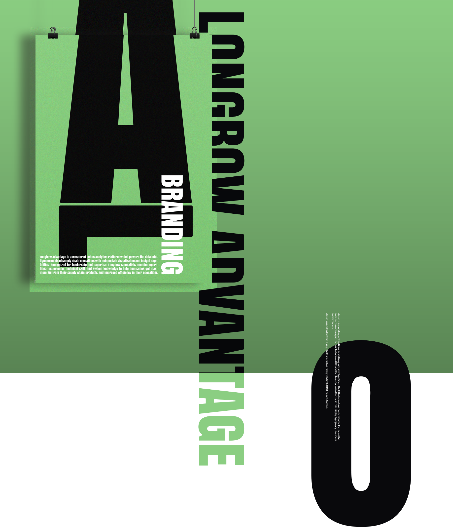
Longbow Advantage is a creator of Rebus Analytics Platform which powers the data intelligence needs of supply chain operations with unique data visualization and insight capabilities.
Recognized for leadership and expertise, Longbow specialists combine operational experience, technical skill, and system knowledge to help companies get maximum ROI from their supply chain products and improved efficiency in their operations.
The logo concept
November 23, 2016
The main idea and starting point come from the title - LongBow. The concept literally reflects the meaning of the company name – LongBow Advantage.
Below is the process of transformation of the name into abstract, visual form followed by the geometric rules establishment for later realisation into the shape, slogans and historico-cultural parallels.
Realistic illustration of the concept final sketch
Mapping the process. Later reconstruction
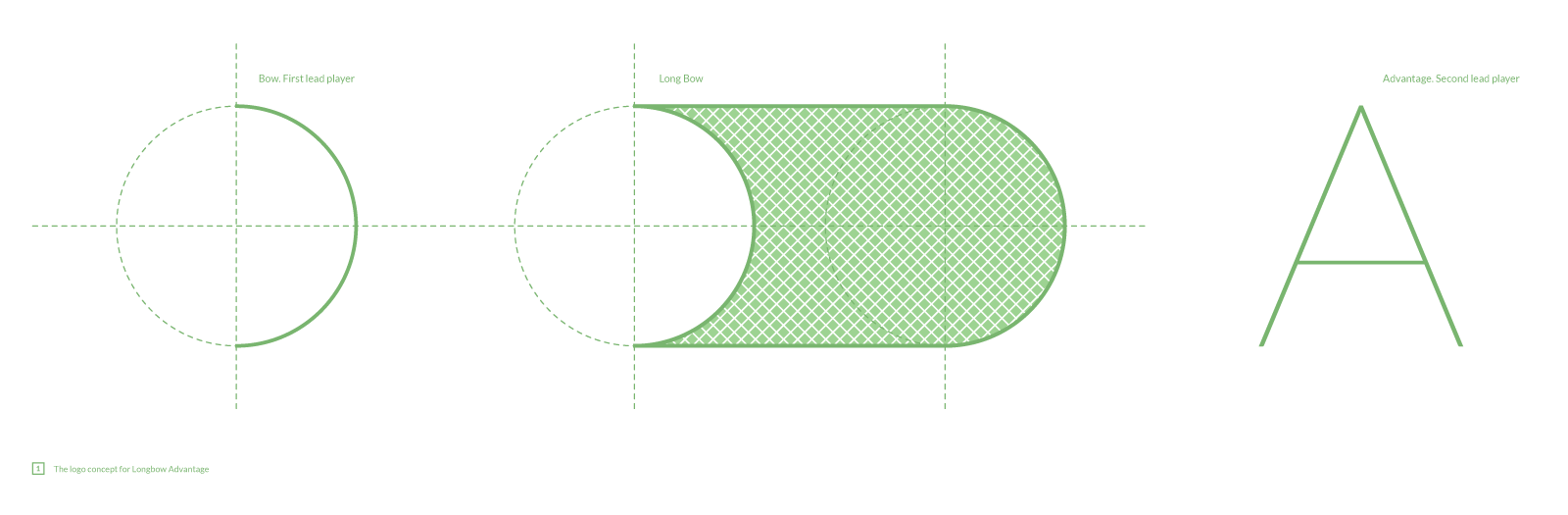
First lead player – Bow. The simplest geometric representation of the bow is a half circle. The literal expression of the word longbow – in our case, it's going to be a shape between two bows placed horizontally some (long) distance from each other.
Second lead player – letter A.
The first scene illustration
Slogan variant – Making others grow. One of the possible color associations is the color green. Grow – green, even the sound of those two words, when spoken, shows the invisible relation.
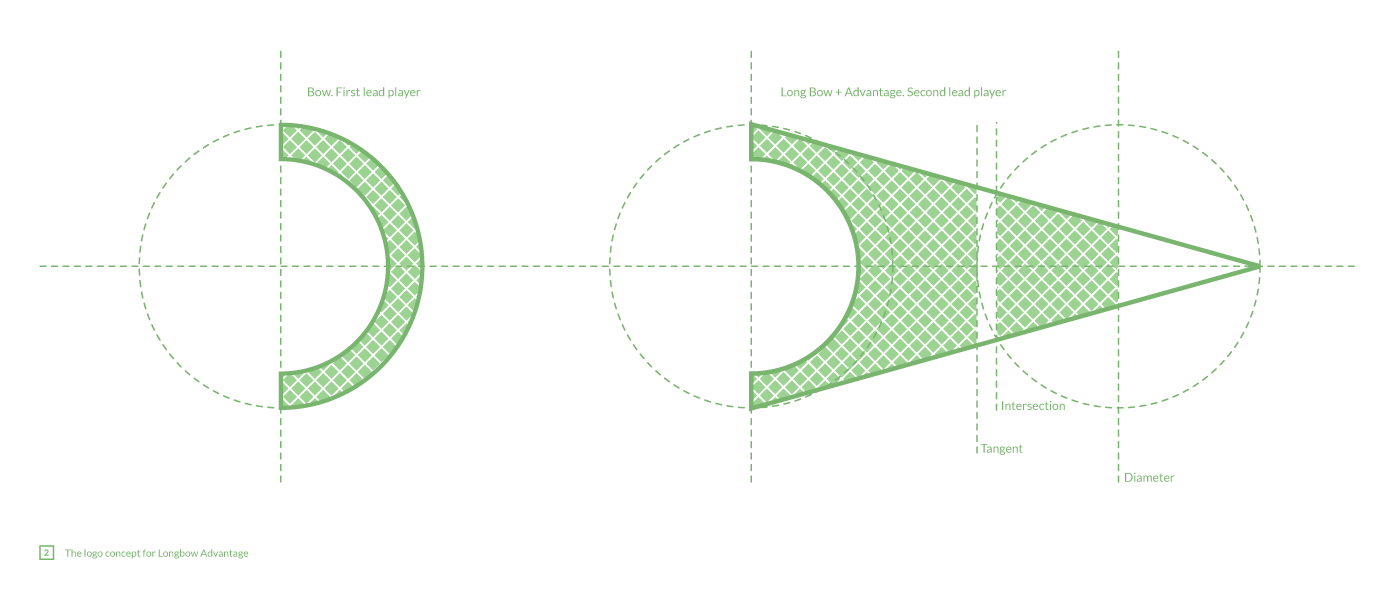
Let's continue with our two players. We will give some volume to the first lead player – Bow - and create the LongBow using same volume value. At the same time, let's incorporate the second lead player - A - with the created longbow: "A" fits in between the two diameters.
Letter A - without the top part of the letter, it means unfinished – it can grow. Two lines convergent to one point have a feeling of something finalised – it is not what we are looking for :)
At this time, I established a few geometric rules that help to recreate the shape afterwards. Those rules lead me to the revolutionary idea of creating a flexible brand mark. By changing the distance between two central points of the longbow, the height of the logo can be controlled and adjusted relative to the canvas or surface we will place the logo on.
The second scene illustration
Let's rotate the shape to its normal position and place the letter characters of the company name.
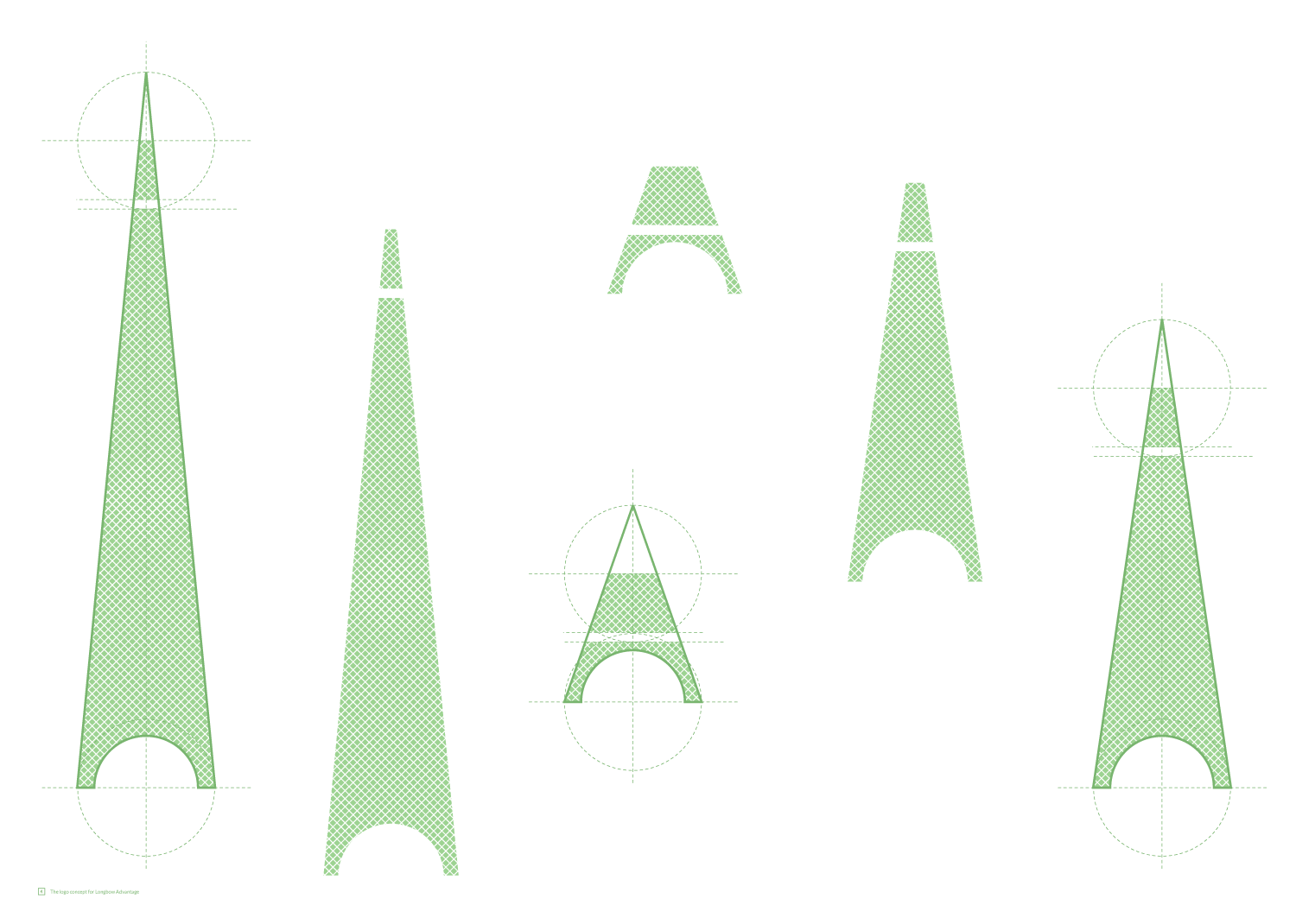
Evident associations with The Eiffel Tower: attention to the historical and cultural interrelation and use of it creates strong emotions – and transfers this power to the logo. Slogan variant – Strong base to grow UP.
The third scene illustration
The revolution. Flexible/responsive brand mark
By changing the distance between two central points of the longbow, the height of the logo can be controlled and adjusted relatively. Thus was born the responsive brand mark concept.
Basic illustration of the responsive brand mark concept
The final logo also incorporates the letter L (first letter of the first word of the name). Even a great concept needs some corrections. I also included a border around the main shape to create a better balance and clearer separation from the other elements that will surround it. However, the final logo has a few different variants that will be used relative to the brand guidelines.
Two variants of the final logo and stamp. Realistic illustration
Logo with guidelines. Illustrator
From paper to digital
A few examples of the logo in progress
Visual identity
Colors
As explained above, the main brand color chosen is pale green. The main color will be used alone or in combination with dark and white colors. In some cases the other two colors may be used without the main green color relative to the established brand guidelines.
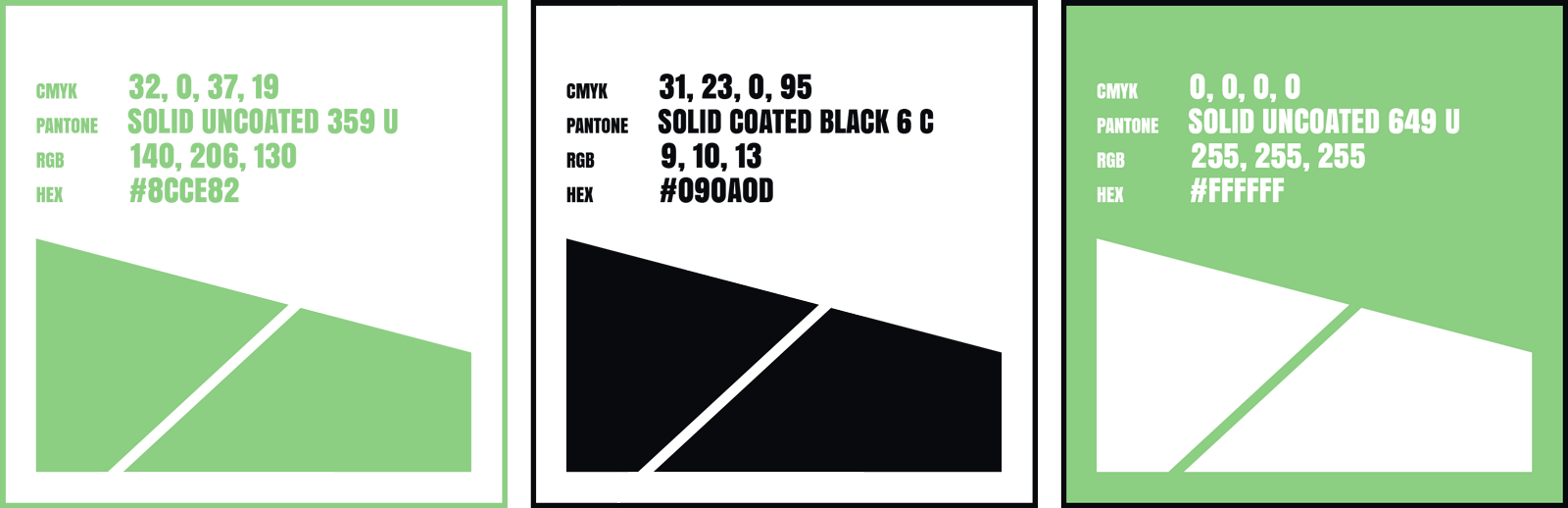
The main pale green color accompanied by the two basic colors – dark and white.
Typography
Anton Regular by Vernon Adams
Anton is a reworking of traditional advertising sans serif typefaces. In our case, it will be used only in uppercase characters.
Adams practiced typeface design from 2007 to 2014. A lifelong artist, during this time he eagerly explored designing type for the cloud-based era. His work spans all genres, from lively script faces to workhorse text families and operating system UI.
The poster demonstrates usage of Anton font in Longbow Advantage brand concept.