Vol. 1. 2020
This publication contains selected logos developed between 2012 and 2019. The logos sorted randomly. This work not planned to reflect the development progress of the designer and it's skills, but present the designer's work as a whole.
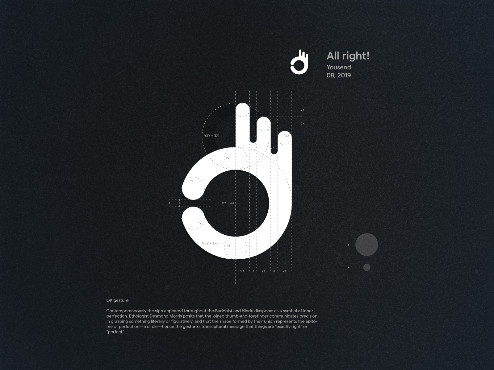
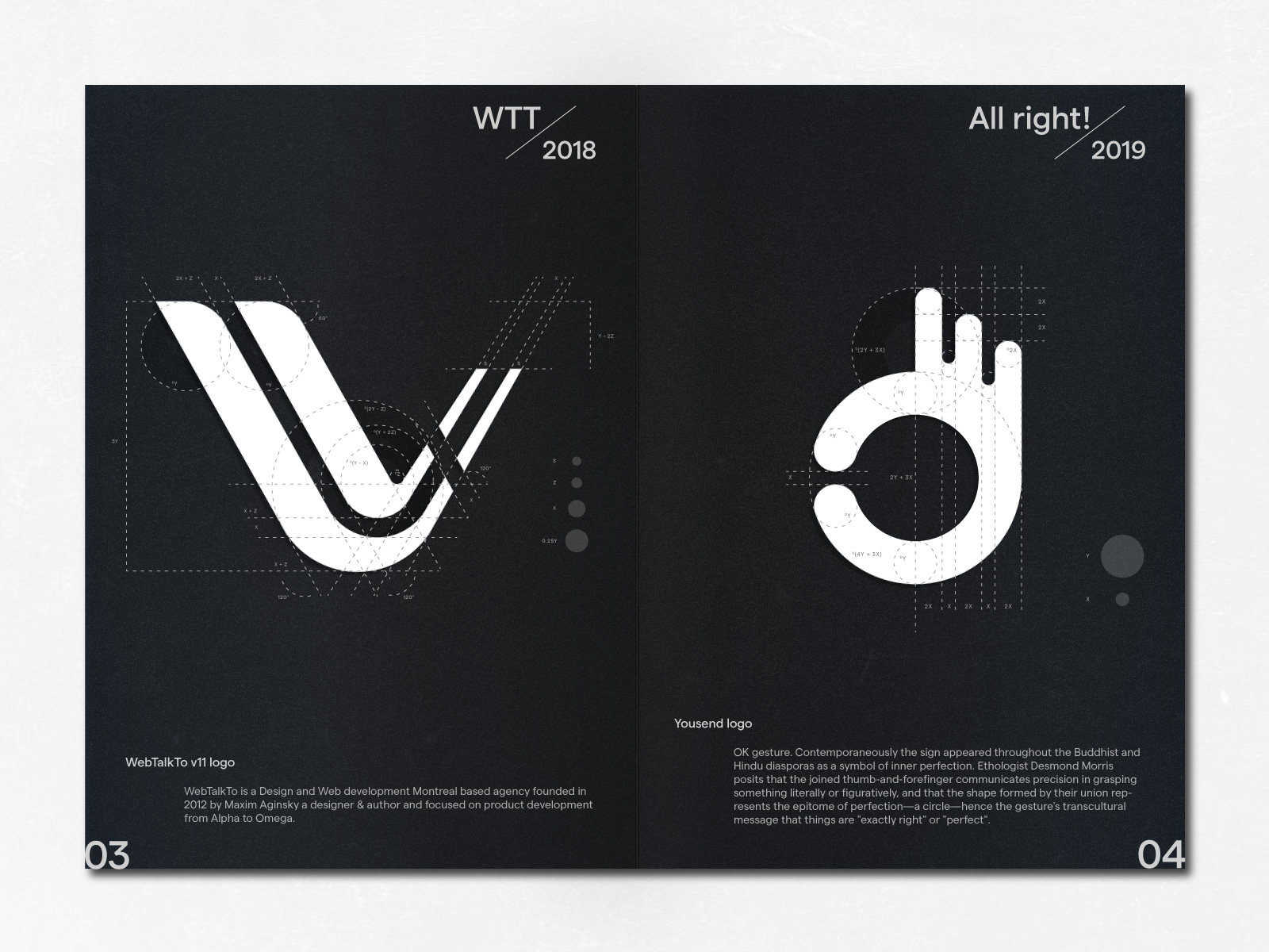
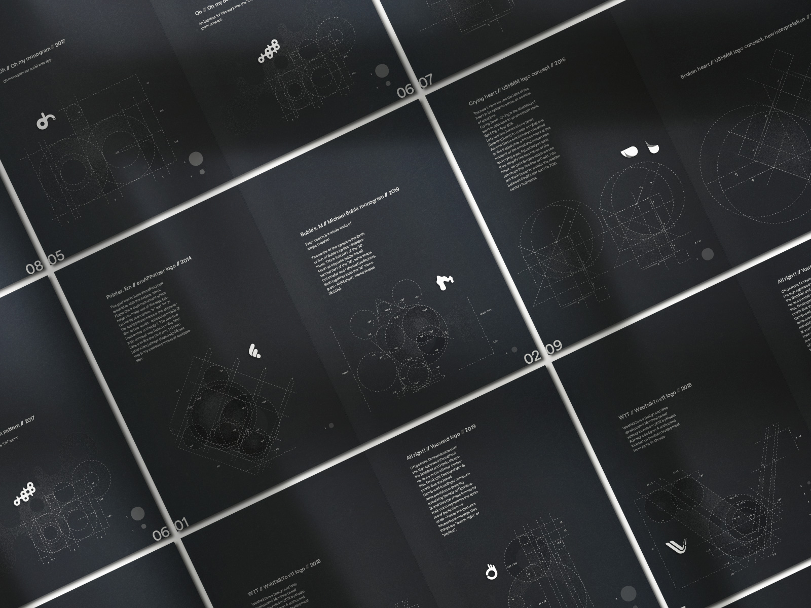
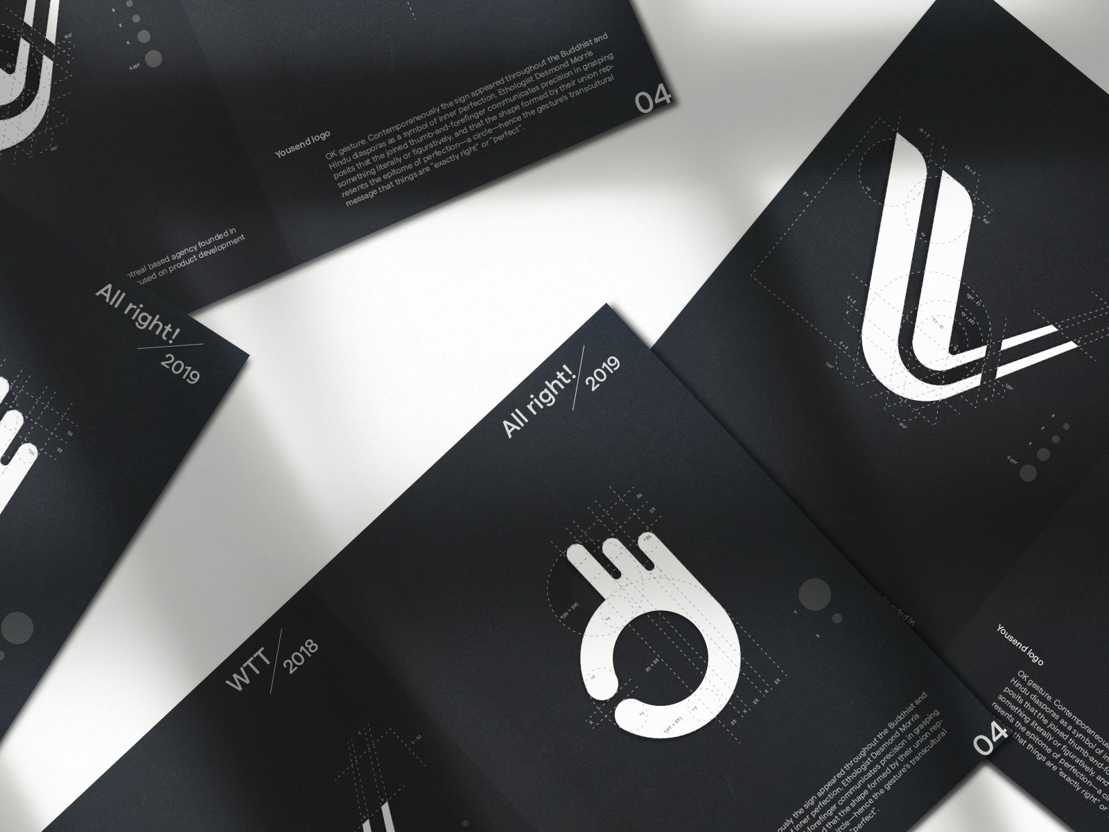
All right! / Yousend / 08, 2019
OK gesture.
Contemporaneously the sign appeared throughout the Buddhist and Hindu diasporas as a symbol of inner perfection. Ethologist Desmond Morris posits that the joined thumb-and-forefinger communicates precision in grasping something literally or figuratively, and that the shape formed by their union represents the epitome of perfection—a circle—hence the gesture's transcultural message that things are "exactly right" or "perfect".
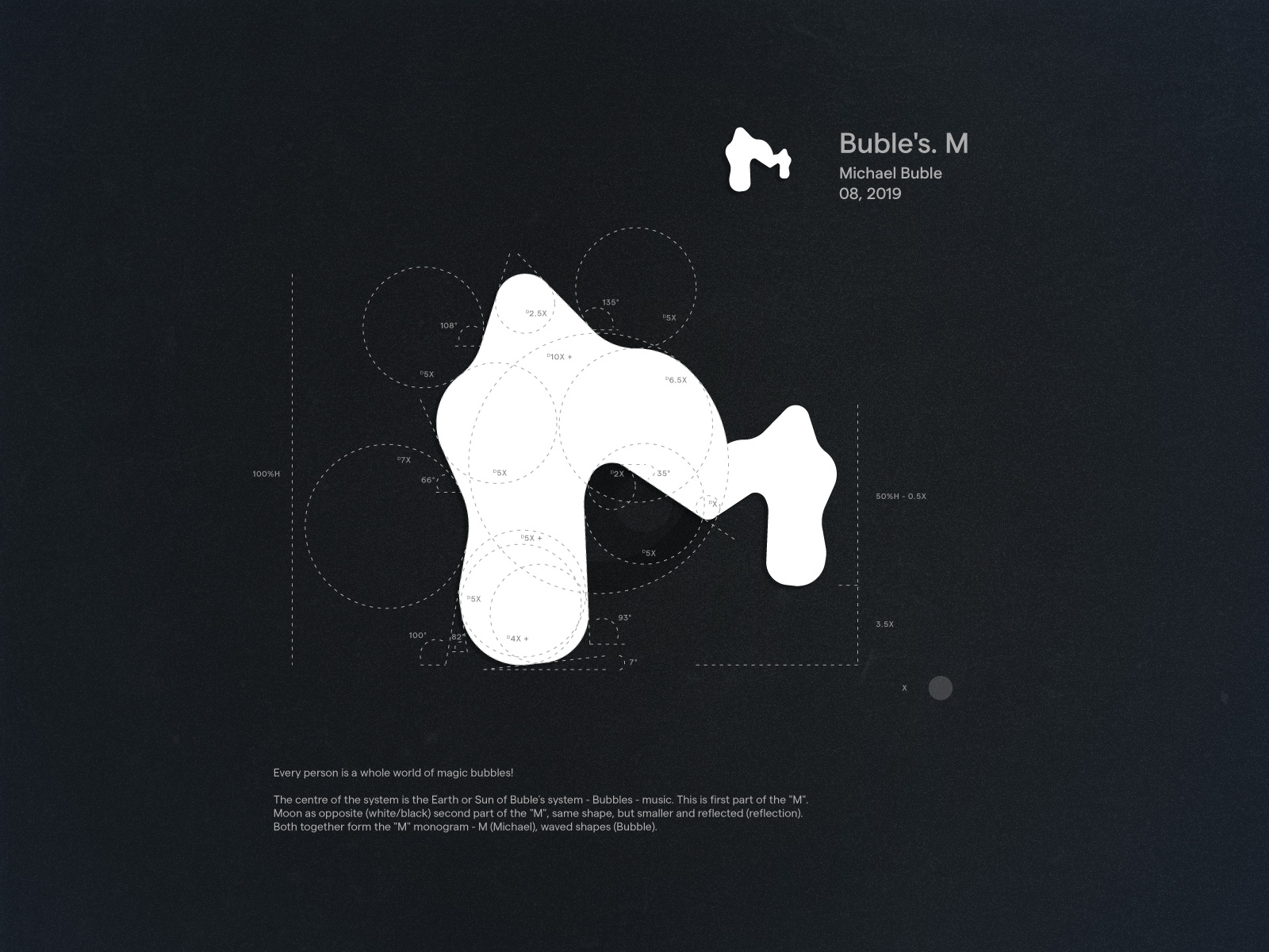
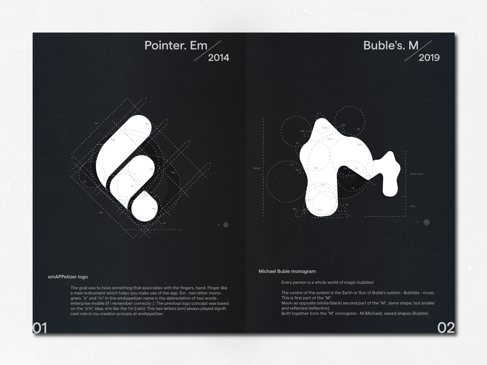
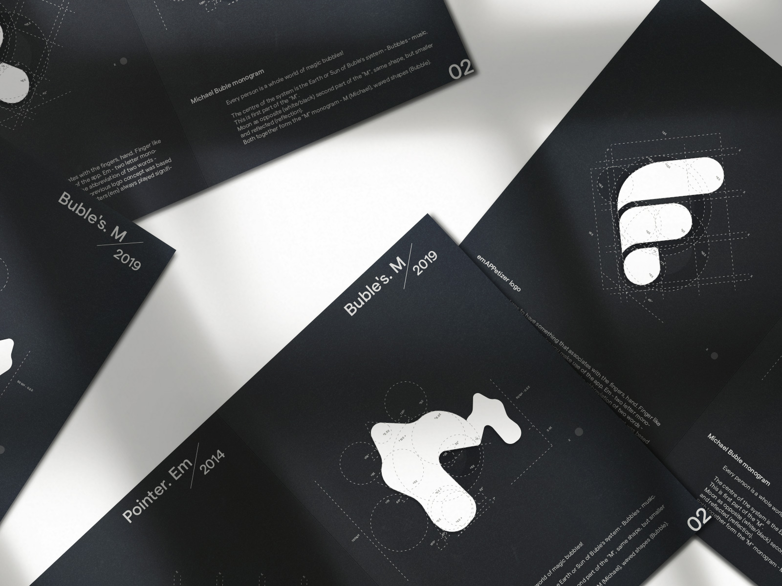
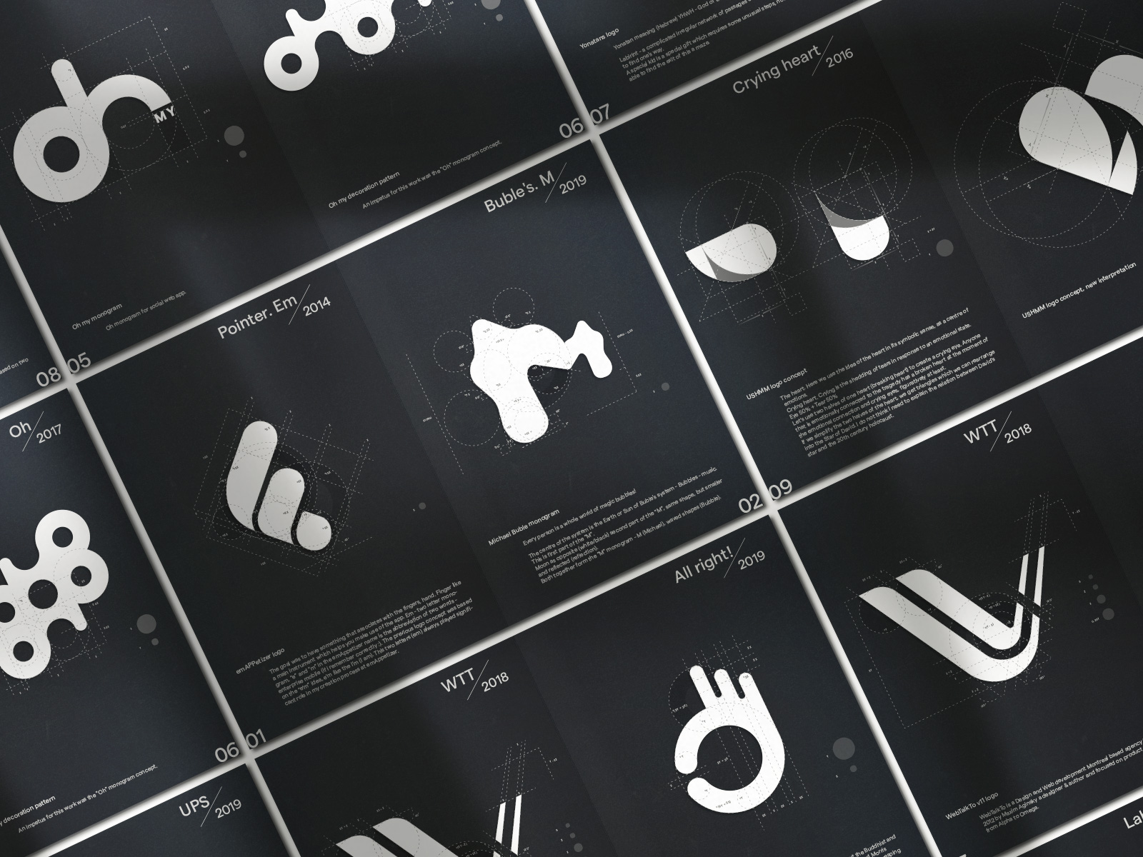
Buble's. M / Michael Buble / 08, 2019
Every person is a whole world of magic bubbles!
The centre of the system is the Earth or Sun of Buble's system - Bubbles - music. This is first part of the "M".
Moon as opposite (white/black) second part of the "M", same shape, but smaller and reflected (reflection).
Both together form the "M" monogram - M (Michael), waved shapes (Bubble).
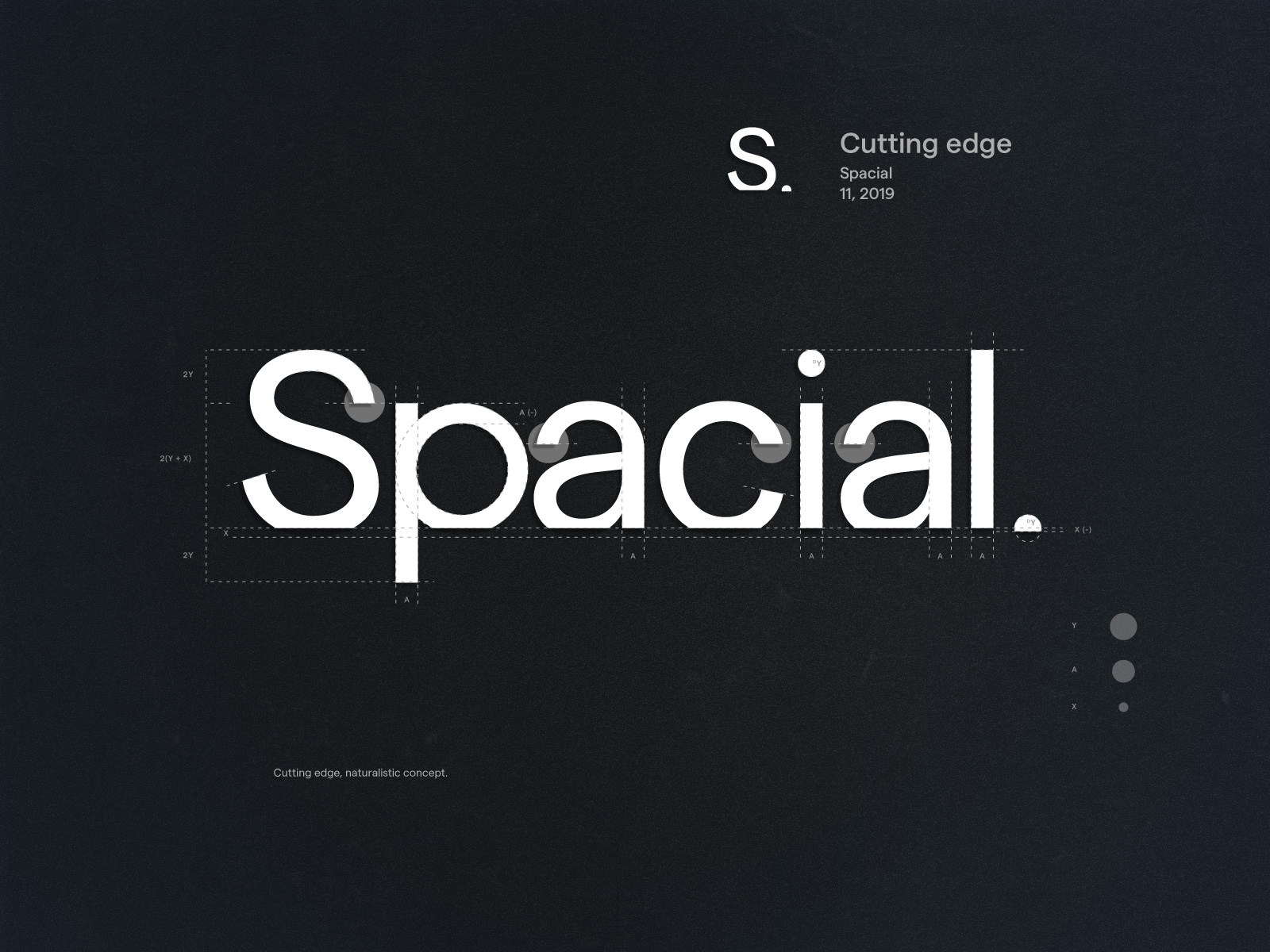
Cutting edge / Spacial / 11, 2019
Cutting edge, naturalistic concept.
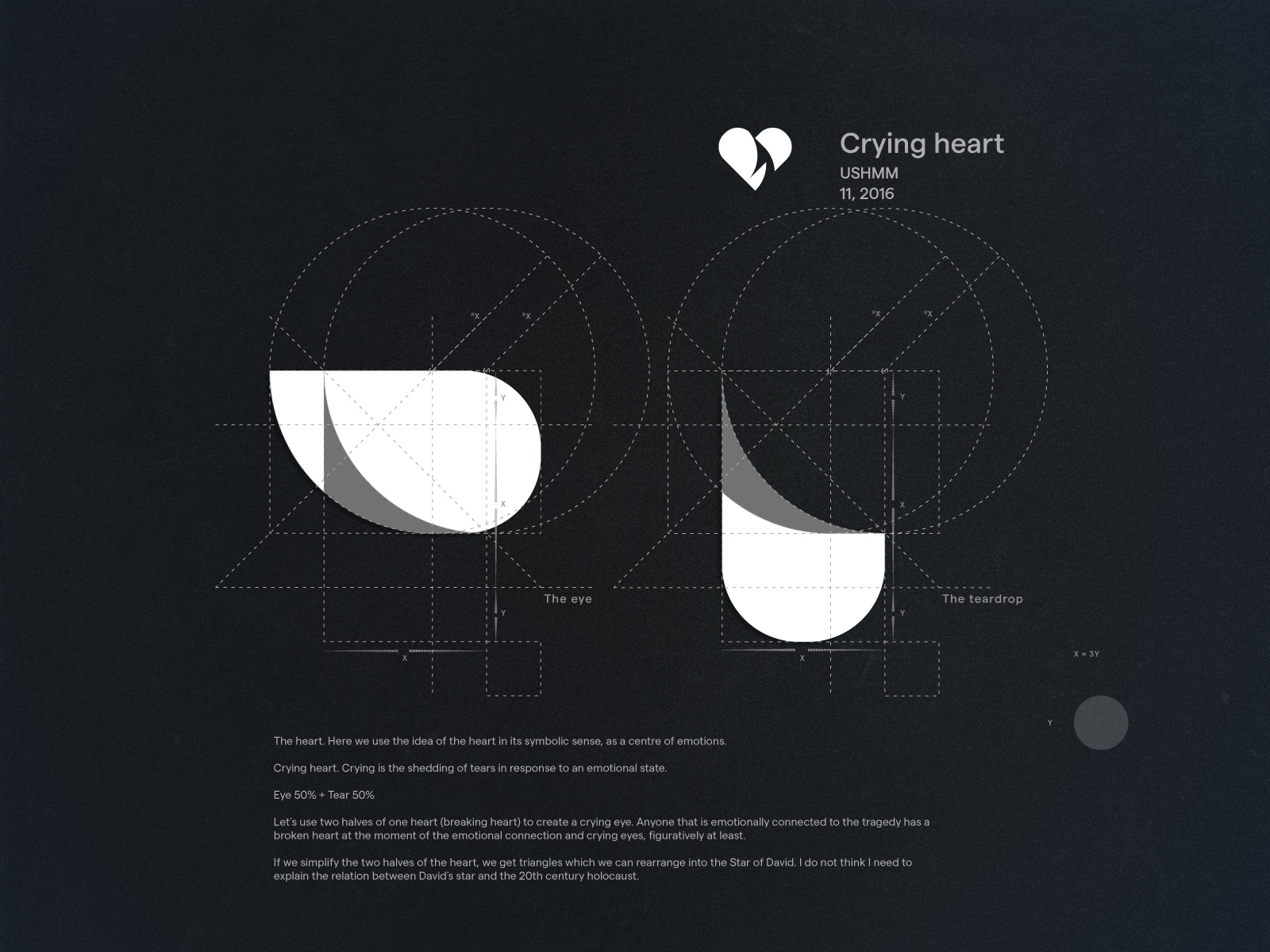
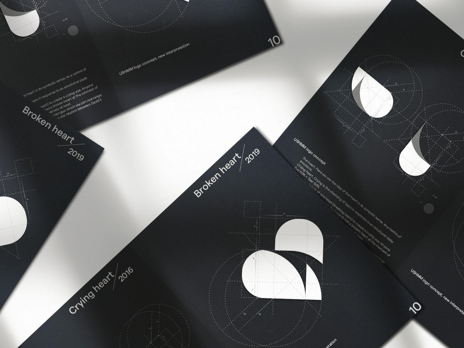
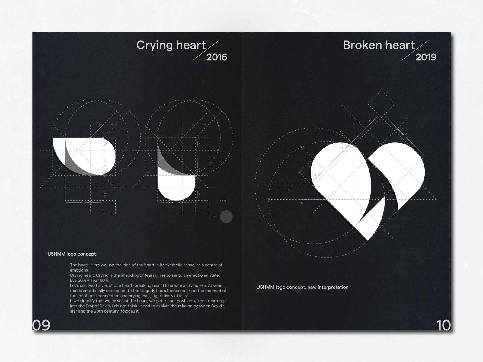
Crying heart / USHMM / 11, 2016
The heart. Here we use the idea of the heart in its symbolic sense, as a centre of emotions.
Crying heart. Crying is the shedding of tears in response to an emotional state.
Eye 50% + Tear 50%
Let's use two halves of one heart (breaking heart) to create a crying eye. Anyone that is emotionally connected to the tragedy has a broken heart at the moment of the emotional connection and crying eyes, figuratively at least.
If we simplify the two halves of the heart, we get triangles which we can rearrange into the Star of David. I do not think I need to explain the relation between David's star and the 20th century holocaust.
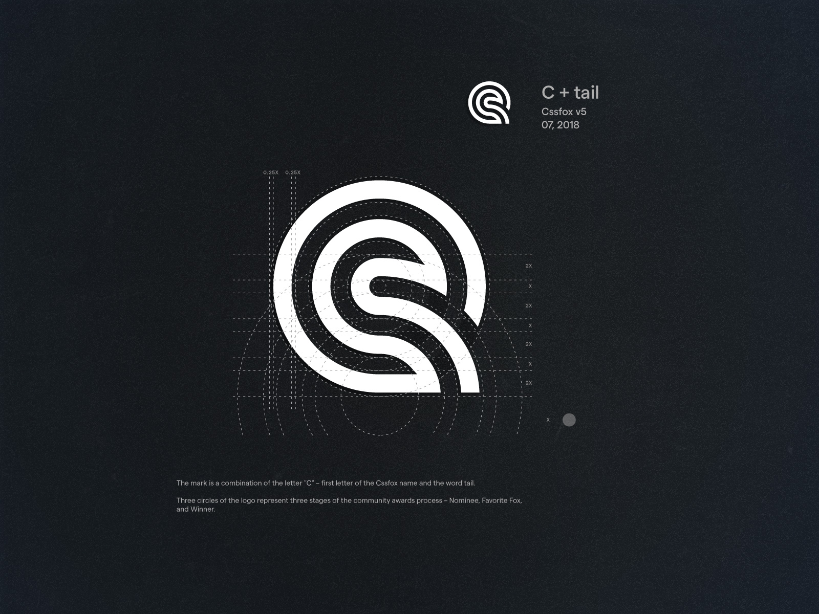
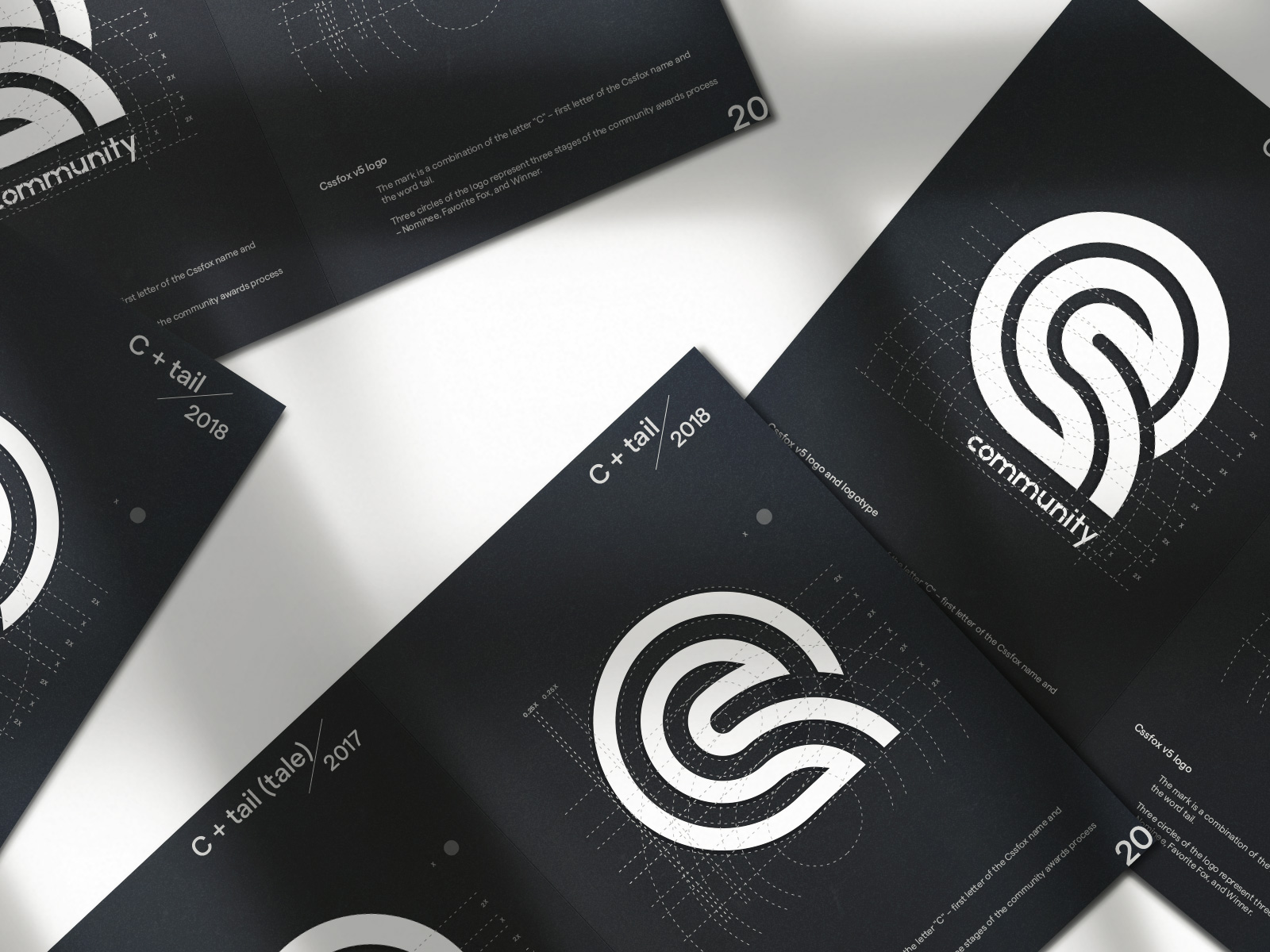
C + tail / Cssfox v5 / 07, 2018
The mark is a combination of the letter "C" – first letter of the Cssfox name and the word tail.
Three circles of the logo represent three stages of the community awards process – Nominee, Favorite Fox, and Winner.
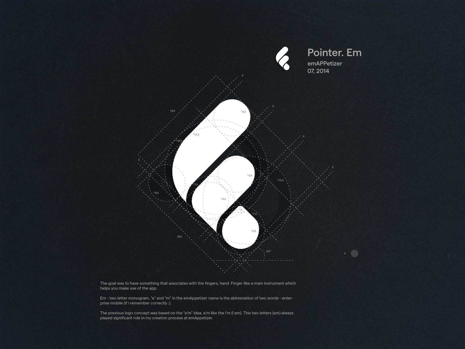
Pointer. Em / emAPPetizer / 07, 2014
The goal was to have something that associates with the fingers, hand. Finger like a main instrument which helps you make use of the app.
Em - two letter monogram, “e” and “m” in the emAppetizer name is the abbreviation of two words - enterprise mobile (if i remember correctly :).
The previous logo concept was based on the “e’m” idea, e’m like the I’m (I am). This two letters (em) always played significant role in my creation process at emAppetizer.
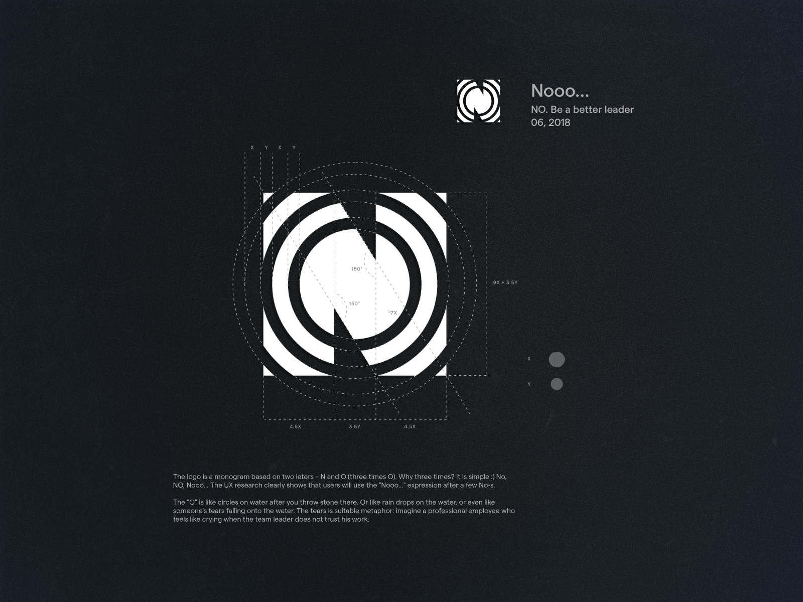
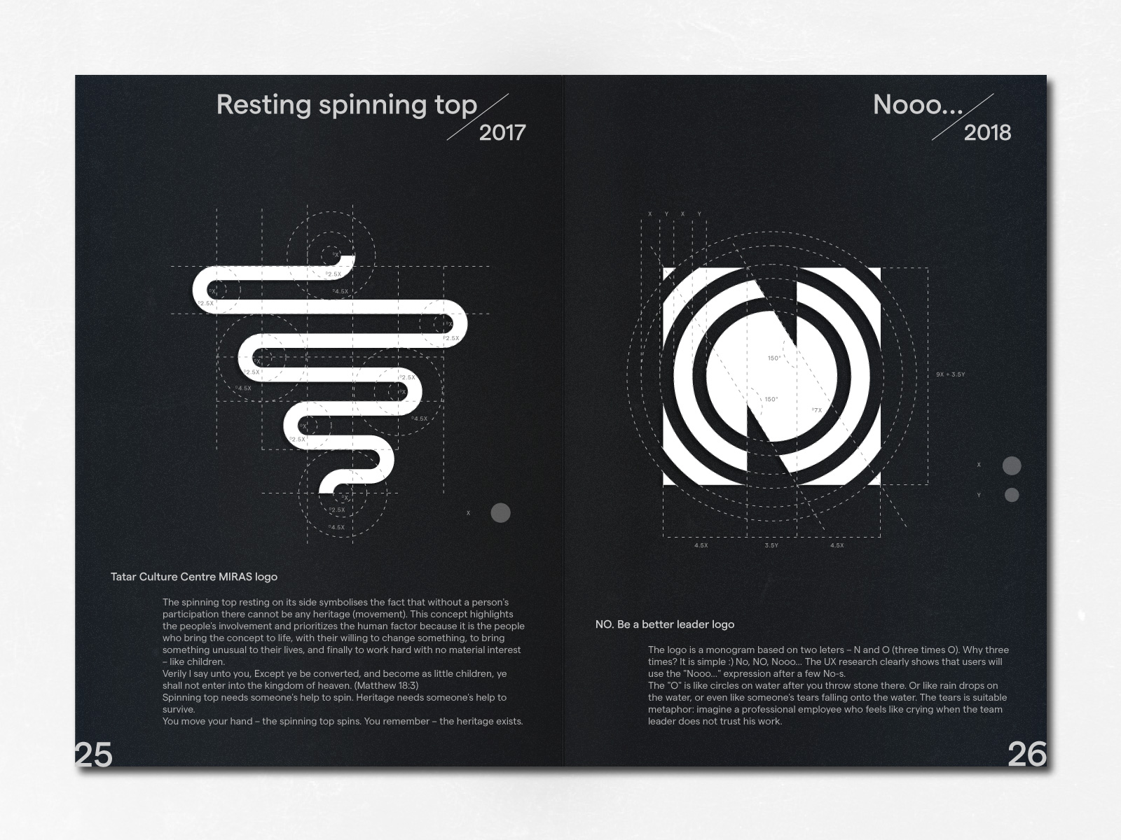
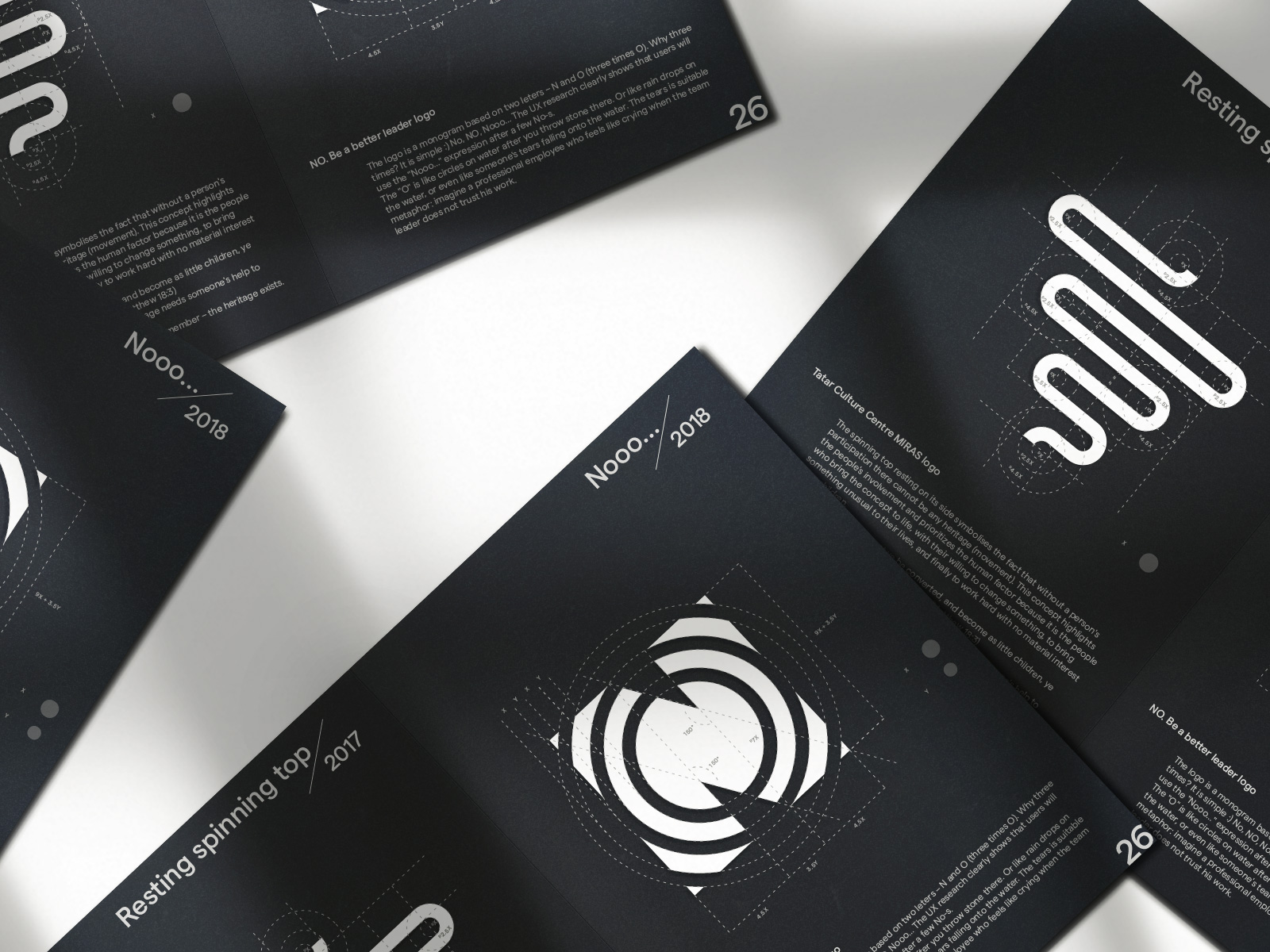
Nooo… / NO. Be a better leader / 06, 2018
The logo is a monogram based on two leters – N and O (three times O). Why three times? It is simple :) No, NO, Nooo… The UX research clearly shows that users will use the "Nooo…" expression after a few No-s.
The "O" is like circles on water after you throw stone there. Or like rain drops on the water, or even like someone's tears falling onto the water. The tears is suitable metaphor: imagine a professional employee who feels like crying when the team leader does not trust his work.
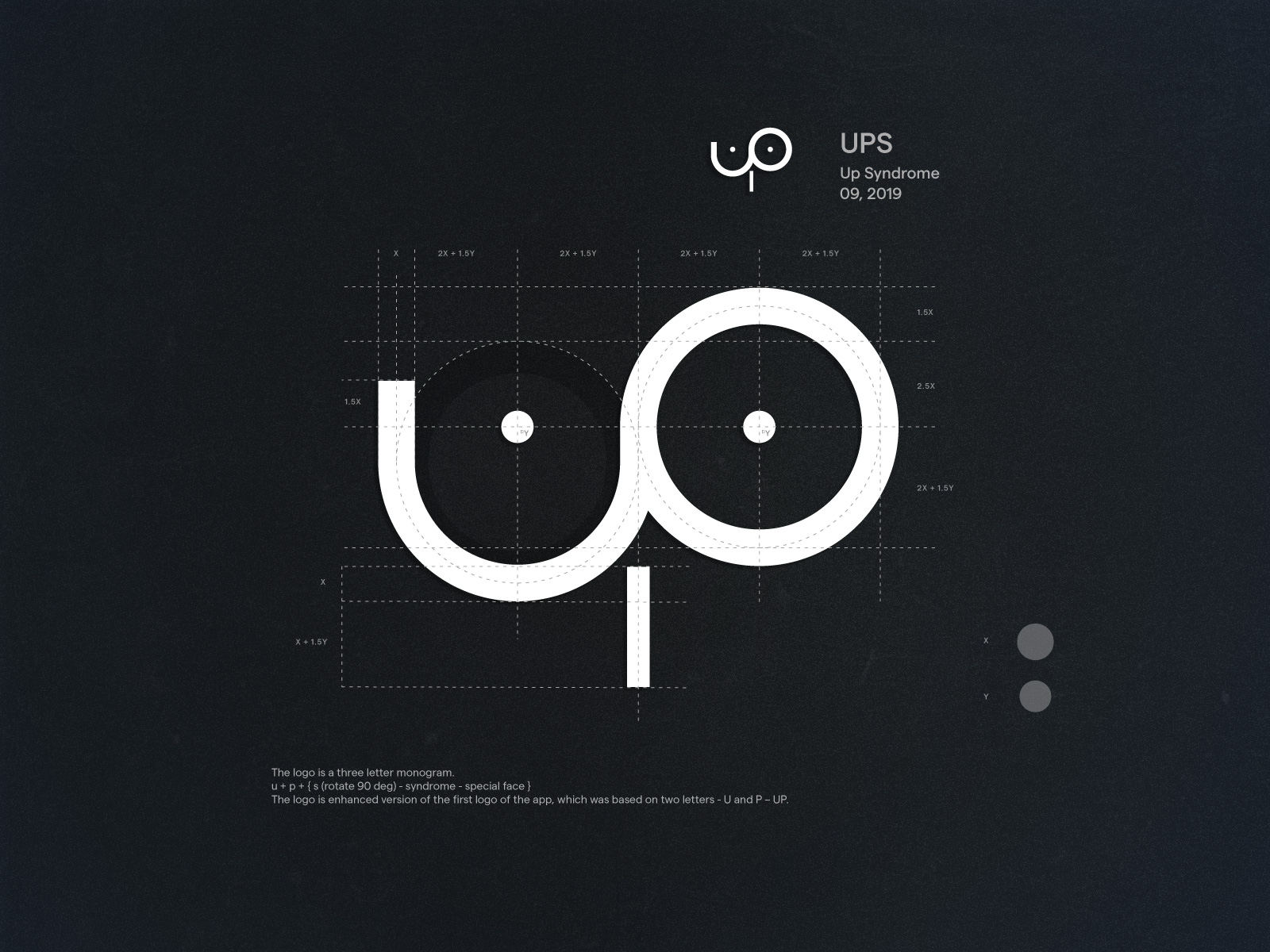
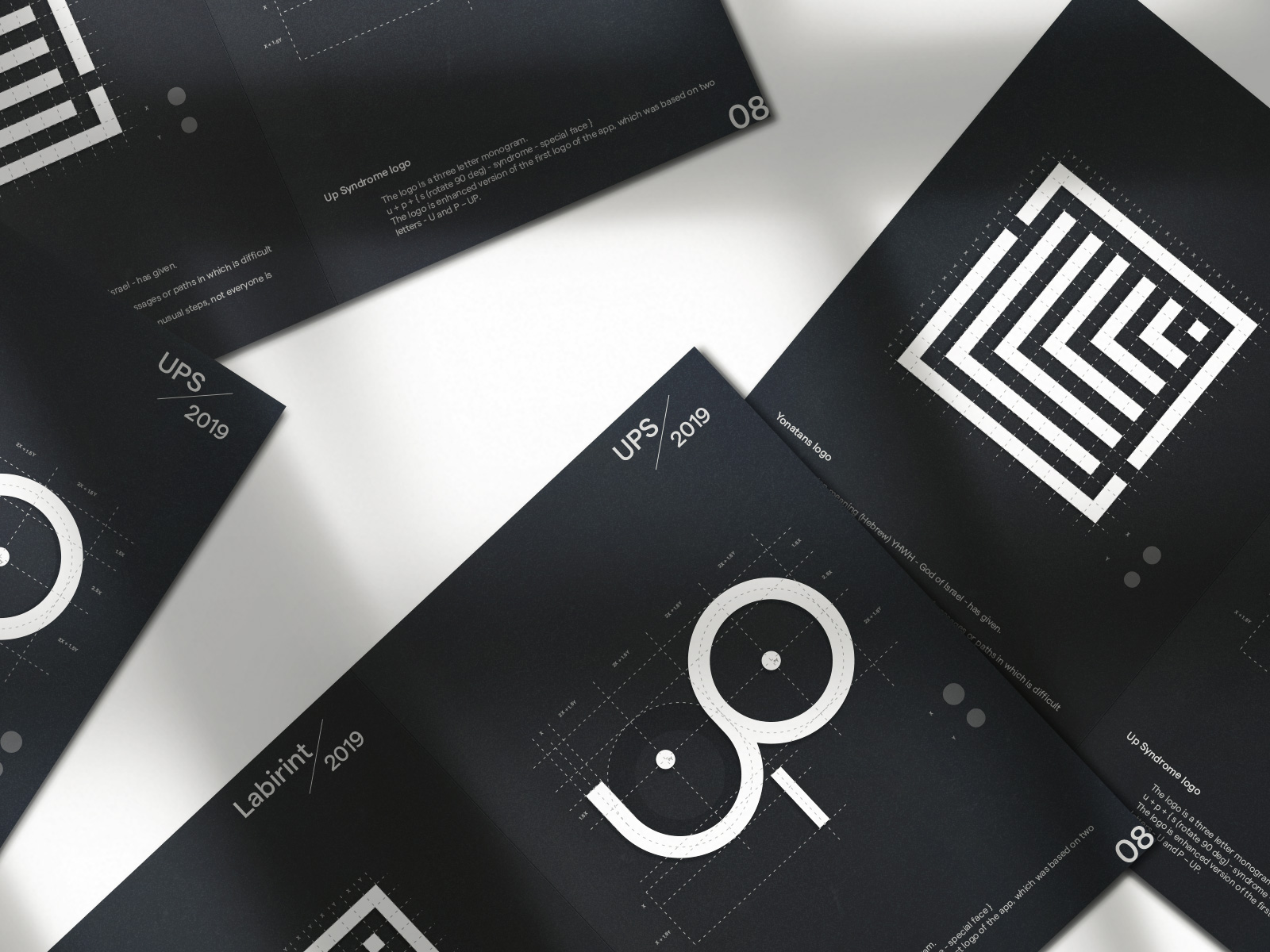
UPS / Up Syndrome / 09, 2019
The logo is a three letter monogram.
u + p + { s (rotate 90 deg) - syndrome - special face }
The logo is enhanced version of the first logo of the app, which was based on two letters - U and P – UP.
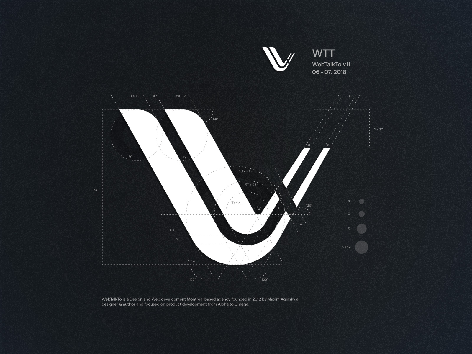
WTT / WebTalkTo v11 / 06 - 07, 2018
WebTalkTo is a Design and Web development Montreal based agency founded in 2012 by Maxim Aginsky a designer & author and focused on product development from Alpha to Omega.
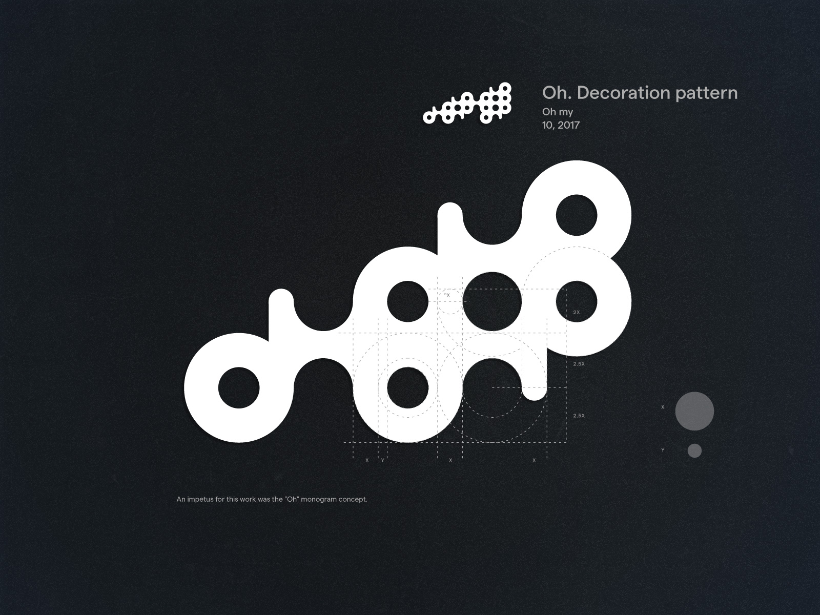
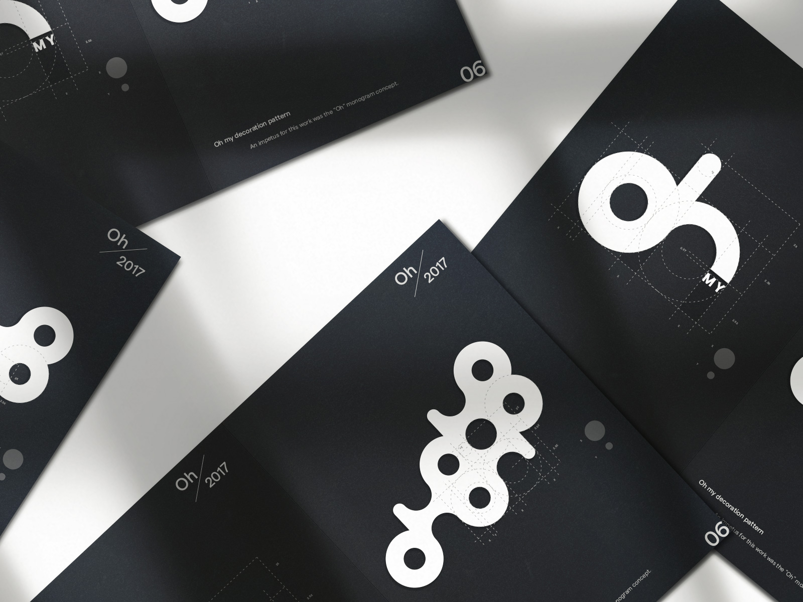
Oh. Decoration pattern / Oh my / 10, 2017
An impetus for this work was the "Oh" monogram concept.
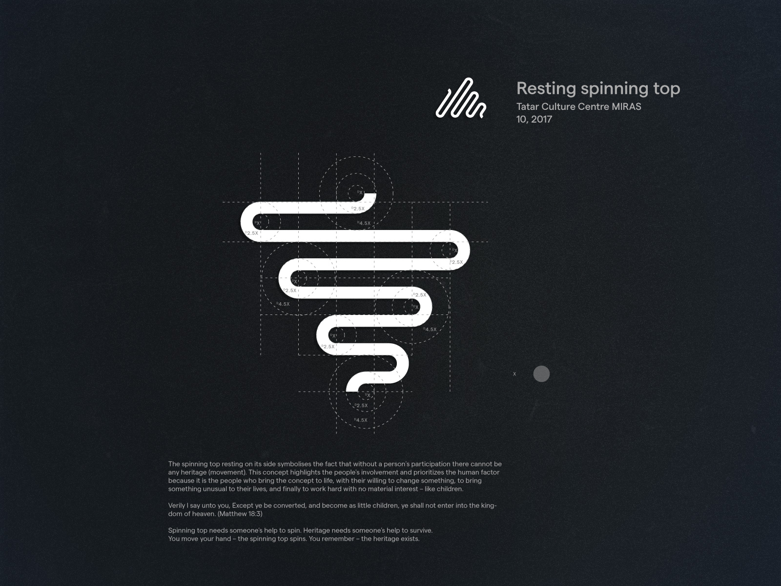
Resting spinning top / Tatar Culture Centre MIRAS / 10, 2017
The spinning top resting on its side symbolises the fact that without a person's participation there cannot be any heritage (movement). This concept highlights the people's involvement and prioritizes the human factor because it is the people who bring the concept to life, with their willing to change something, to bring something unusual to their lives, and finally to work hard with no material interest – like children.
Verily I say unto you, Except ye be converted, and become as little children, ye shall not enter into the kingdom of heaven. (Matthew 18:3)
Spinning top needs someone's help to spin. Heritage needs someone's help to survive. You move your hand – the spinning top spins. You remember – the heritage exists.
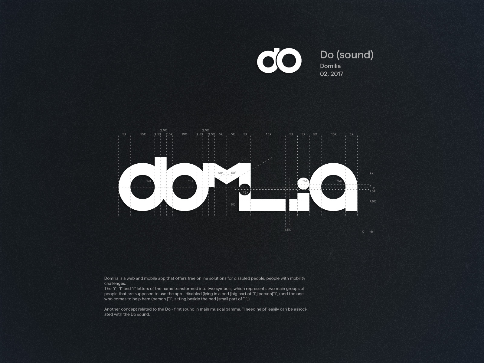
Do (sound) / Domilia / 02, 2017
Domilia is a web and mobile app that offers free online solutions for disabled people, people with mobility challenges.
The "i", "l" and "i" letters of the name transformed into two symbols, which represents two main groups of people that are supposed to use the app - disabled (lying in a bed [big part of "l"] person["i"]) and the one who comes to help hem (person ["i"] sitting beside the bed [small part of "l"]).
Another concept related to the Do - first sound in main musical gamma. "I need help!" easily can be associated with the Do sound.