Yonatans family
Yonatans is a non-profit organization (NPO) and host of series of mobile applications for special kids.
Table of contents:
- Phonemania. Intro
- Desktop views / Web interface
- Mobile views / Web interface
- Logomark / Branding
- Icon / Branding
- Logotype / Branding
- Cards /Branding
- Stationery / Branding
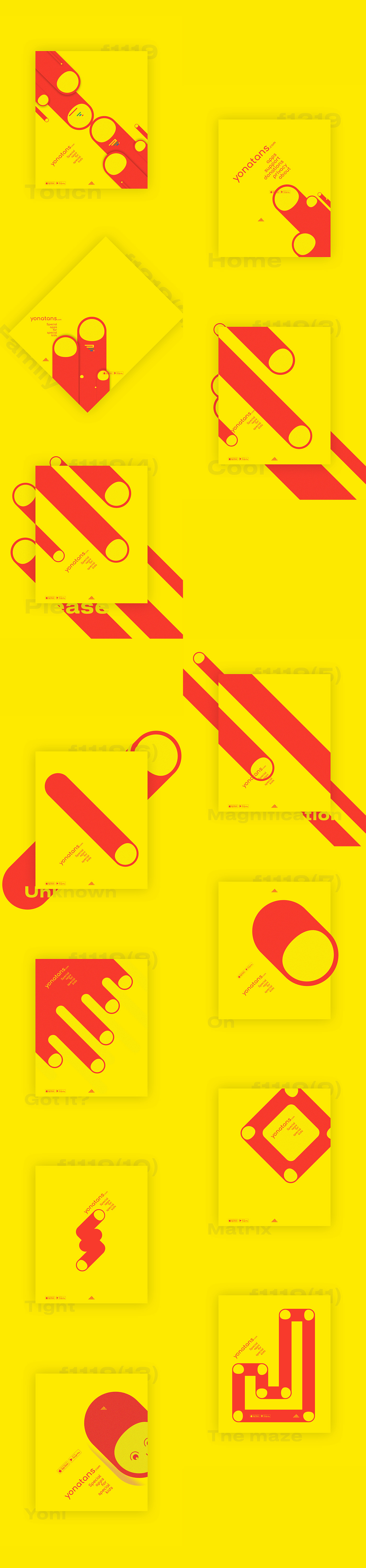
- Yellow motive / Posters
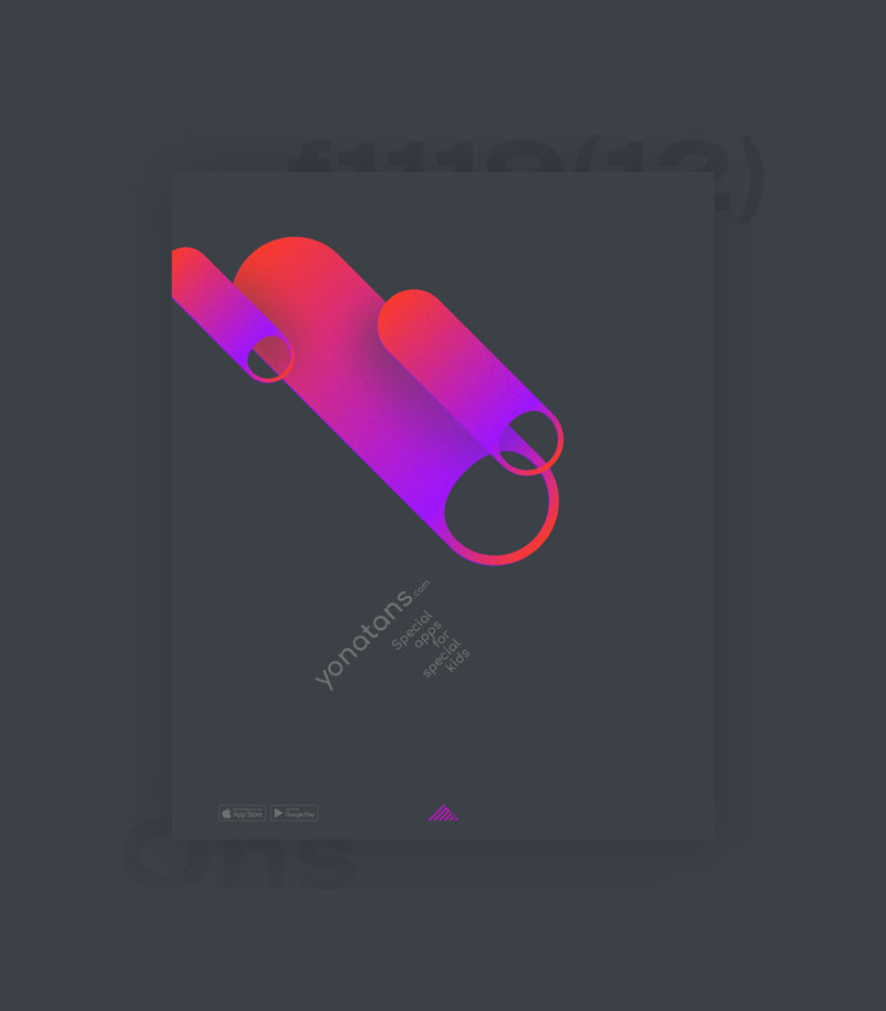
- Dark motive / Posters
- Blue motive / Posters
- Early interface tests
Phonemania. Intro
I probably need to explain this. It is pretty straightforward and this is just an intro, but...
Lately I have noticed that designers started to use phone screen dimensions for their artworks more and more.
This format becoming one of the main for different kinds of design work presentation.
I am guessing that this was the impetus for creating the Phonemania set.
The cards contain different graphic details which were created for Yonatans. I found that it looks affective.
The trend works!
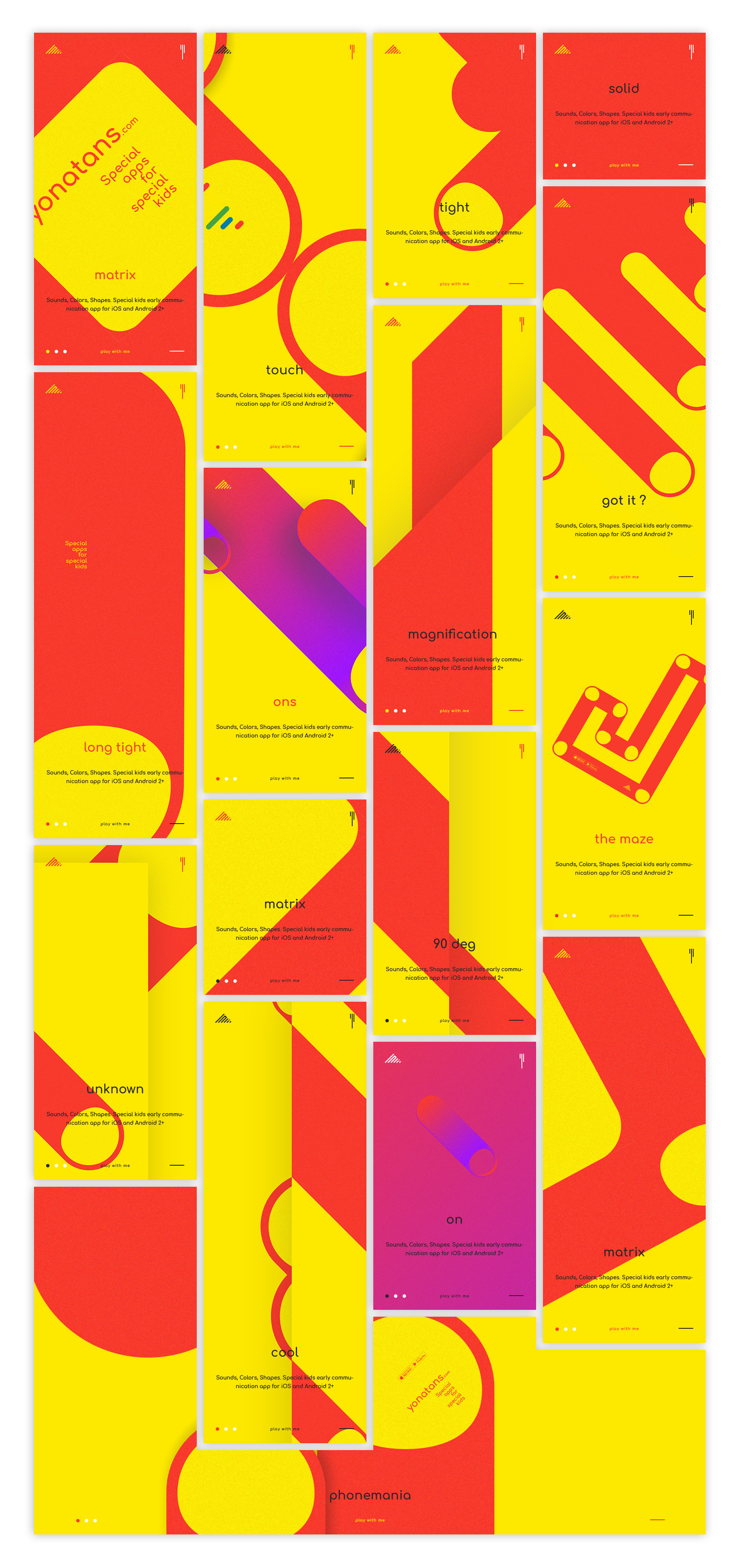
Phonemania
March 2019
Web interface
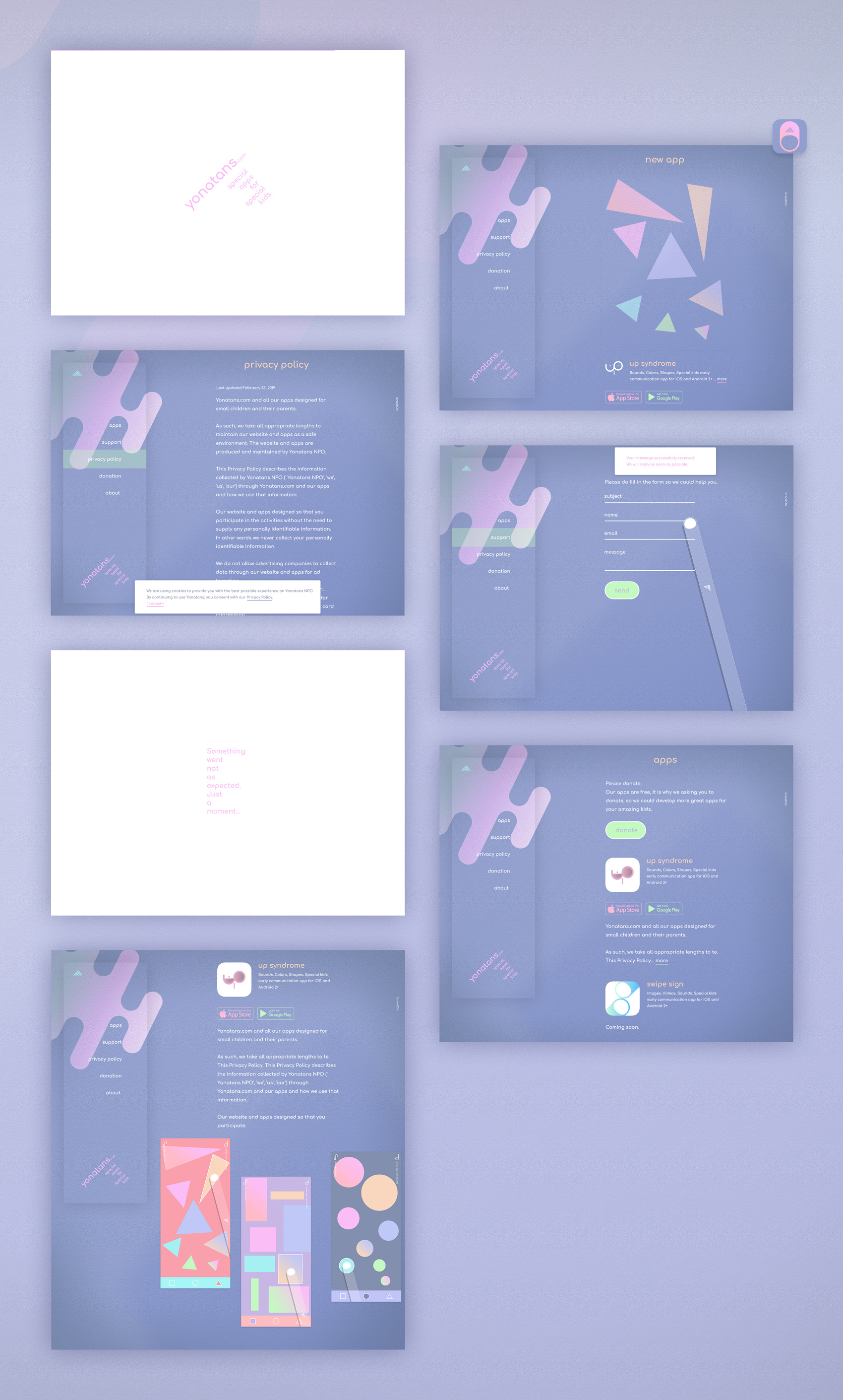
The visual language of the interface influenced from the Up Syndrome app design patterns. There is a reason for it.
The home page of the site is planned to introduce the latest app.
From this angle of view, it makes sense to keep the entire site design similar to the latest app we are introducing to the public.
It is an extra headache - you probably would say, but from marketing point of view I think it is worth it, especially if you have an in house designer which is a must to keep improving the visual language of the product.
Design is a communication tool; updated design is the shortest way to the potential user's mind.
Thus, we have an interesting situation. When the Yonatans branding can have two visual identities – digital and non-digital, website and other materials, for example printing elements of the brand.
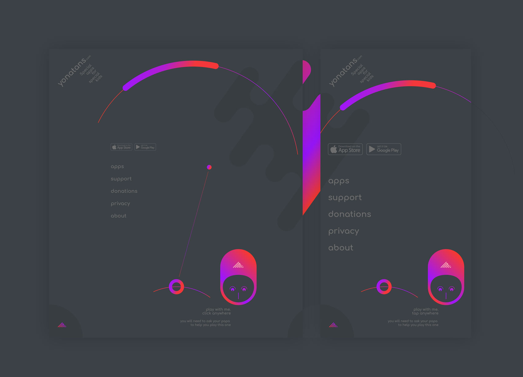
Desktop views
Viewport size 1400x1050 px - close to MacBook Pro
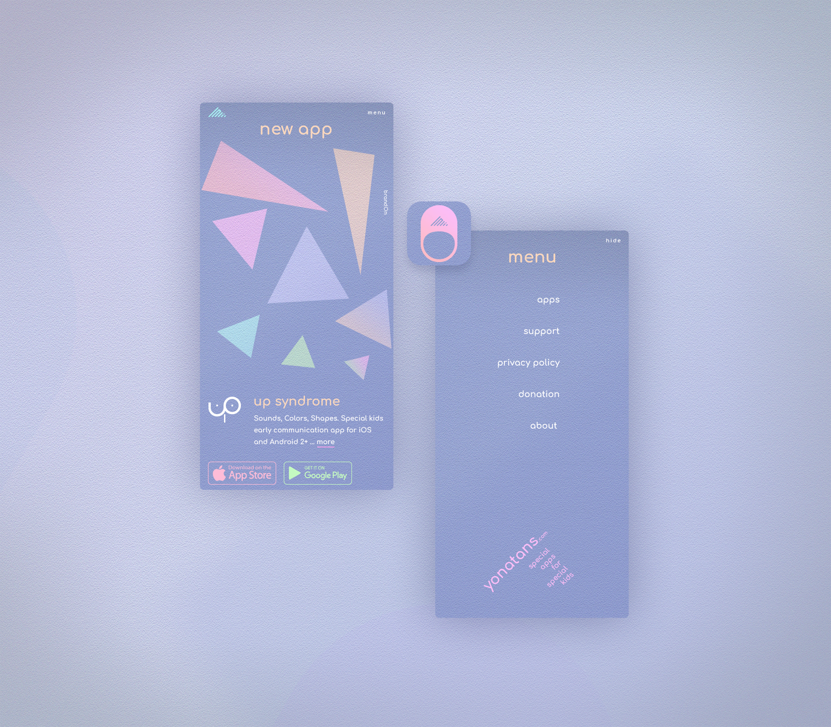
Mobile views
Viewport size 422x823 px - Pixel 2 XL Phone
Most of the elements remain the same, whether it is large or small screen. It is why the mobile set presented with two screens only – home and menu.
Branding
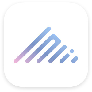
Logomark
The first version (2016) of the logo for Yonatan very clearly shows that the shape built based on the Hebrew language letters, it is a logotype.
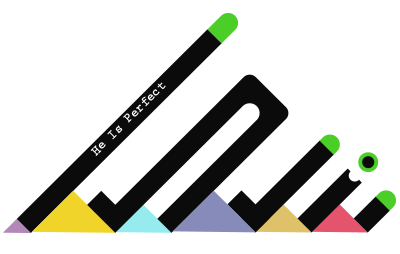
The new version of the logo has the same meaning and shares the same rule of proportions with the previous version.
The shape was just simplified following latest modern patterns of the logo feel and look.
One of the differences between the art and design is that the art does not need to be updated, it is as good as it is, same thing if the design is out-dated it will reflect on how the product is sold.
One of the possible reasons (noting for myself :) is that the art proposal is for a small group of people that are elite and require from its user some preparations, same time the design is selling for as many as possible users and here you need to make sure users will get it right away, in other words; message must be delivered immediately, otherwise you will lose the user for ever.
Icon
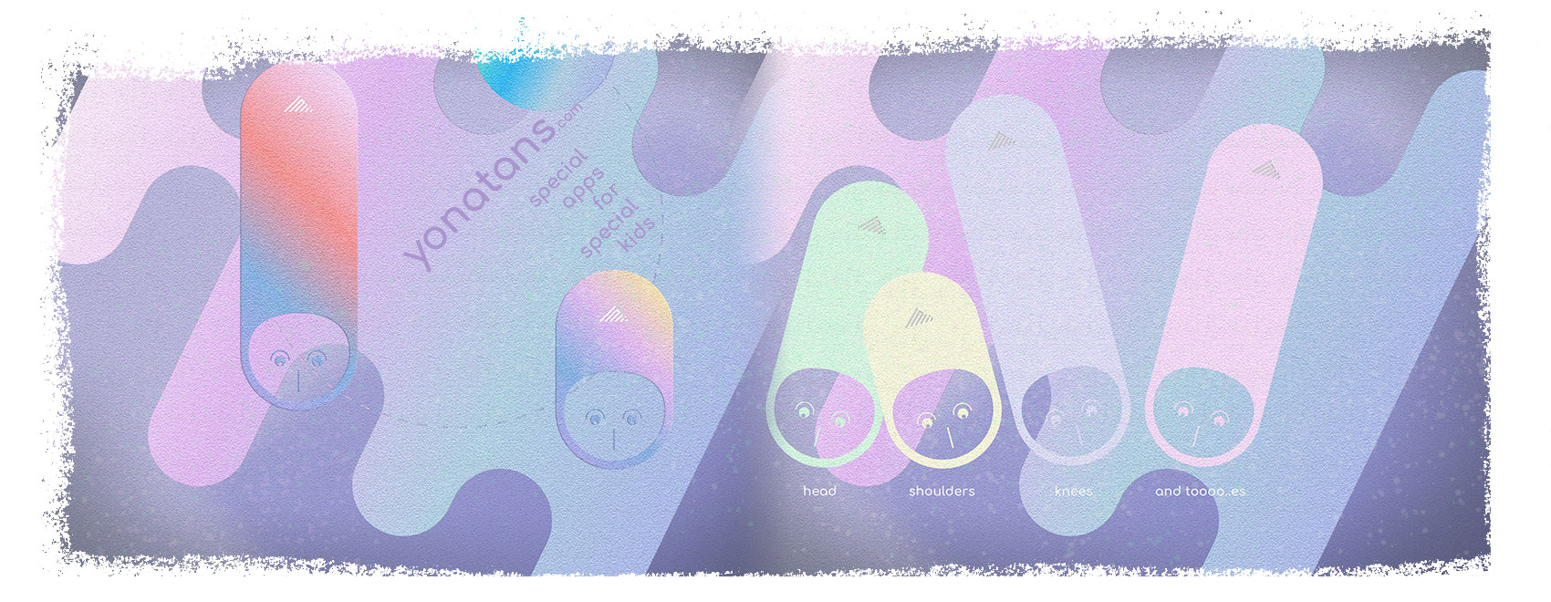
App icon is simplified head of YONI without face elements.
At the top (hat) part of the head – logo.
Hat with logo, this is a very common thing, do not be surprised.
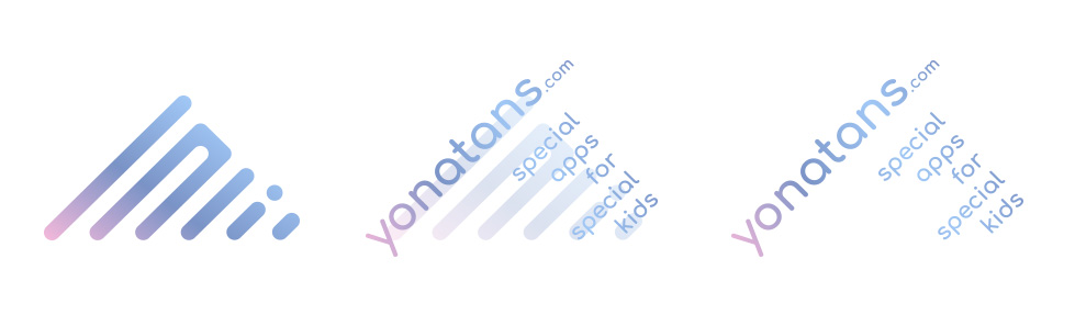
Logotype
The logotype is a site name and description, visually referring to the logo construct.
Keeping things follow same patterns, creates a similarity. This similarity helps to glue elements together, thus provides a feeling of solid monocentric composition.
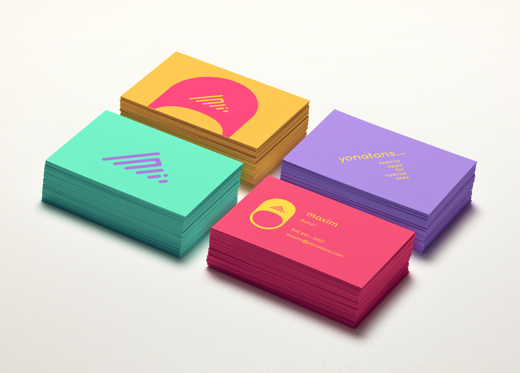
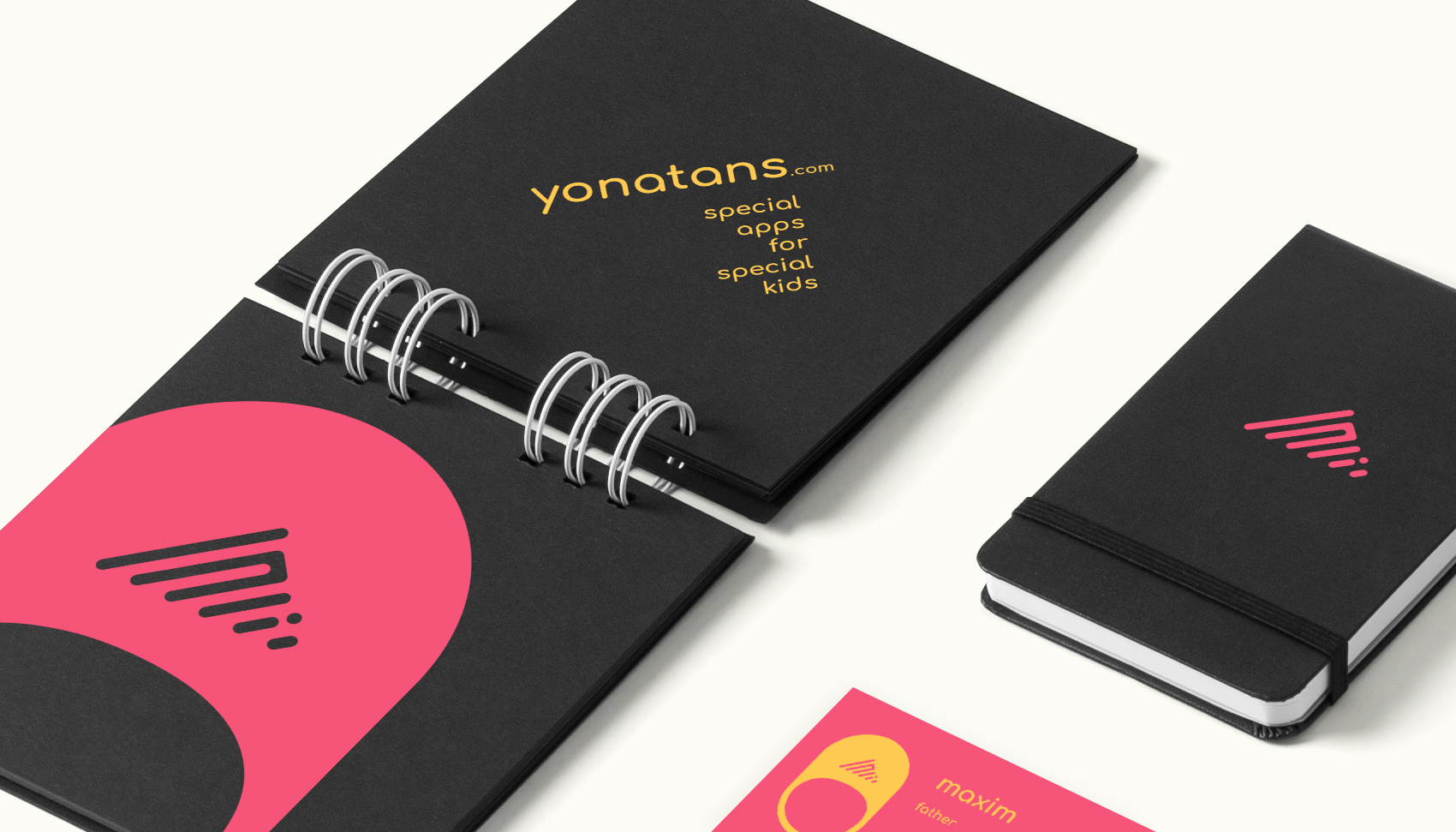
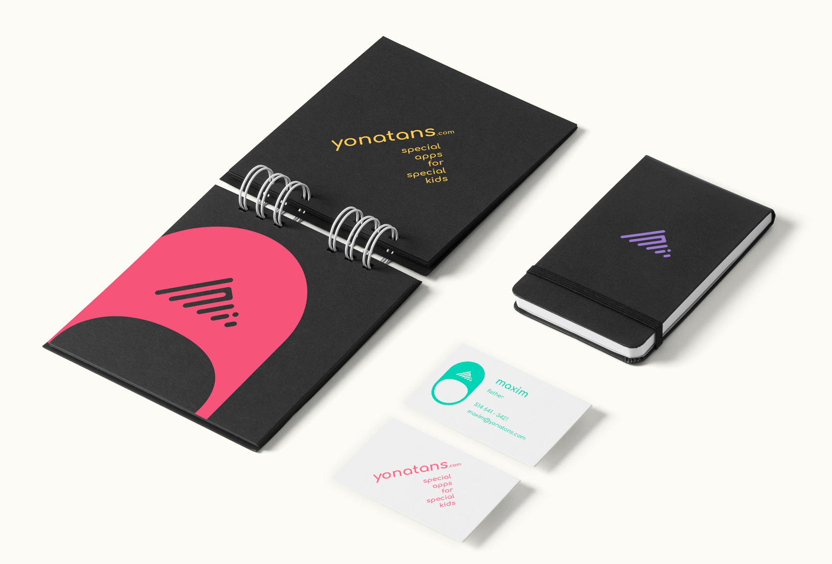
Cards
Stationery
Fragment. Close up
Alternative colors
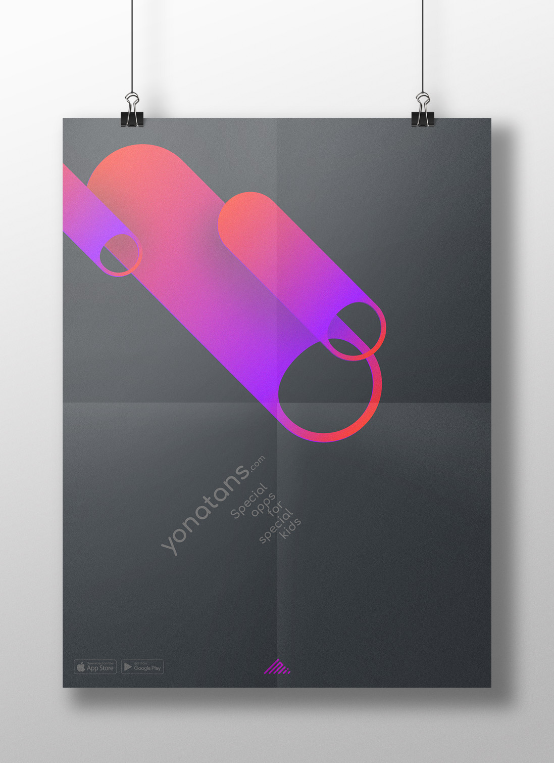
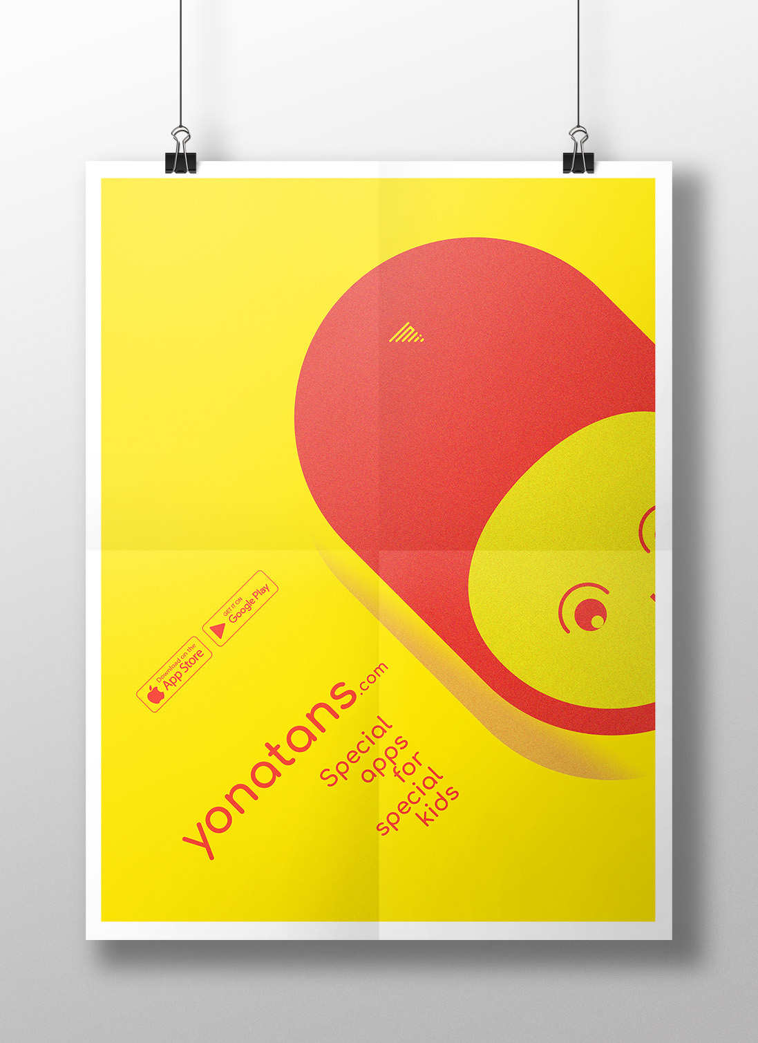
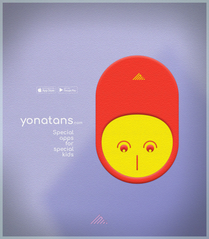
Posters
Yellow motive
Dark motive no.12
Blue motive
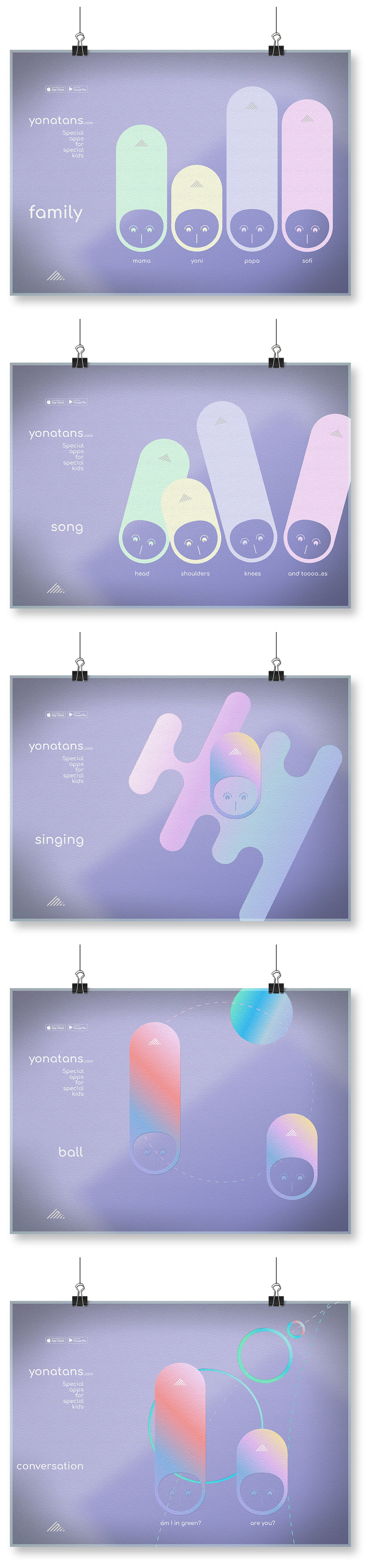
First tests
Here are the first tests of web and mobile interfaces. Or maybe better to call it future version ideas.
Simple game at the Home page.
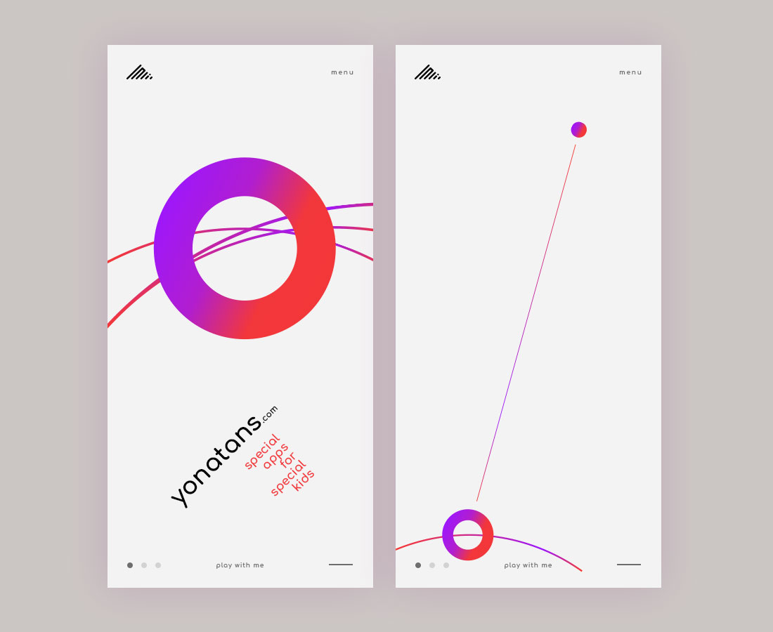
As you can see, the work has quite a few potential ways of future development. This is not bad :)
Thank you for your time!