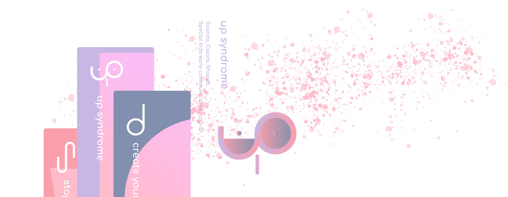
App screens fragments
Up Syndrome - Sounds, Colors, Shapes is a special kid's early communication hybrid app for iOS and Android.
We believe it is going to be useful for kids two years old and up.
This is first app in a series of educational applications, which planned to be created for special kids.
All the applications will be published by Yonatans NPO – which was created especially for this case - to host the similar experiences.
Table of contents:
- User persona
- Purpose and mission
- It does
- Logo concept
- Touch indicator. Interaction concept
- iPad screens
- iPhone screens
- Logo evolution
- Flowchart
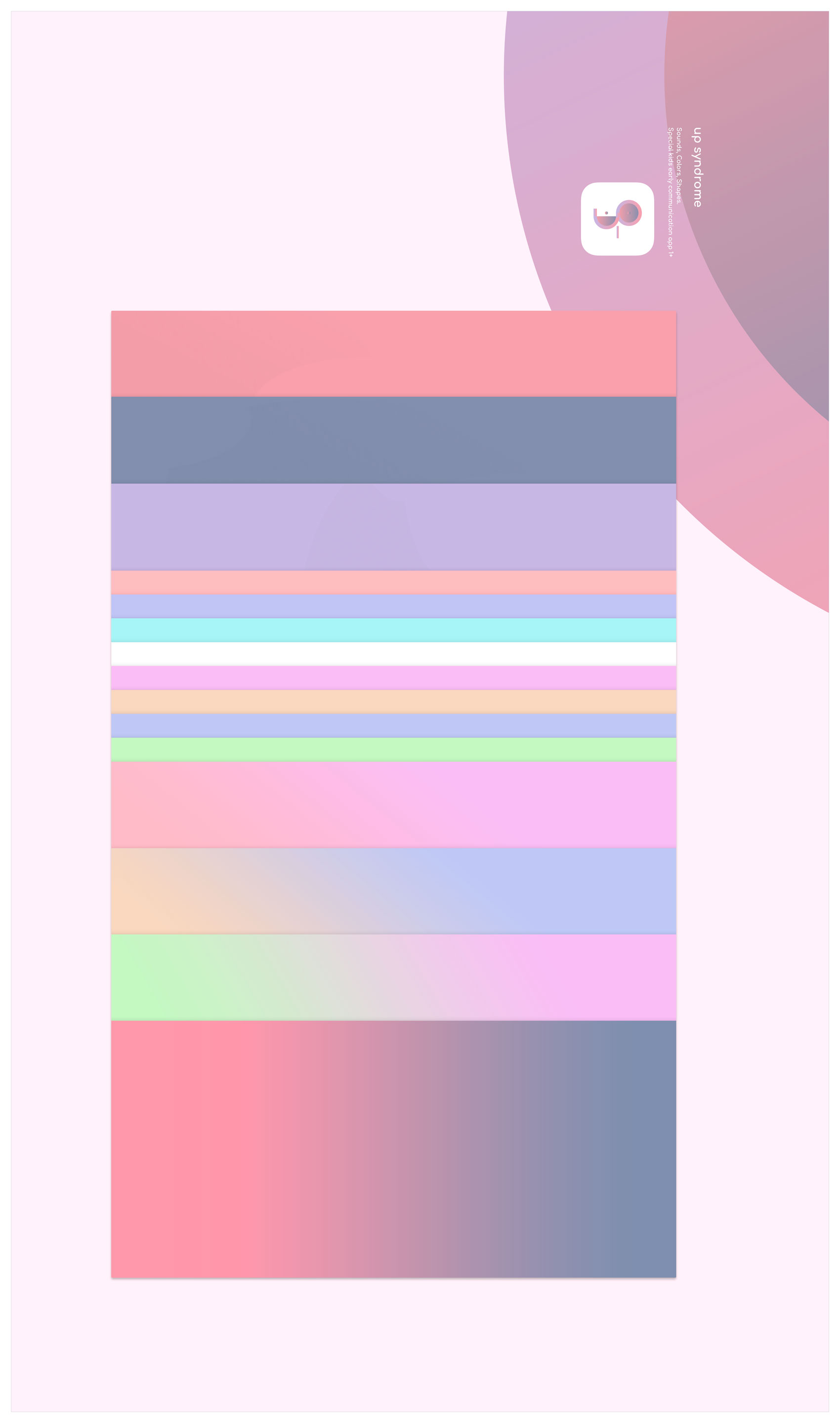
- Colors palette and gradients
- Animation prototypes
User persona
Yonatan a perfect baby boy was born with a diagnosis of Trisomy 21 (Up) Syndrome.
Just like any child who is born to this world or maybe a bit more than a regular child, he filled his family's life with the greatest joy and laughter,
but unlike a regular child, he is dealing with certain challenges, difficulties and delays.
At the beginning it was mainly physical delays, anything that was natural to a regular child was not for Yonatan, he had to learn how to use his body properly to be able to walk and we spent a lot at physiotherapy sessions improving his gross motor skills. Thank god Yonatan is easily self-motivated to move and therefore it was not hard to make him learn and improve physical abilities.
Just like any child, Yonatan loves to spend time at the park to swing and slide,
but unlike a regular child, he is also loves to share his unique ability to spread free love to everyone.
Just like any child, he has things he is fascinated about. He adores music,
but unlike a regular child, he can play with drum sticks for hours.
Just like any child, he is fun to be with,
but unlike a regular child, he makes every situation a real fun adventure and his endless positivity ensures constant enjoyment around him.
Just like any child, he loves to get attention and affection,
but unlike a regular child, his verbal communication skills are delayed and the fact that he is less self-motivated to use verbal communication makes it challenging for him to express what he wants verbally, but he uses sign language to communicate.
Just like any child, he loves devices to watch cartoons and to interact with mobiles,
but unlike a regular child, he is having difficulties to easily use the screen because of complexity of most of the apps, and even with watching a cartoon on a mobile, he can press the interface button and lose the point to continue watching and enjoying.
Purpose and mission
The mobile applications are very magnetic for anyone and little Yonatan is not an exception here.
The main idea behind this app is to make the devices user-friendly also for kids with special needs that have challenges that regular kids are not dealing with,
to better help them get the sense of interaction with modern communication tools such as smartphones and tablets.
For them to be able using and enjoying devices without frustration it must be extremely simple.
The screen must function and respond immediately without any delays.
We see our mission in creating useful communication tools for Yonatans.
It does
Logo concept
The logo is a three letter monogram.
u + p + { s (rotate 90 deg) - syndrome - special face }
The logo is enhanced version of the first logo of the app, which was based on two letters - U and P – UP.
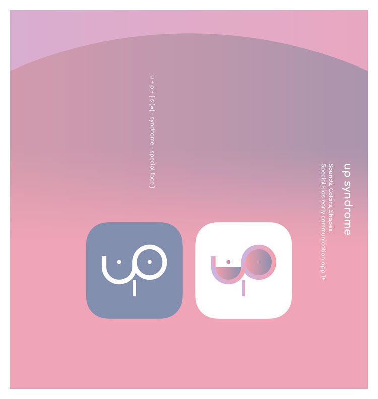
The app icon
Touch indicator. Interaction concept
Behaviour description: when user taps any place of the app interface, transparent circle appears, as an indicator of app's response.
Whether it is an active object of the app, such as buttons or just the background elements.
Communication is when after someone's request the response follow.
Purpose of this small app's feature is to show responses even when the little user interacts with non-active elements of the app.

Looped touch indicator
iPad screens
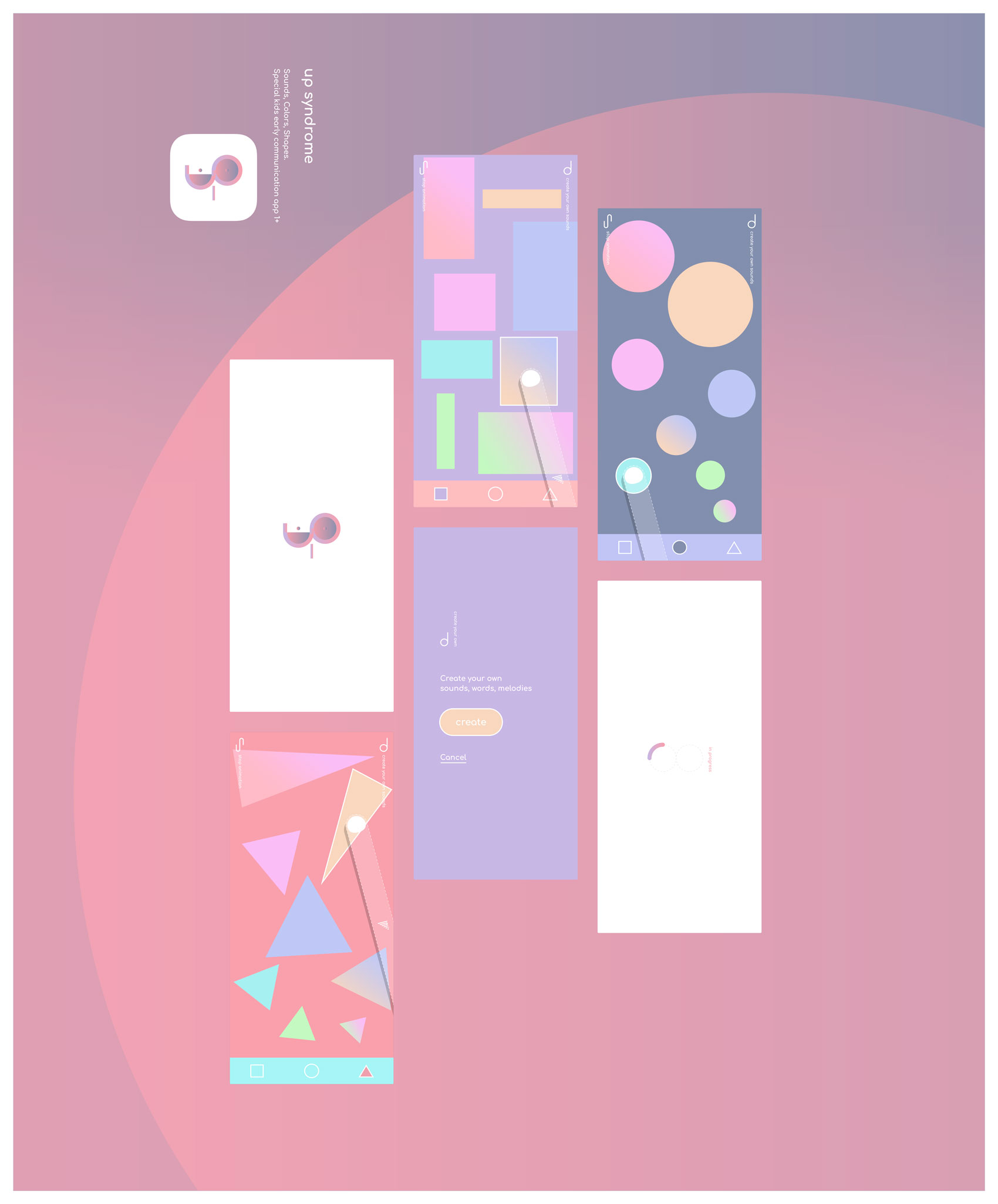
Complete set of the design screens for iPad.

iPhone screens
Selected (core) screens of the design for iPhone.
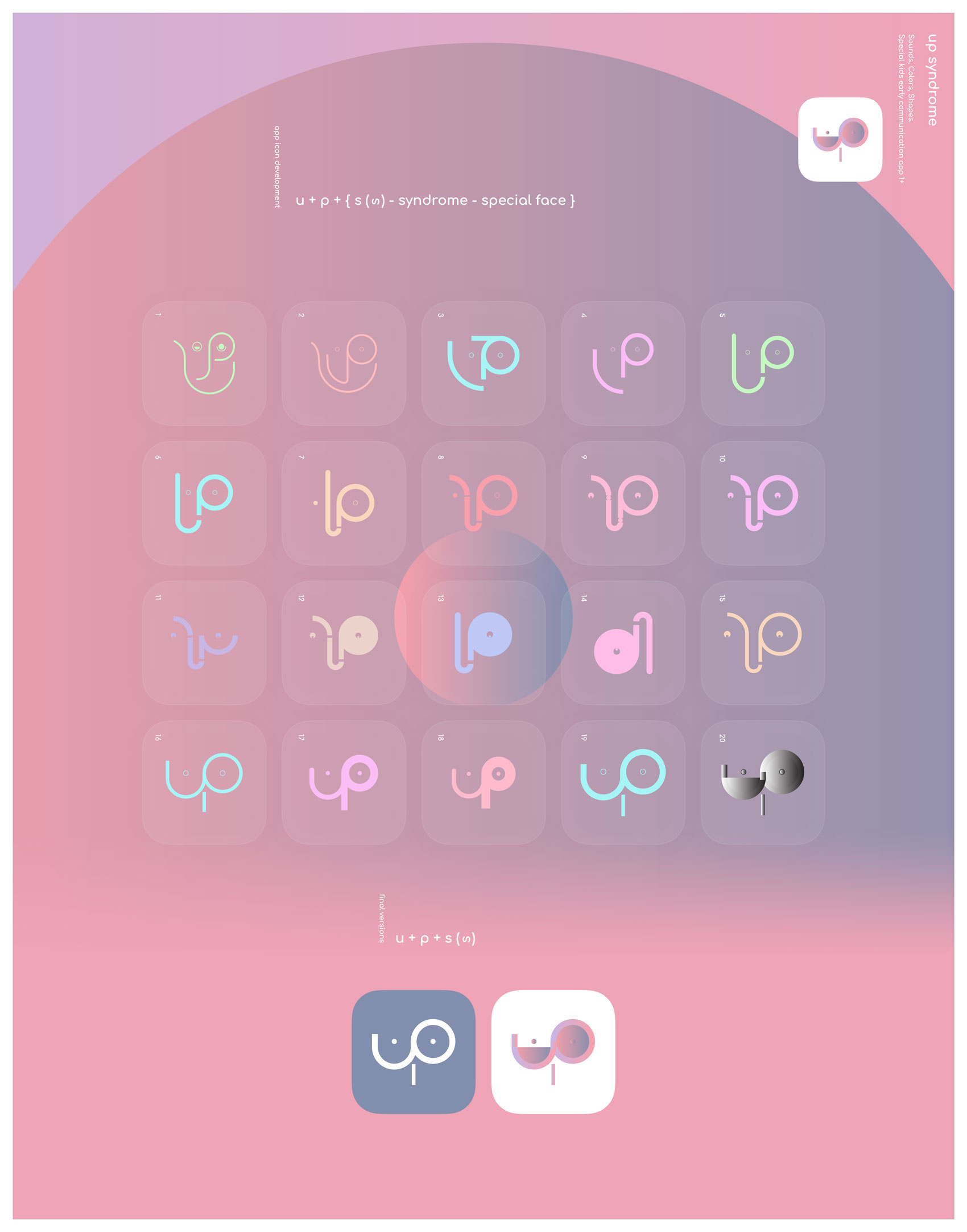
Logo evolution
Illustration of the logo development process.
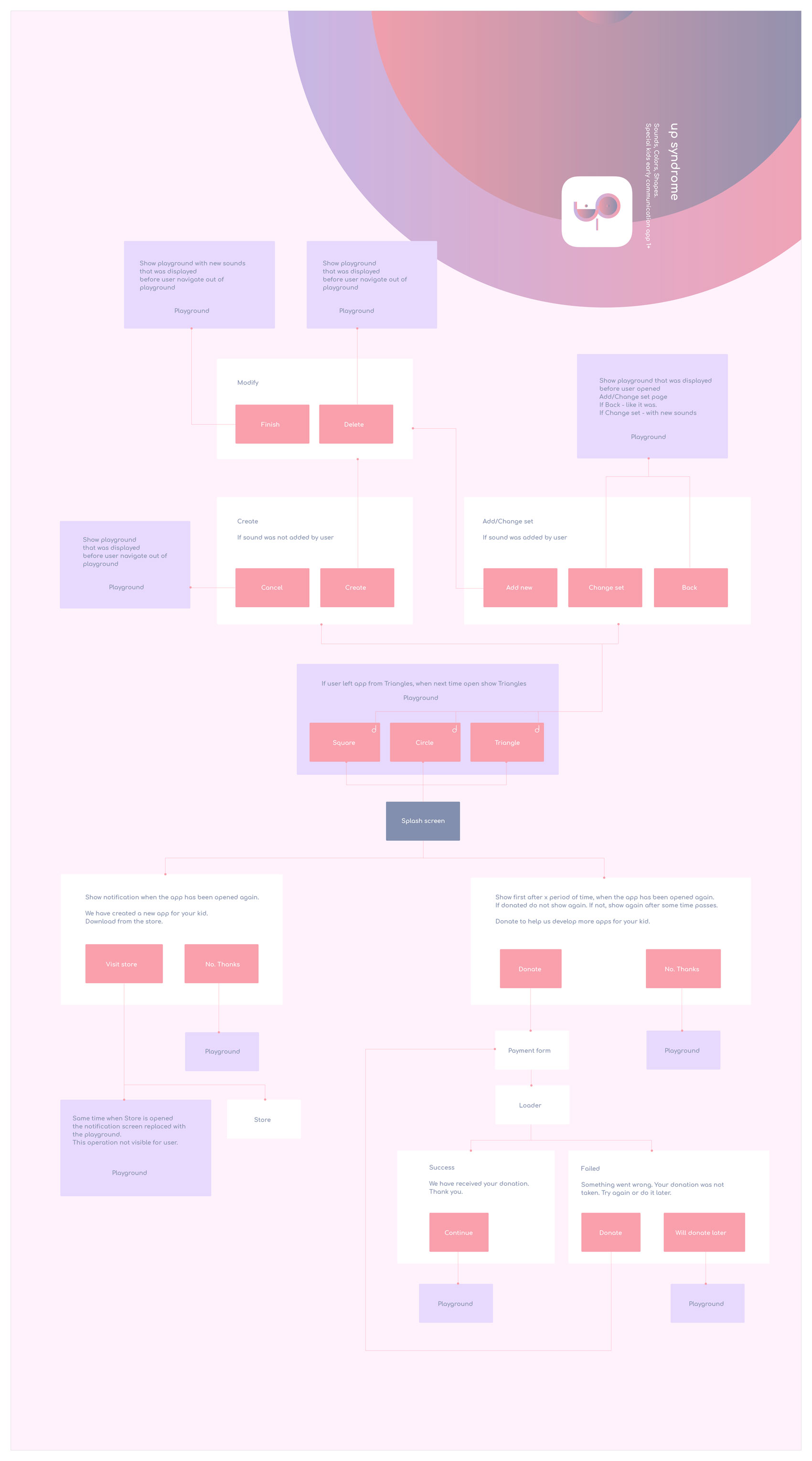
Flowchart
The complete map of user journey, accompanied with comments for dev team and all necessary user messages.
Colors palette and gradients
Animation prototypes
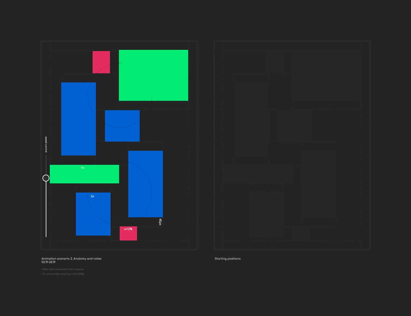
Here are some of the prototypes we have created using Adobe After Effects.
Working on prototypes has helped a lot to understand how we want the animation to behave and saved a month or so, of development team work :)
Scenario and anatomy of animation number 2.
Adobe Photoshop/Illustrator
March 20
Prototype number 2.
Prototype number 3.
Prototype number 1. Random animation example.
Thank you for your time!