At 2013 I did not have my Dell UltraSharp 27 inch monitor. The ability to test the design on different monitor sizes can really help to do better job.
September 28, 2017
Intro
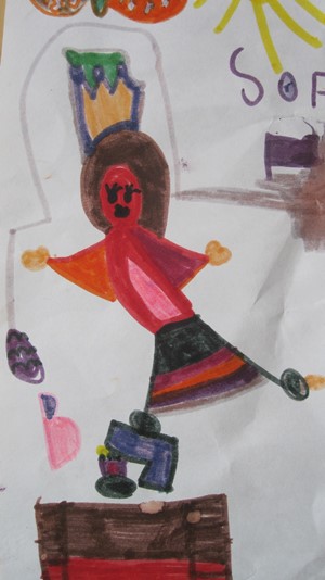
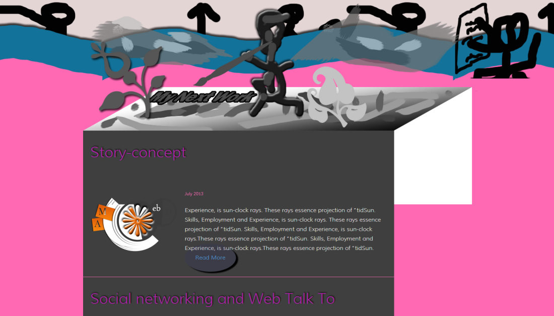
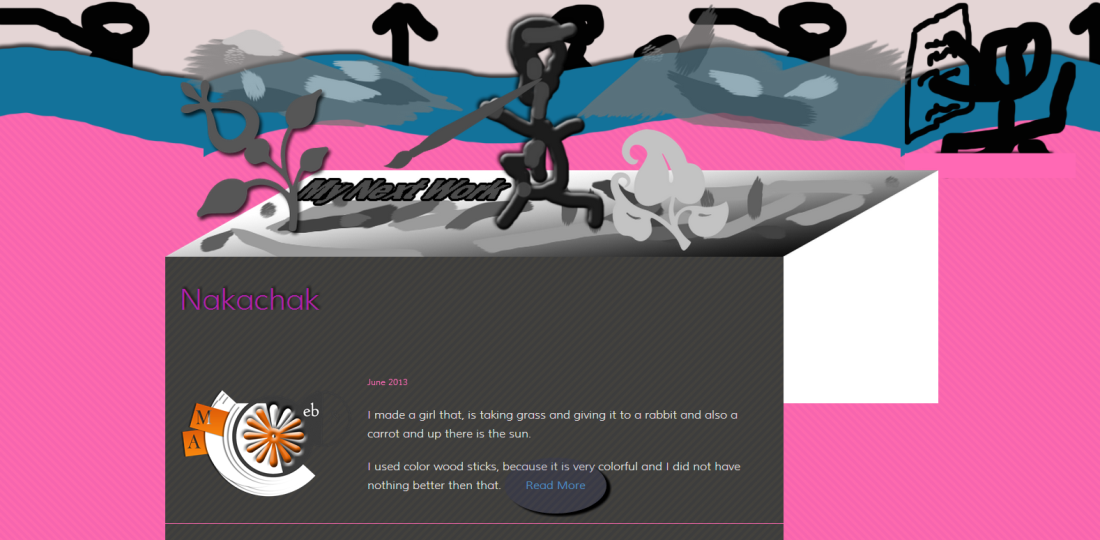
One day Sofi (she is 7 years old) showed me her new art work – Nakashak. The moment I saw this Thing, I immediately realized that it is time to create an art portfolio – the house of Sofi's art works.
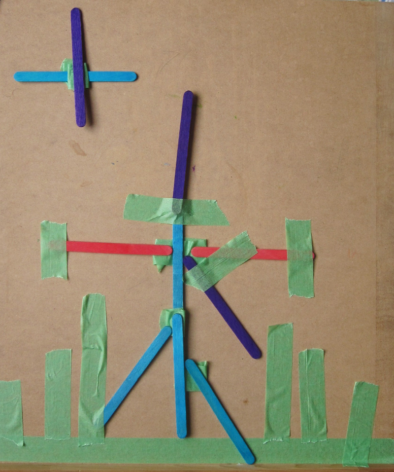
The Nakachak
Read about Nakachak on Sofi's site
The Idea
This is a sketch from August 26 of the design idea I started with.
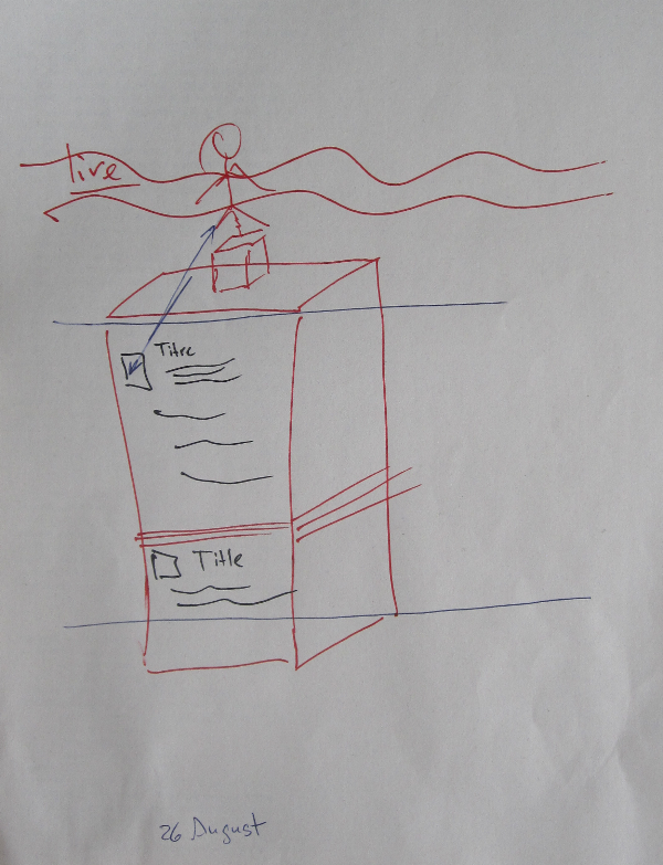
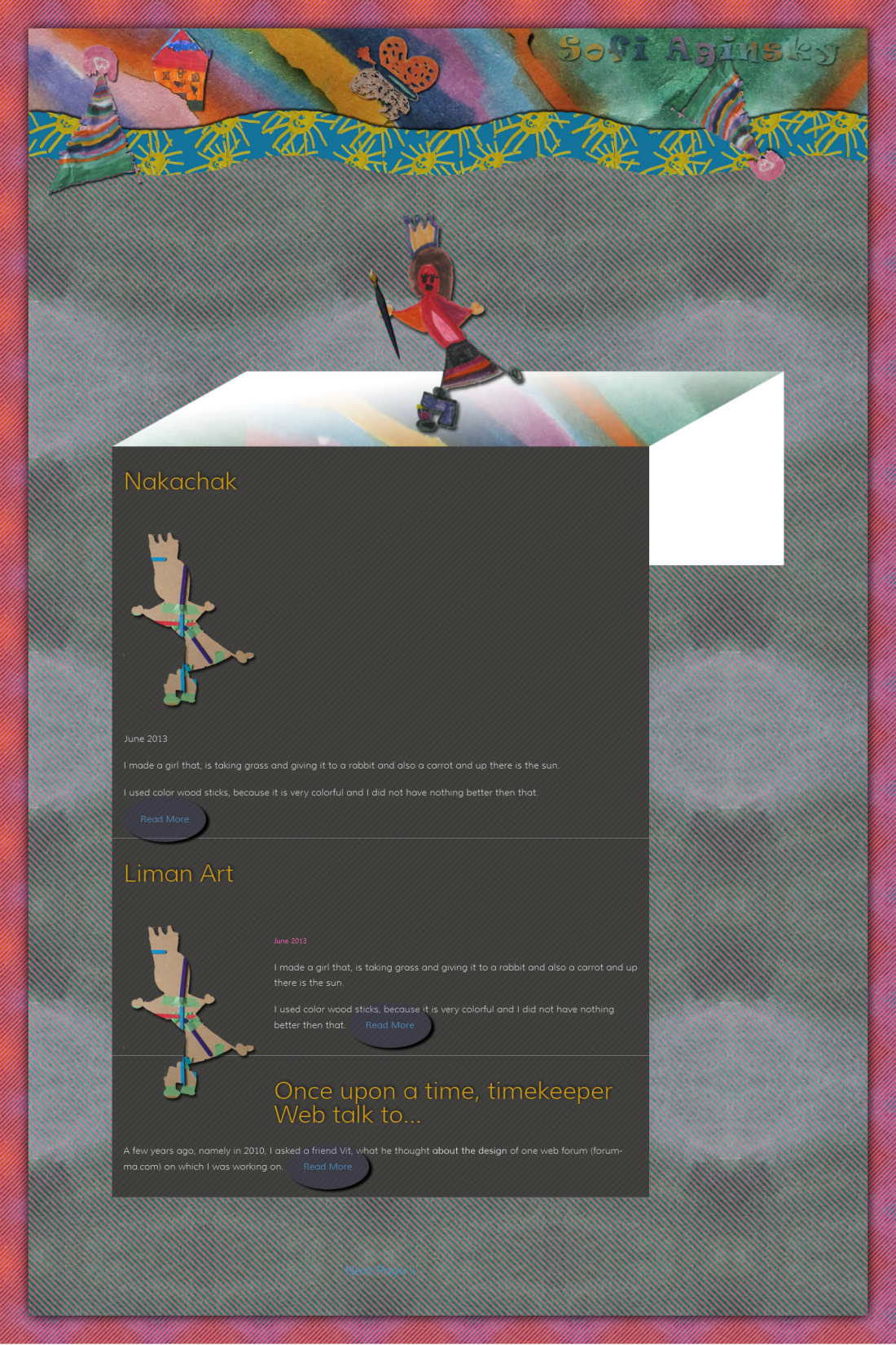
The Building
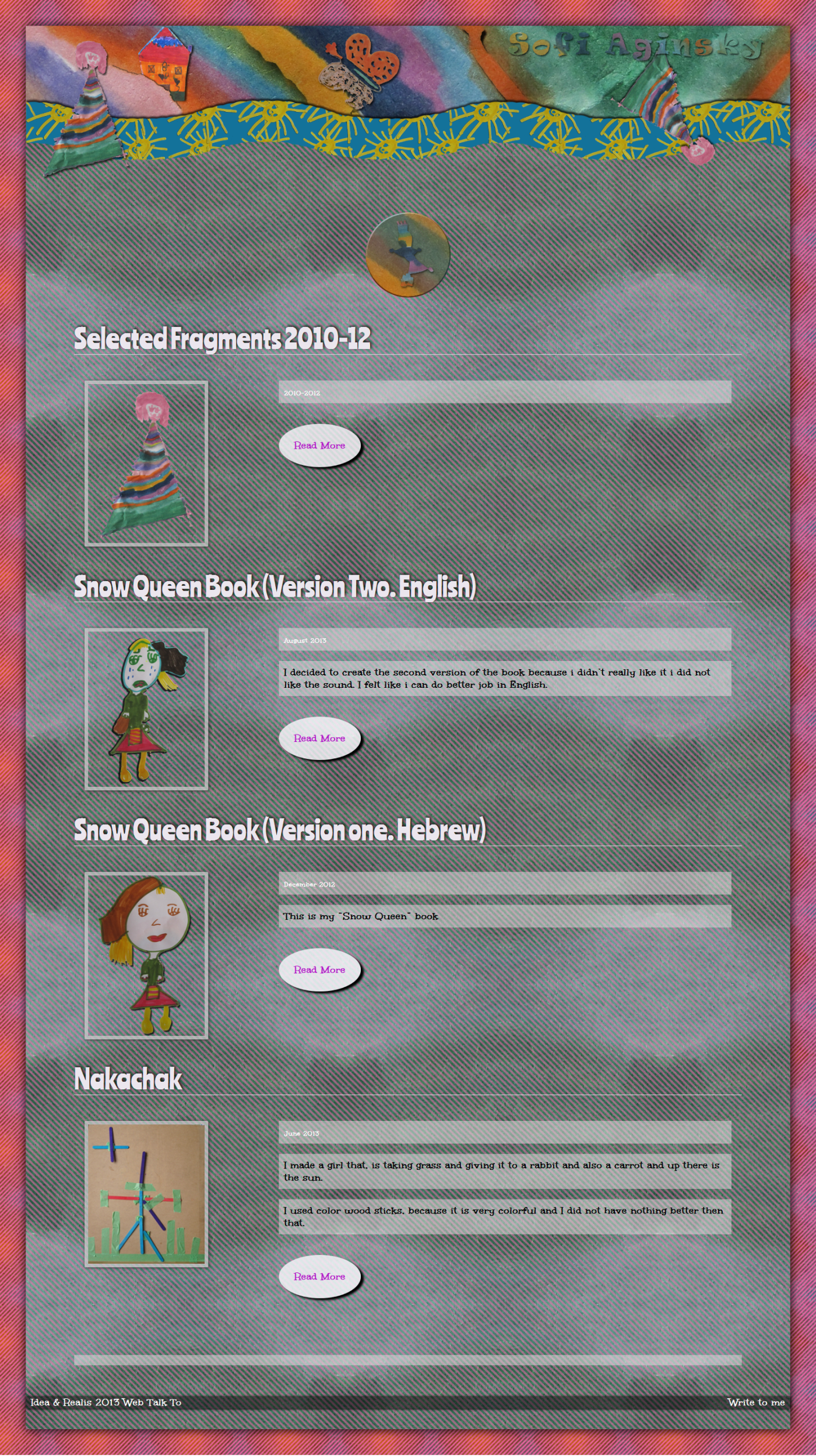
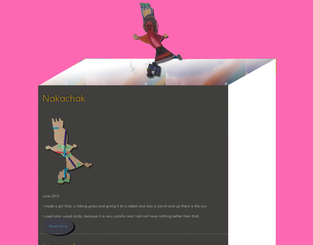
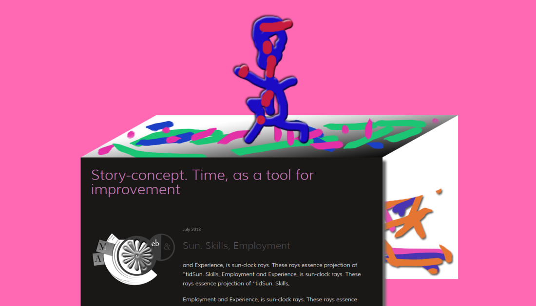
I planned to create a building when each level represents one of Sofi's works. The works organized in chronological order, the new one goes on the top, the old one processing down, toward the bottom of the building. On top of a building a figure of Sofi that means that Sofi's works is basis for her individuality and actually building the future.
Sofi's figure
Sofi's art
I used one of Sofi's drawings. The figure balancing on the unstable (broken, fixed) bench when the bench even not touching the ground – very dangerous position (later on I was told that the bench is actually a number seven and a cake). This picture matches perfectly Sofi's spirit. I chose it as the main element of the composition that will glue all the pieces of the design to one. Small and repeated element of composition is good way to provide solid view experience for site visitors.
Example of usage: thumbnails of the works in the building levels will be display through the shape of Sofi's figure.
Live Line
Behind of Sofi's figure is a path that goes from left side of the browser window to right side with different fragments of her works, like life passage or road way of life.
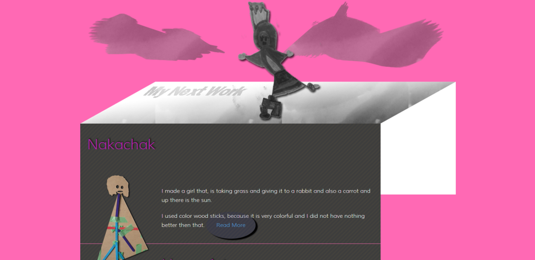
Checking the technical ability for displaying the idea
Creating the building shape with the HTML and CSS. On top of the box – image.
I wanted to build the website based on responsive design principles, so I had to make sure that this construction will look properly on different screen size. The building contents from two floating divs: main content div and right side div that provides the visual effect of the box, and image on the top of the wrapper div. This construct will have the same look on all possible devises.
Building and Sofi's figure on top
The content on the screenshot above is taken from WebTalkTo's portfolio page. On that page when hovering the article section block – there are few CSS3 effects working: black & white to color, size increase of the thumbnail. I planned to use this effect on Sofi's site too.
Example of the CSS3 effects
The source code
<div class="example">
<ul>
<li>
<a href="#">
<img src="../../uploads/content/website-for-sofi/Design-Concept.png" alt="Design Concept" />
<span class="small">October 2013</span>
<span class="h1">The Tree. Concept for Website Theme</span>
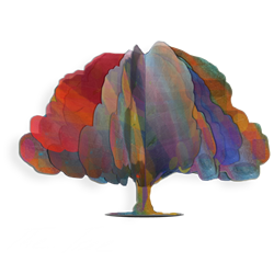
Turning any business conception of the client into a set of simple, generally <strong>monochrome forms</strong> and placing this graphics on the main plan of the same color, we will receive something similar to <strong>a tree growing from the soil</strong>.
</a>
</li>
</ul>
</div>
<style type="text/css">
.example ul {
list-style: none;
margin: 0;
padding: 0;
}
.example ul li a {
color: rgb(15, 15, 15);
padding: 0 15px 15px 15px;
float: left;
width: 100%;
margin: 10px 0 30px 0;
text-decoration: none;
border-bottom: none;
transition: all 0.5s ease-in-out;
filter: grayscale(100%);
}
.example ul li a:hover {
background: rgba(204, 204, 204, 0.5);
color: black;
border-bottom: none;
filter: none;
filter: grayscale(0);
}
.example ul li img {
margin: 0 20px 20px 0;
float: left;
}
.example a img {
transition: transform 0.5s ease-in-out;
}
.example a:hover img {
transform: scale(0.7);
}
.example .h1 {
display: block;
font-size: 32px;
line-height: 1;
color: #c53b10;
}
.example .small {
display: block;
font-size: 14px;
color: #274797;
}
</style>
For single article page I thought to have free from images and colors page, just white background with content displayed on it. That will provide strong, serious and classic feeling.
The Design
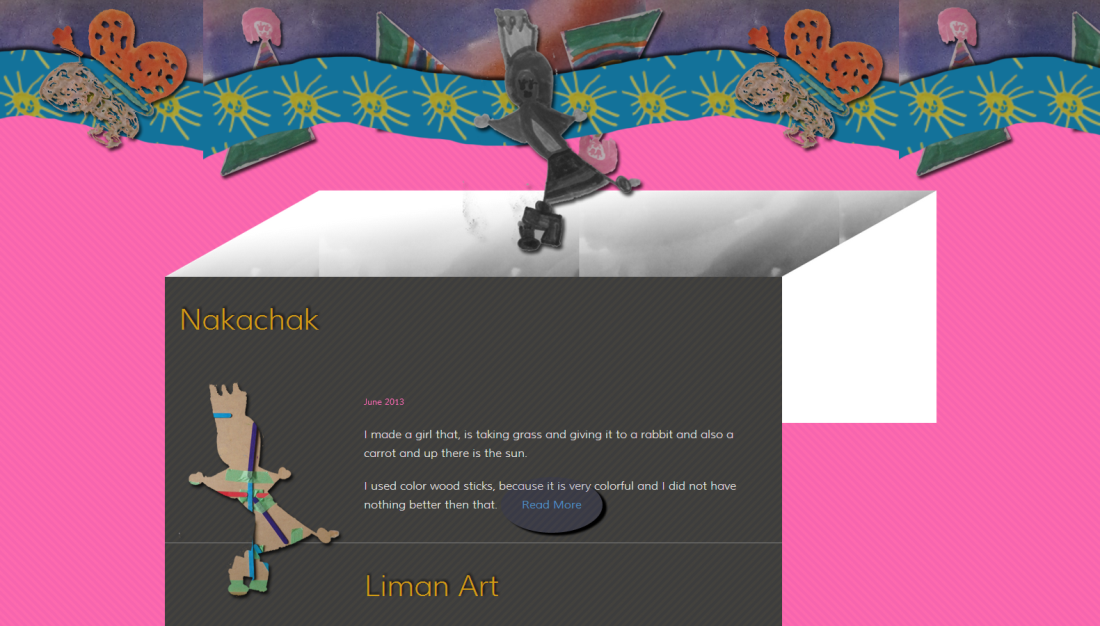
During the work process we continue to look for ideas and also making corrections in existing ones. This is exactly what happened with the idea of the Building.
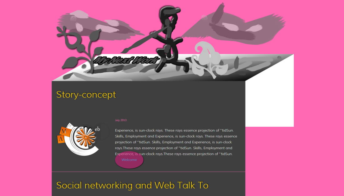
The List
List of Sofi's works is a new look to the old idea.
The figure on top creates the art work; after work is finished it is slides down as an article
Background images test
I took an image and cleaned it from the yellow color, also I applied negative opacity.
This is what I got
Testing the background image
The "Live Line" test
The Finished "Live Line" – top image
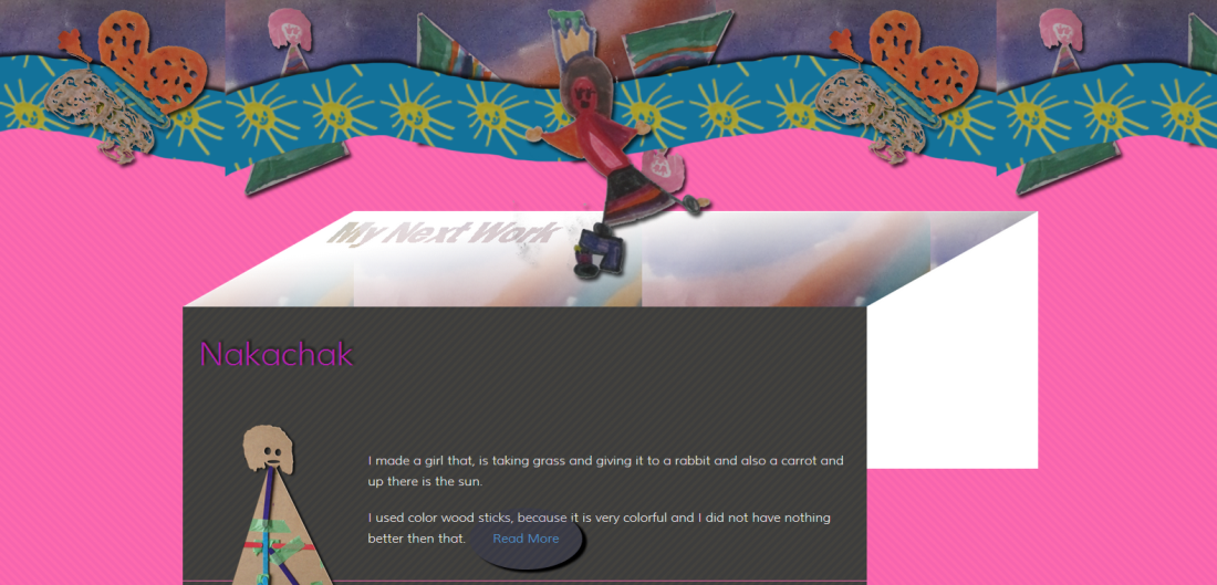
Backgrounds
Working on this Portfolio I experimented a lot with backgrounds images and its combinations.
Background image for the body.
Background image for main content area.
This image goes on top of both: body and content area background images, that creating an interesting effect. I spend a lot of time changing the opacity (both ways) of that image trying to get the right color combination.

Lawyers and dentists website design
As a consequence of the background image experiments I get unexpected result (one of many). That is a cool – background – idea for lawyer or dentist website design.
This background image created from fragment of one of Sofi's drawing works.
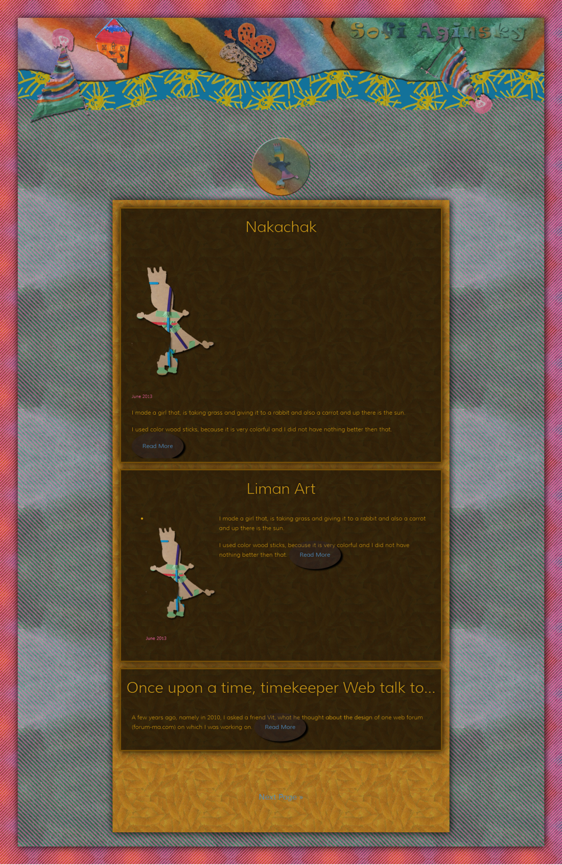
The Futures of the Final Design
Background for paragraphs
I like to use black font color. The content background is quite dark, so I had to search for the solution. Thus was born the idea to use white – slightly transparent – background for the paragraphs. That is a great discovery. The paragraphs style plays the main role in the site composition.
Top icon animation
I used CSS3 to create an animation effect when hovering the Top Icon – from black and white to color.
Pink links
Sofi love pink, so I used pink color for the site links.
Google library fonts
The Google Fonts library is a free source to use, quality fonts. It is very important to find a right Font Family for the site. Thank you Google!
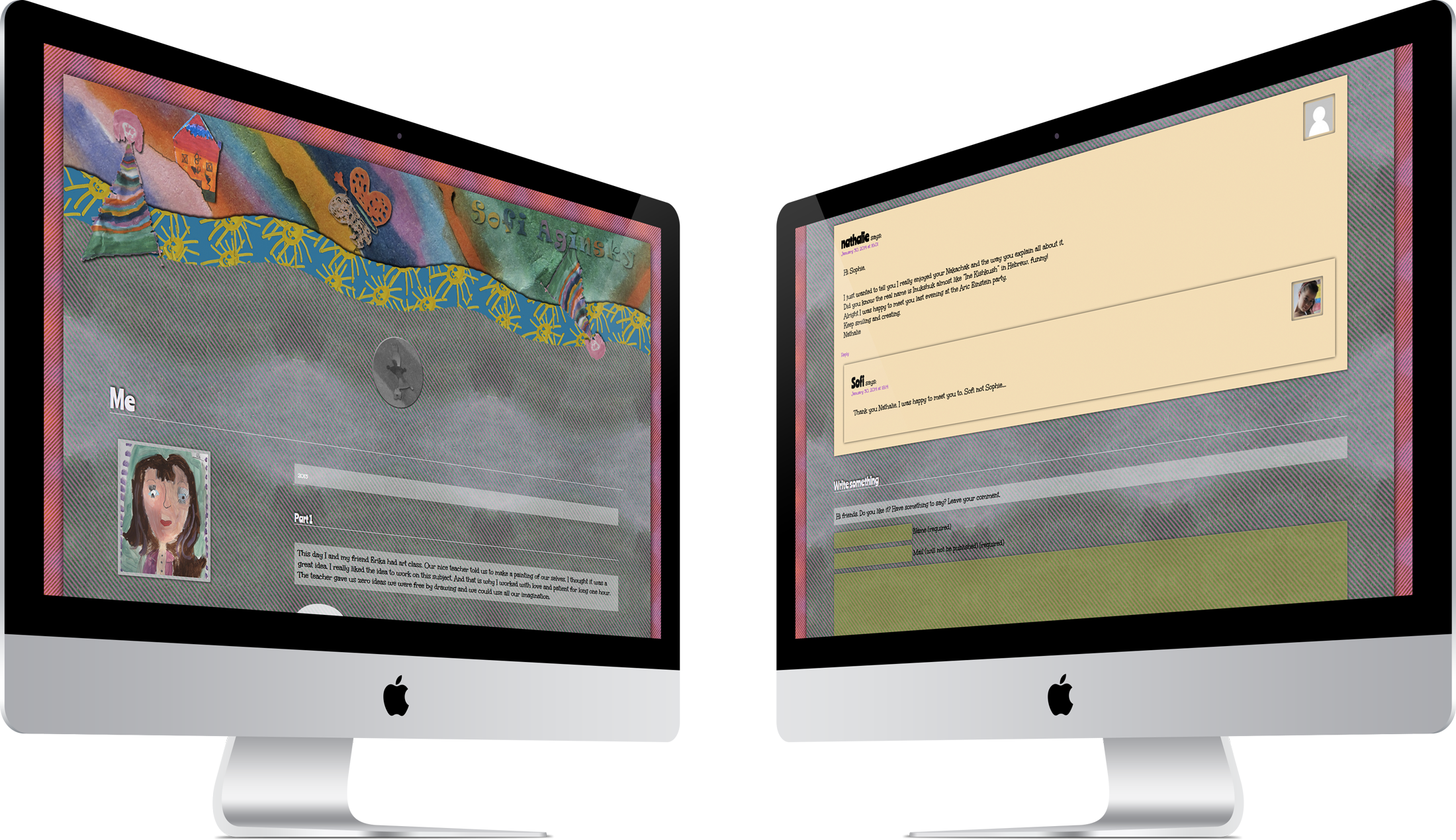
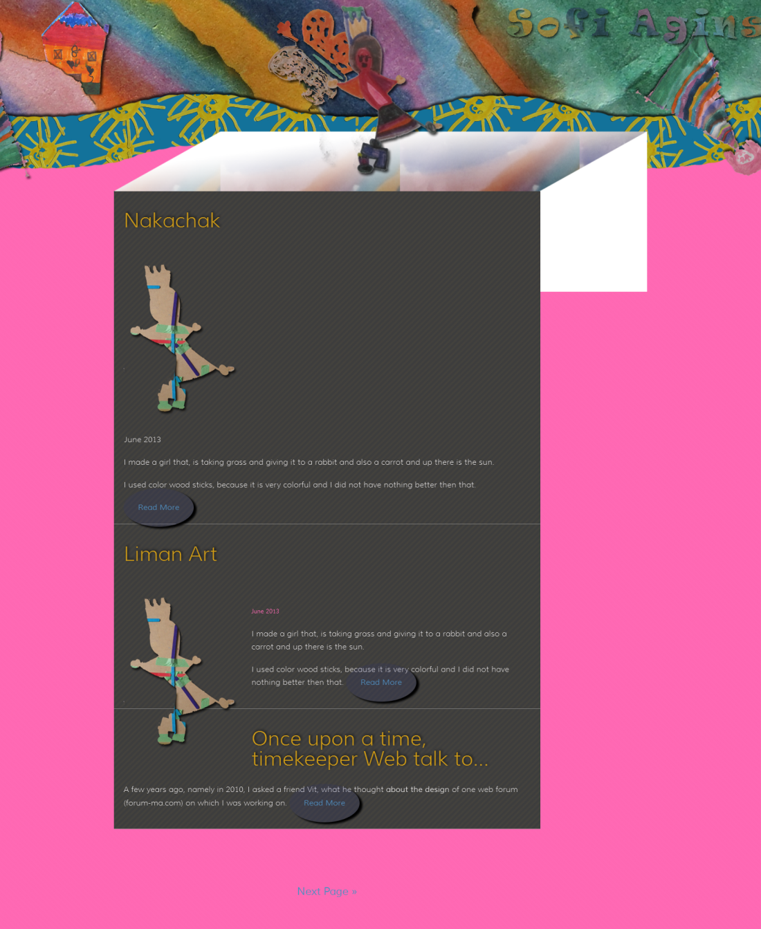
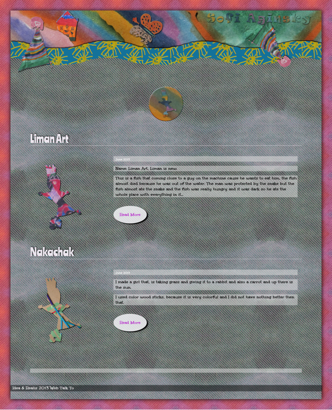
The Final Final
Screenshot of the final design of the portfolio.