JPL logo concept.
Illustration September 27, 2017
For 100 years, the Jewish Public Library has been a celebrated fixture of the Montreal community and cultural life.
The JPL promotes academic and cultural excellence in a warm and accessible space where knowledge and information are shared in multiple formats.
JPL current logo

Composition consists from two elements: Menorah and The Book. The Menorah "stands" on The Book. The Book is the base for Jewish existence.
This great logo idea absolutely reflects the ideals of any Jewish library.
JPL logo concept
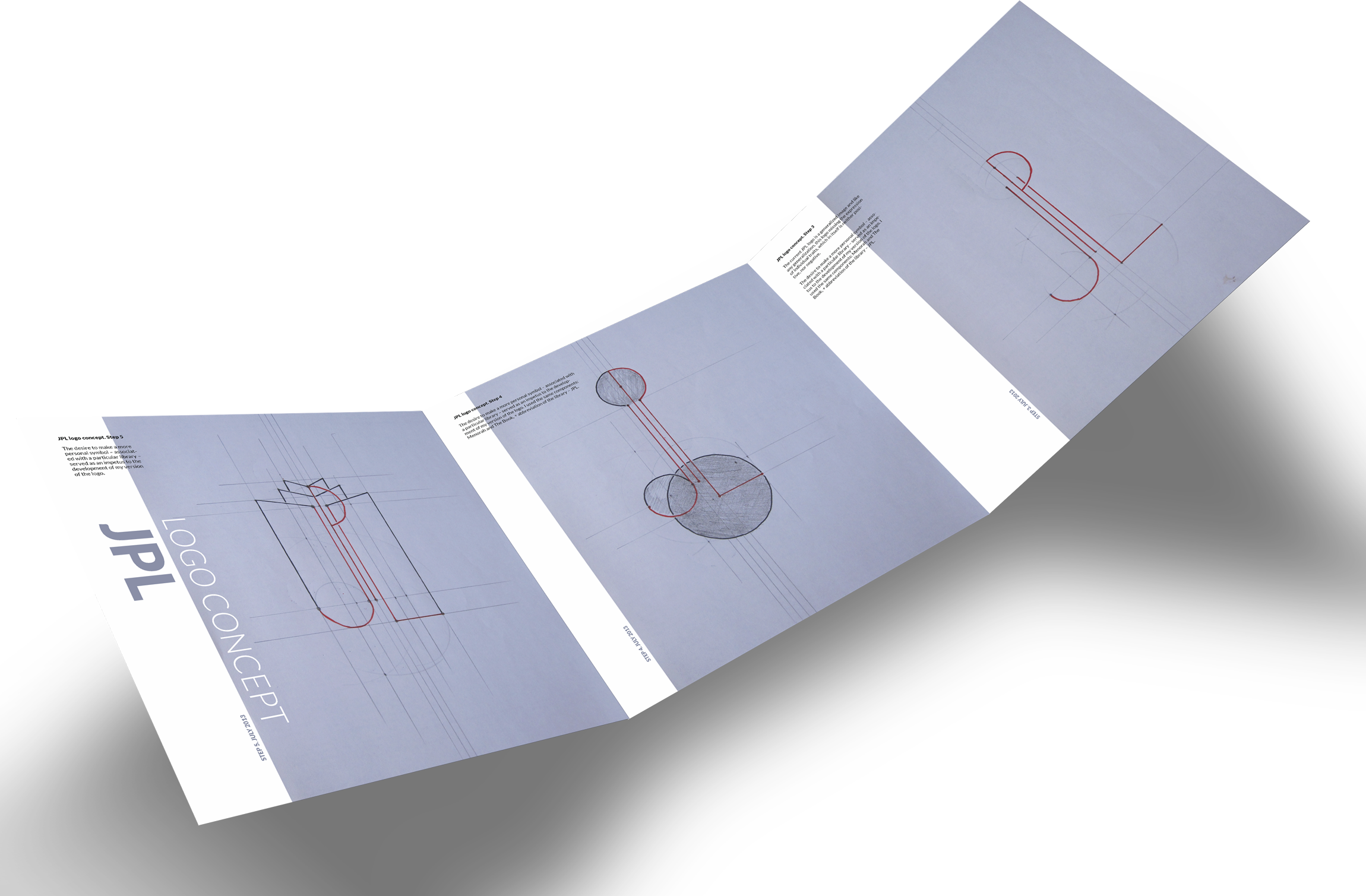
The current JPL logo is a generalized image and like any generalization, this logo missing the expression of individual traits, which in itself is neither positive, nor negative.
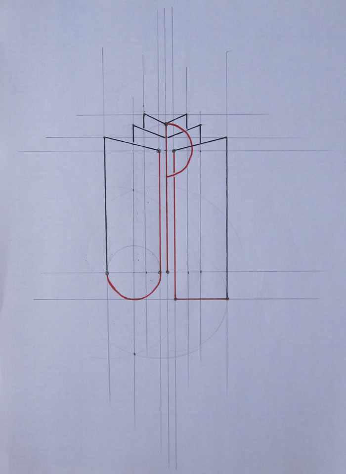
The desire to make a more personal symbol – associated with a particular library – served as an impetus to the development of my version of the logo. I used the same components: Menorah and The Book, + abbreviation of the library – JPL.
Step 1
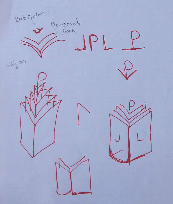
Step 2
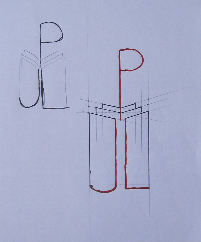
Step 3
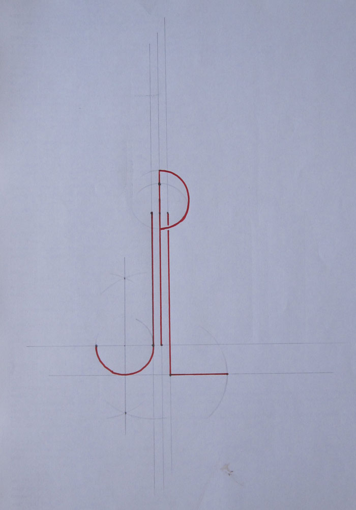
Step 4
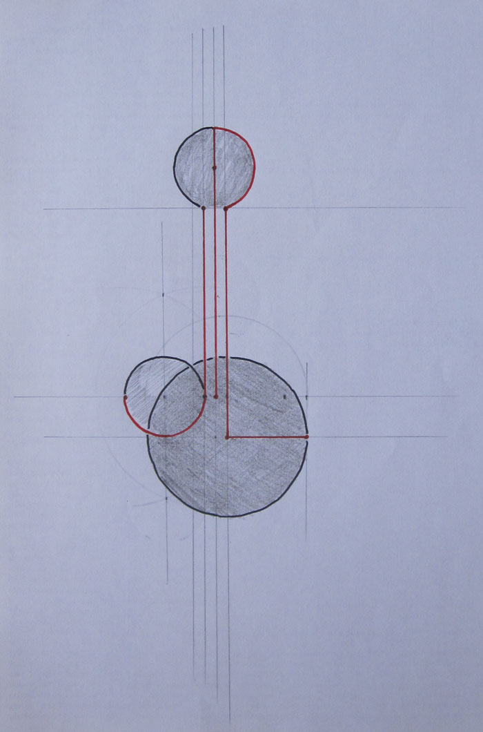
Step 5
