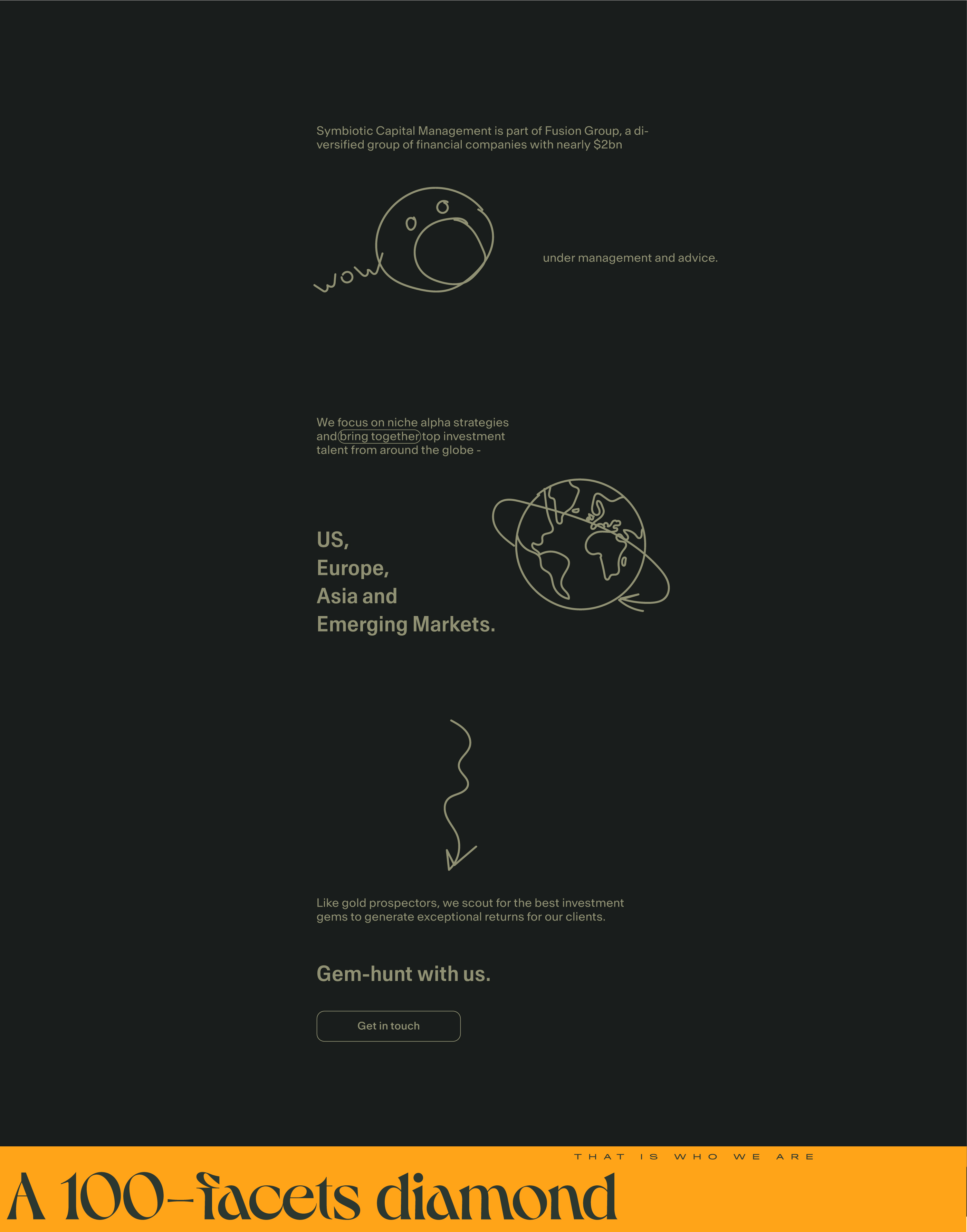
Symbiotic Capital Management is part of Fusion Group, a diversified group of financial companies with nearly $2 billion under management and advice. It focuses on niche alpha strategies and brings together top investment talent from around the globe — US, Europe, Asia, and Emerging Markets. Like gold prospectors, it scouts for the best investment gems to generate exceptional returns for its clients.
Symbiotic Capital Management thought about creating an identity, website design, and all necessary brand components. Maxim Aginsky designed a dynamic and adaptive system embracing the idiom of the finance field and design, flexible enough to be carried through all touchpoints digital and print.
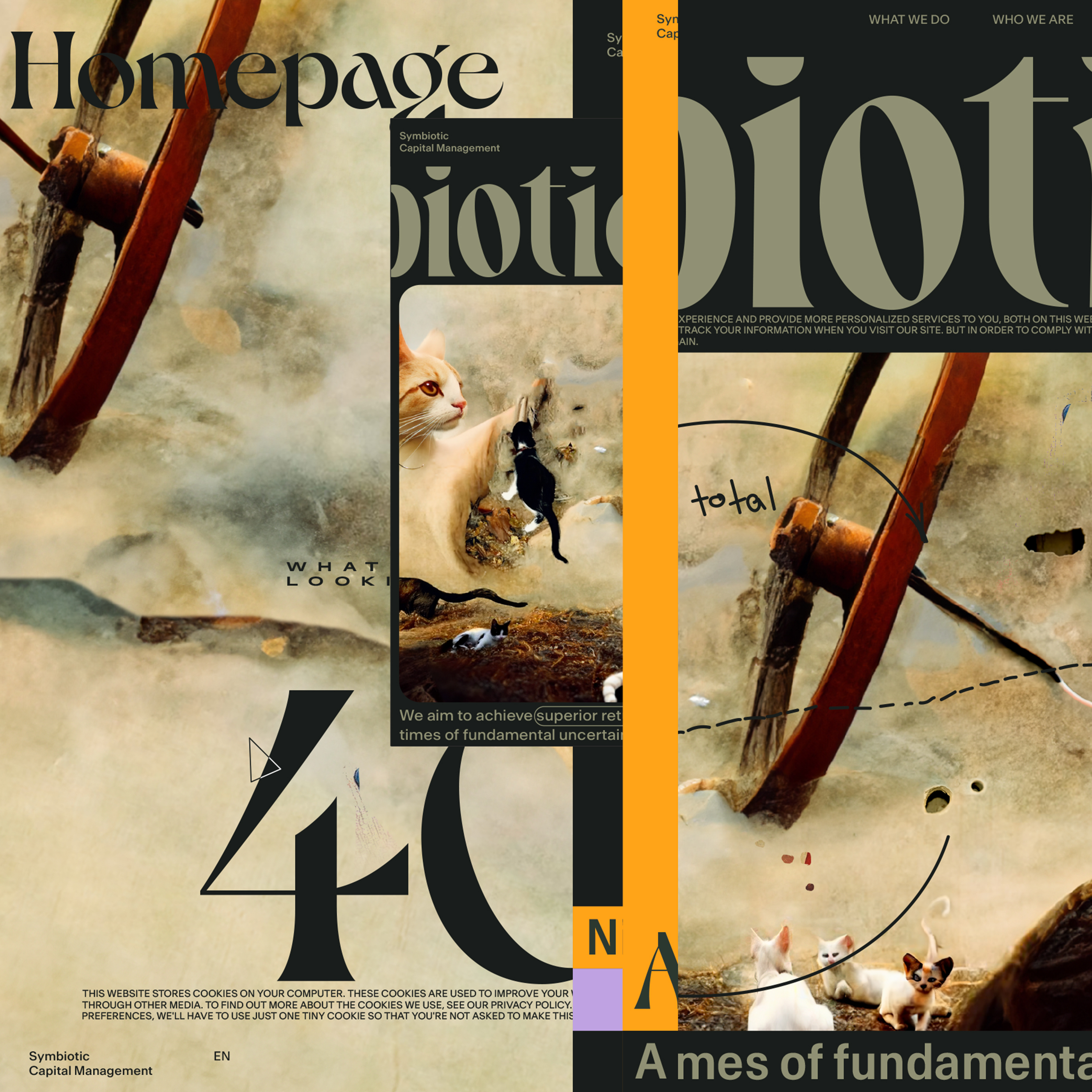
Brief. Essential fragments
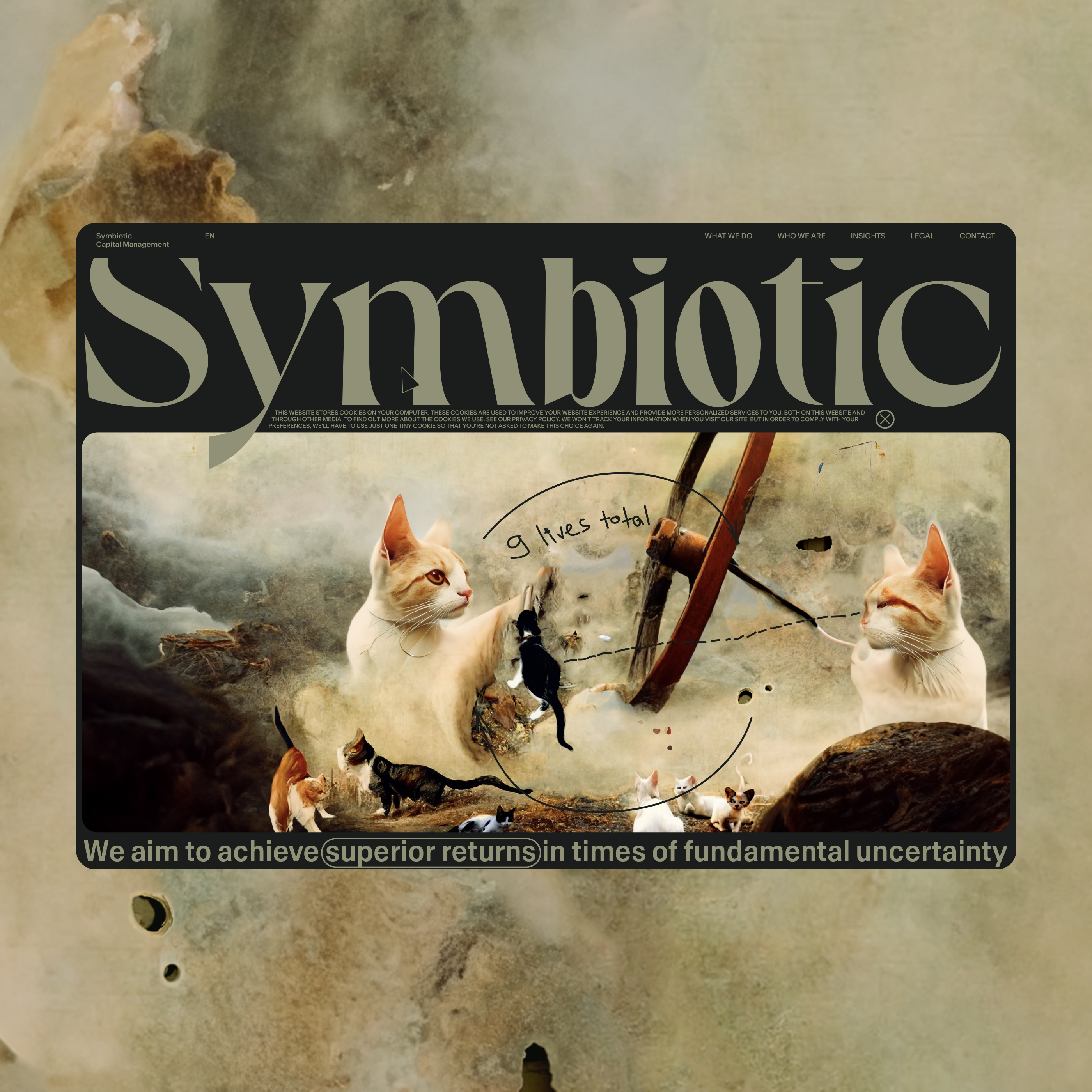
An adaptation of the image of a cat that:
- Nothing is afraid of heights and always lands on all fours,
- sees in the dark,
- who has 9 lives,
- soft and fluffy, but a fearless predator.
Colors
Need to keep in mind that the site is about money management and should project trust.
Goal
Accurately hit our target audience
Who is the Symbiotic Capital Management client
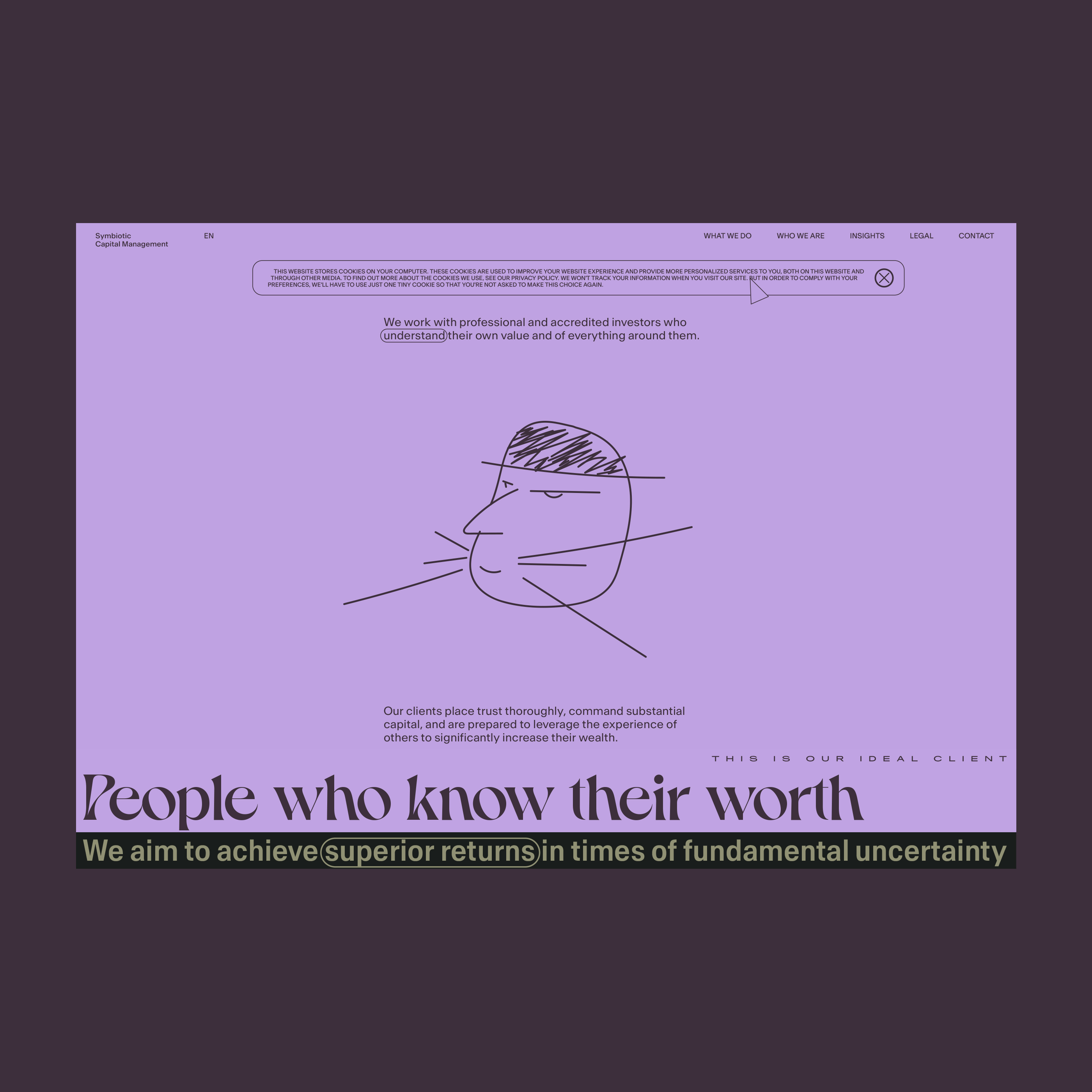
A person who knows the value of himself and everything around him, at the same time, does not trust anyone or anything, who has his own significant capital, and who is ready to climb on the shoulders of someone else’s experience and talent in order to become much more prosperous.
An adult, successful, and respectable person, but who is still a child at heart and loves (expensive) toys.
Typefaces
Headings, mix of the: Dahlia Medium, and Dahlia Bold Condensed.
All except the headings: Antarctica.
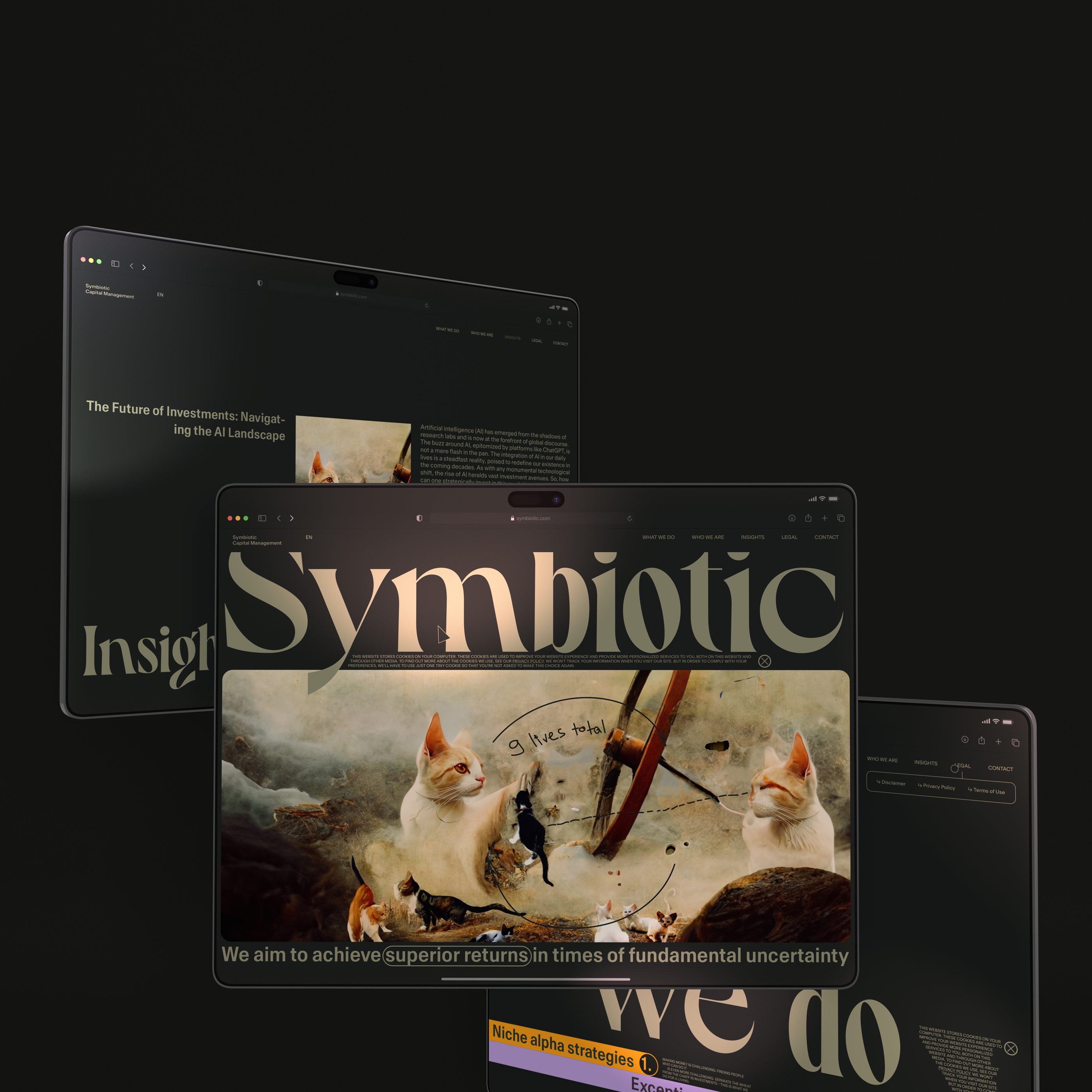
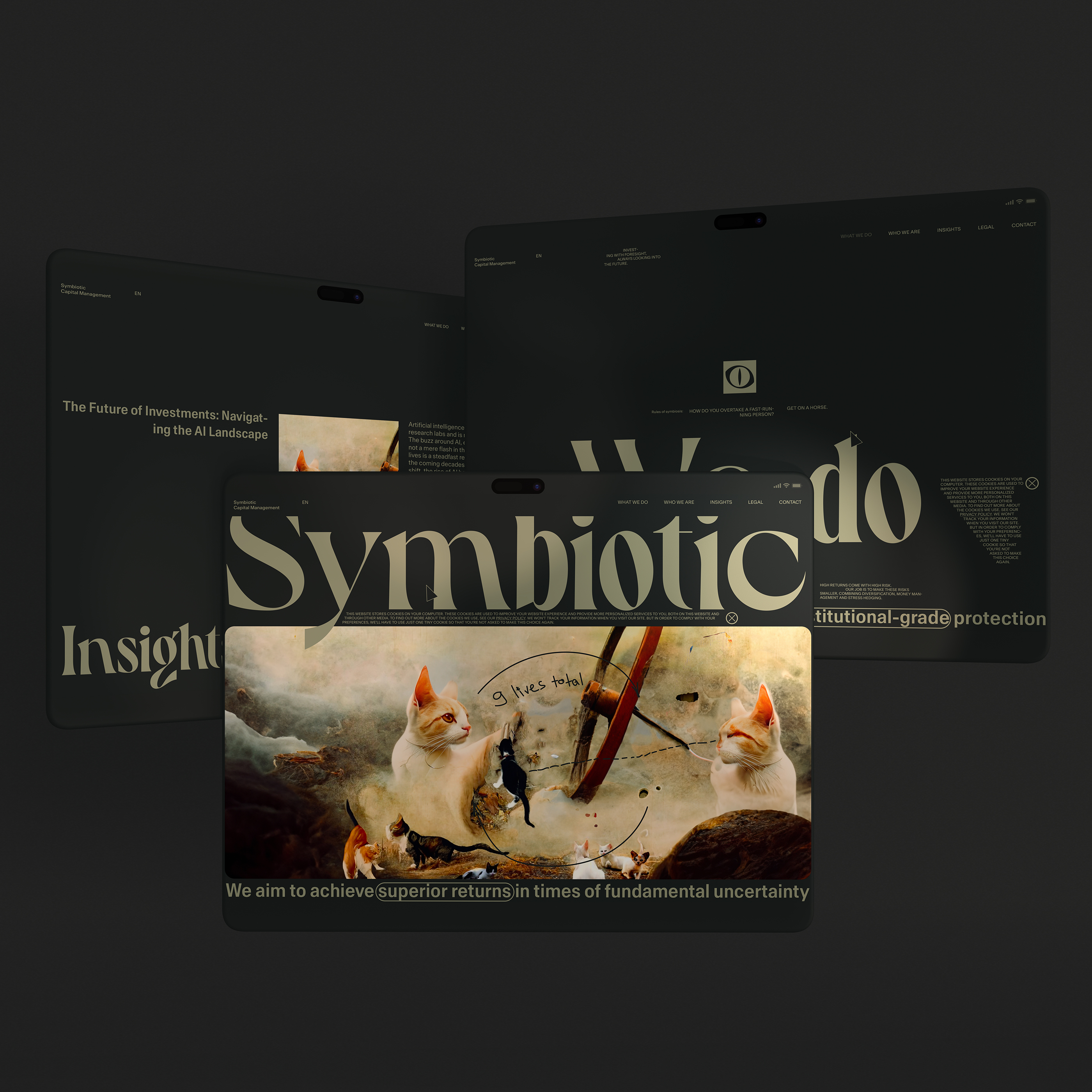
Desktop
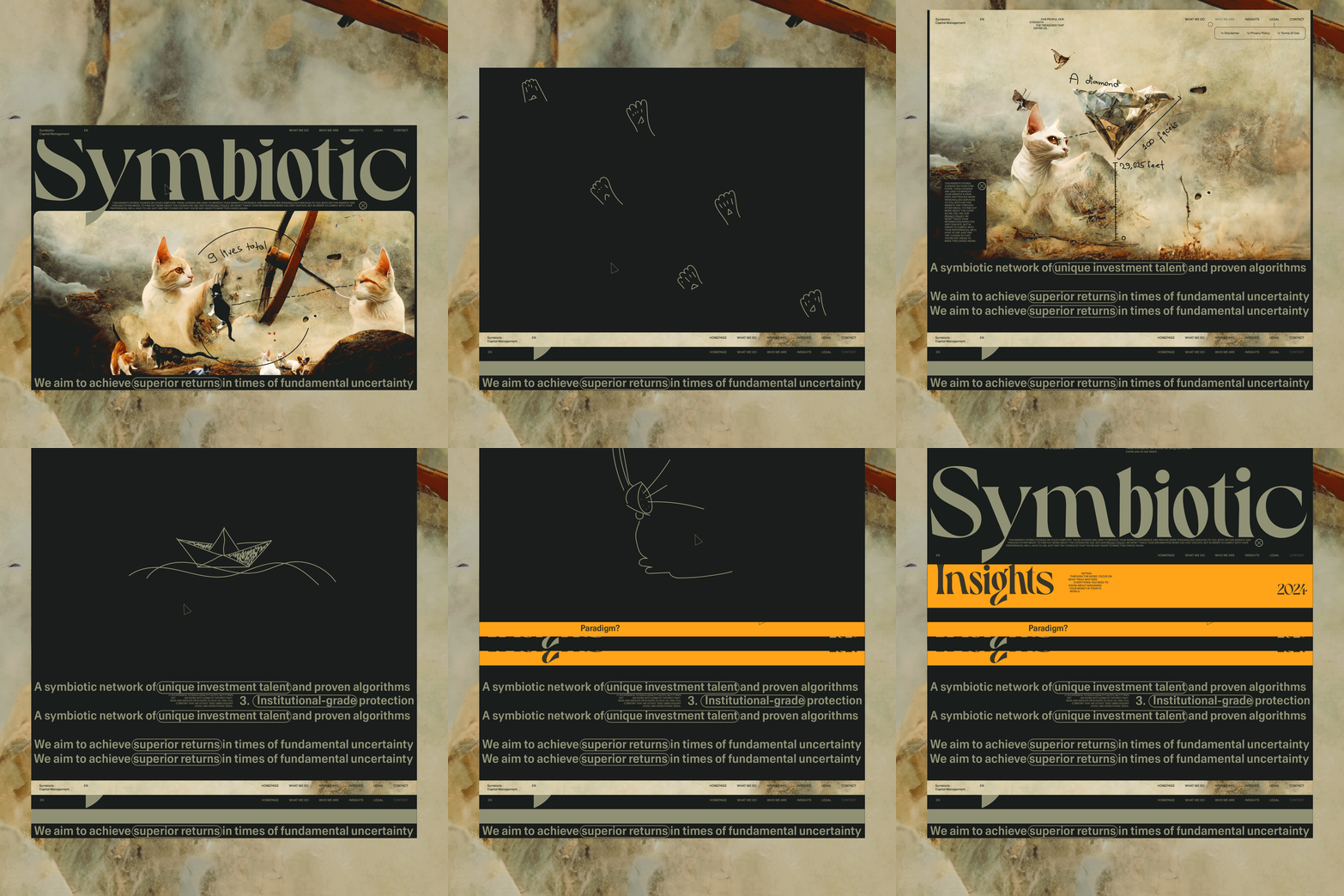
The custom cursor is a triangle (play) that on hover becomes the circle (the eye). The colors of the cursor change relative to the section color.
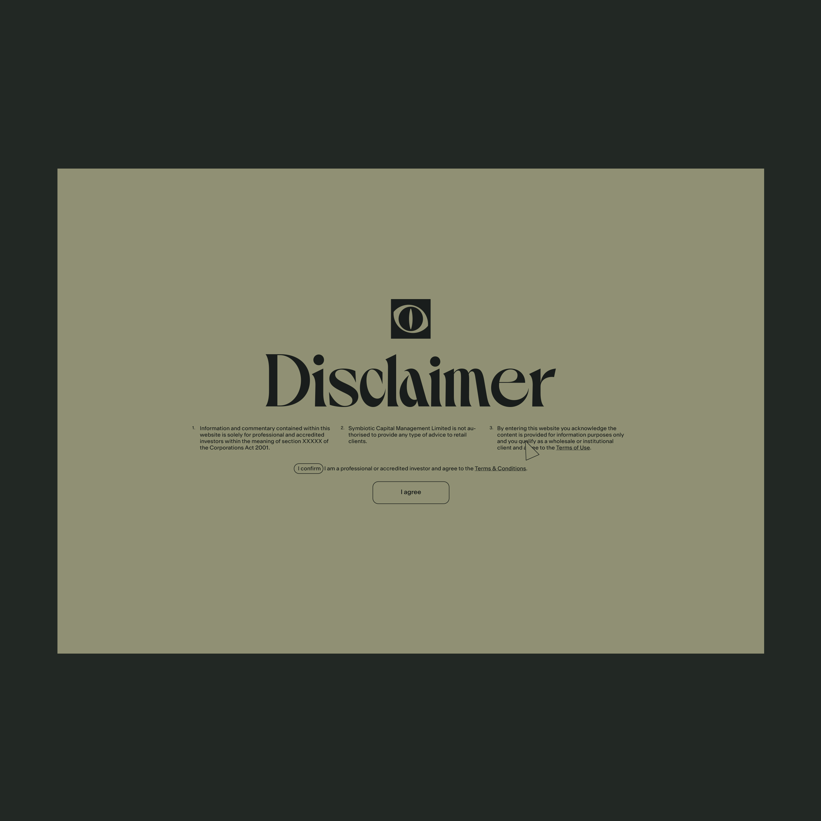
Disclaimer
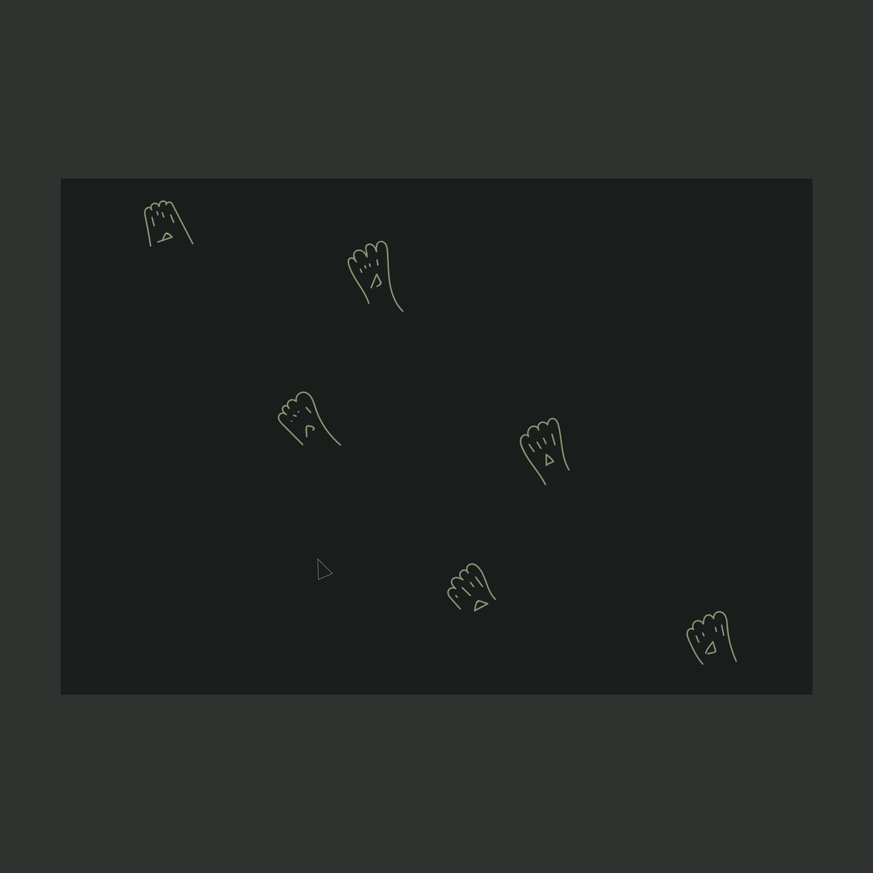
Main loader final frame. “Cat footprints”
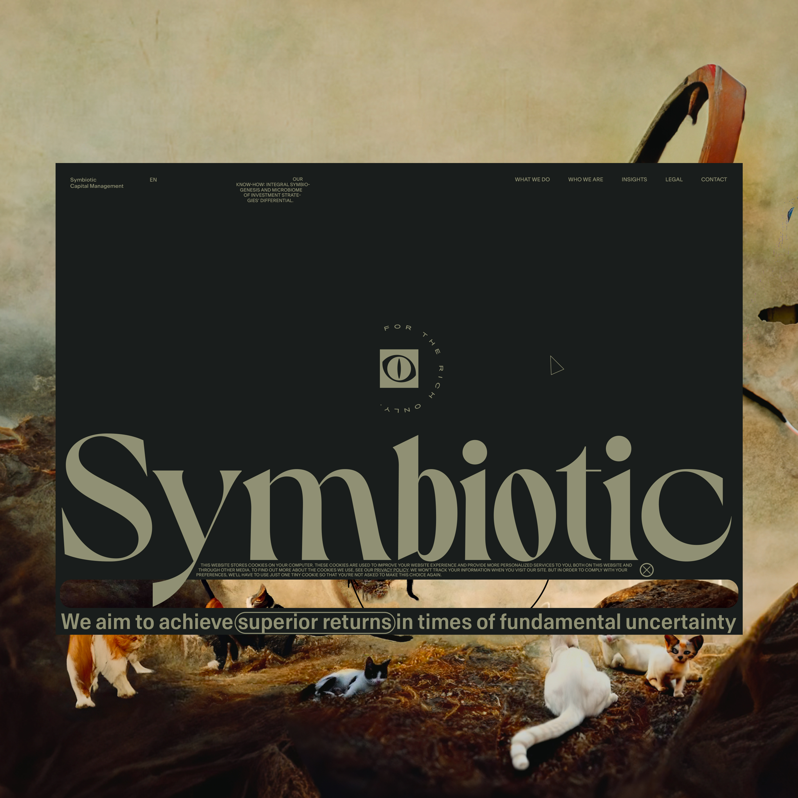
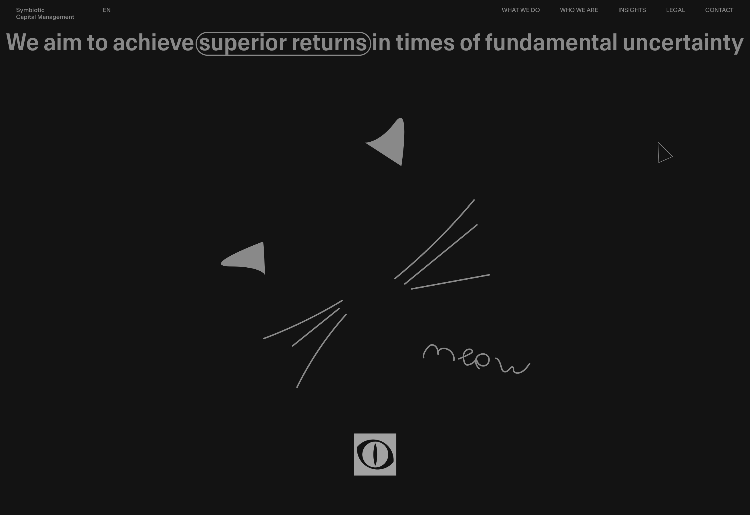
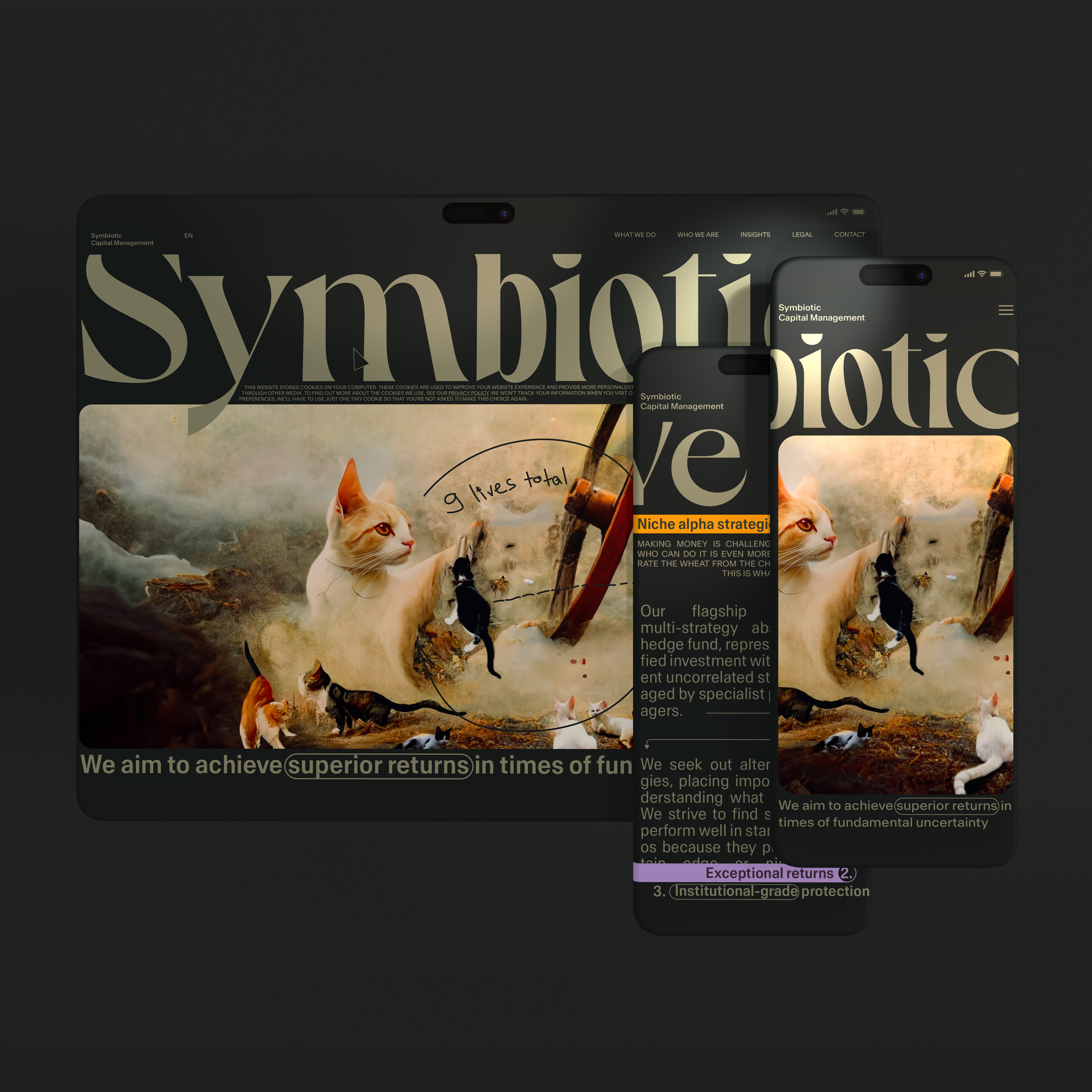
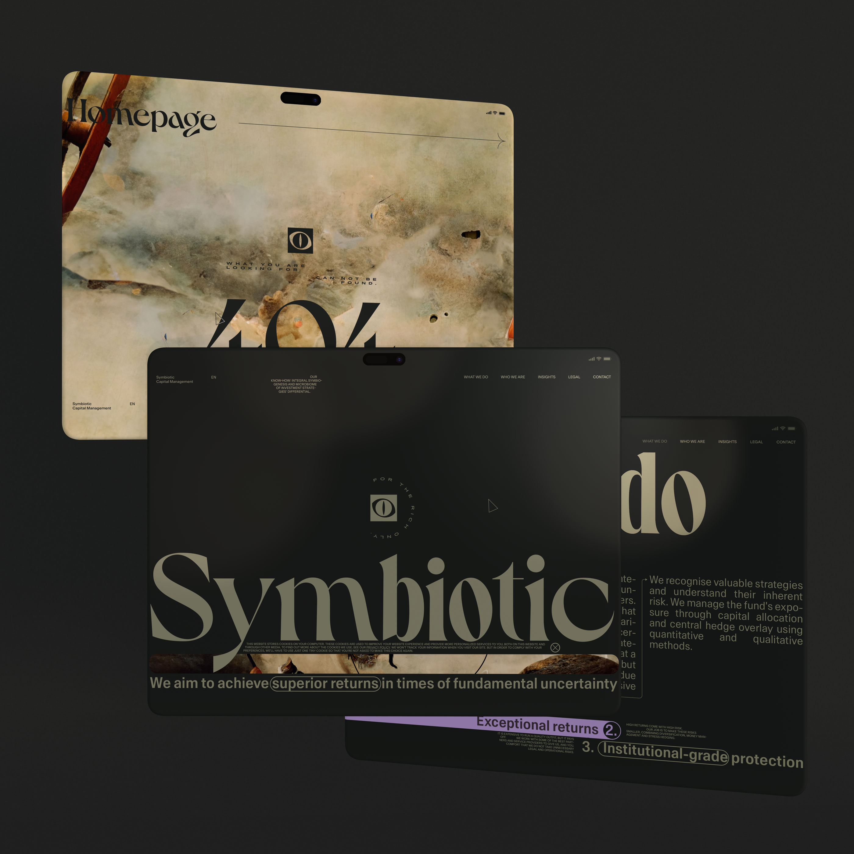
Homepage after execution of the entry animations
For rich only
Definitely, “For rich only” can be rephrased, however, to gain trust sometimes you need to surprise with the frankness. The impression also will be formatted based on the combination of the textual content and visual message, and to be frank, anything can work if the designer can find the right balance.
After some scroll
Art direction explanation
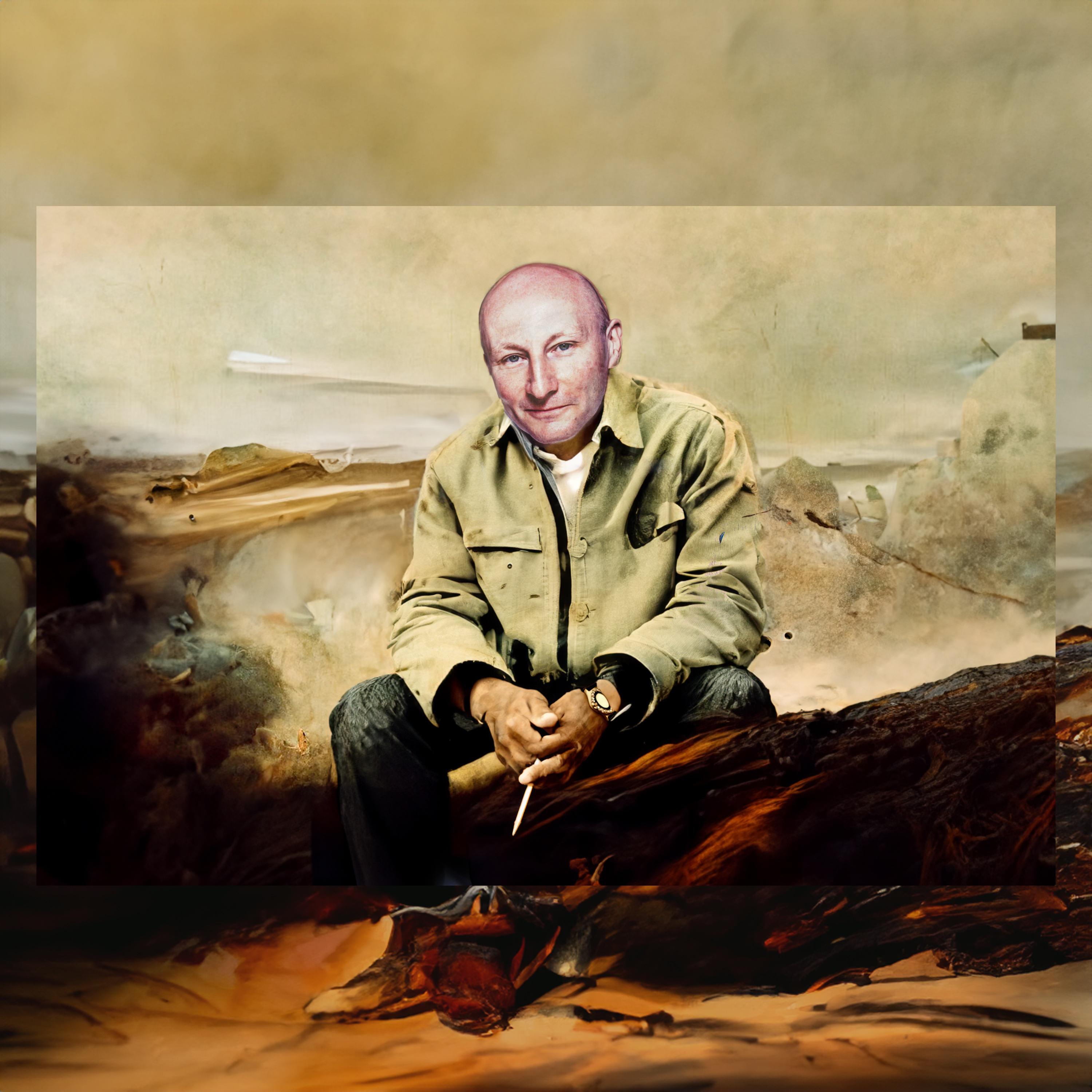
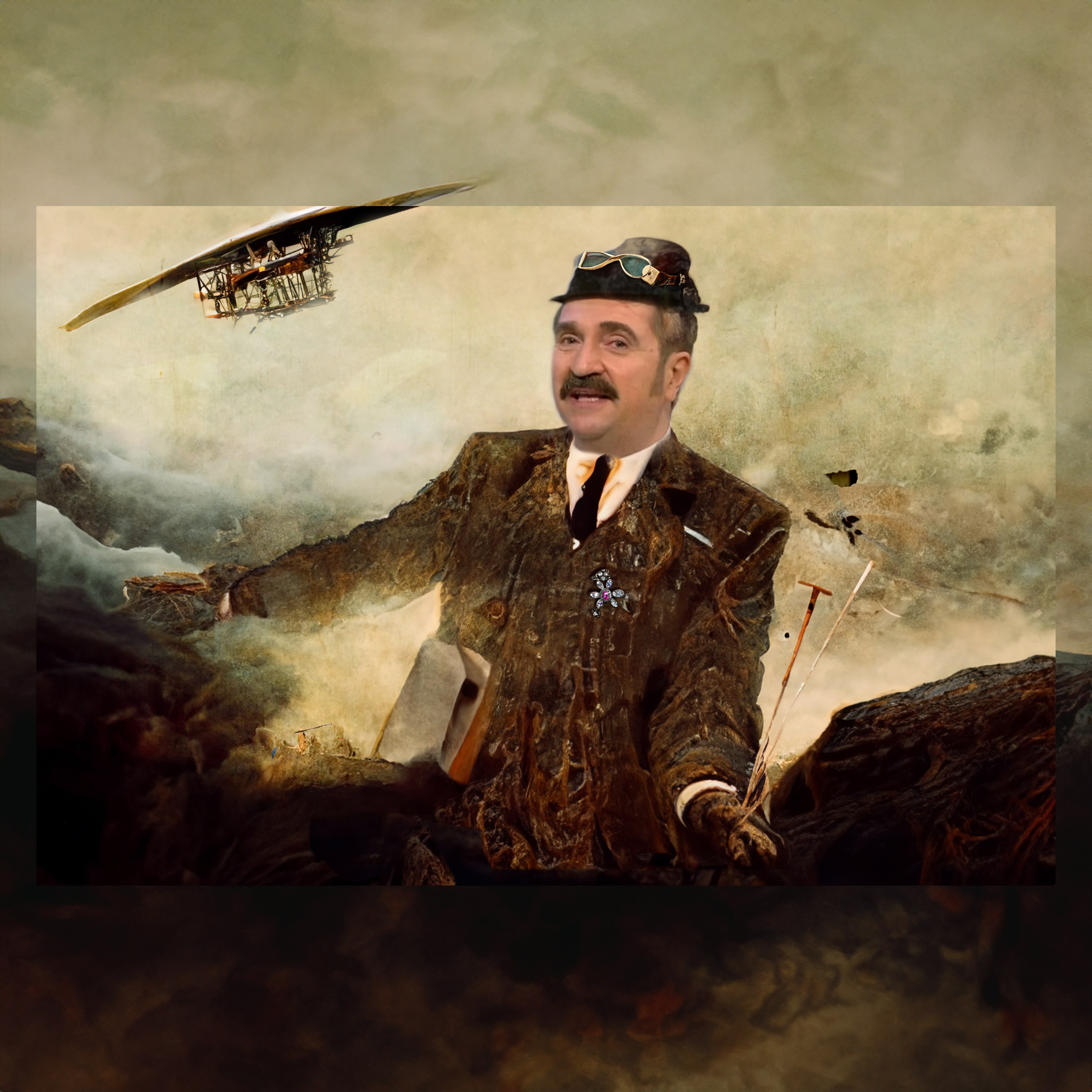
We have two leaders — a “professor” (Kirill Ilinski) and a “producer” (Valery Komissarov), art and whiteboard. Our art direction is a combination of both, this is a symbiosis. Art and comments on top of it — naturalistic approach.
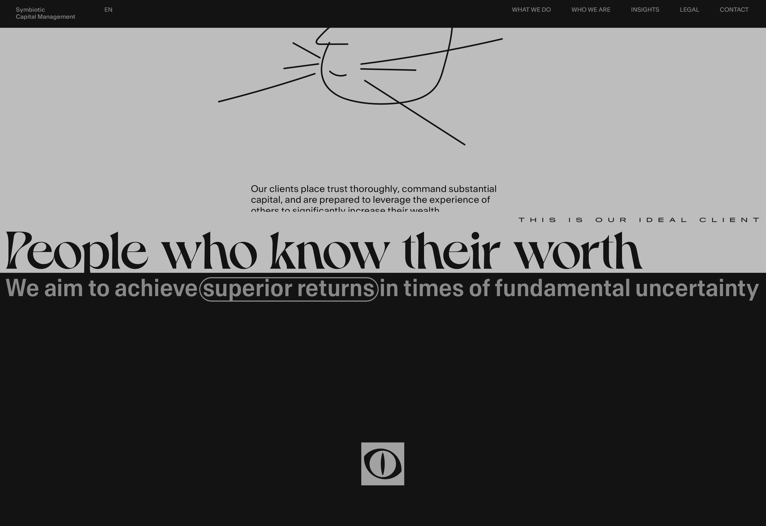
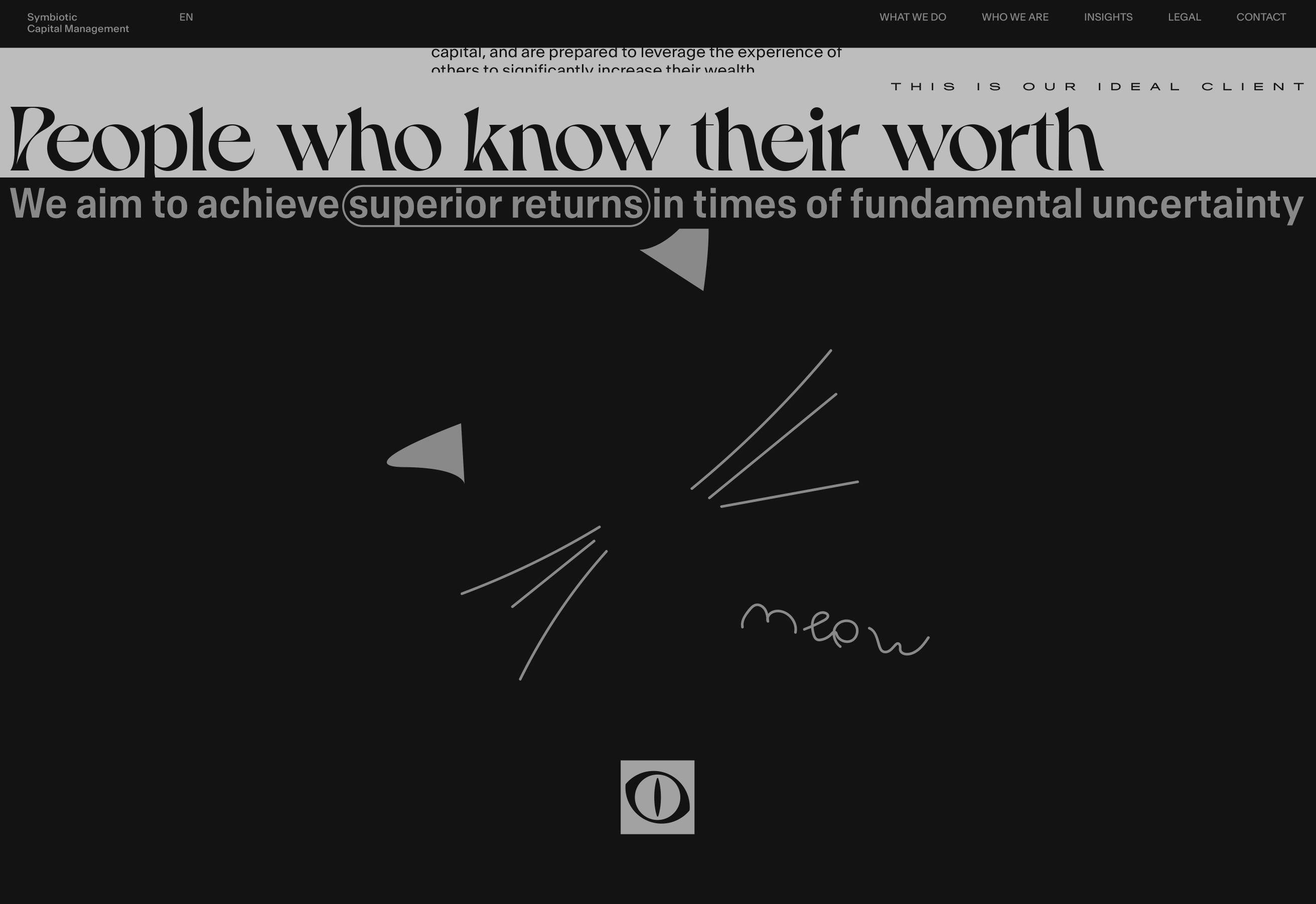
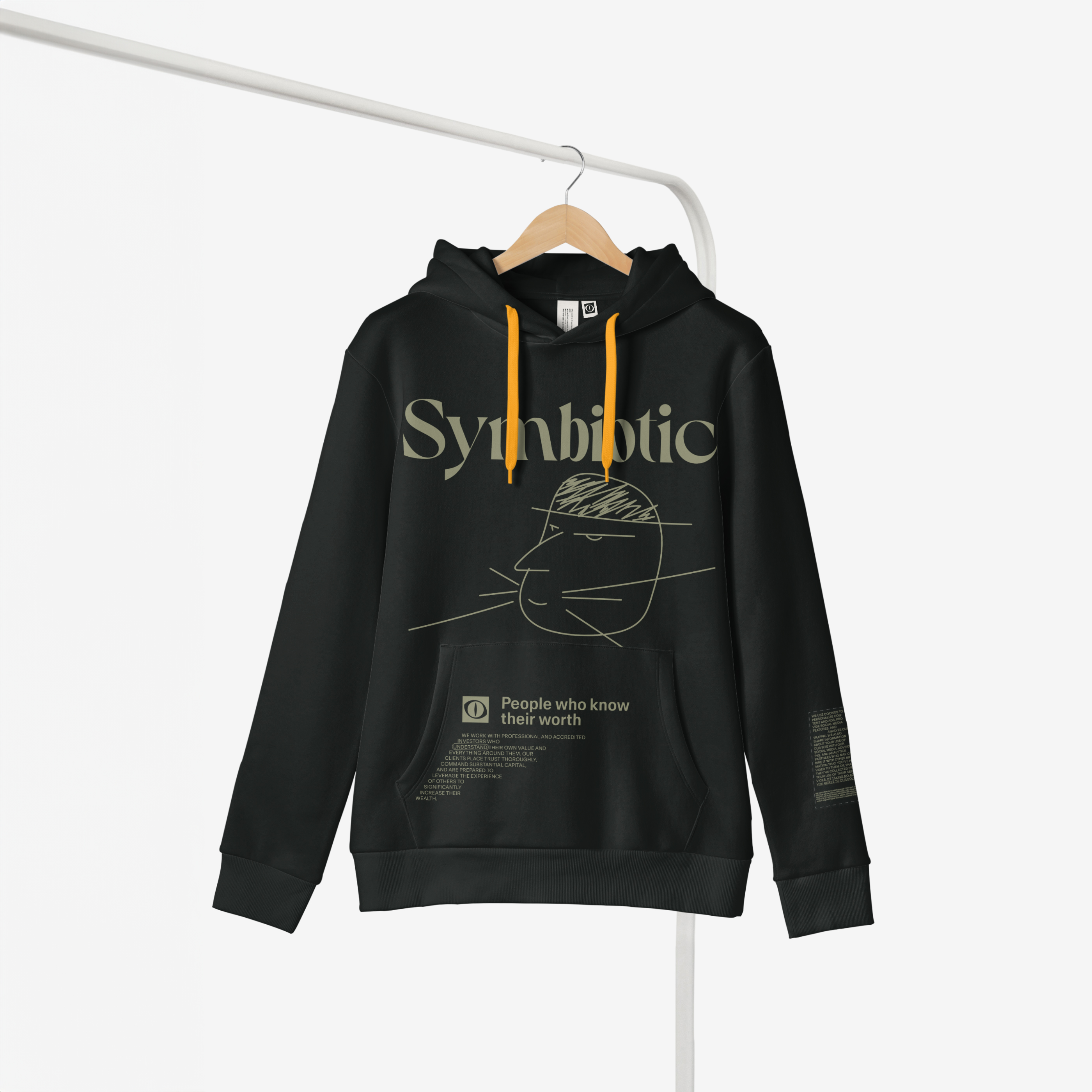
People who know their worth
A 100-facets diamond section
We need to find something better than just texts for the sections with textual content.
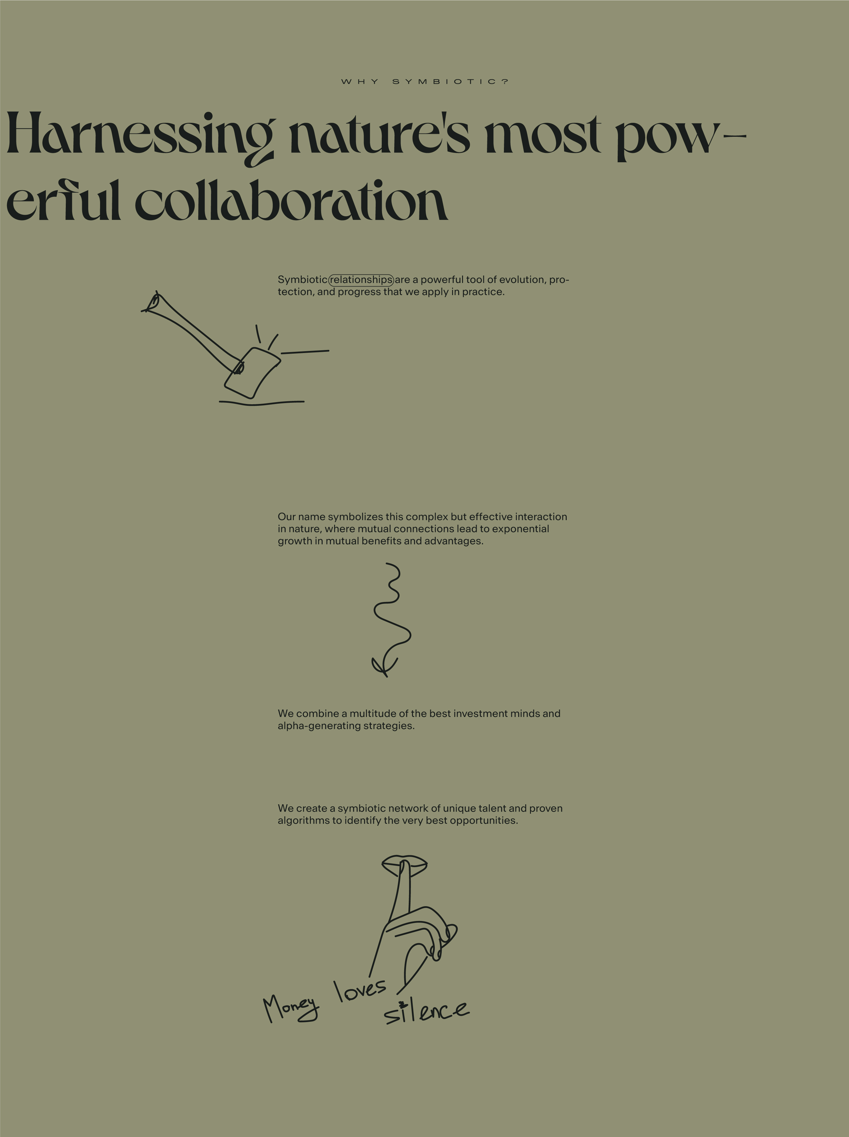
Harnessing nature’s most powerful collaboration section
People who know their worth section
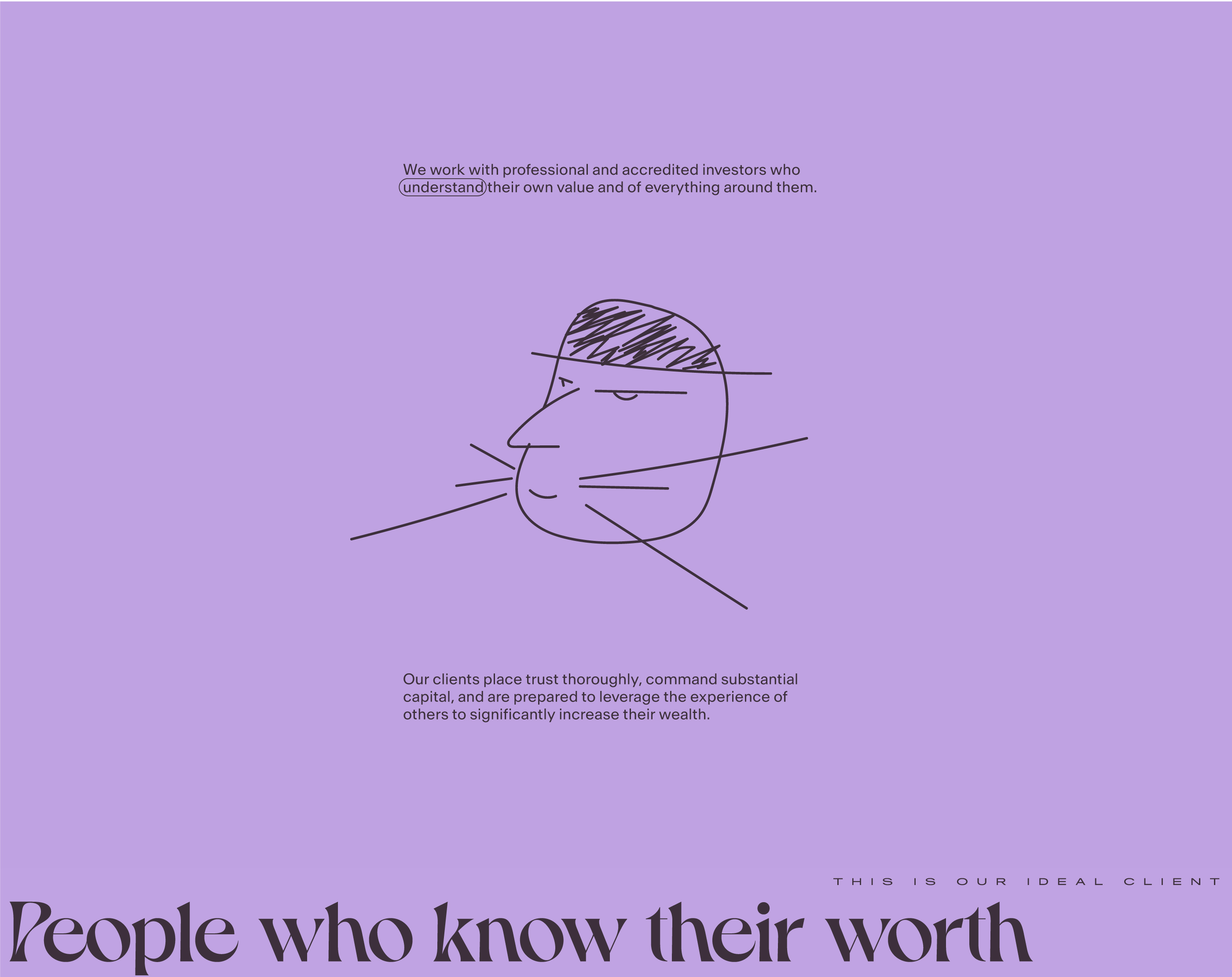
Core screens of the behavior scenario
For the developers only
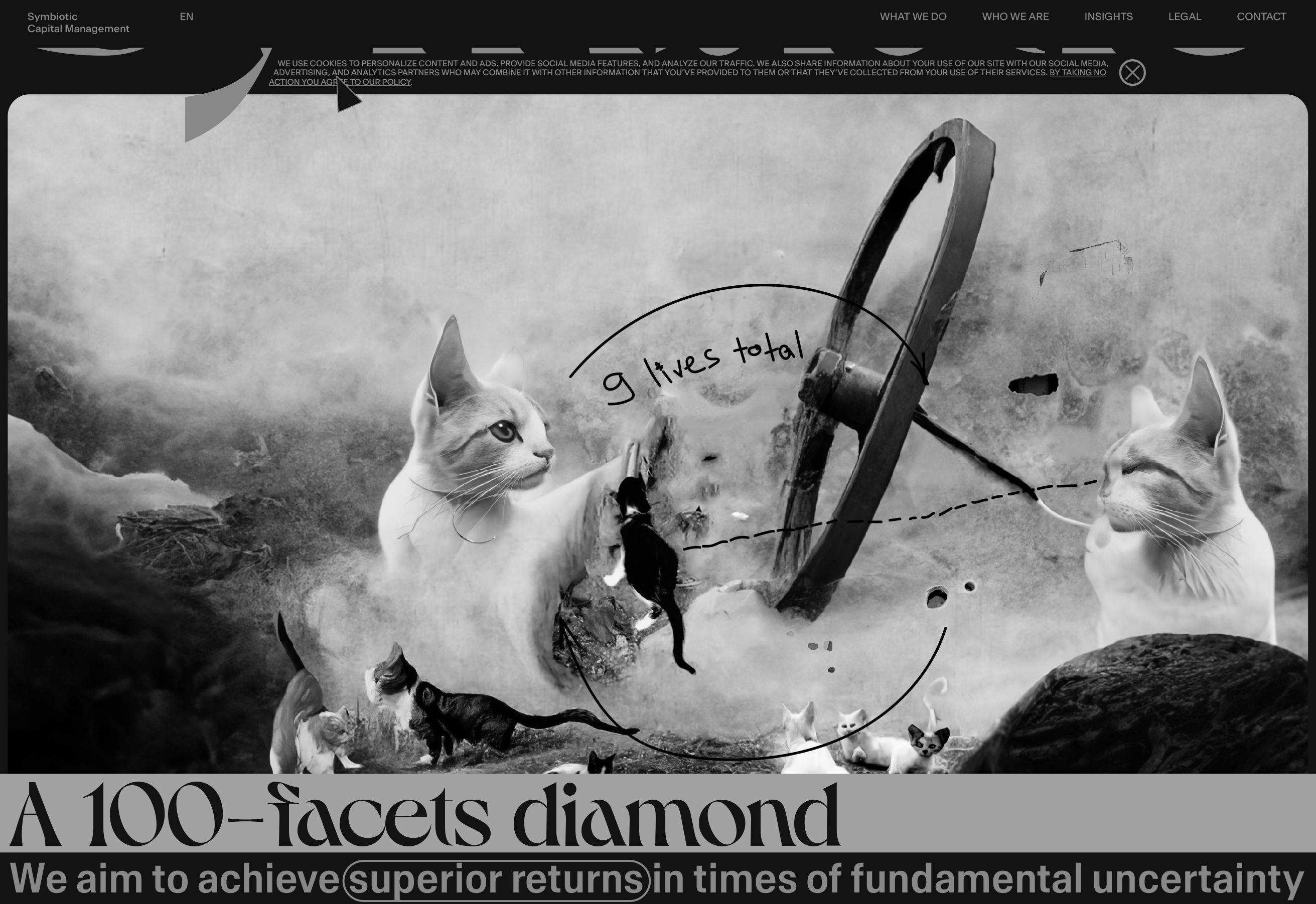
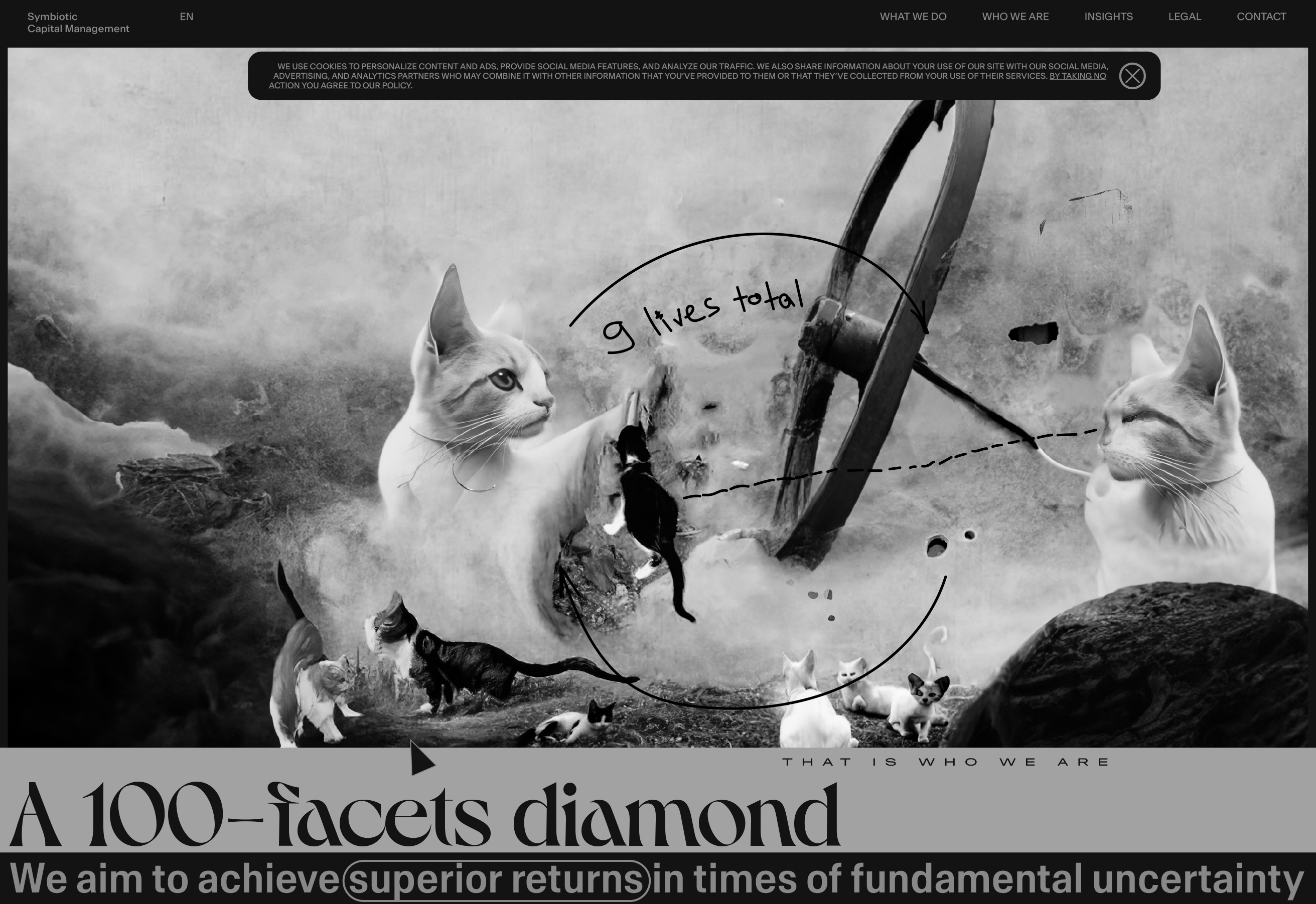
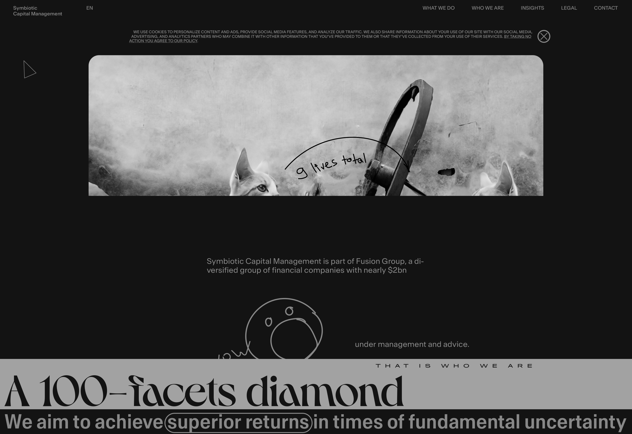
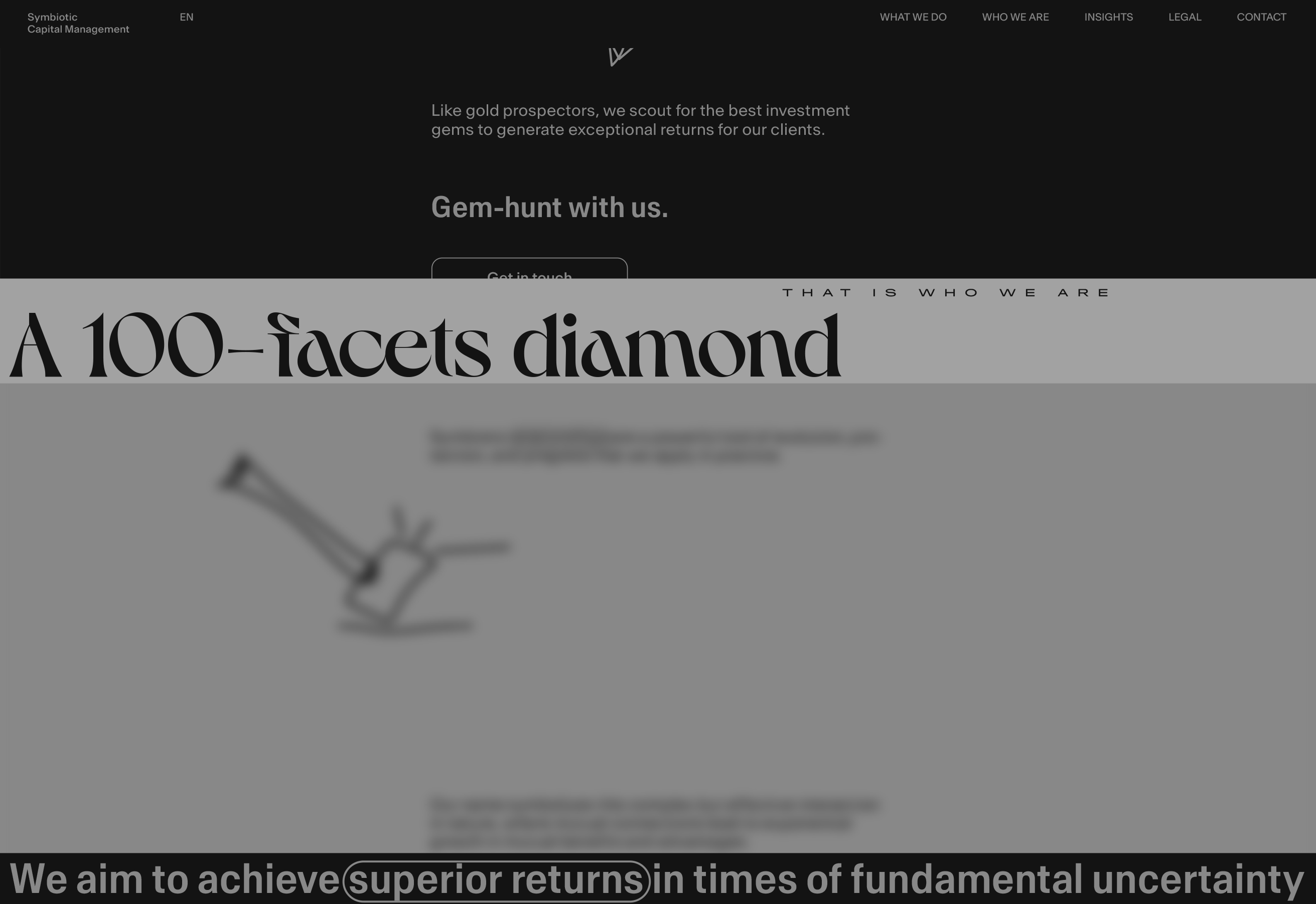
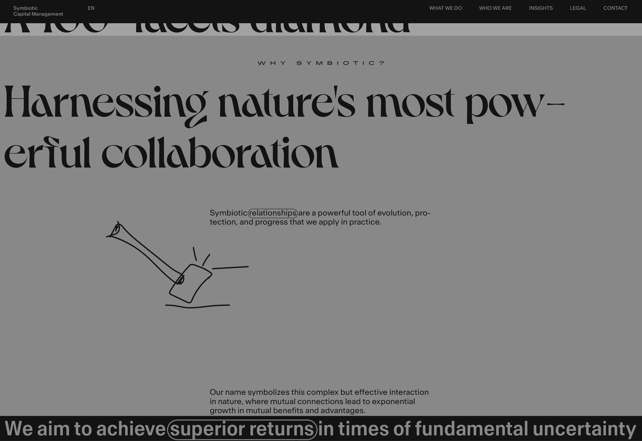
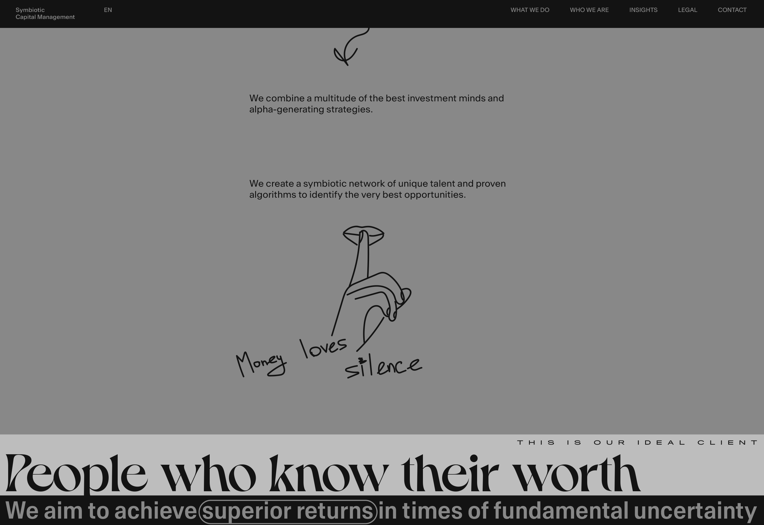
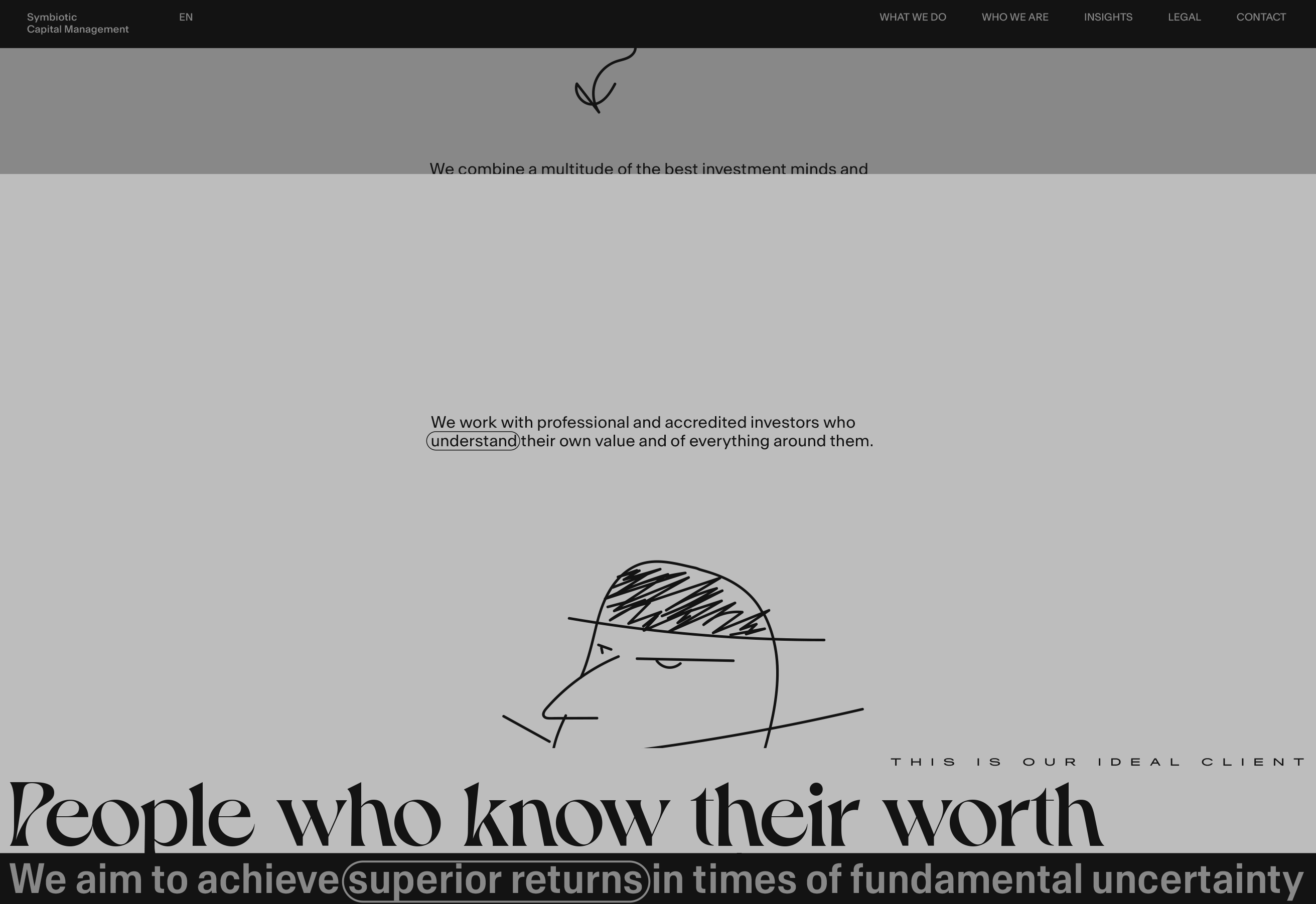
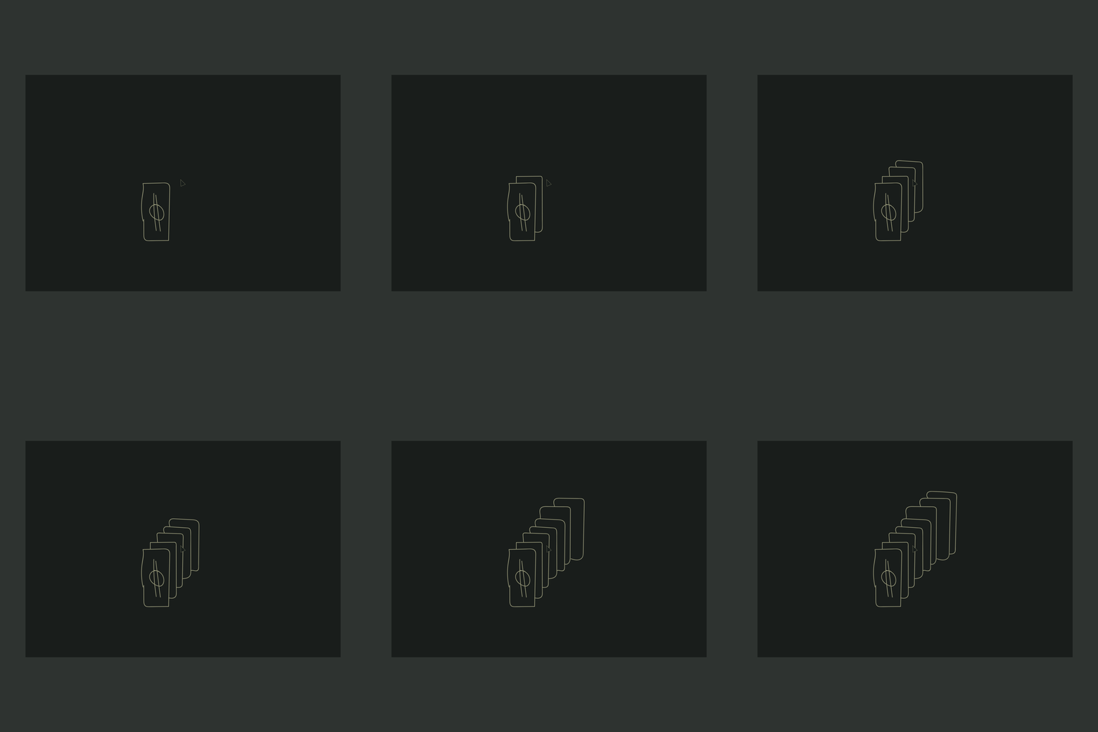
Behavior prototype

What We Do page loader. Prototype
In the end, it is all about dollars, more dollars.
After execution of the entry animations
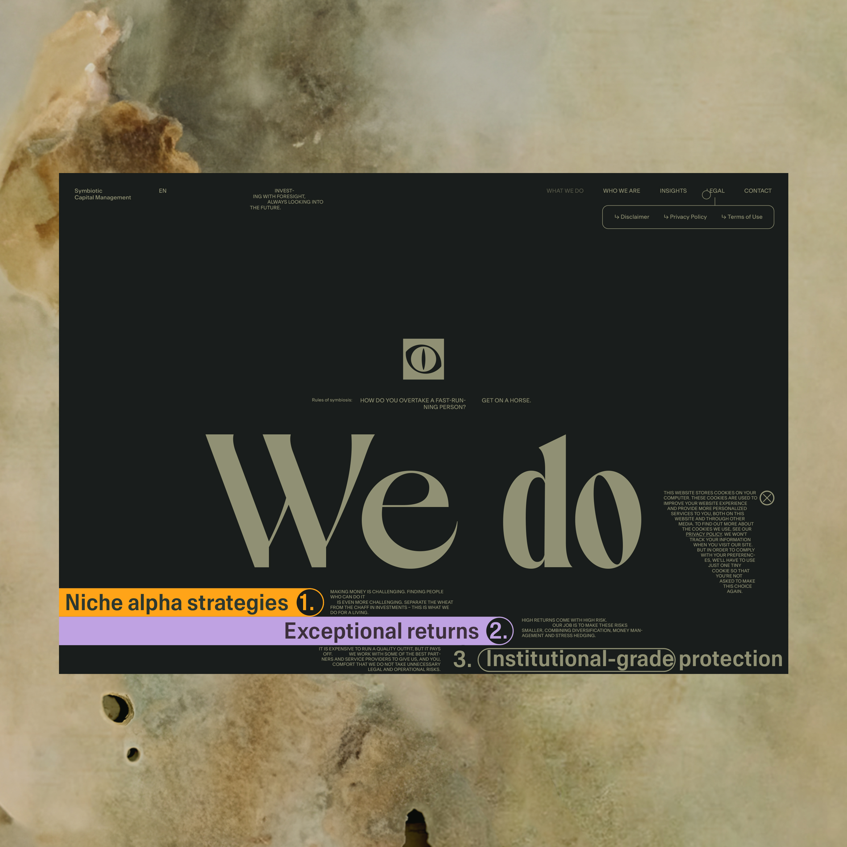
The main challenge is always the same — consistency.
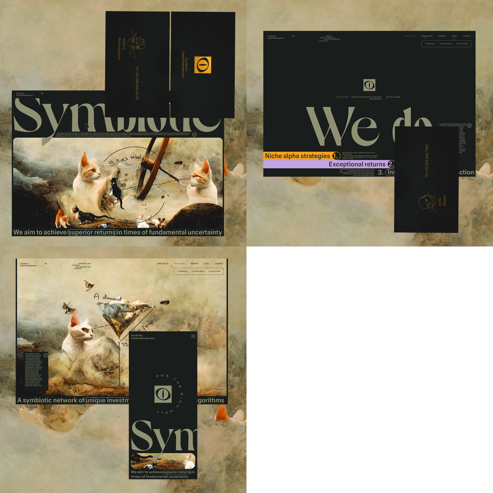
After some scroll
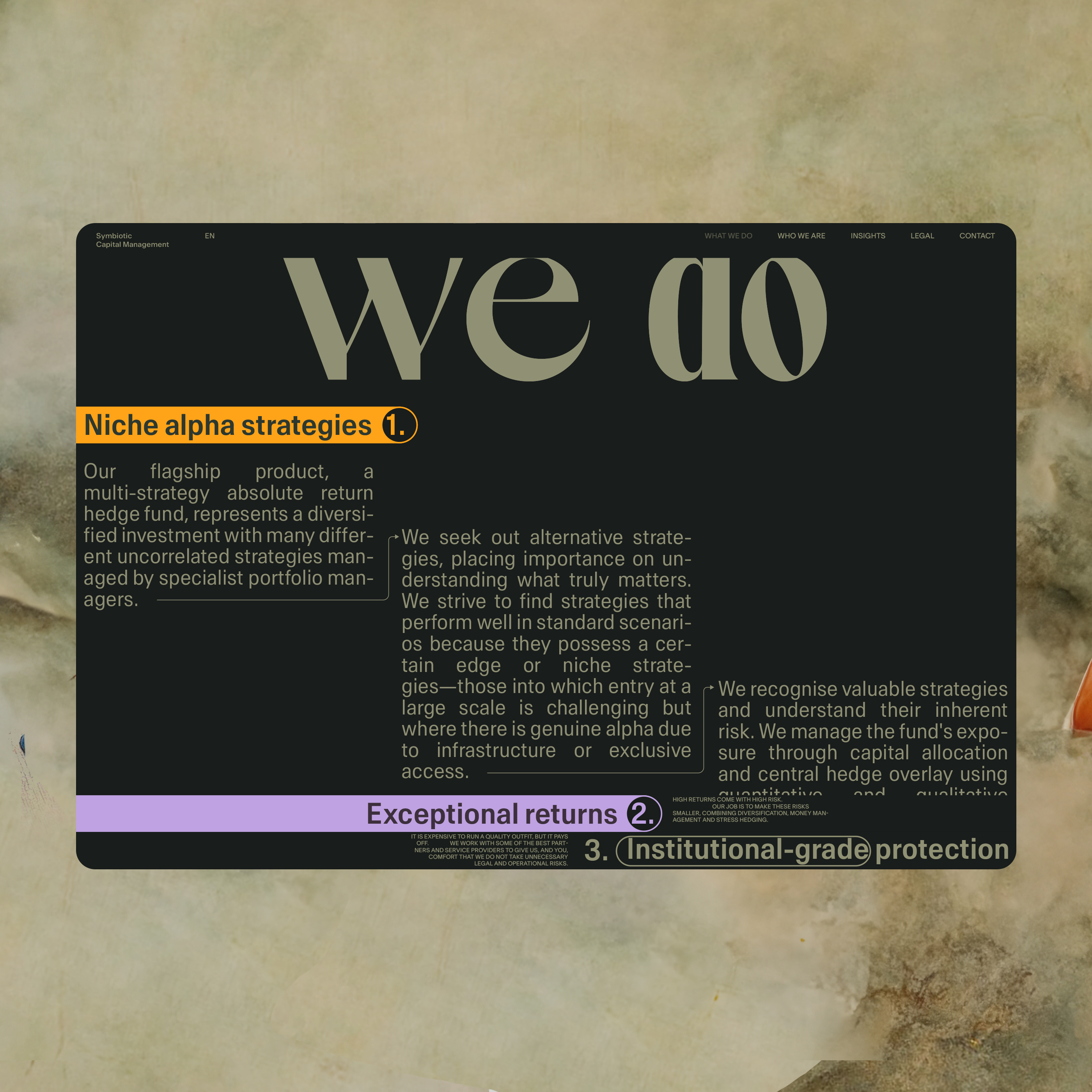
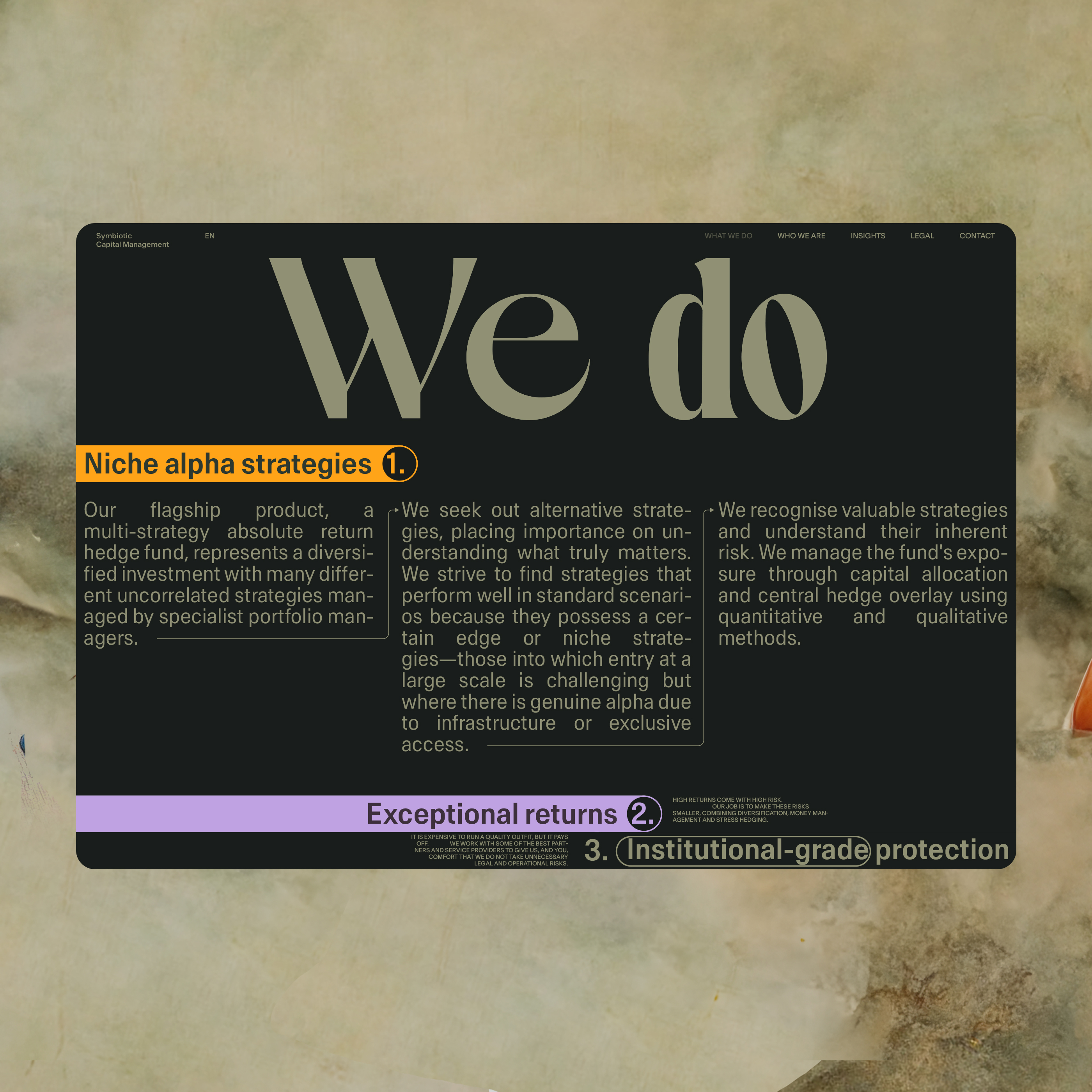
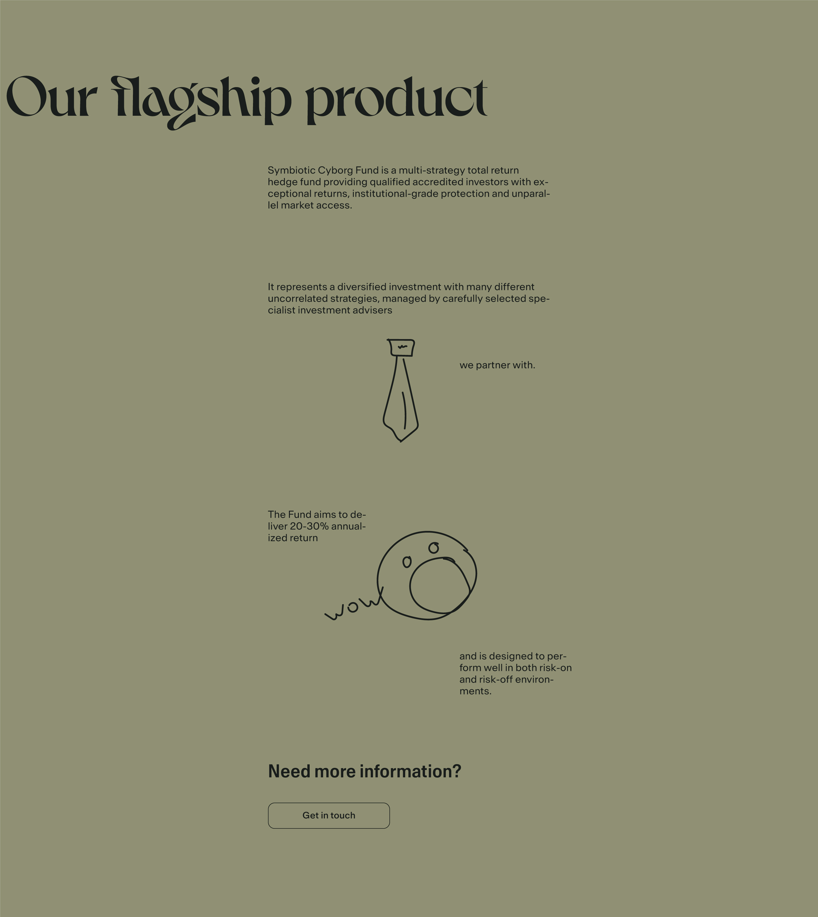
Our flagship product section
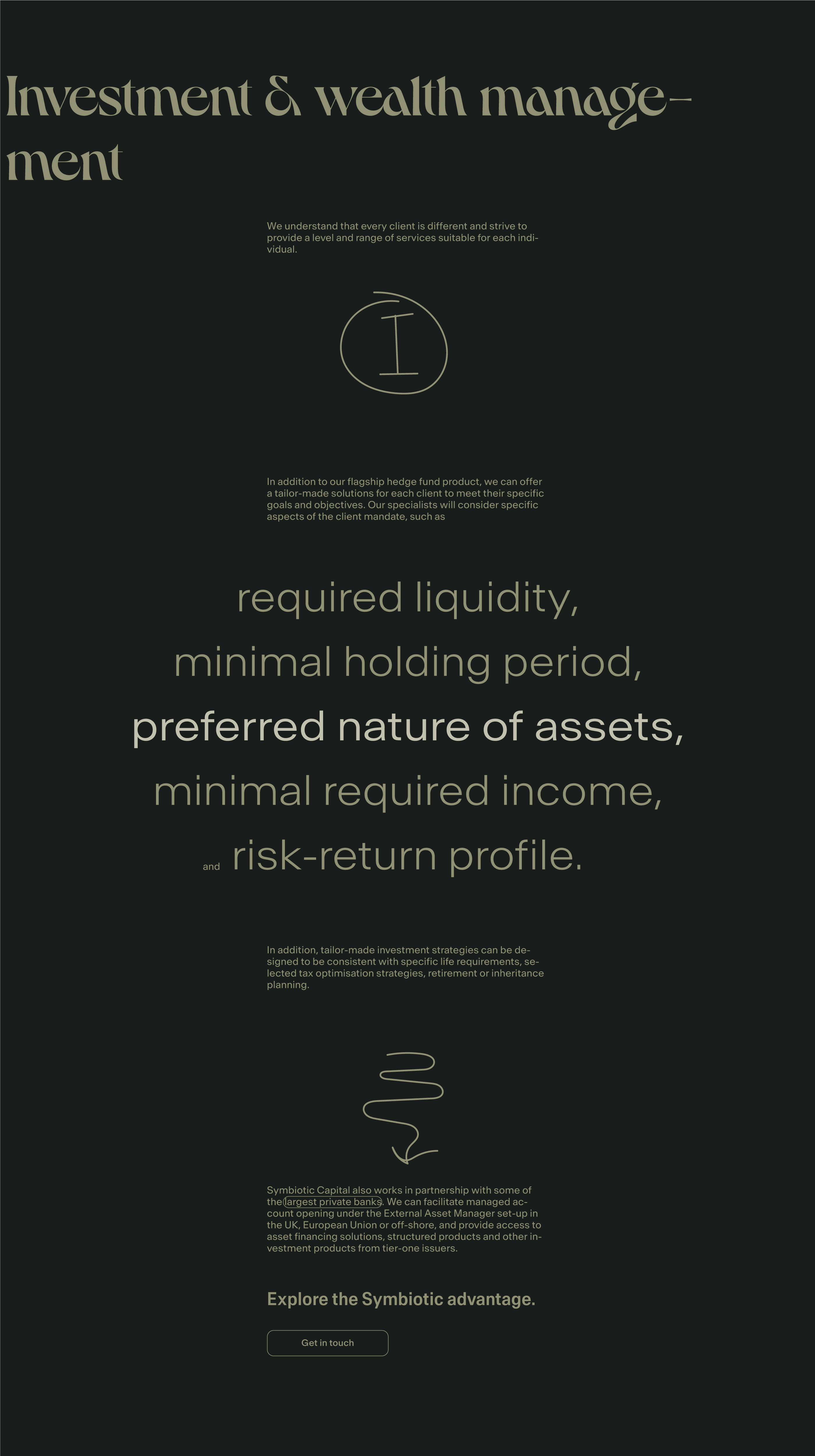
Investment & wealth management section
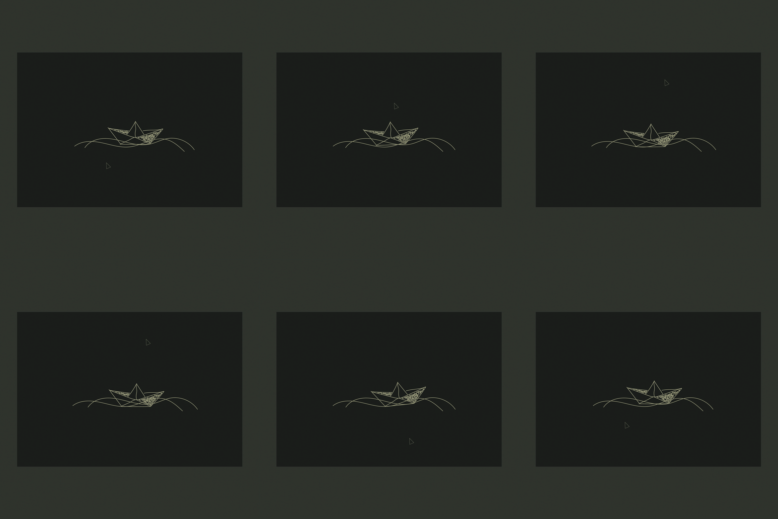
“Loop”. Core screens of the behavior scenario
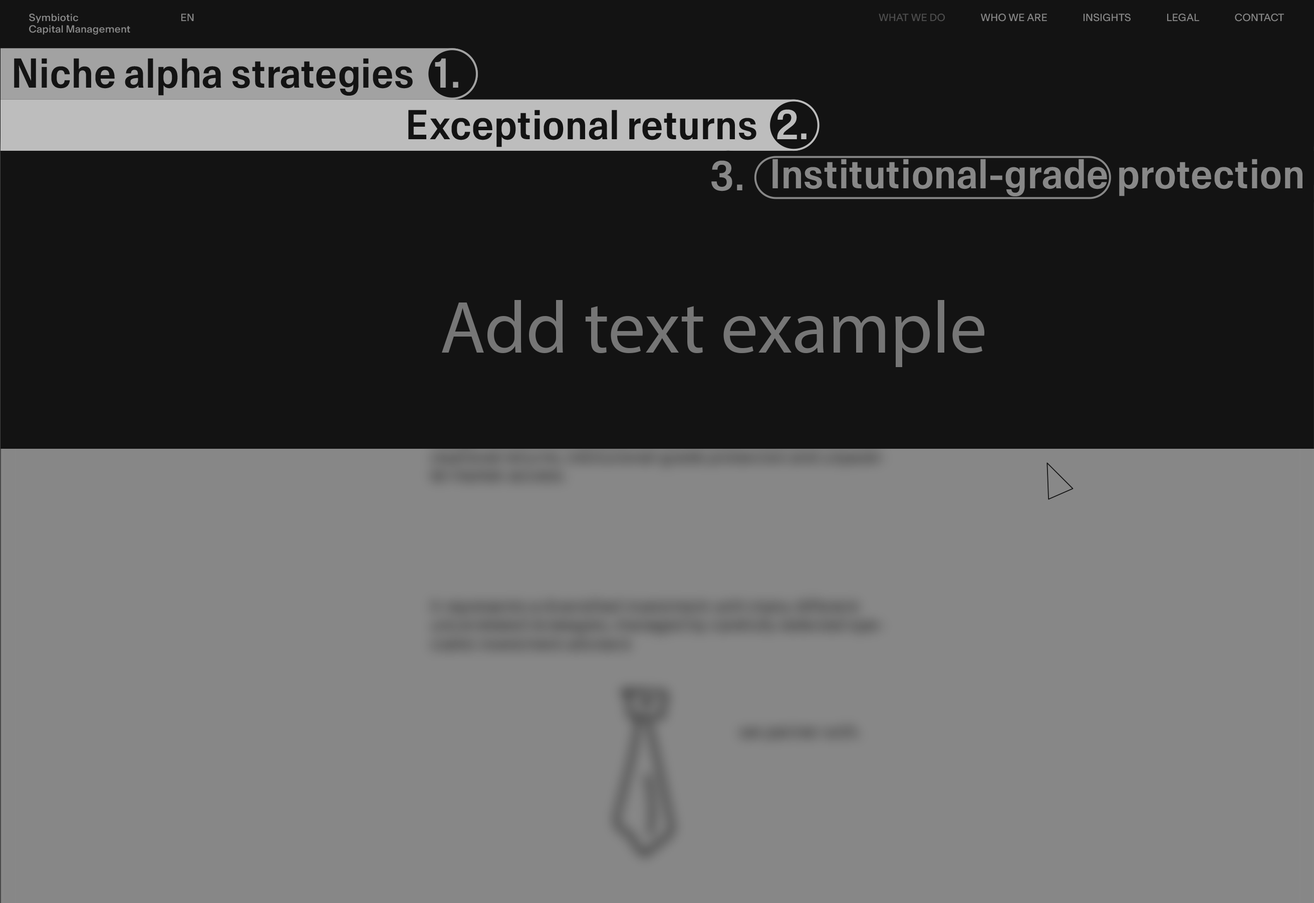
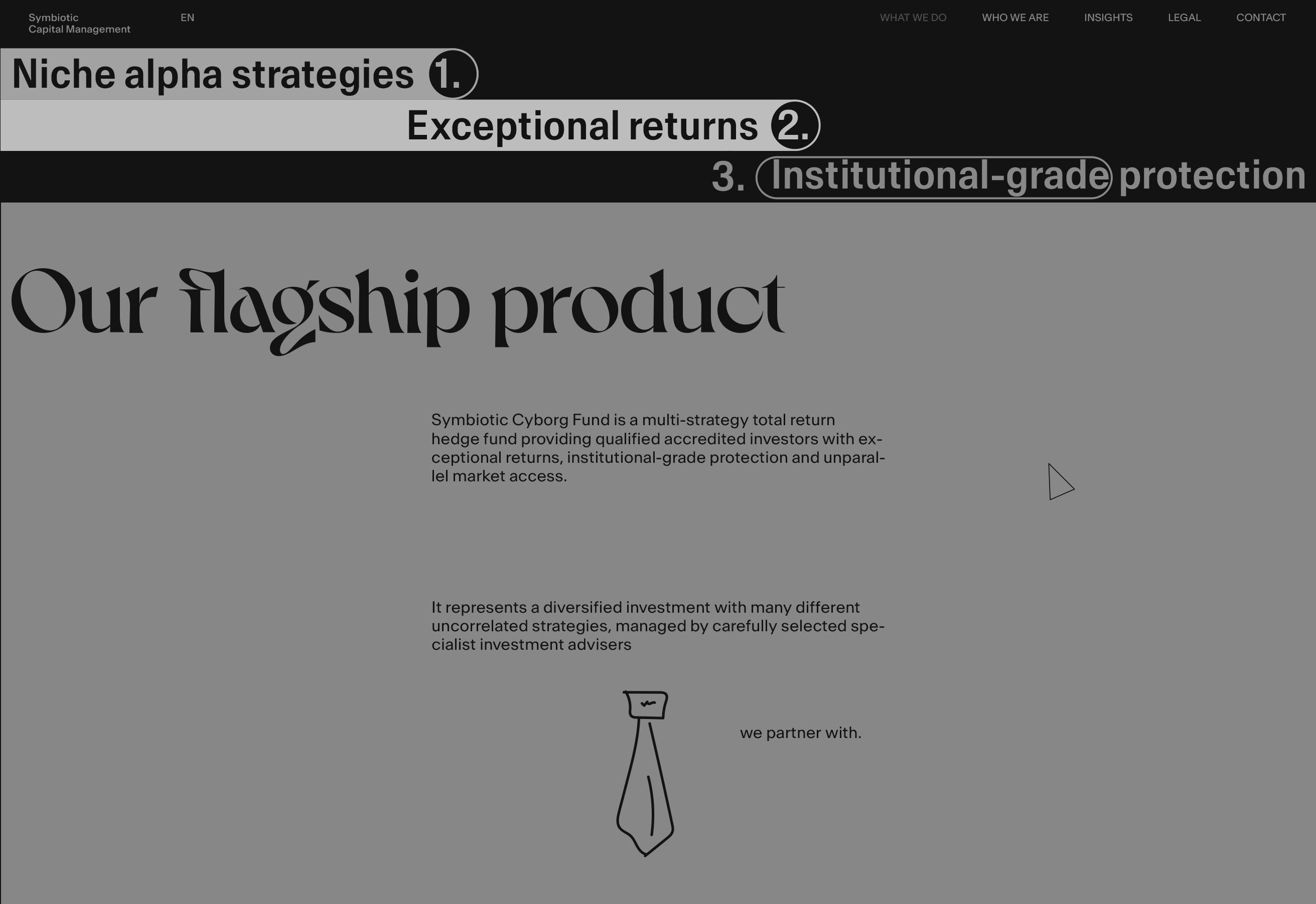
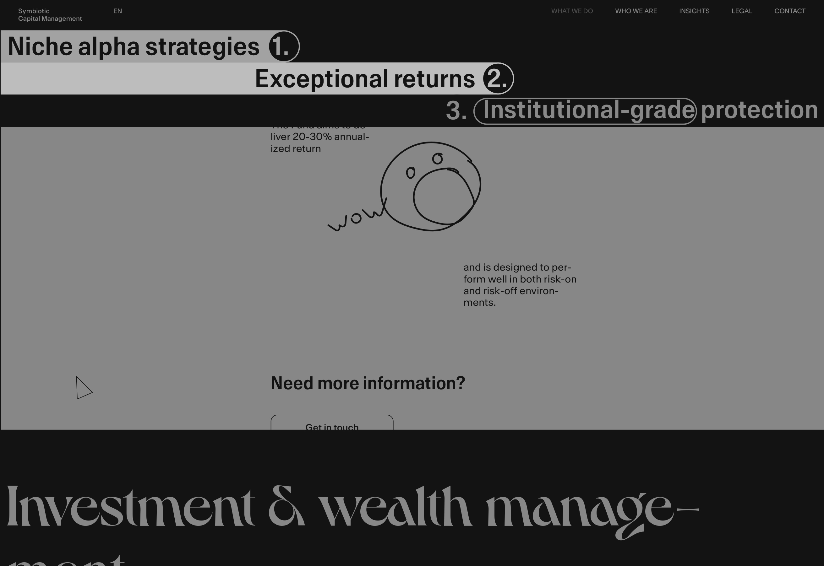
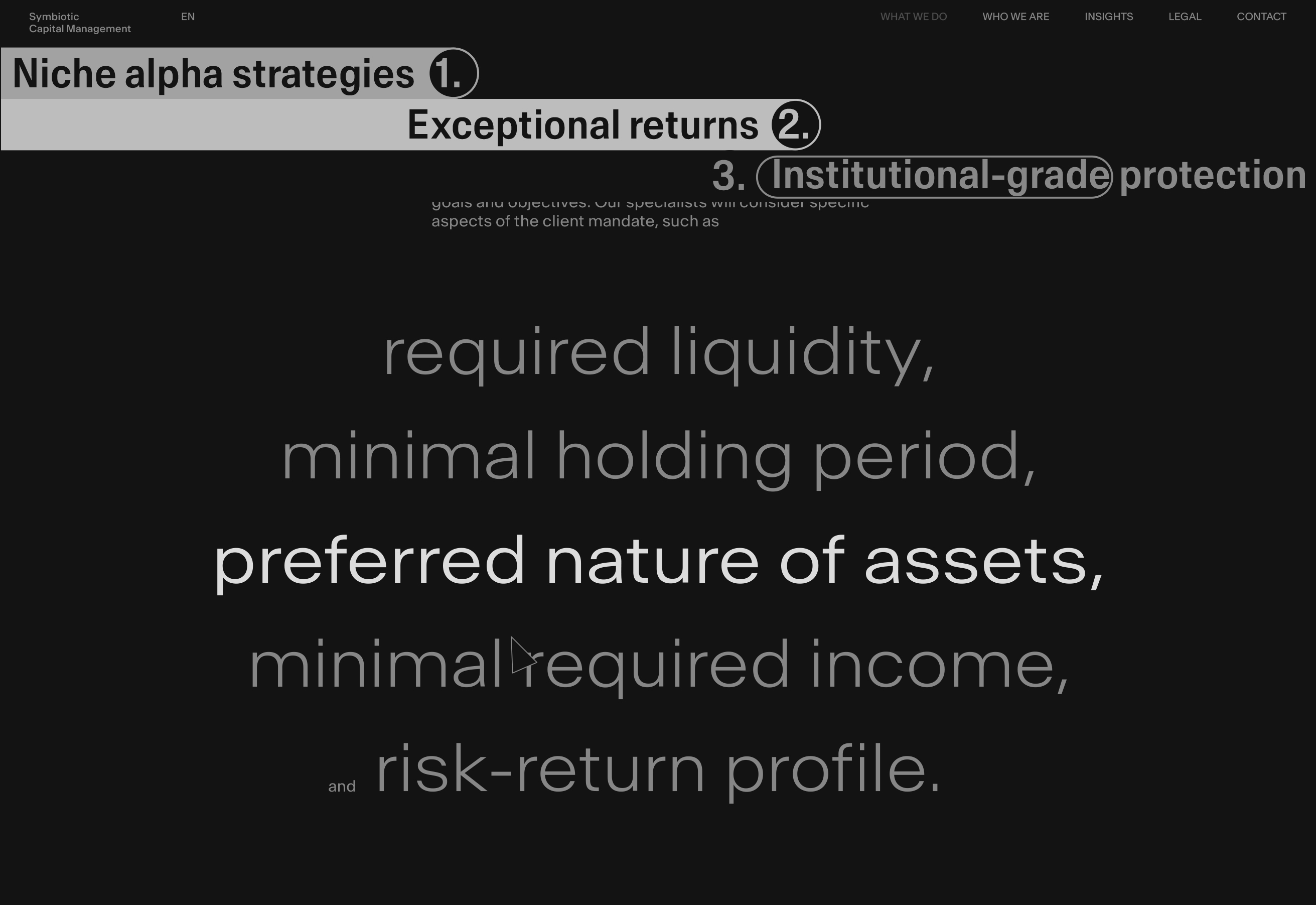
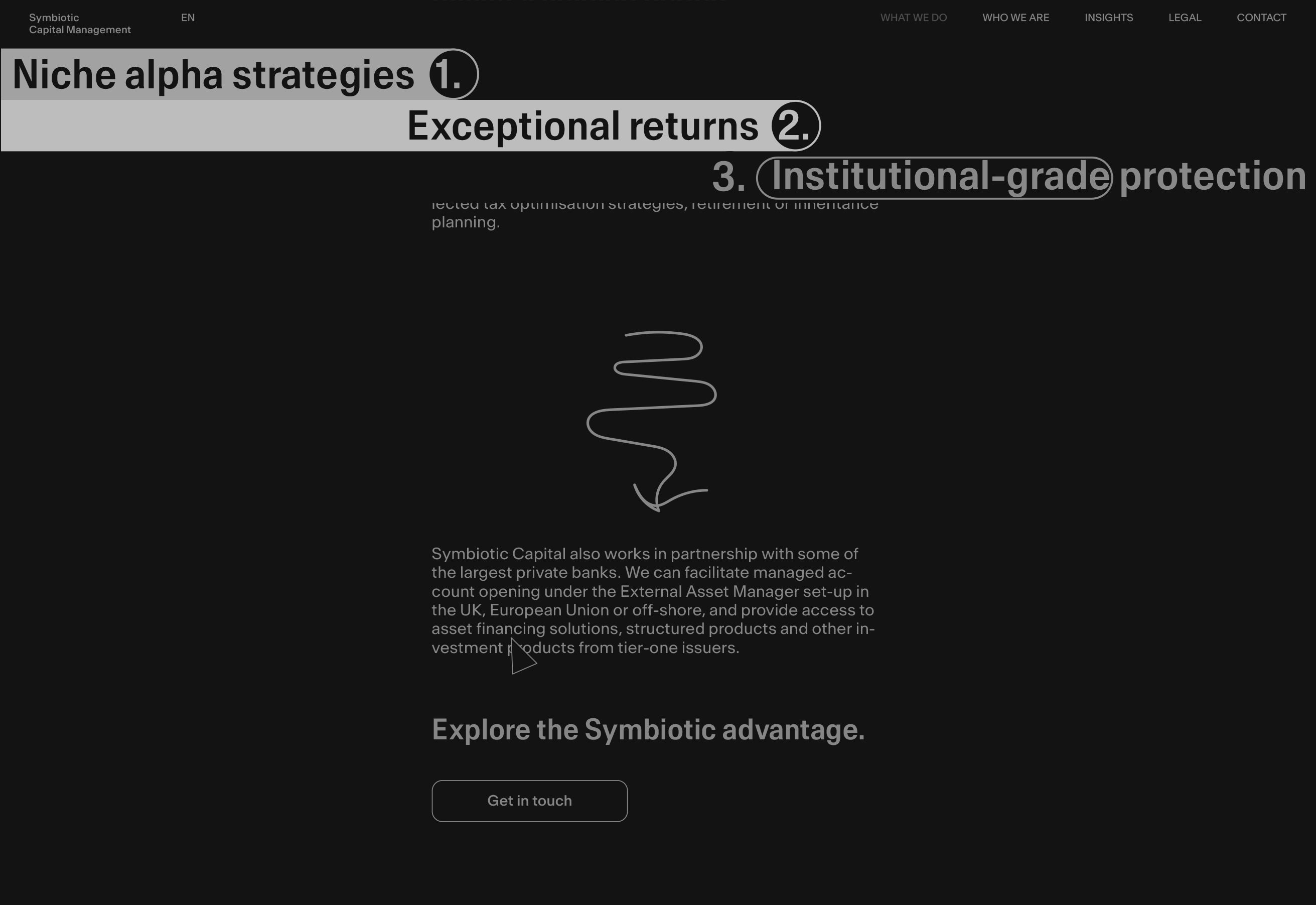
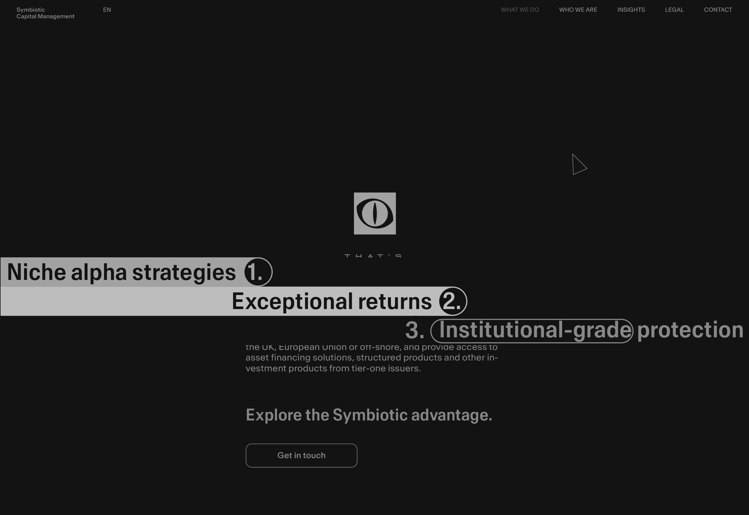
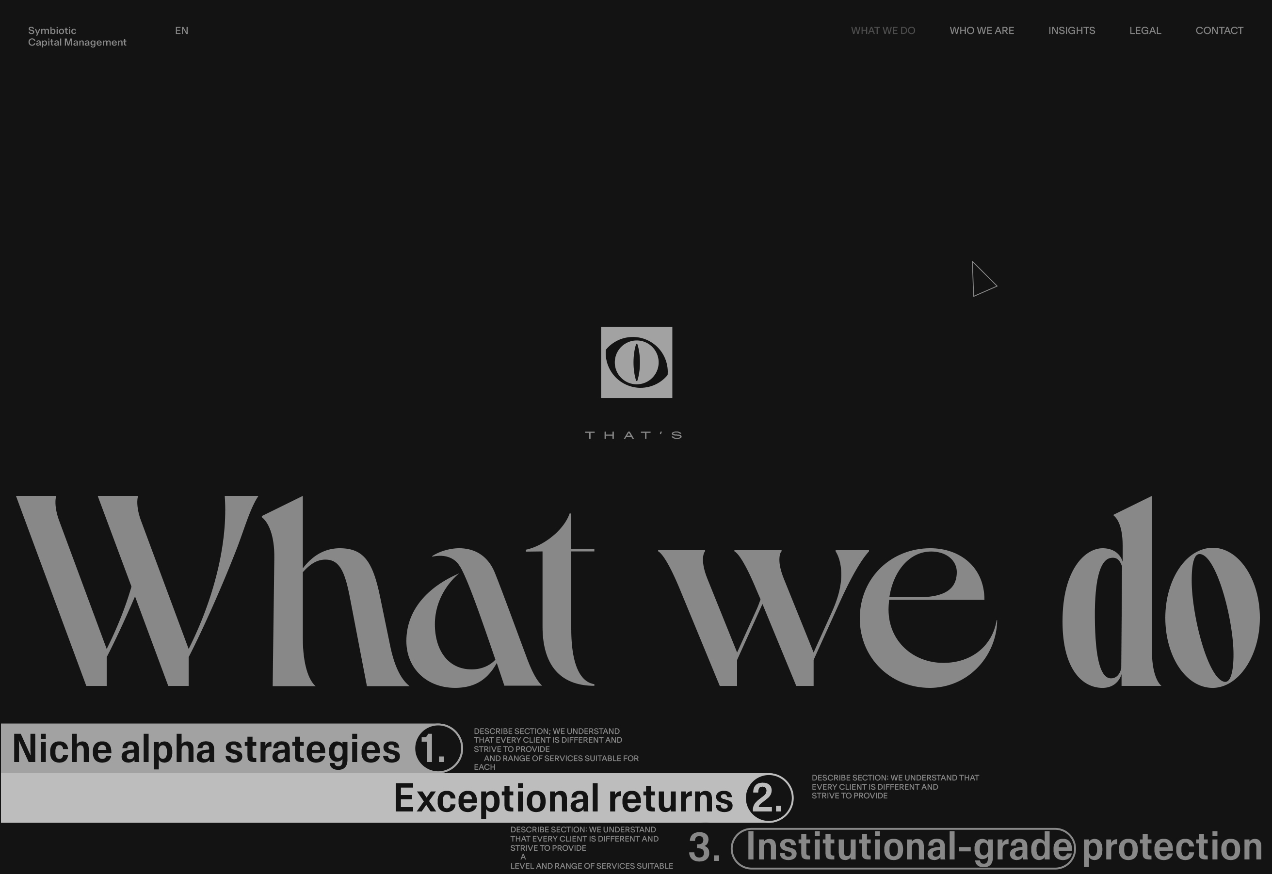
The reverse scroll will be accessible just before the tabs touch the bottom of the page.
If the “tabs” got to the bottom, this is the same as the page just got opened (just the title is a bit different now) — loop.
Another rule we clearly can establish — is to try to hold the most important information as long as possible in view.
Behavior prototype

Who We Are page loader. Prototype
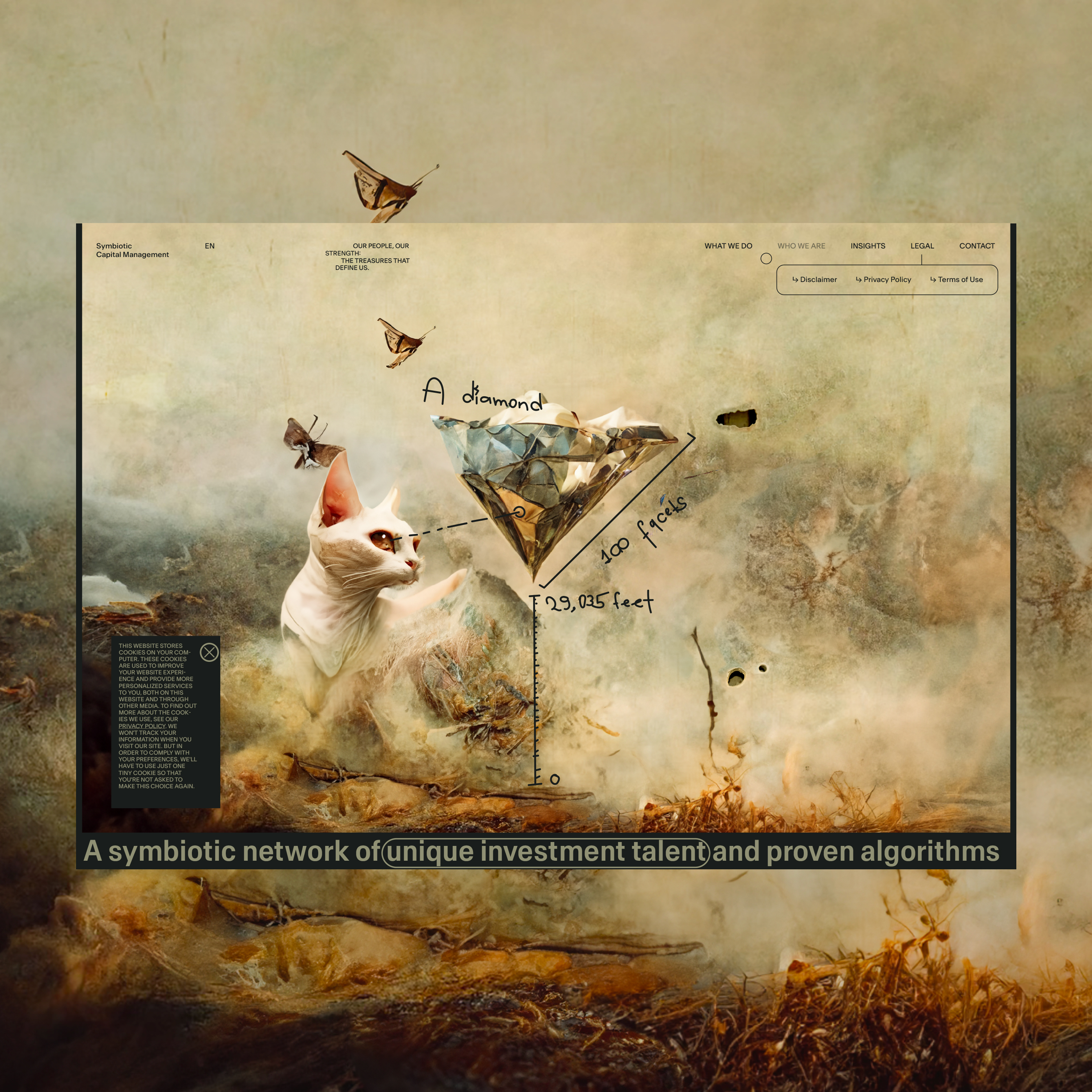
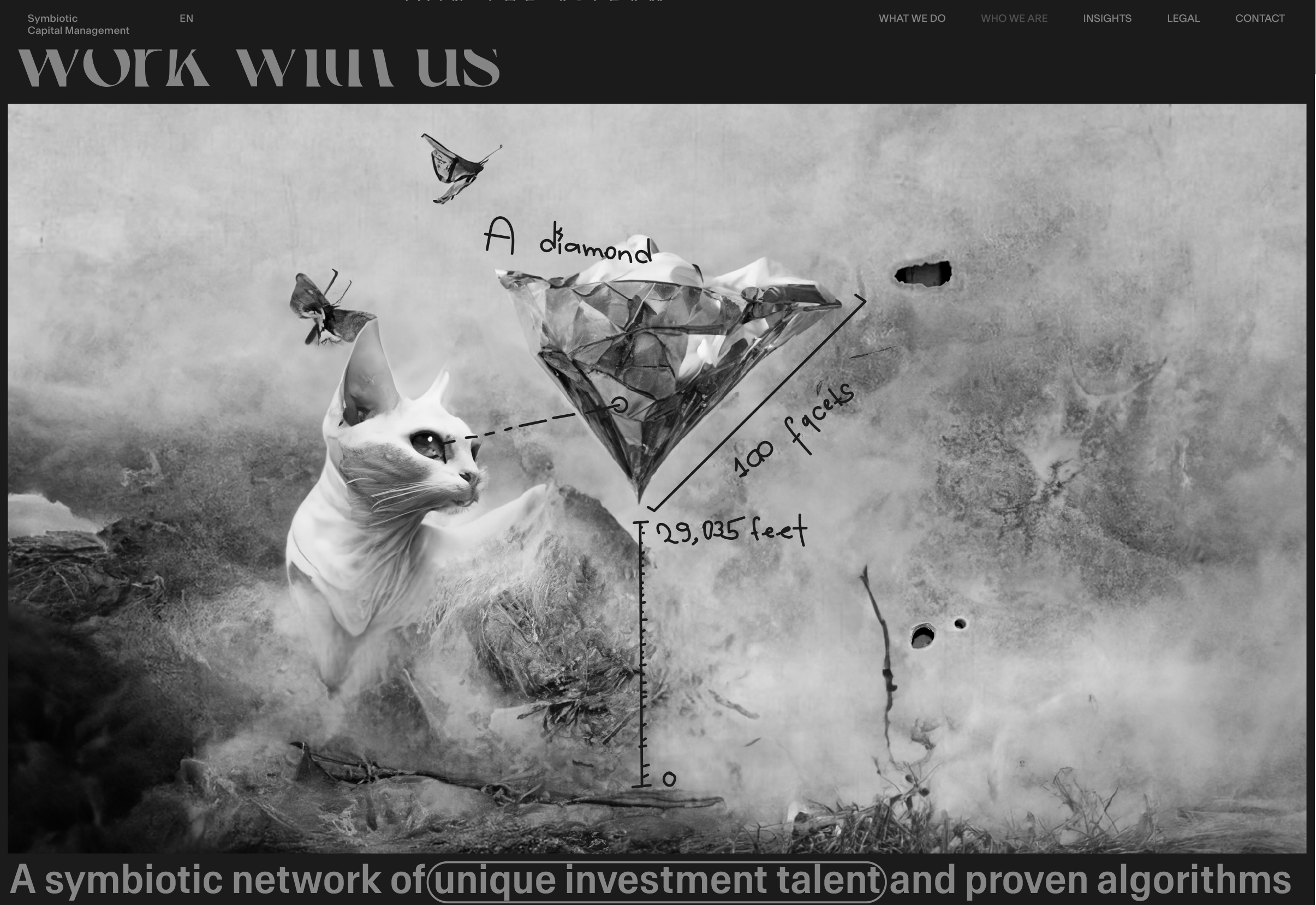
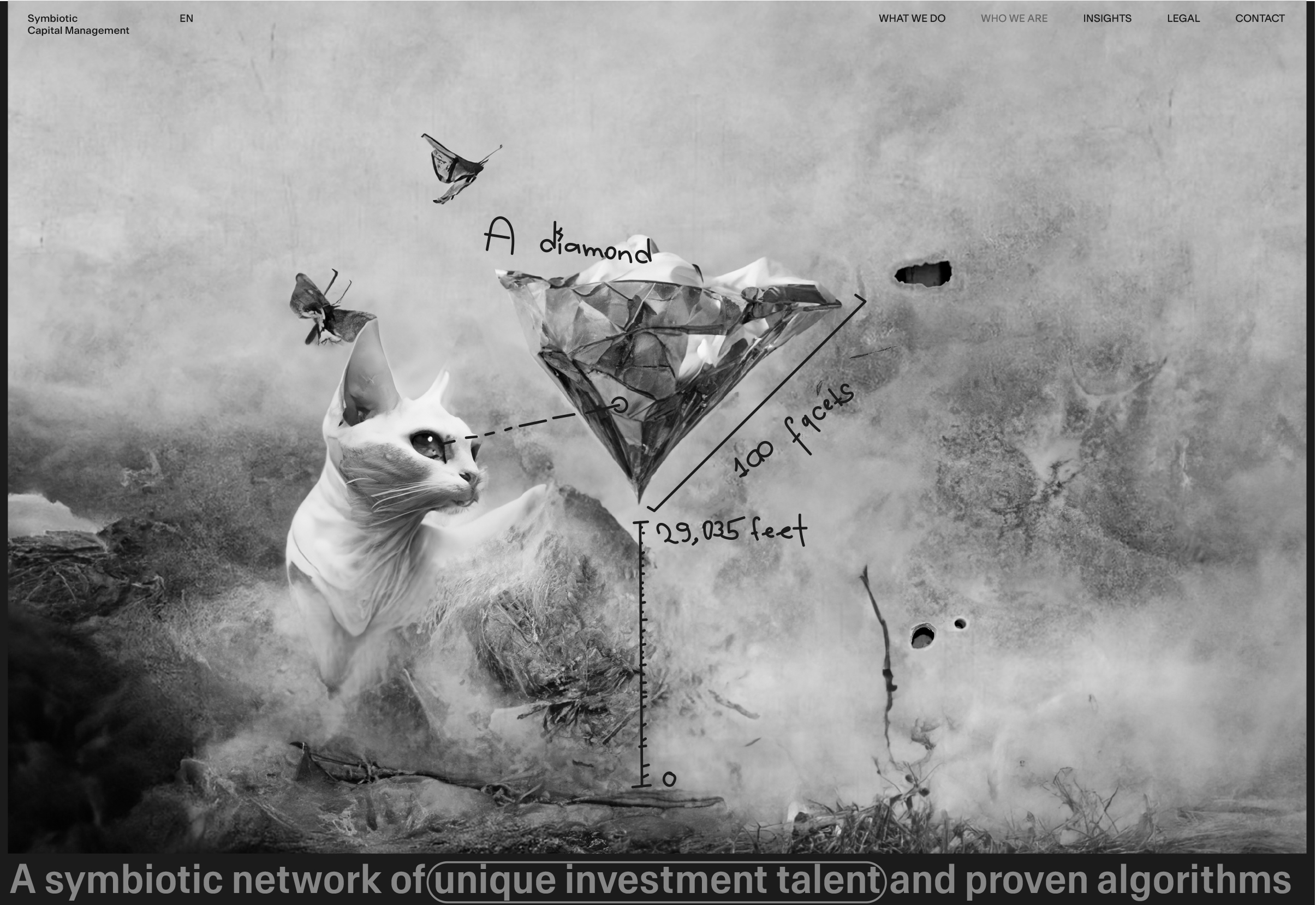
After execution of the entry animations. “Diamond”
When the page opens the hero image is bigger. Then it’s getting smaller — entry animations.
Line comments (SVG) appear as the final element of the entry animations.
About Us
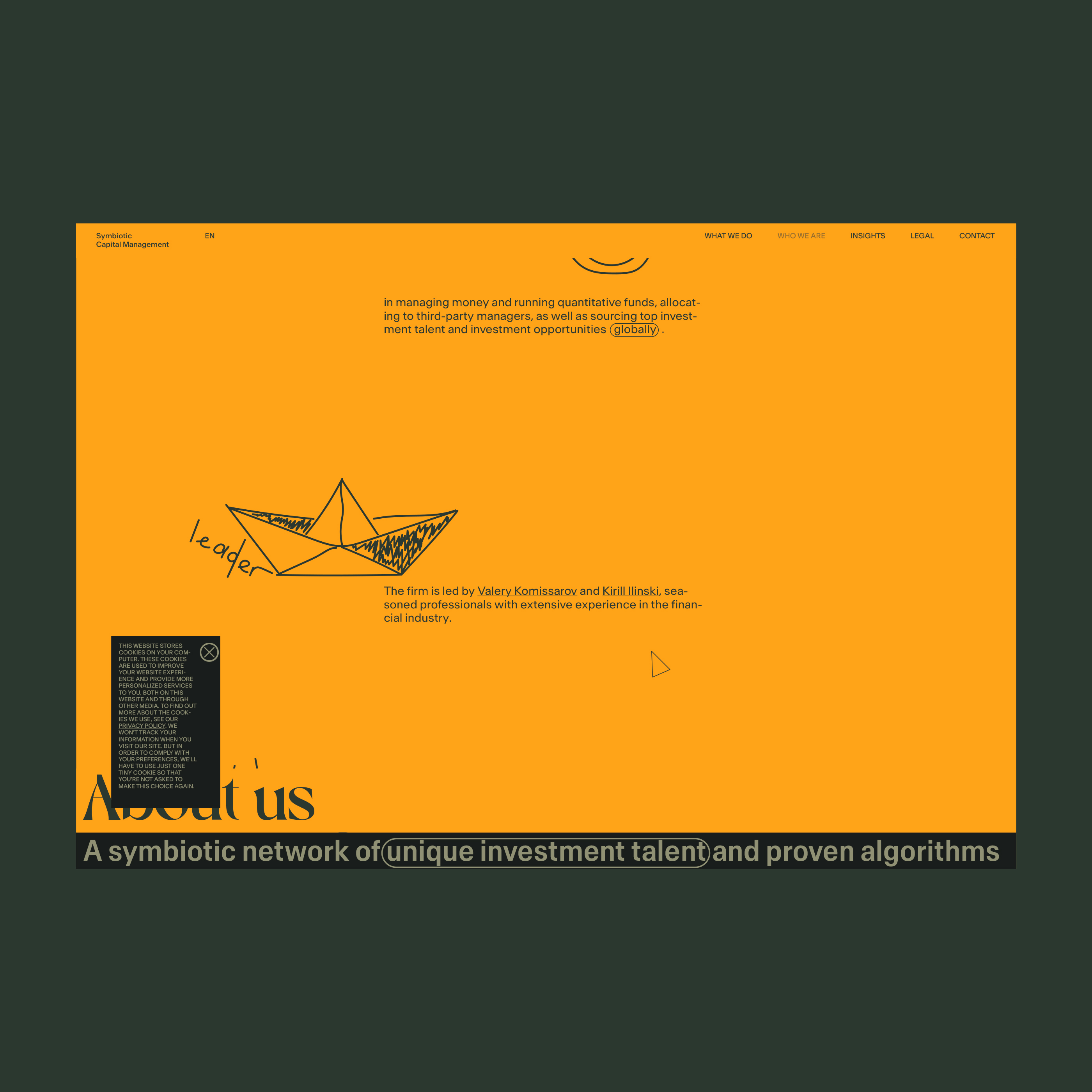
About Us section
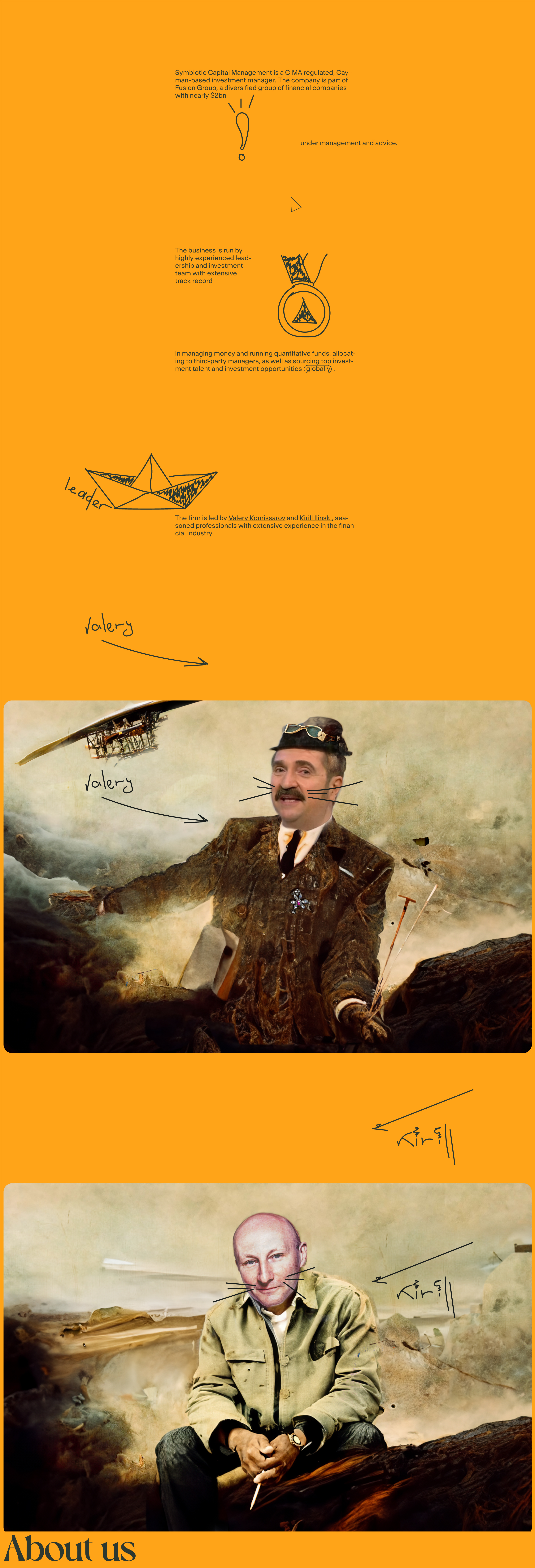
Behavior prototype
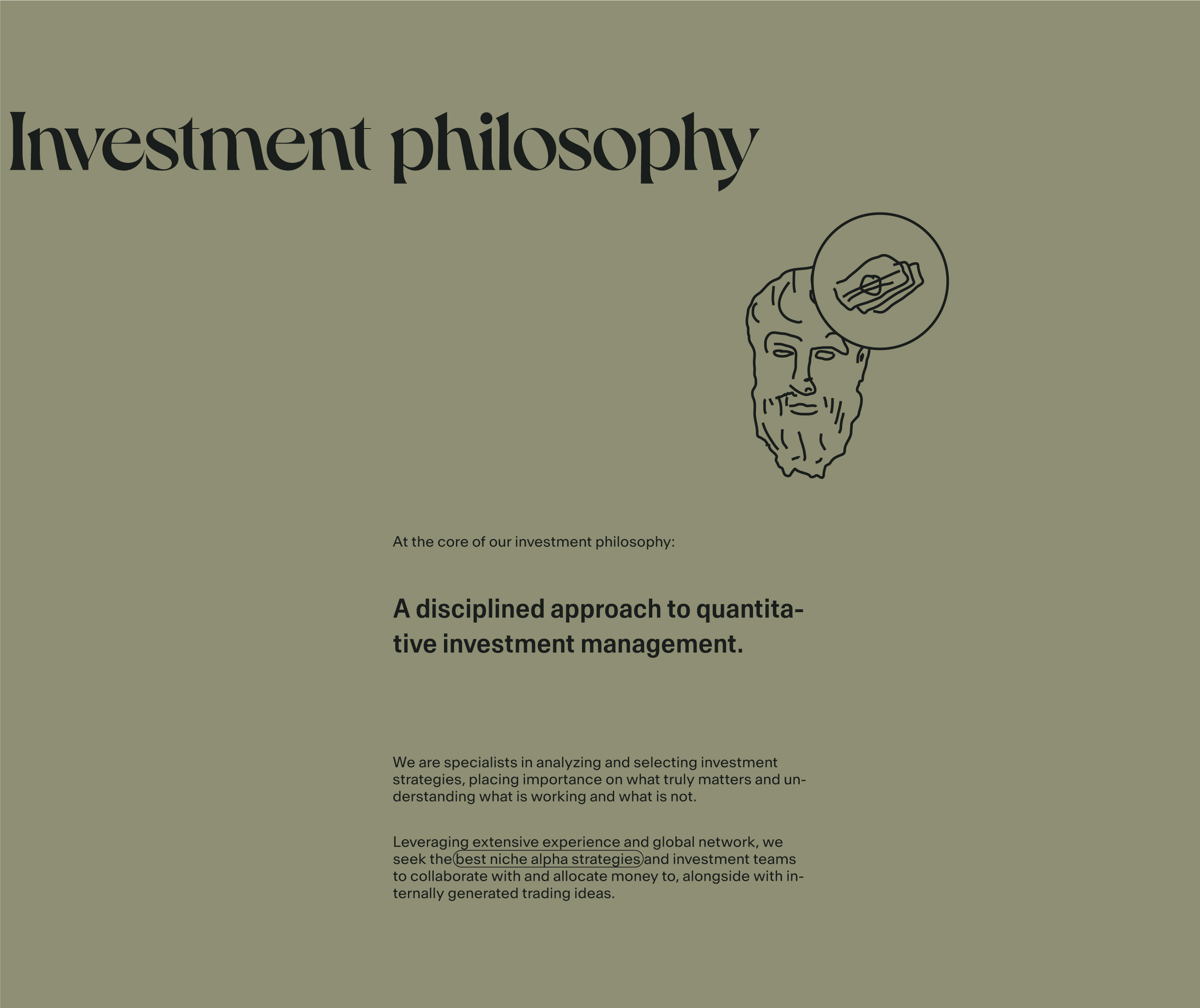
Investment Philosophy section
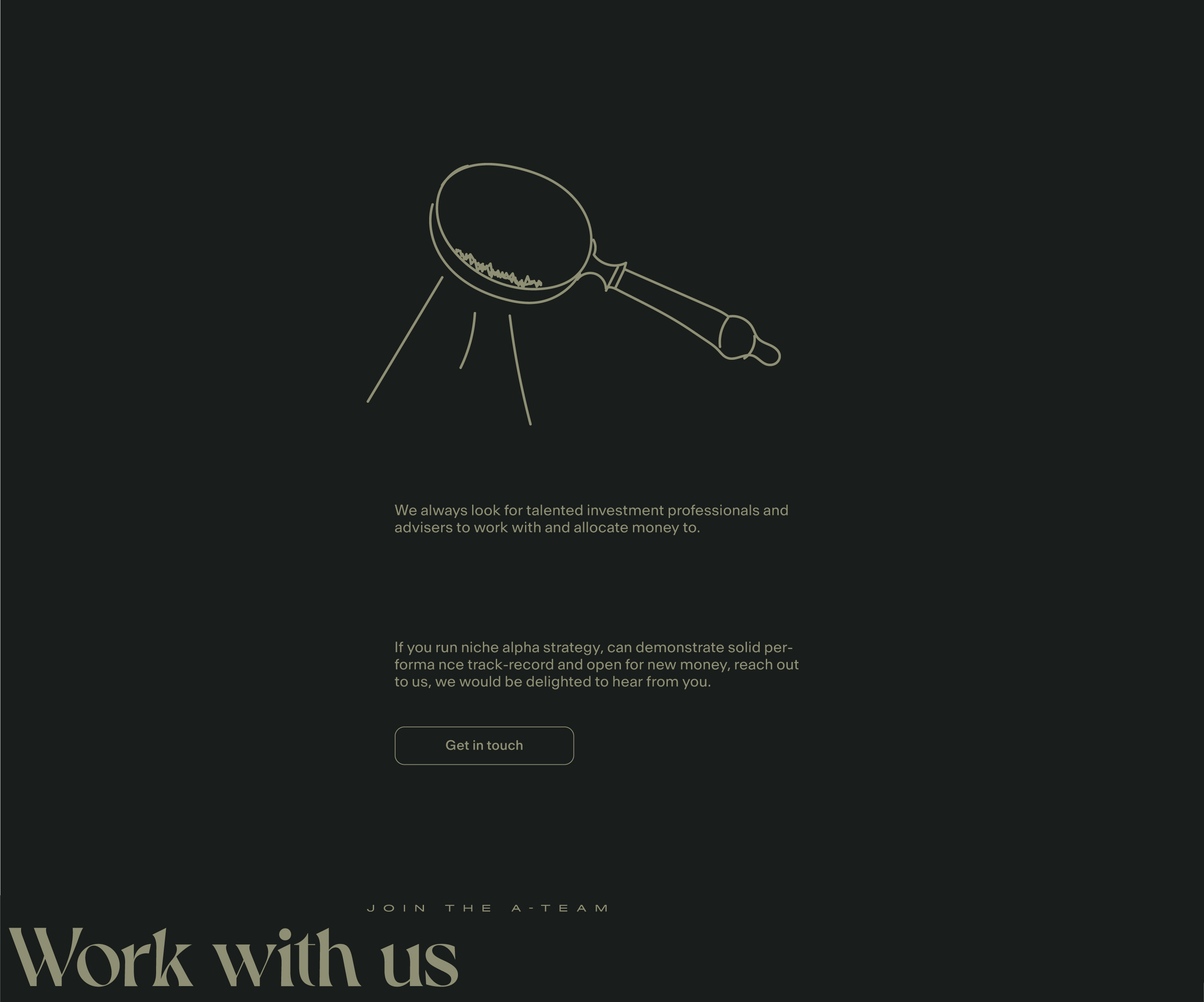
Work With Us section
Core screens of the behavior scenario
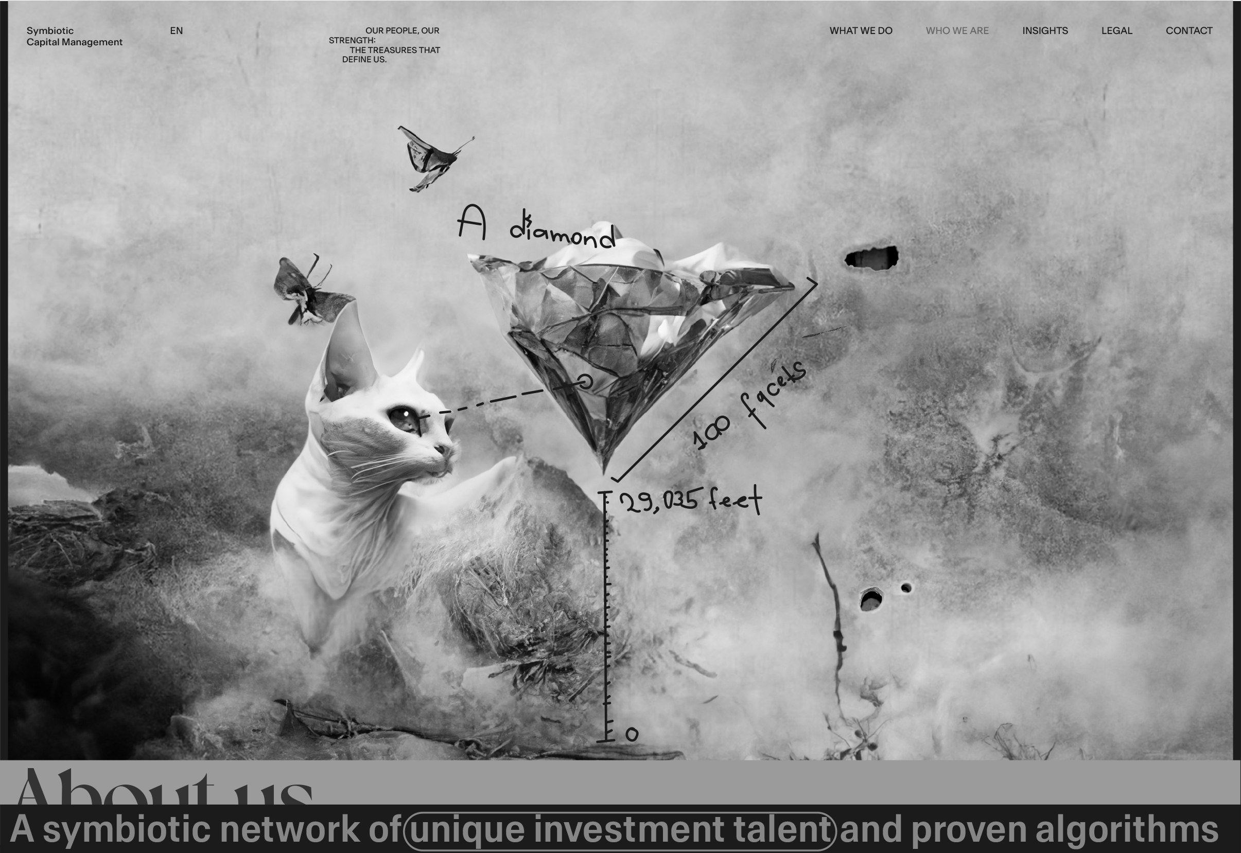
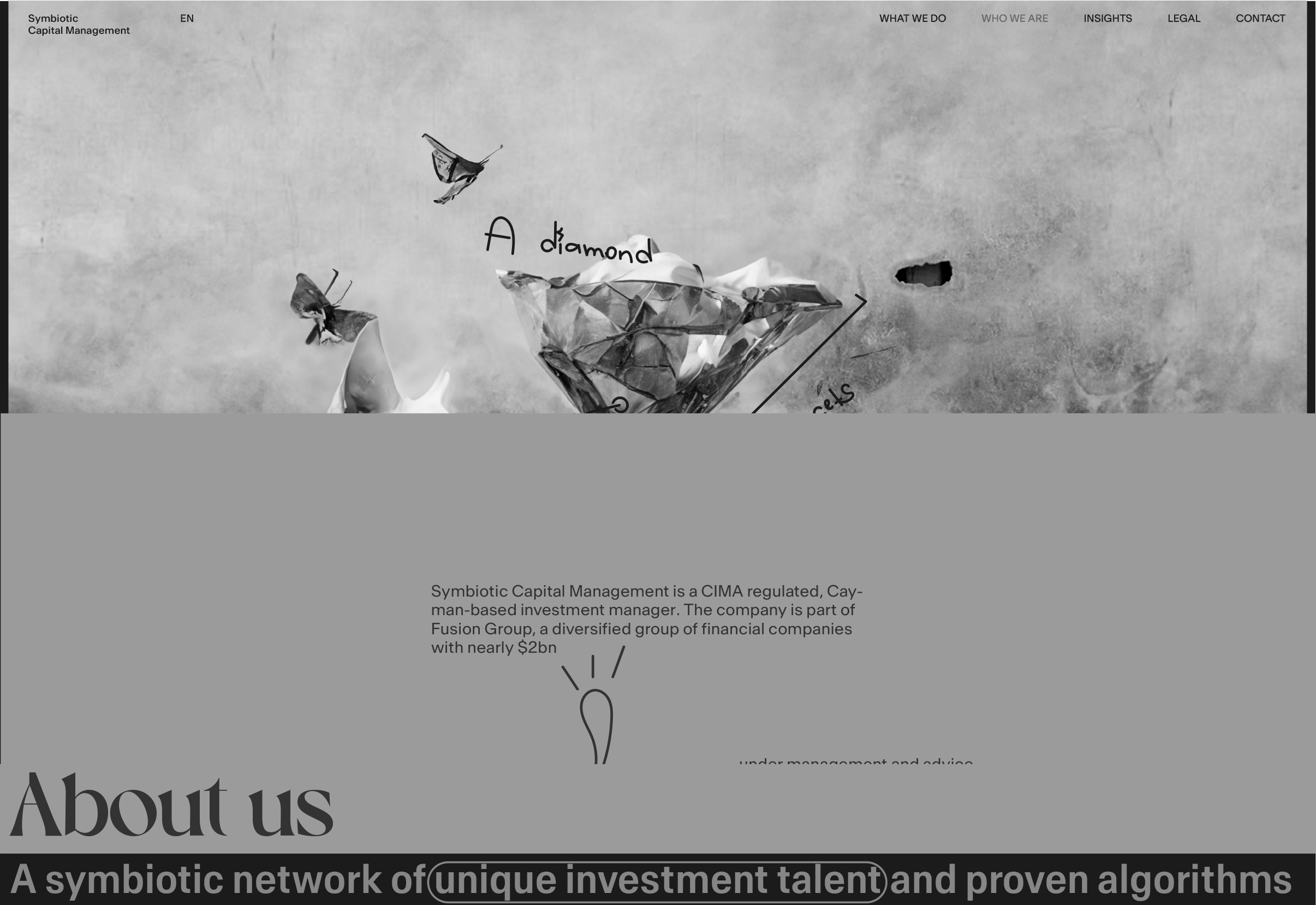
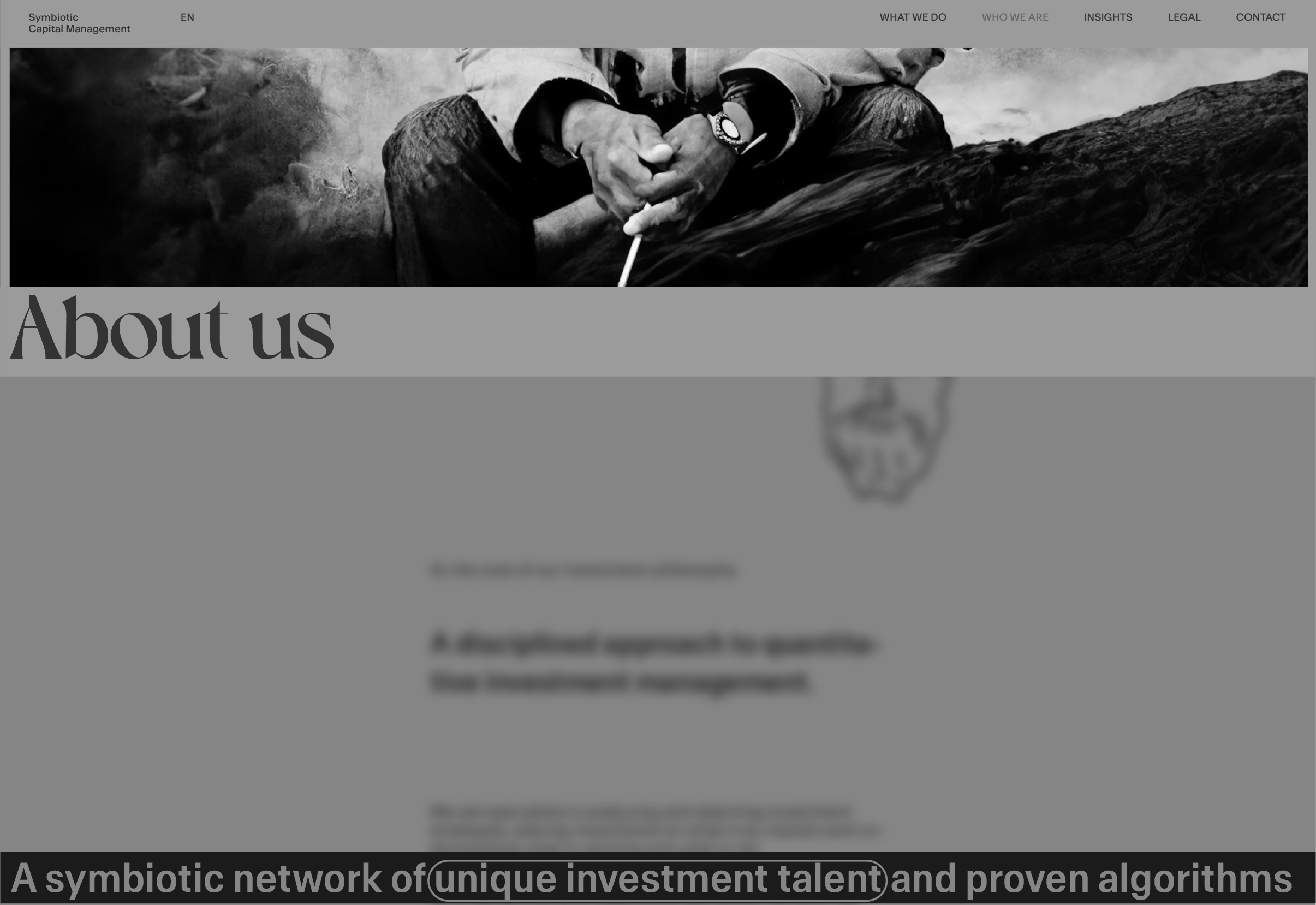
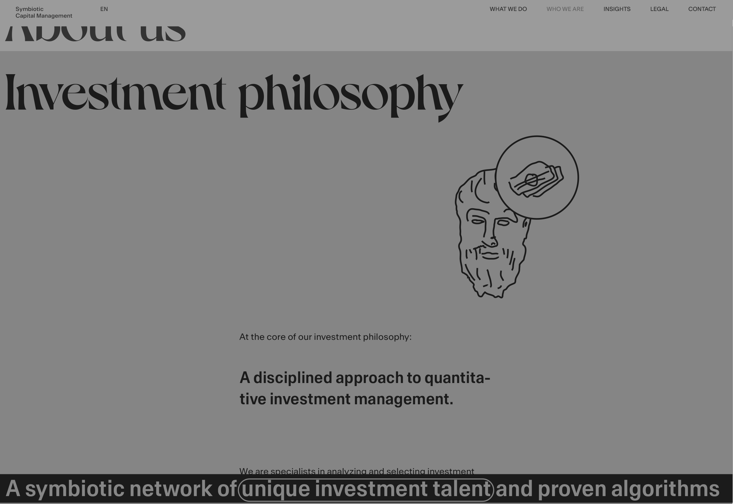
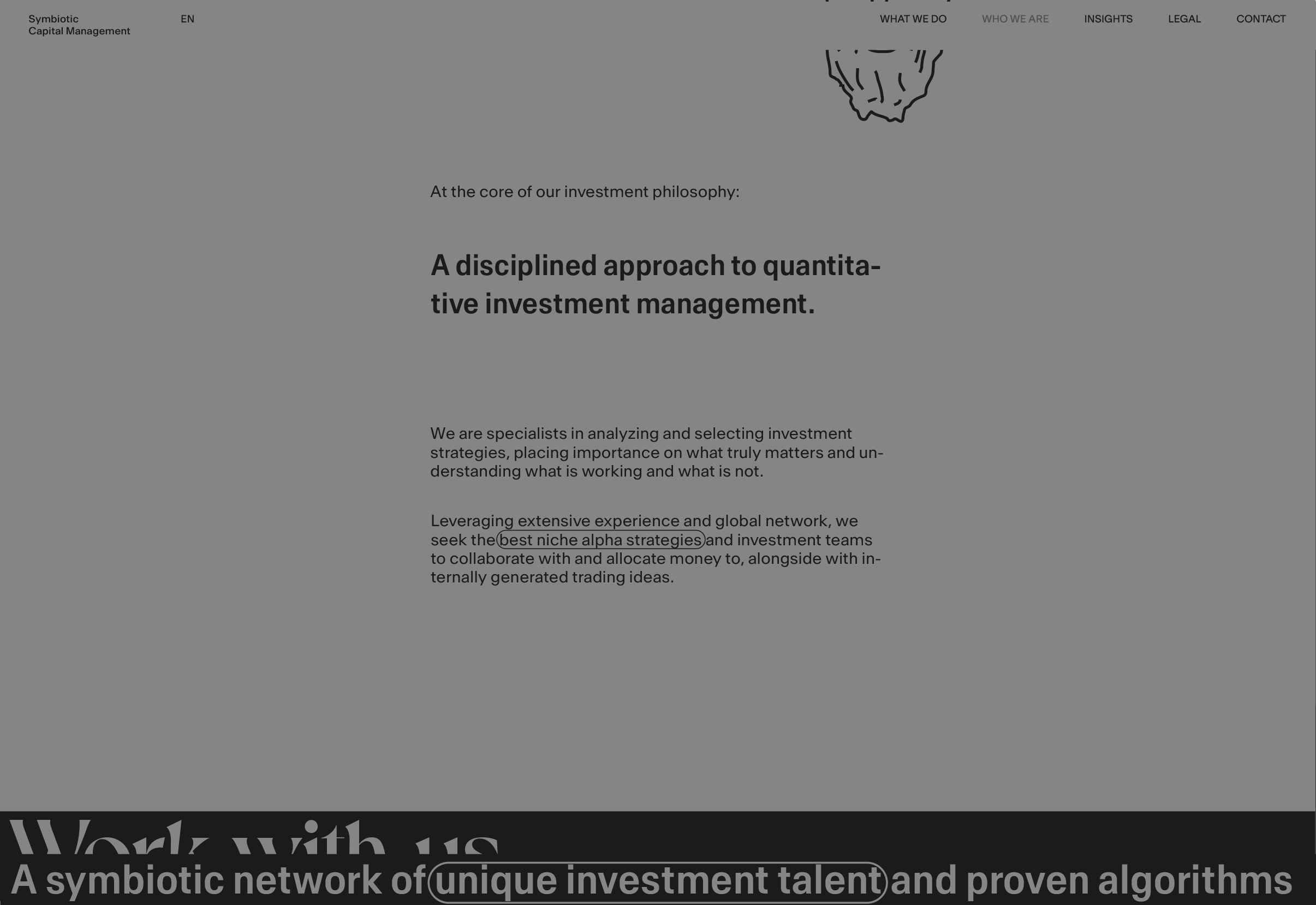
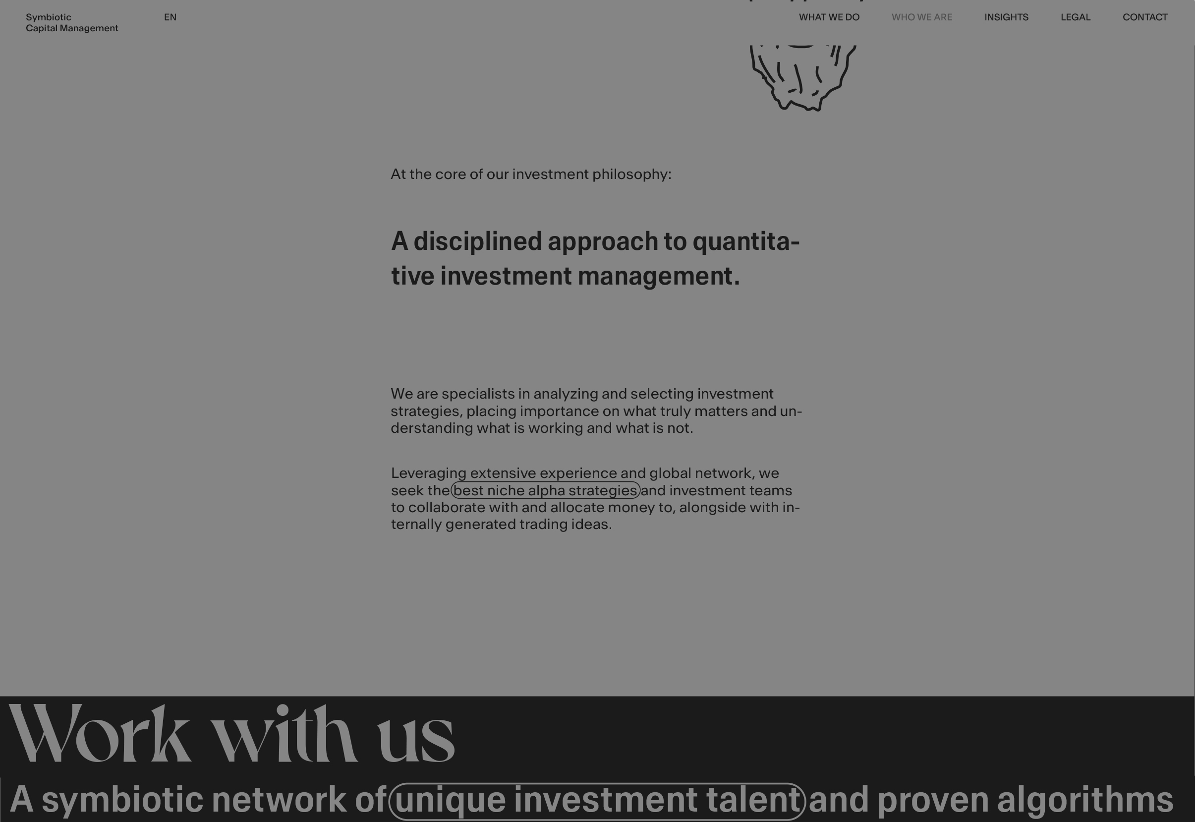
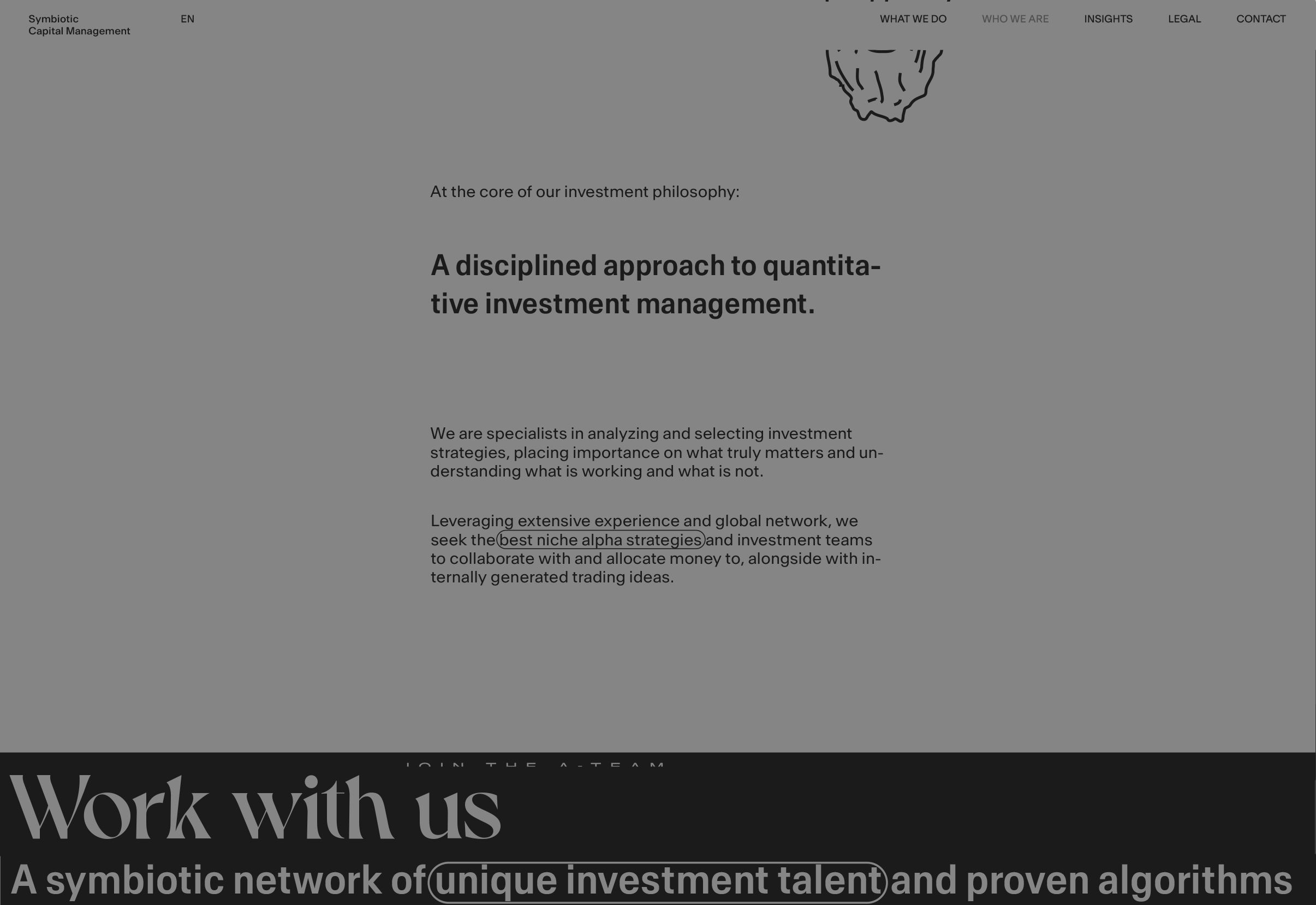
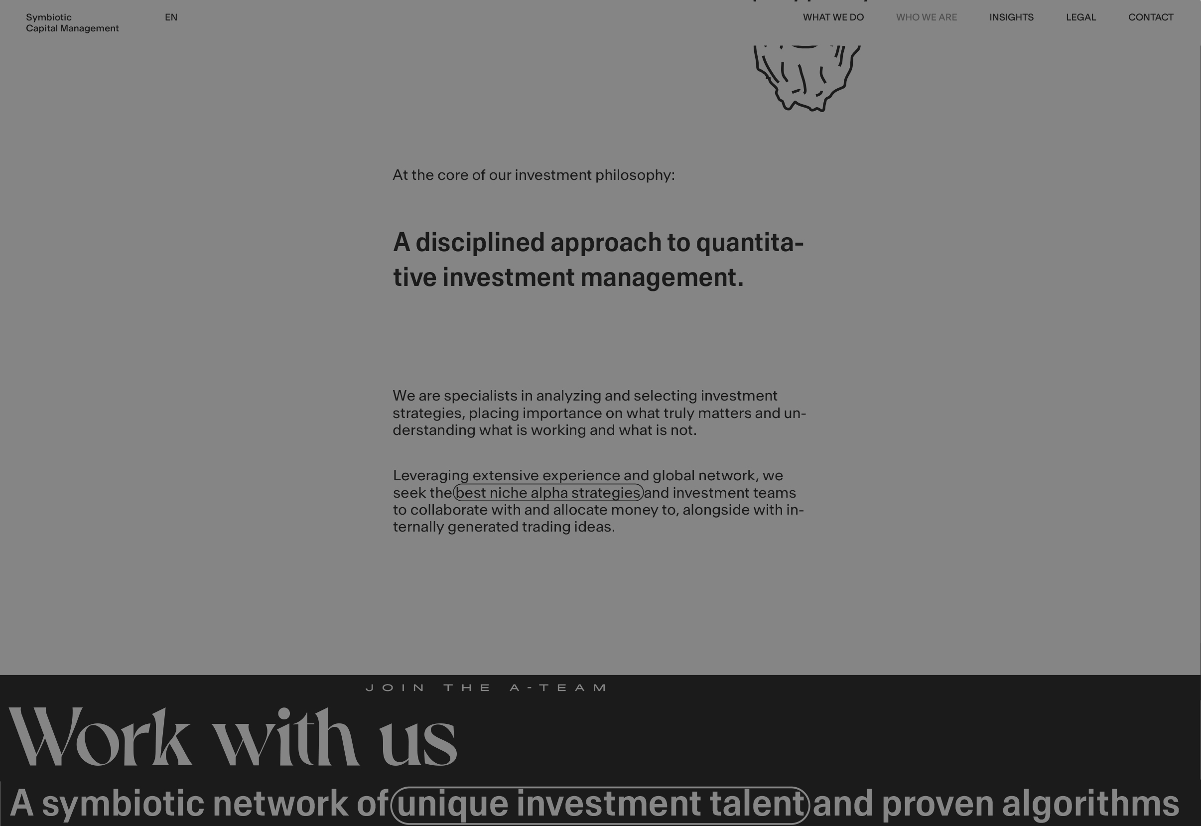
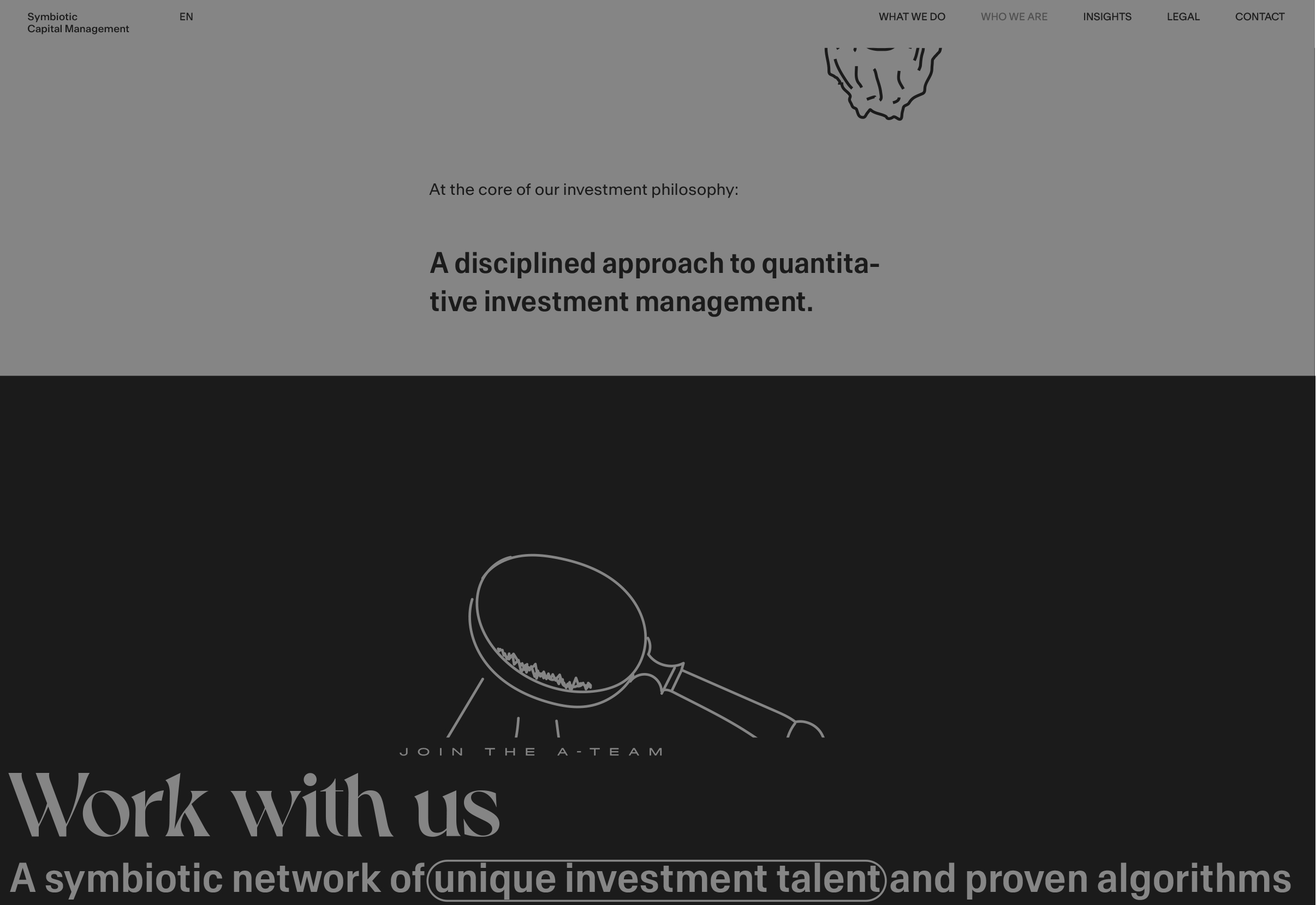
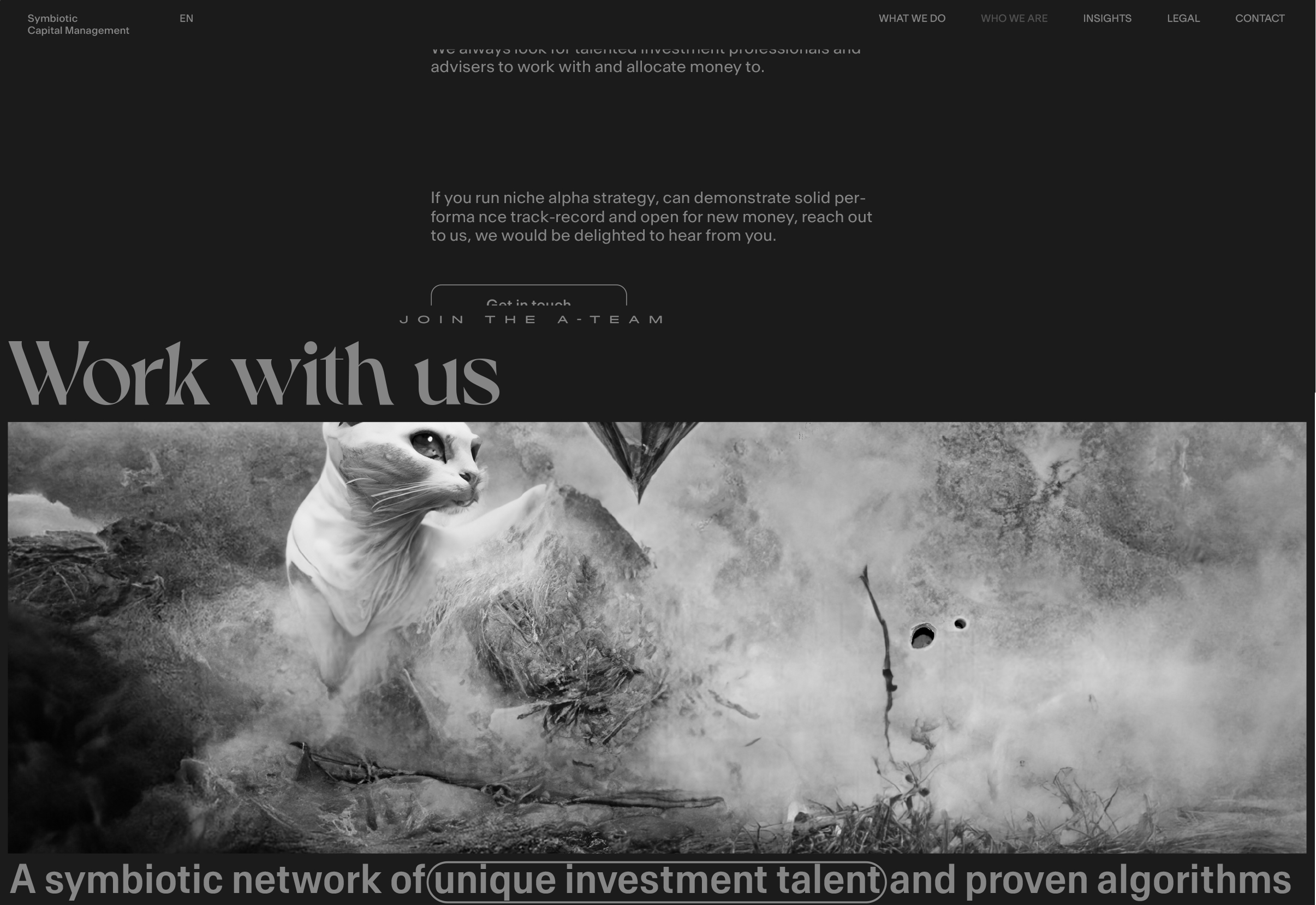
The hero section is slightly lower and without comment (line SVG), which going to appear when the dark background of the previous section will despair or just slightly before it.
Insights
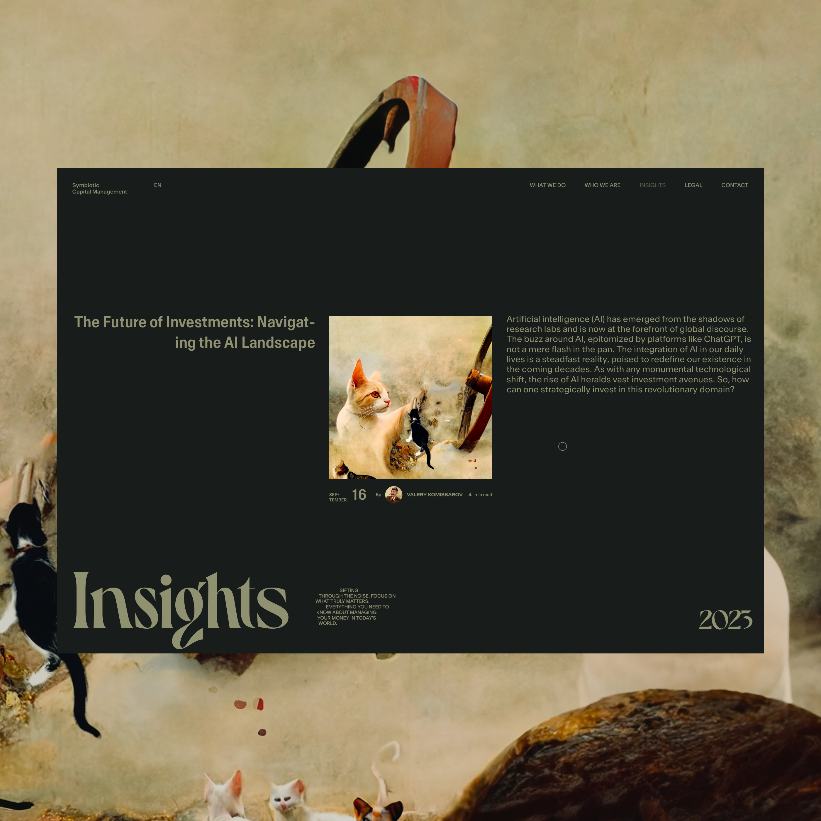
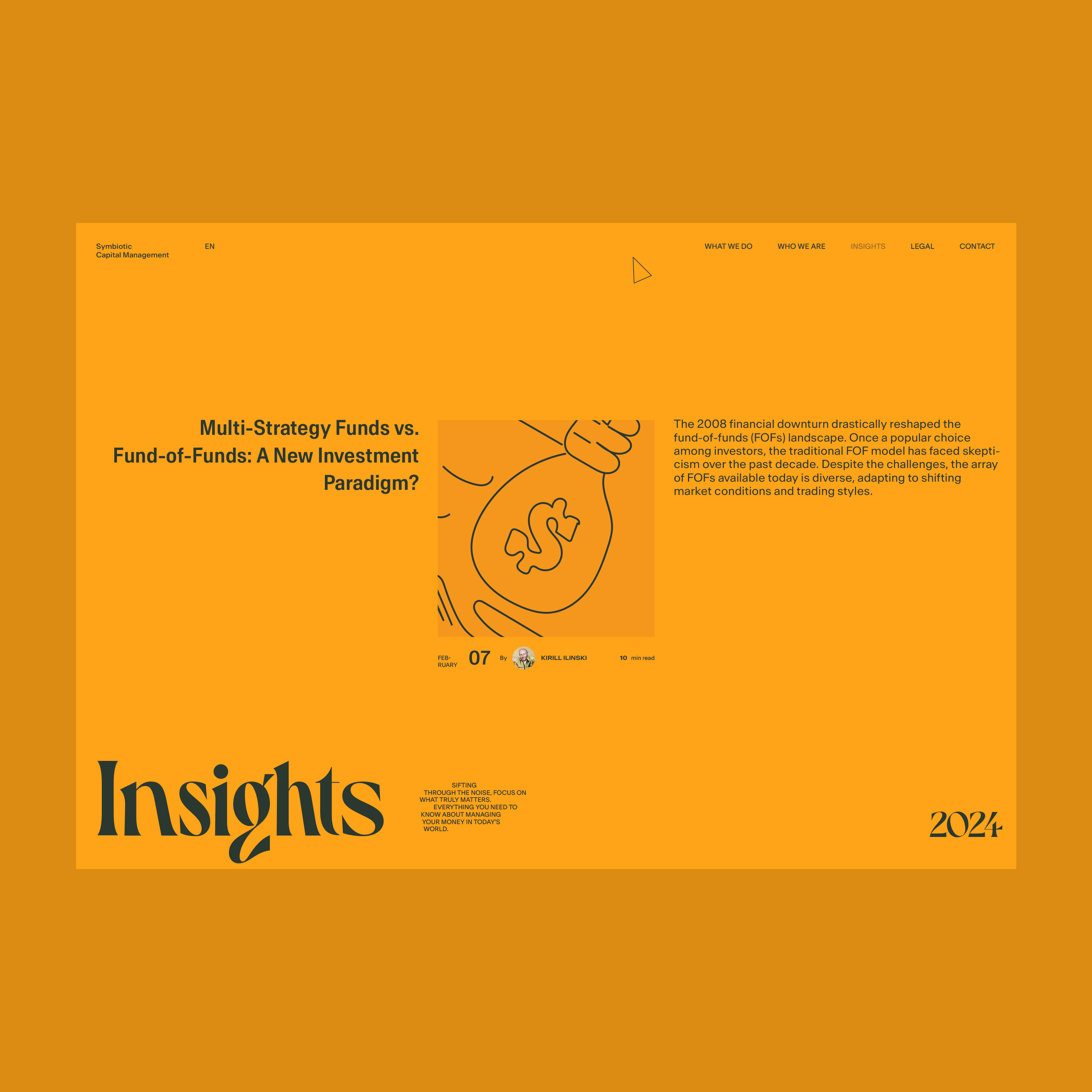
Single post
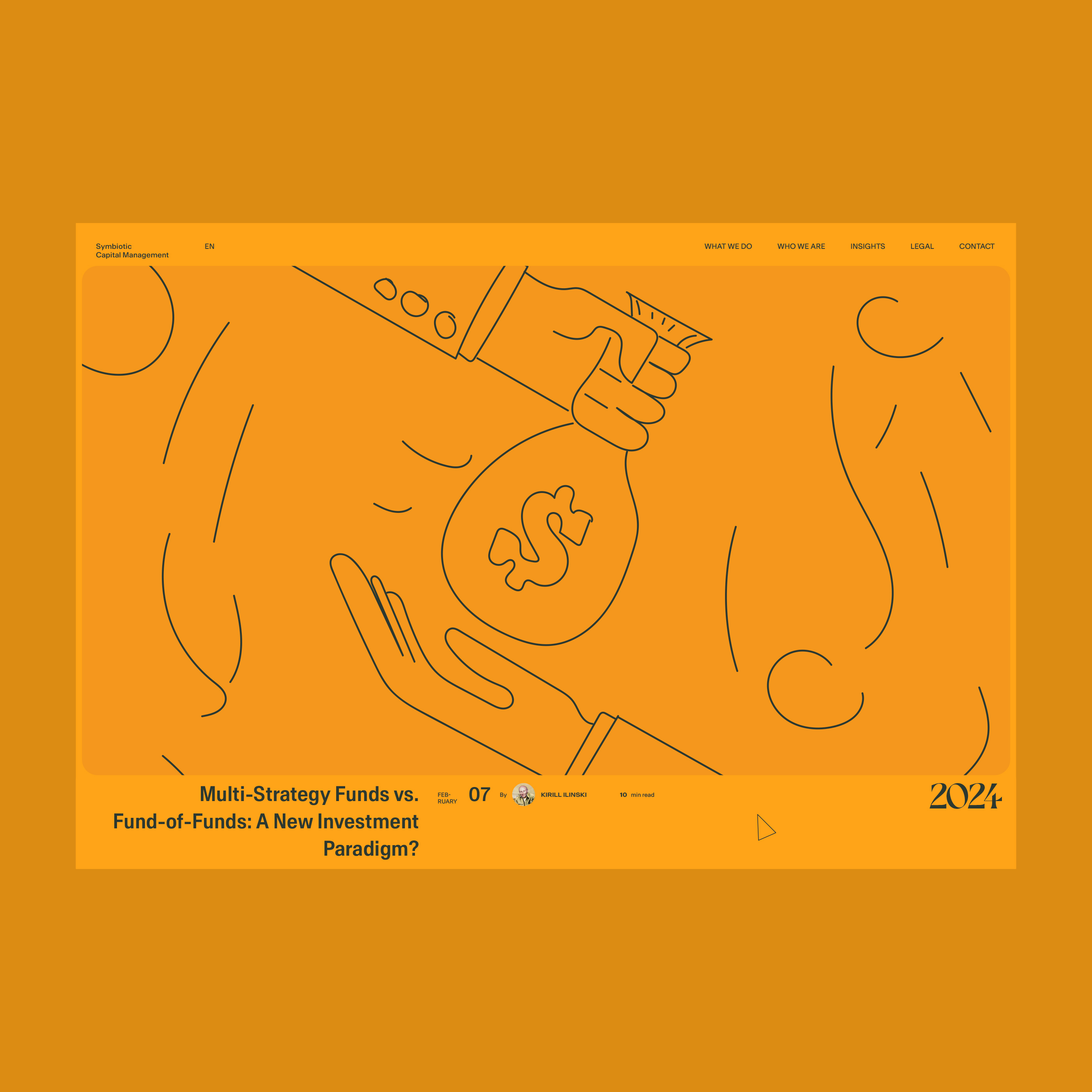
Core screens of the behavior scenario
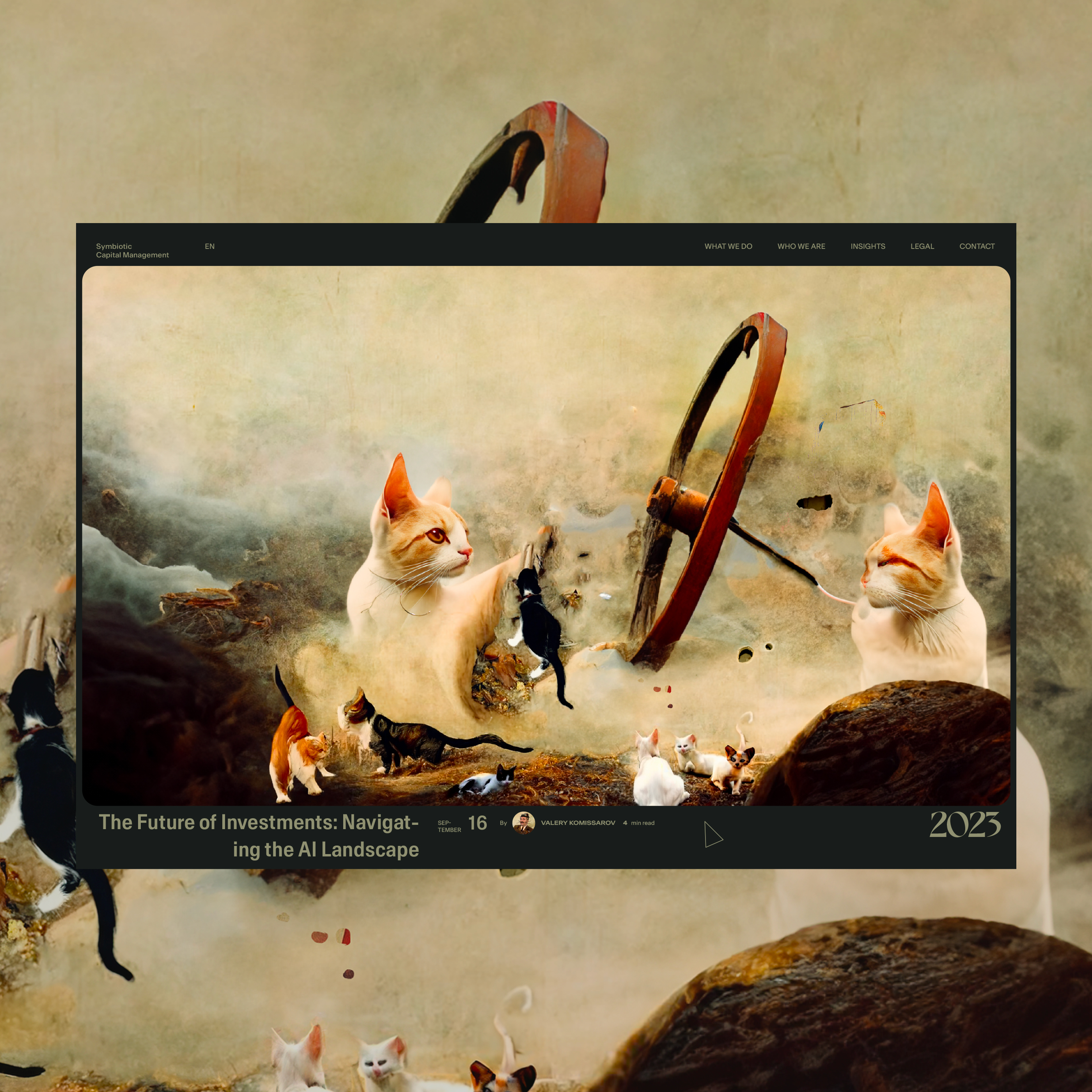
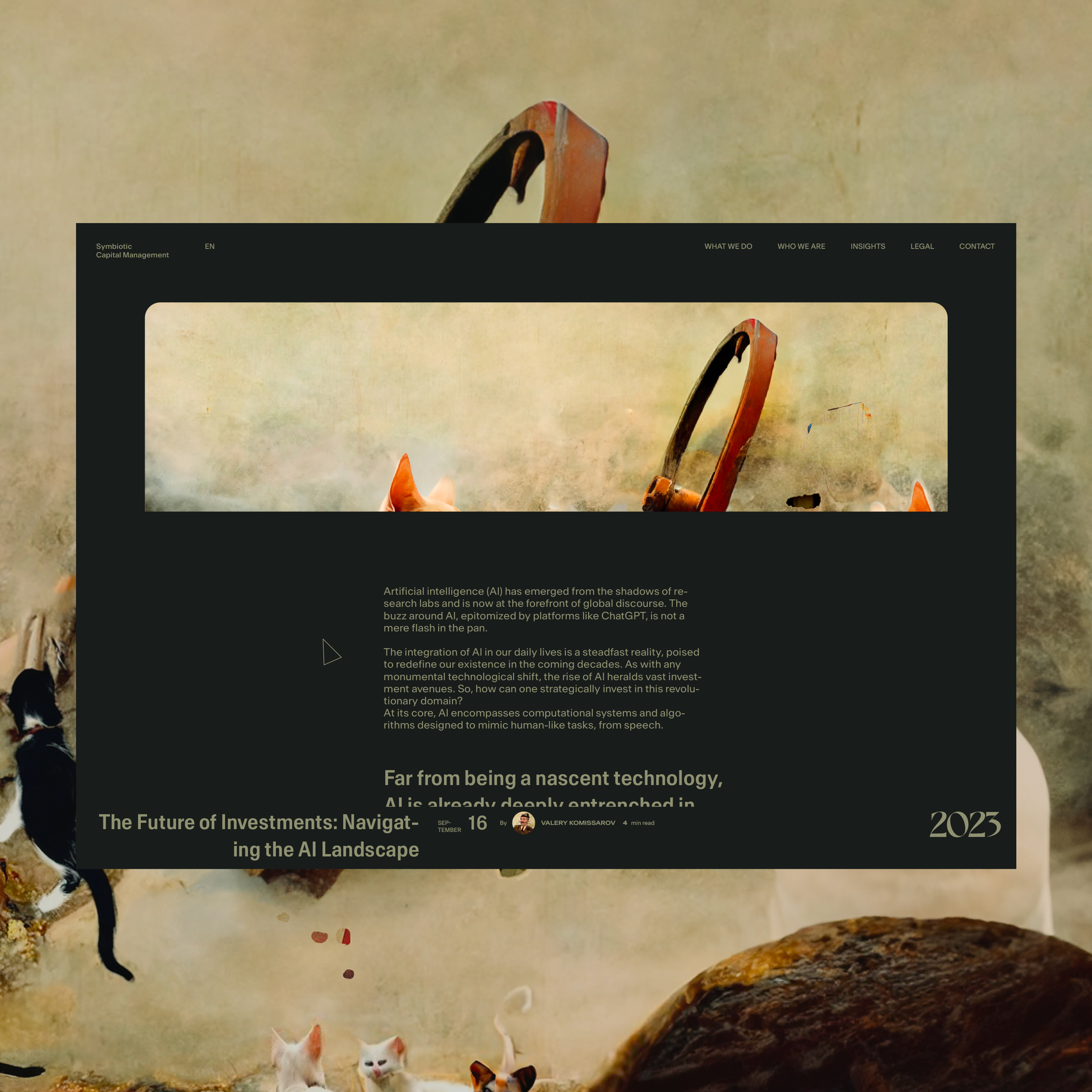
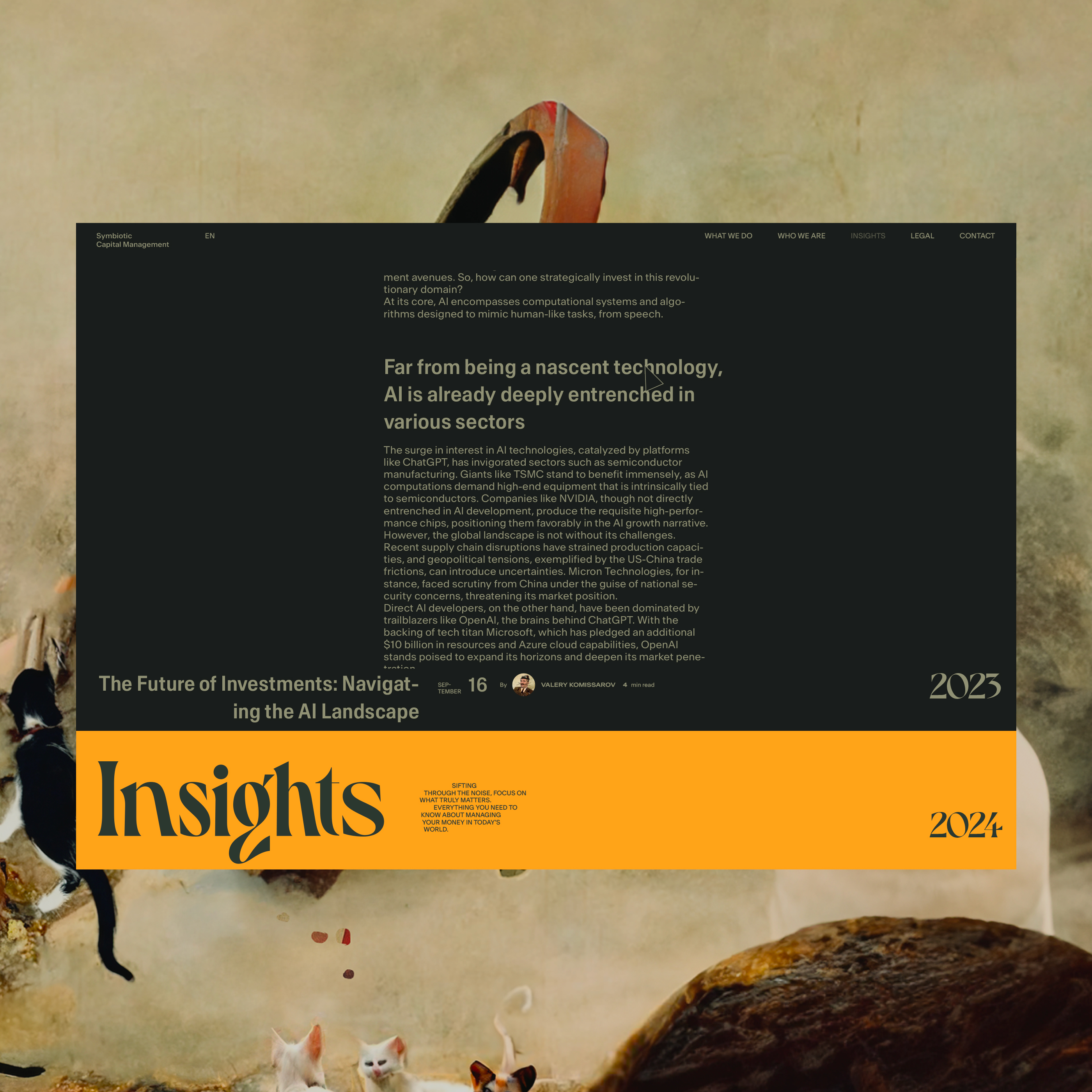
Behavior prototype

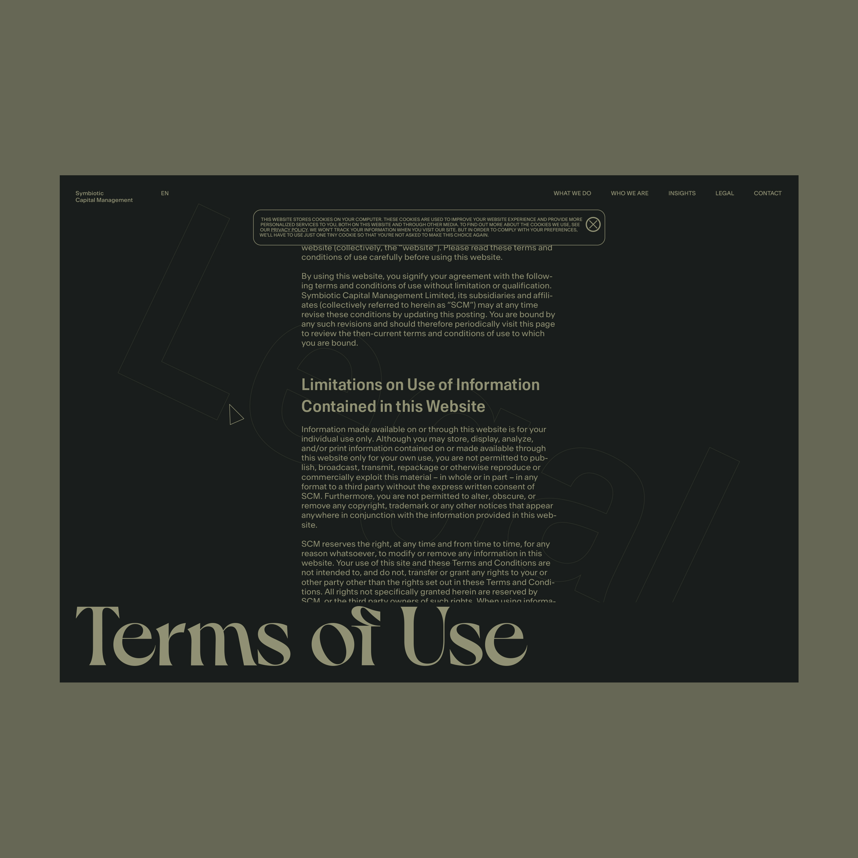
Terms of Use. Legal page template
Contact Us page loader. Prototype
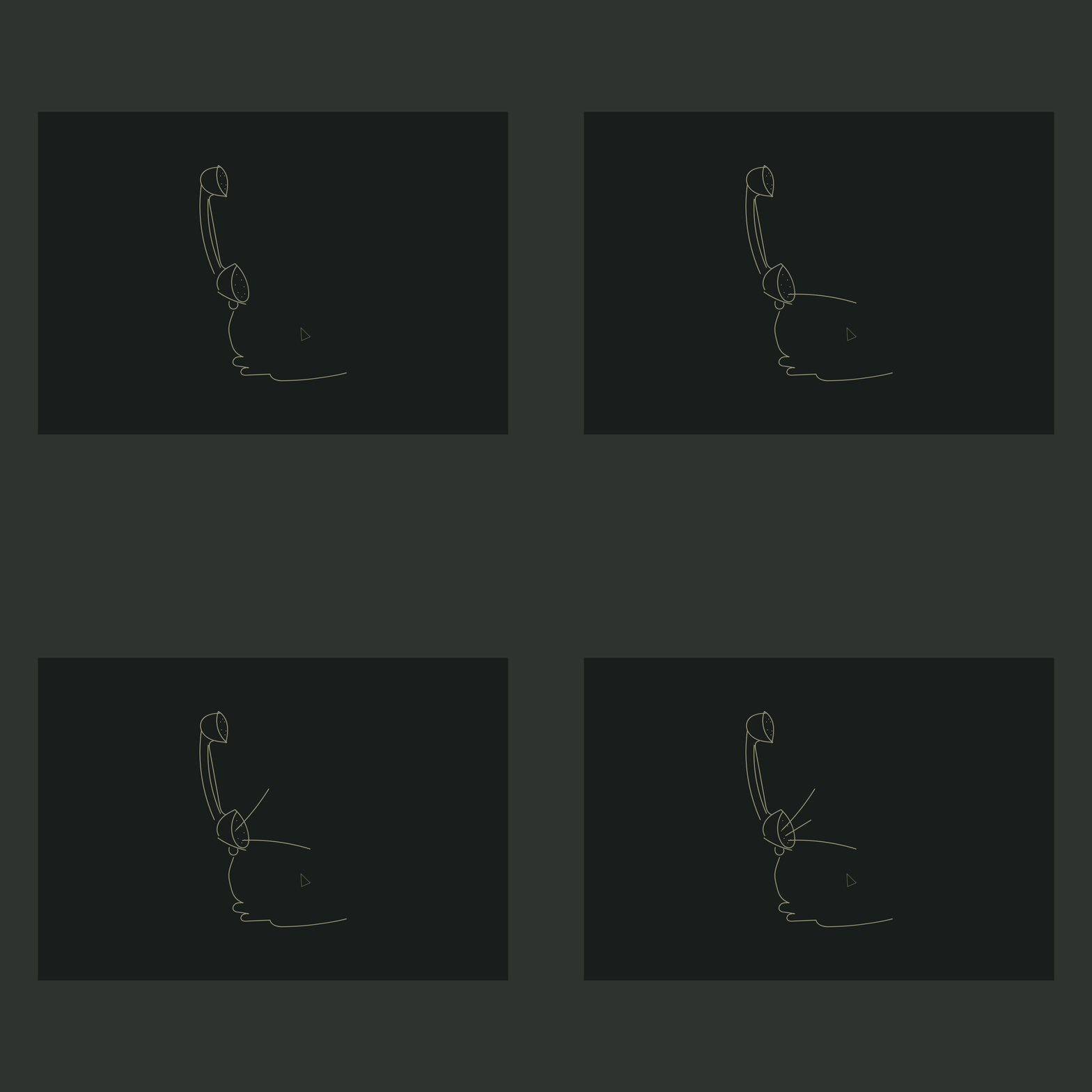
After the execution of the entry animations
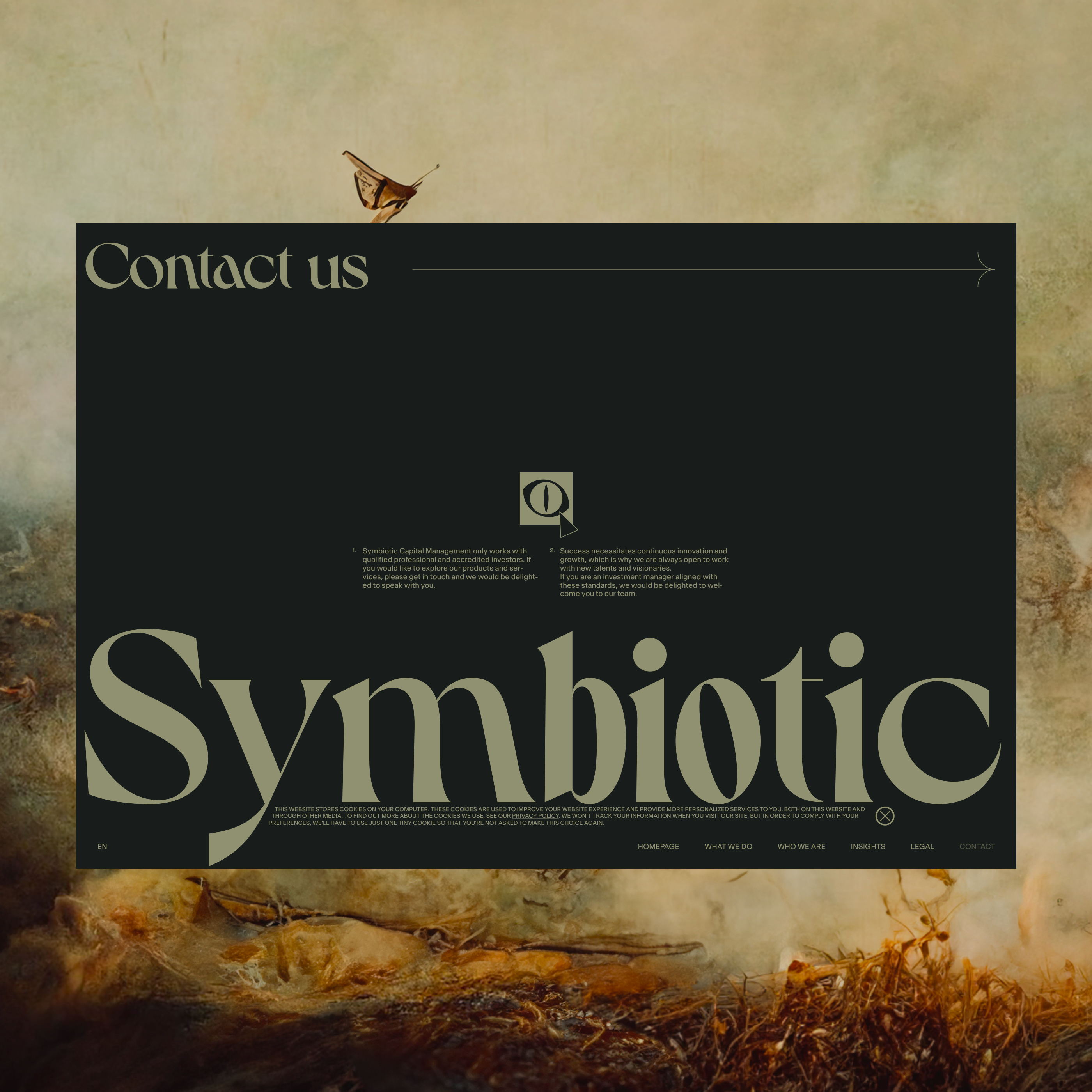
Header section on hover
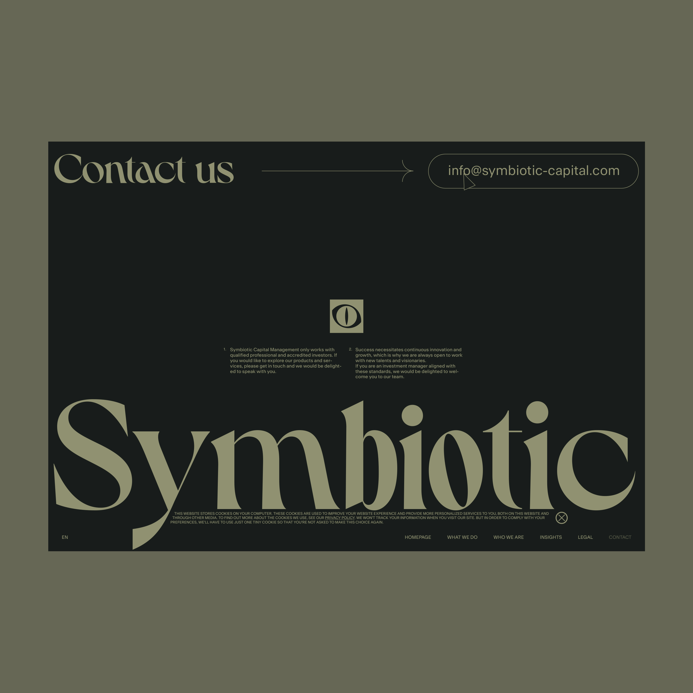
Header section message after click
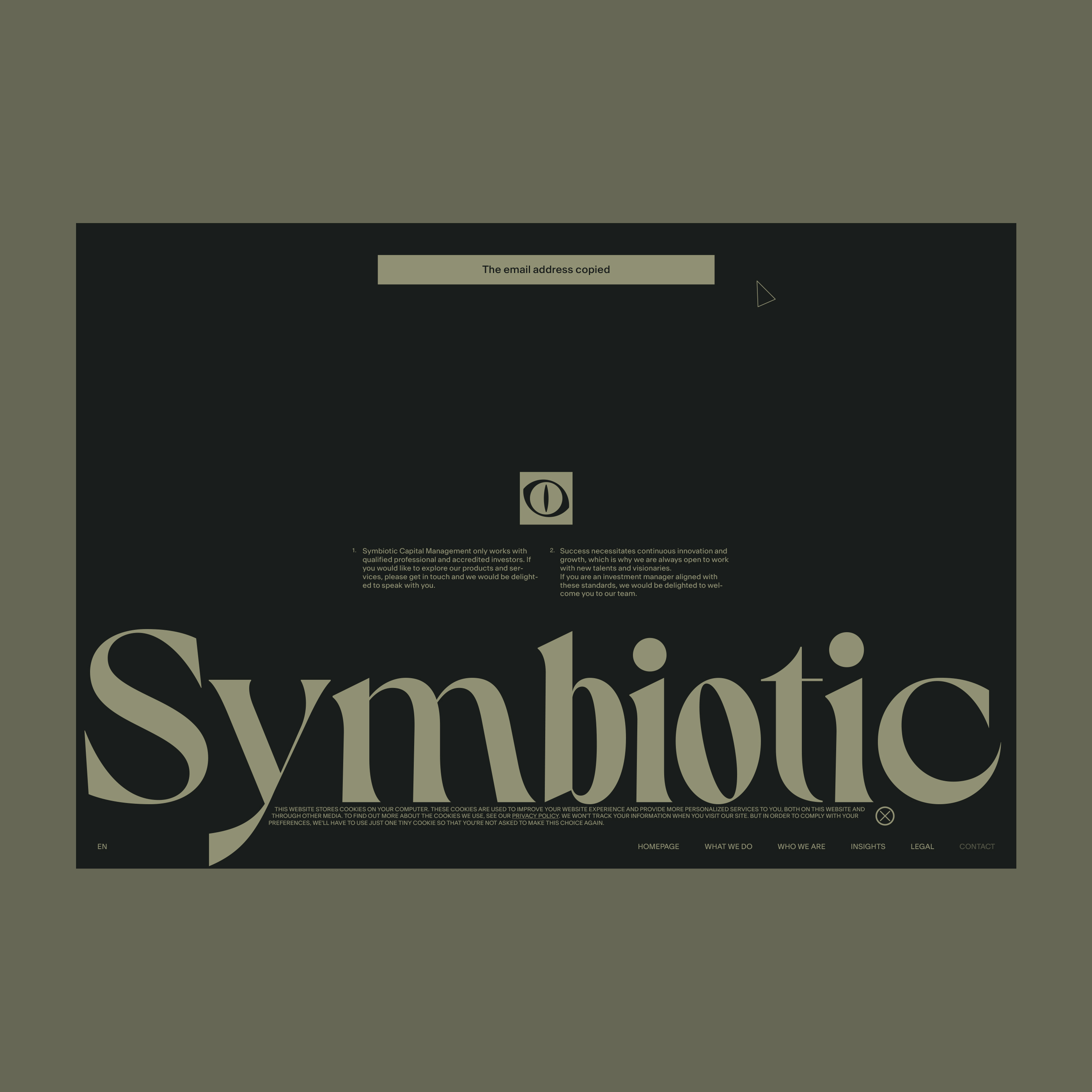
The email copied
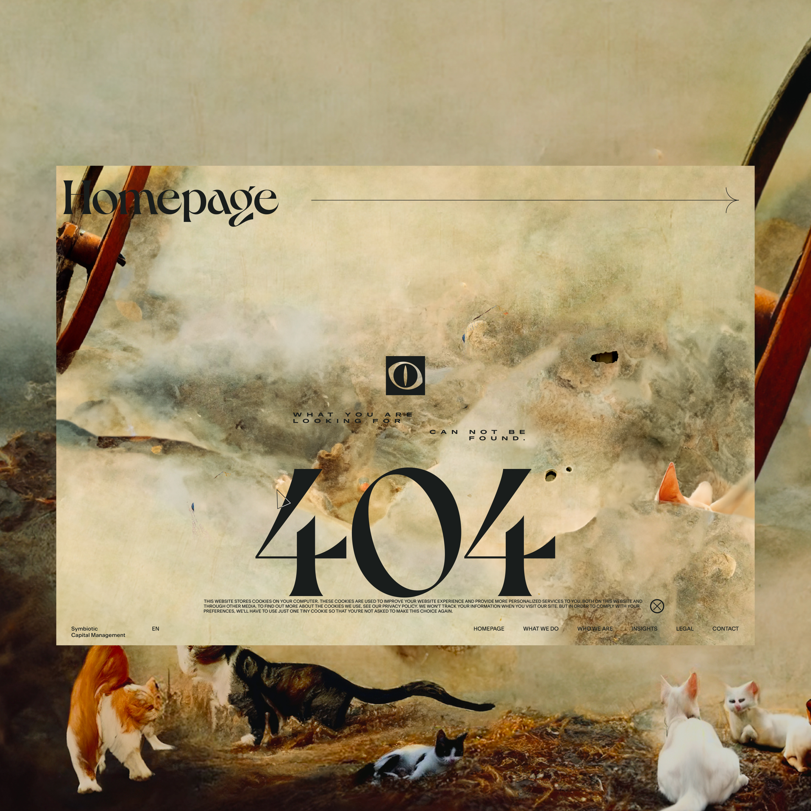
Not Found after the execution of the entry animations
When the page opens the hero image is bigger. Then it’s getting smaller — entry animations.
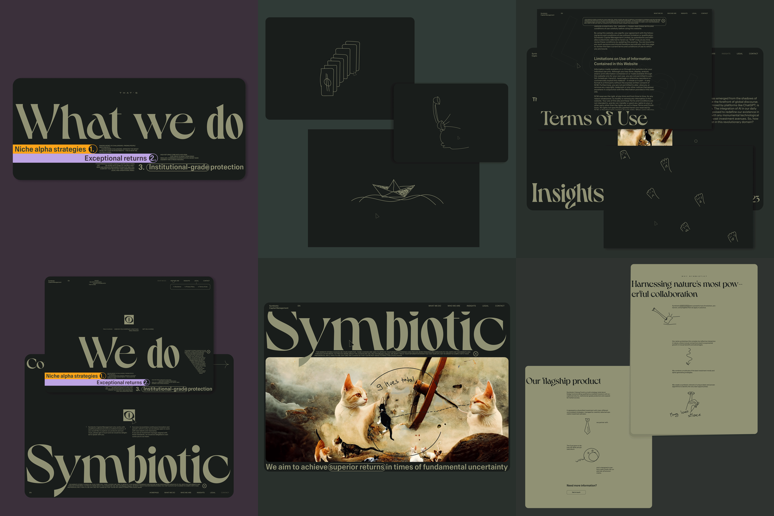
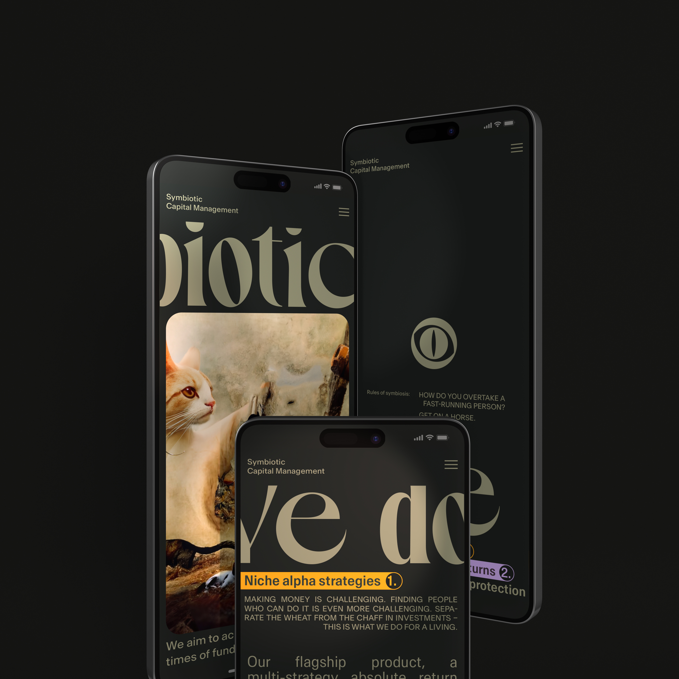
Mobile
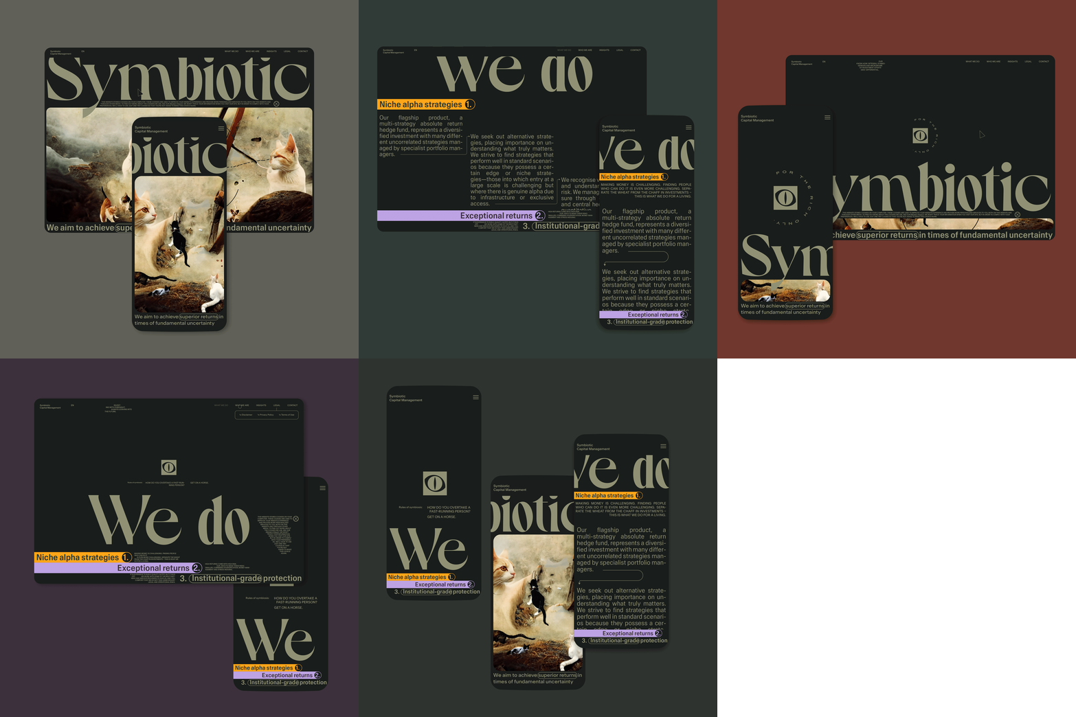
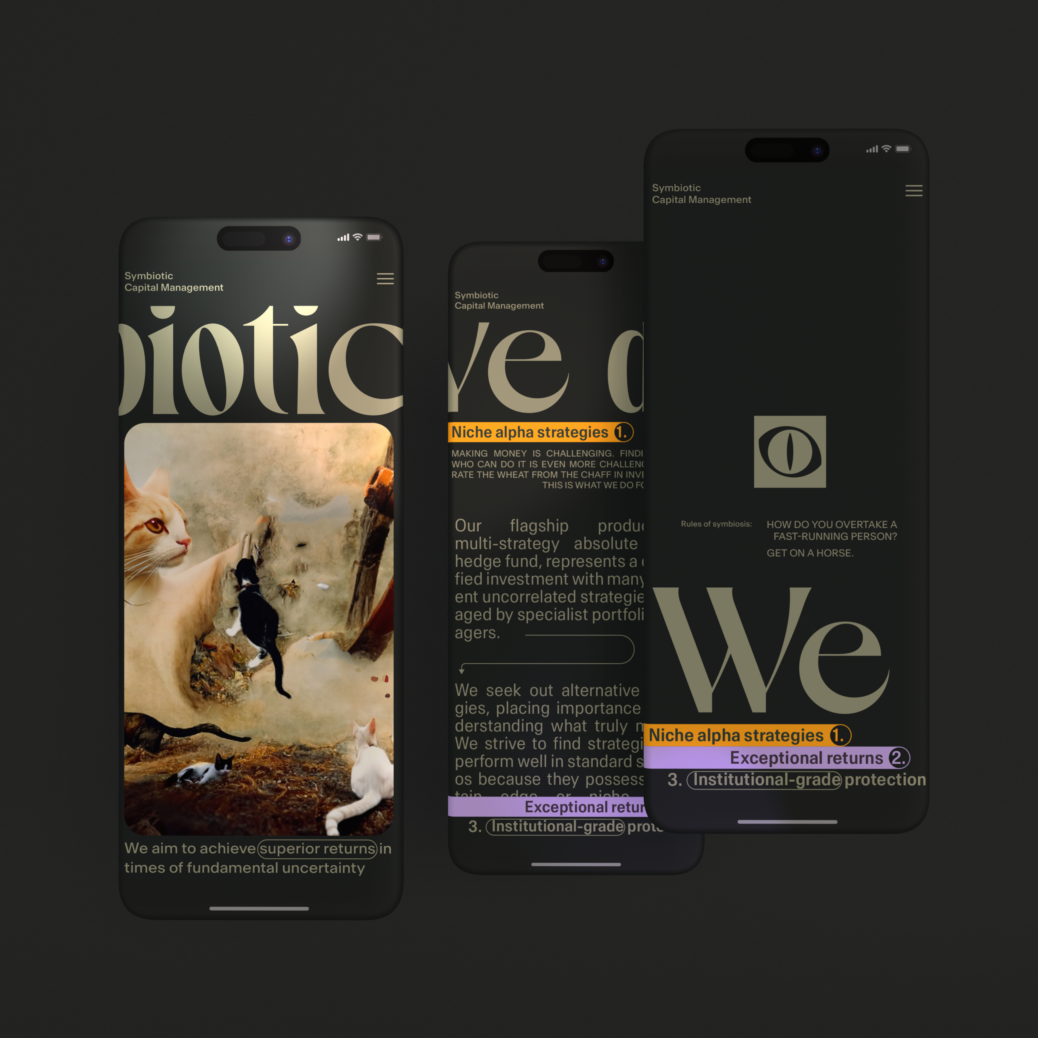
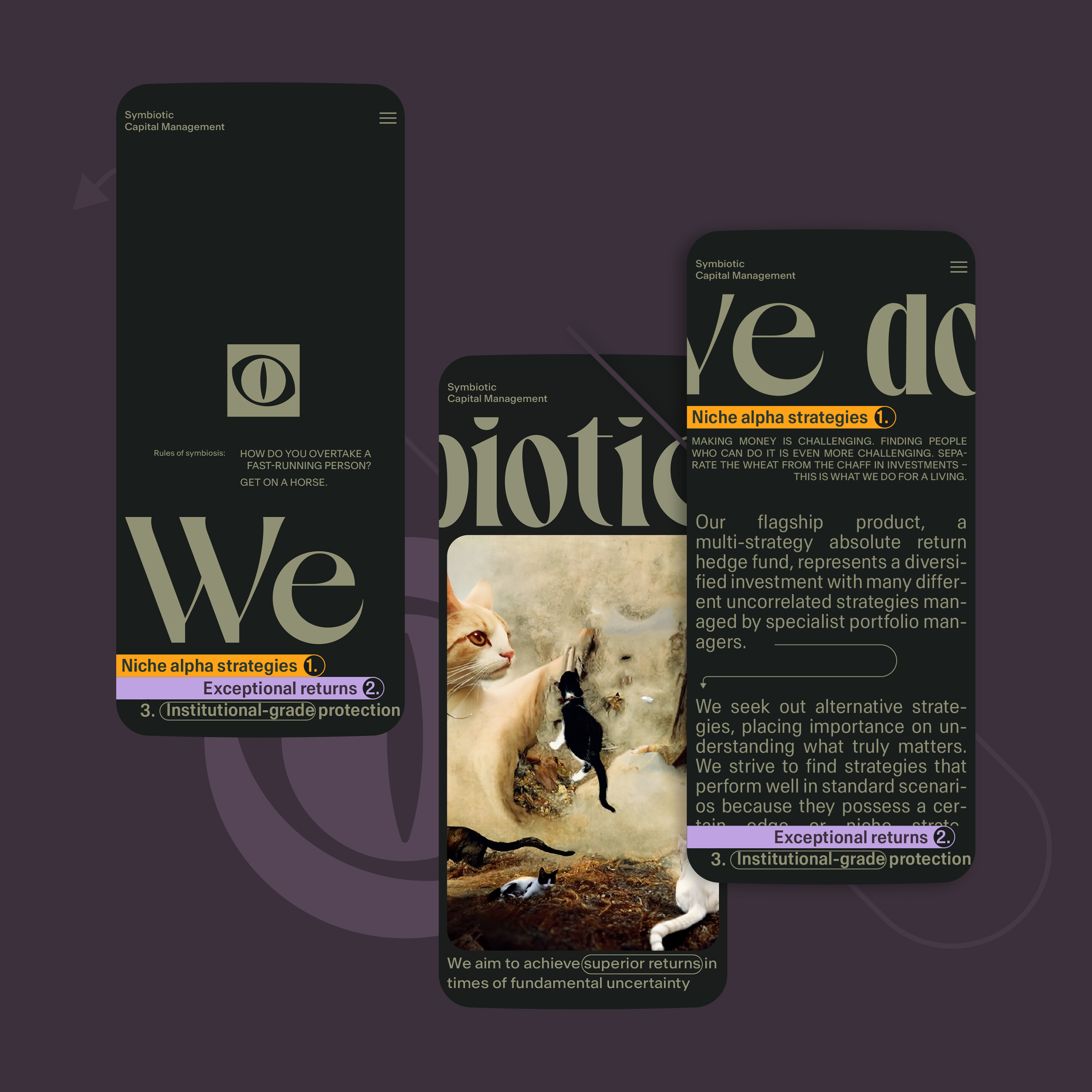
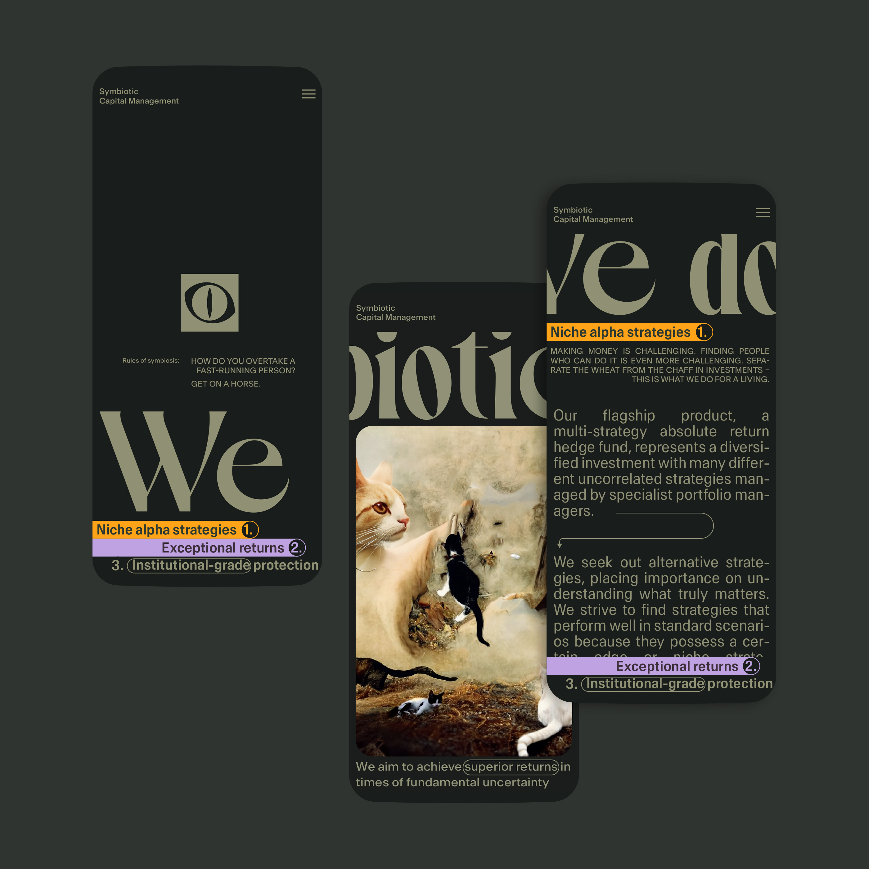
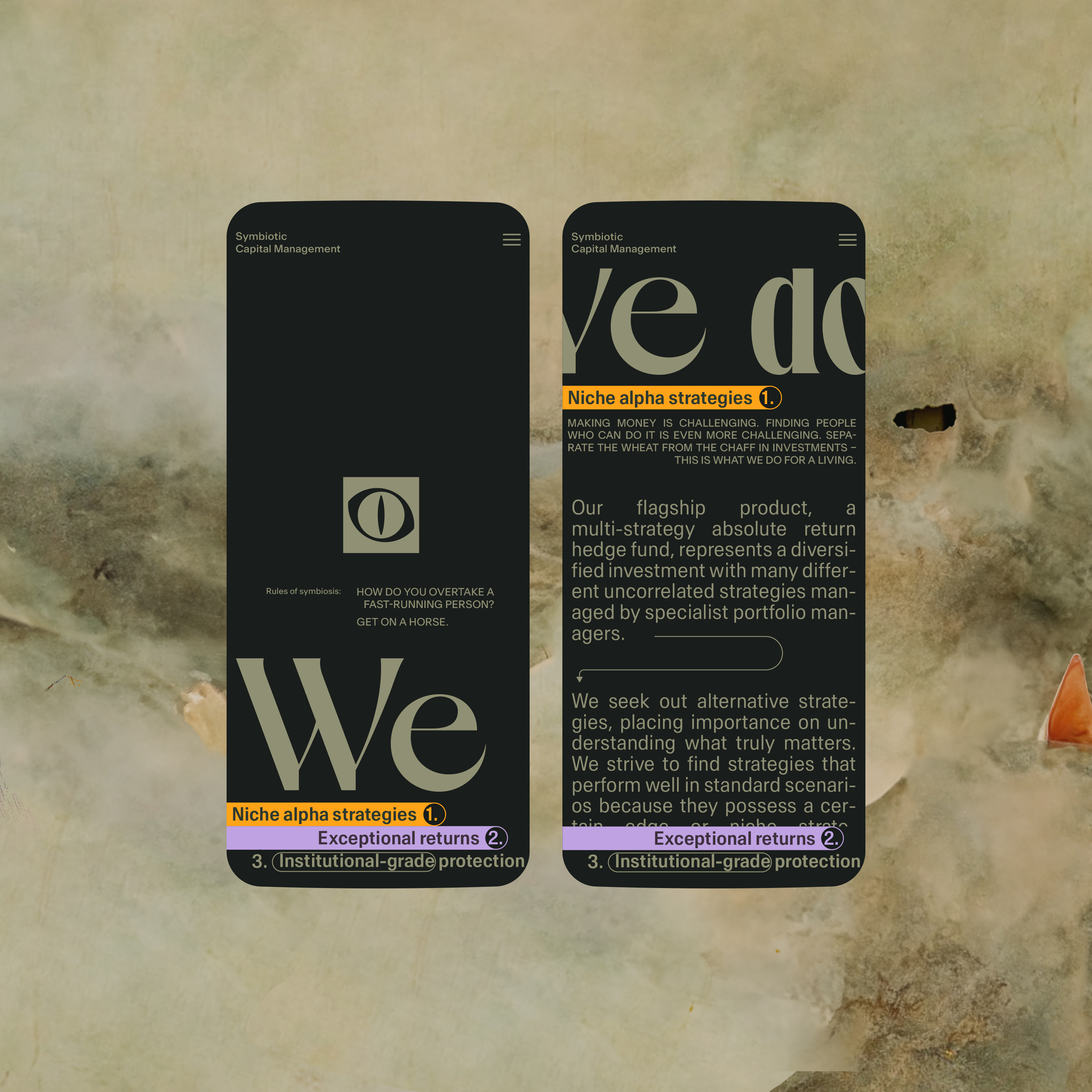
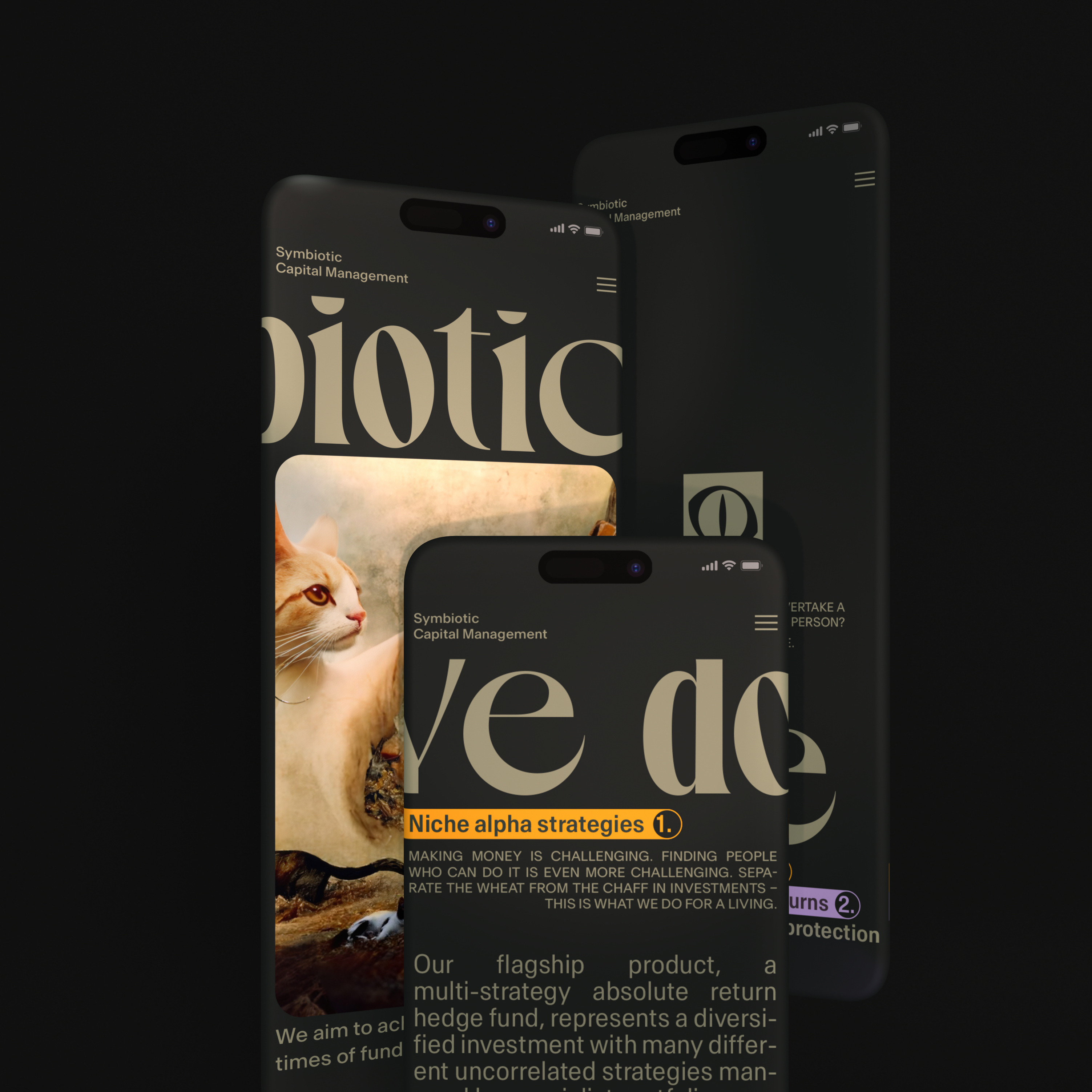
Homepage
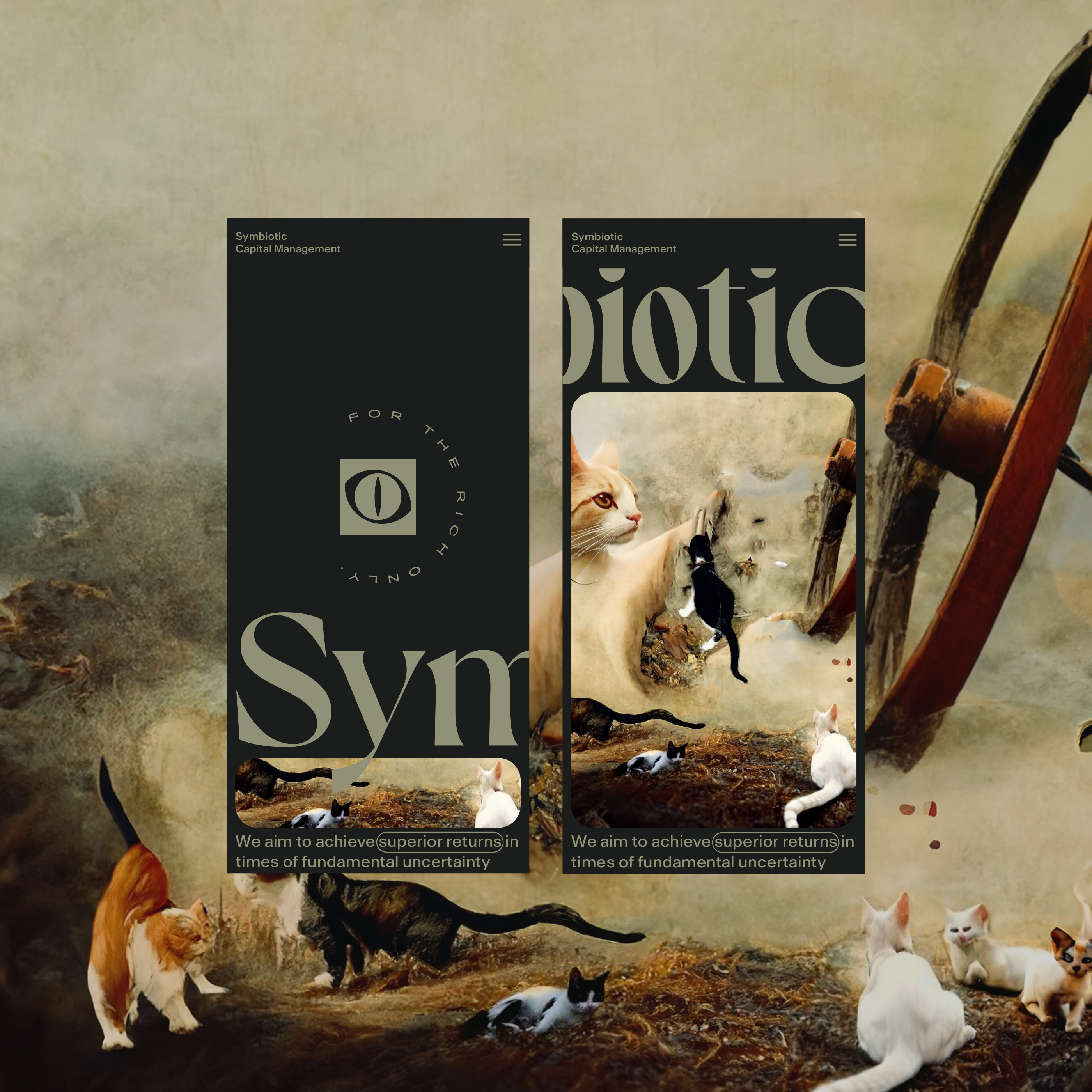
Horizontal behavior of the hero images on mobile
Position sensors are useful for determining a device’s physical position in the world’s frame of reference. For example, you can use the geomagnetic field sensor in combination with the accelerometer to determine a device’s position relative to the magnetic north pole. You can also use these sensors to determine a device’s orientation in your application’s frame of reference. Position sensors are not typically used to monitor device movement or motion, such as shake, tilt, or thrust.
What We Do
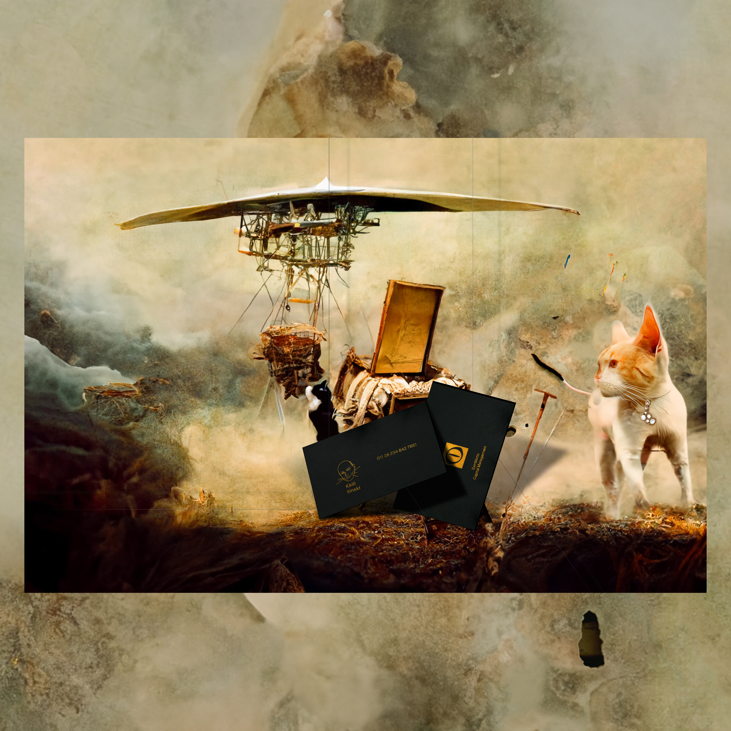
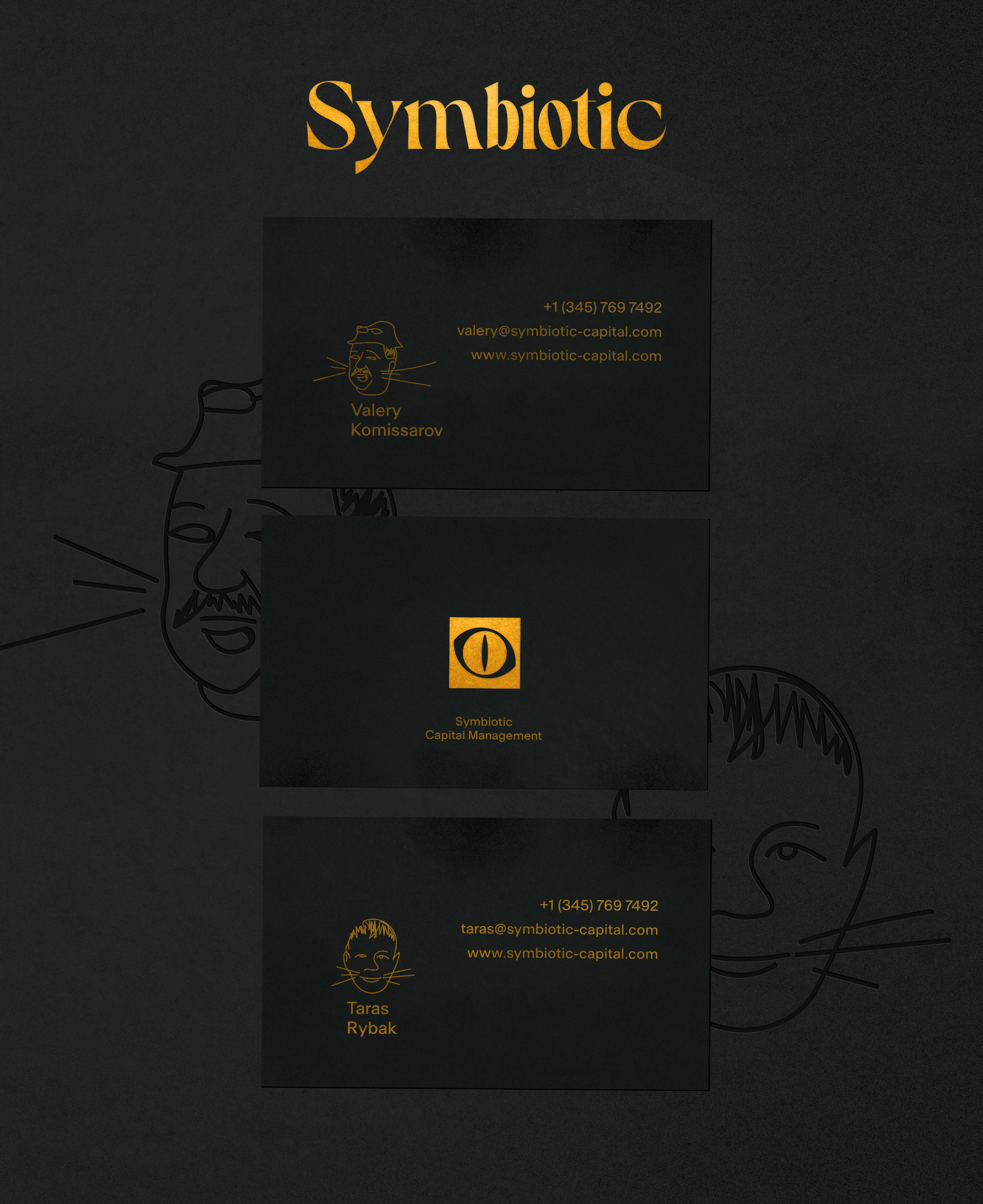
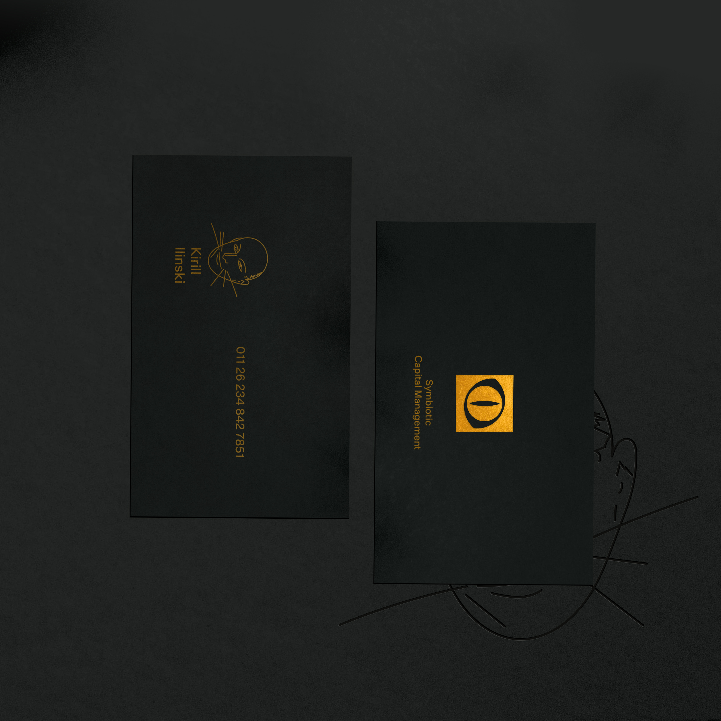
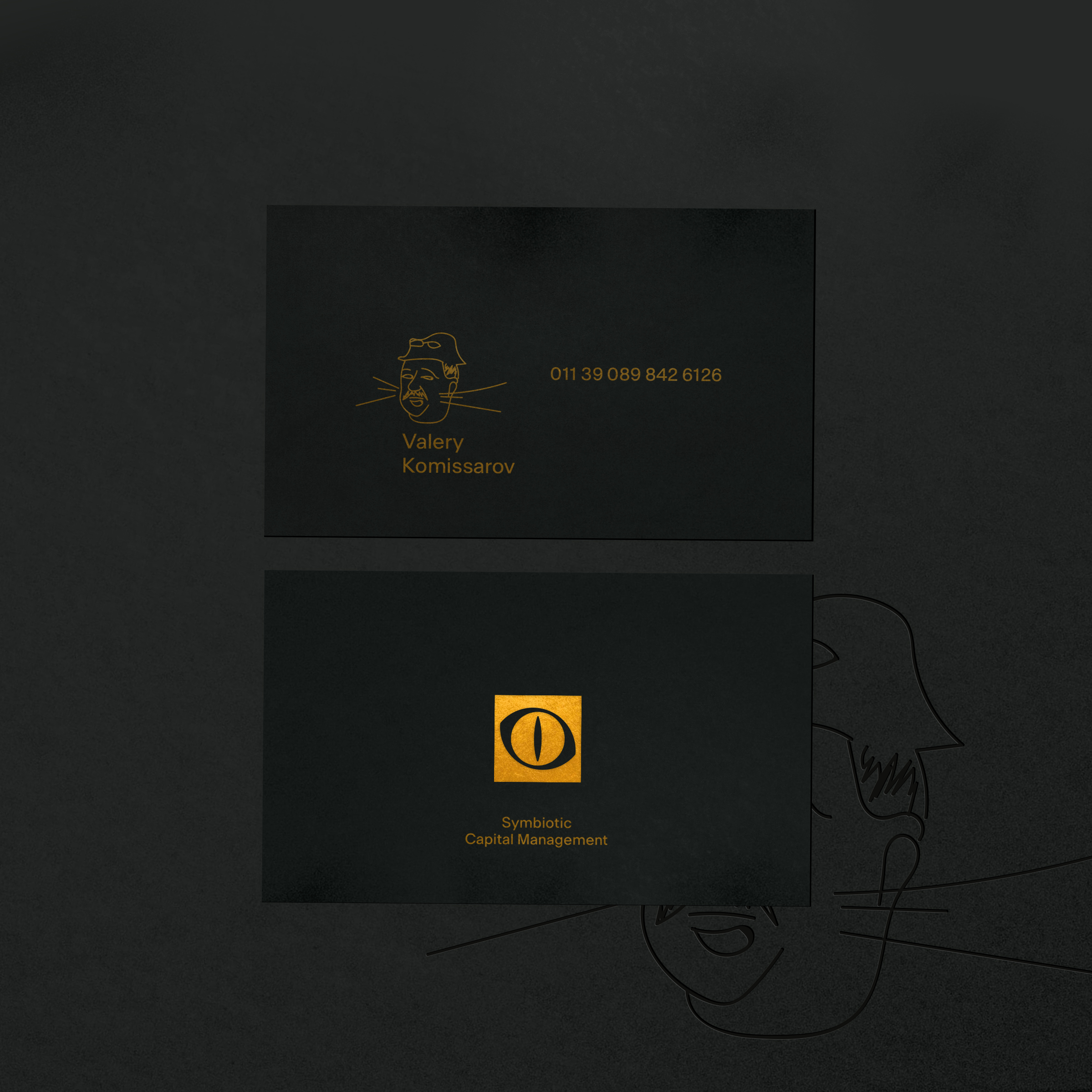
Business cards
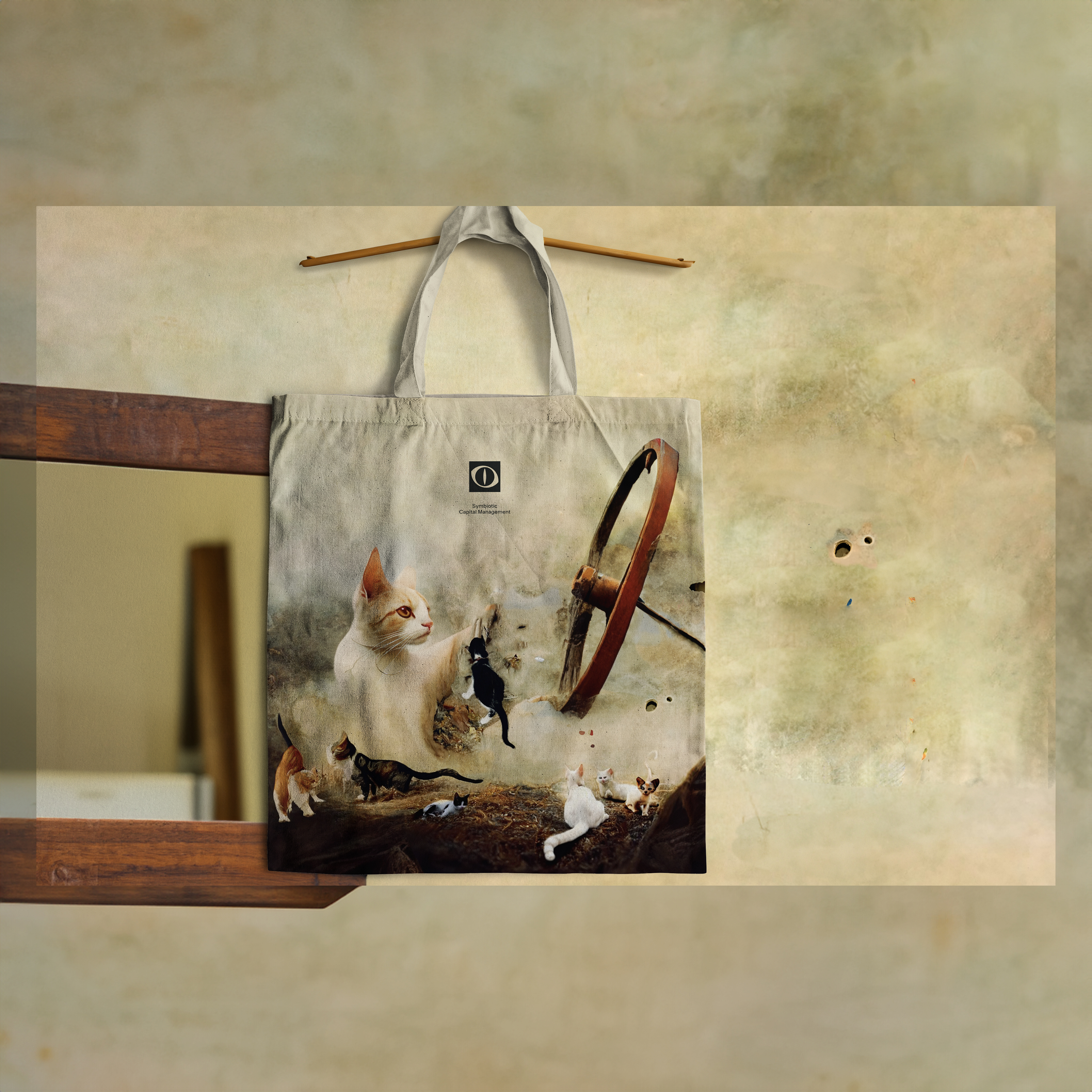
Brand application
Artwork “Nine lives”, logomark, and company name on the tote bag.
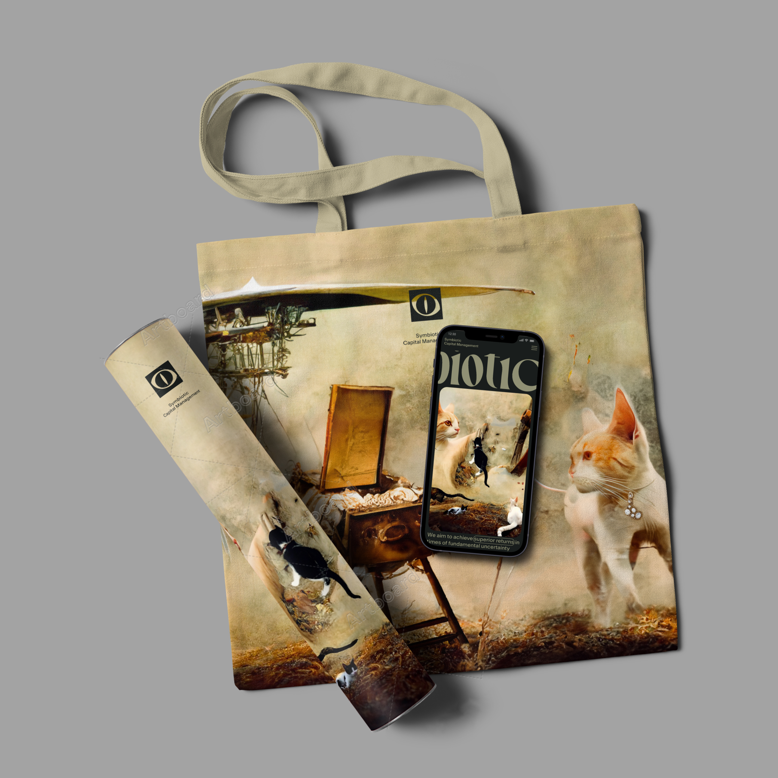
Artwork “Escape Attempt” on a tote bag, a paper tube, and a screen on the iPhone 13 with the “Nine Lives. Heaven” artwork.
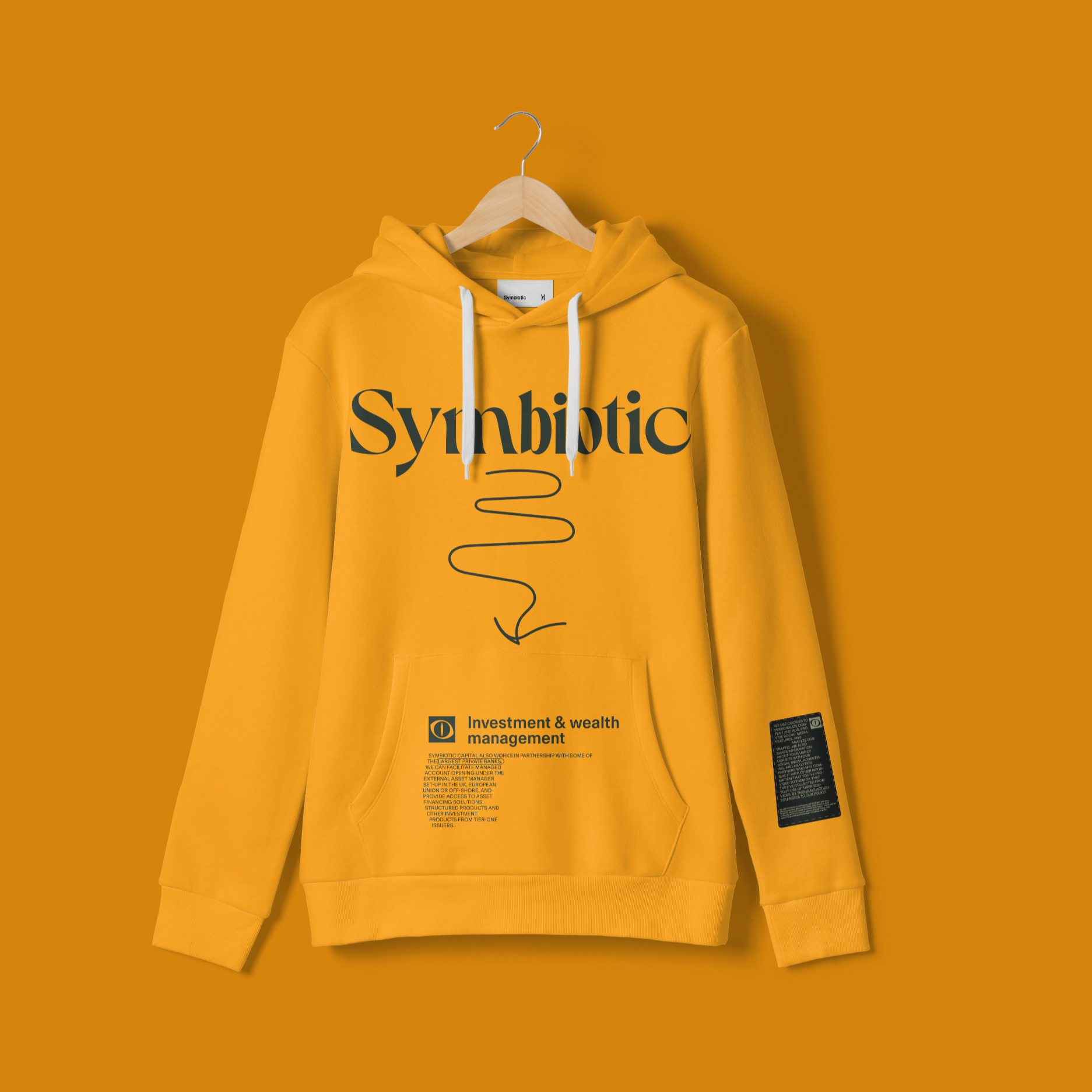
Hoodie with the “People who know their worth” illustration.
Artworks
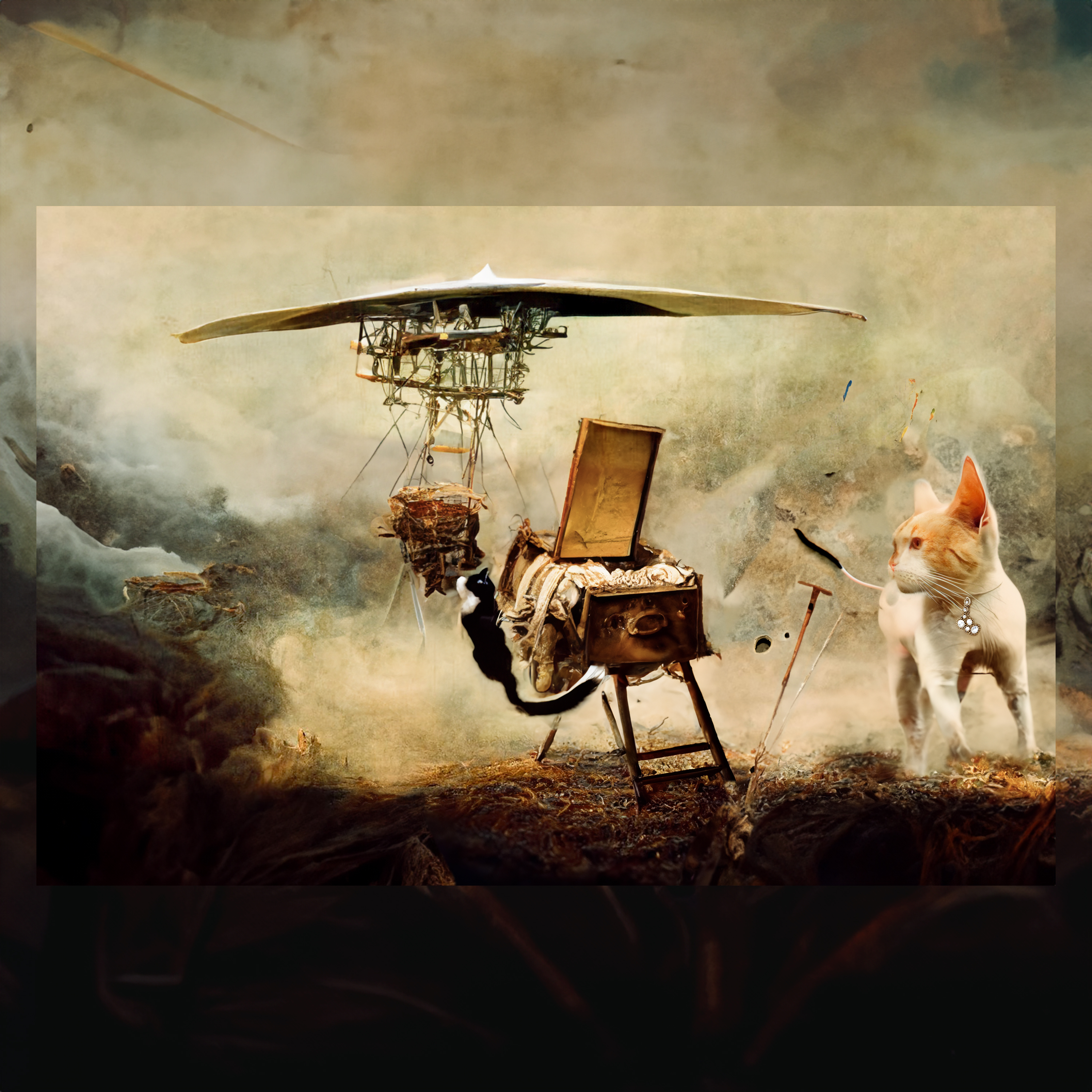
Classic painting (it always smells like big money — for the rich only).
— Main character — cat. An adaptation of the image of a cat that: nothing is afraid of heights and always lands on all fours, sees in the dark, has 9 lives, soft and fluffy, but a fearless predator.
— Comments and notes explaining the art are drawn on top of the art with the digital pen. The pen drawings can be used also on top of the solid color to illustrate the text.
“Nine lives. Heaven”
For the landing website page.
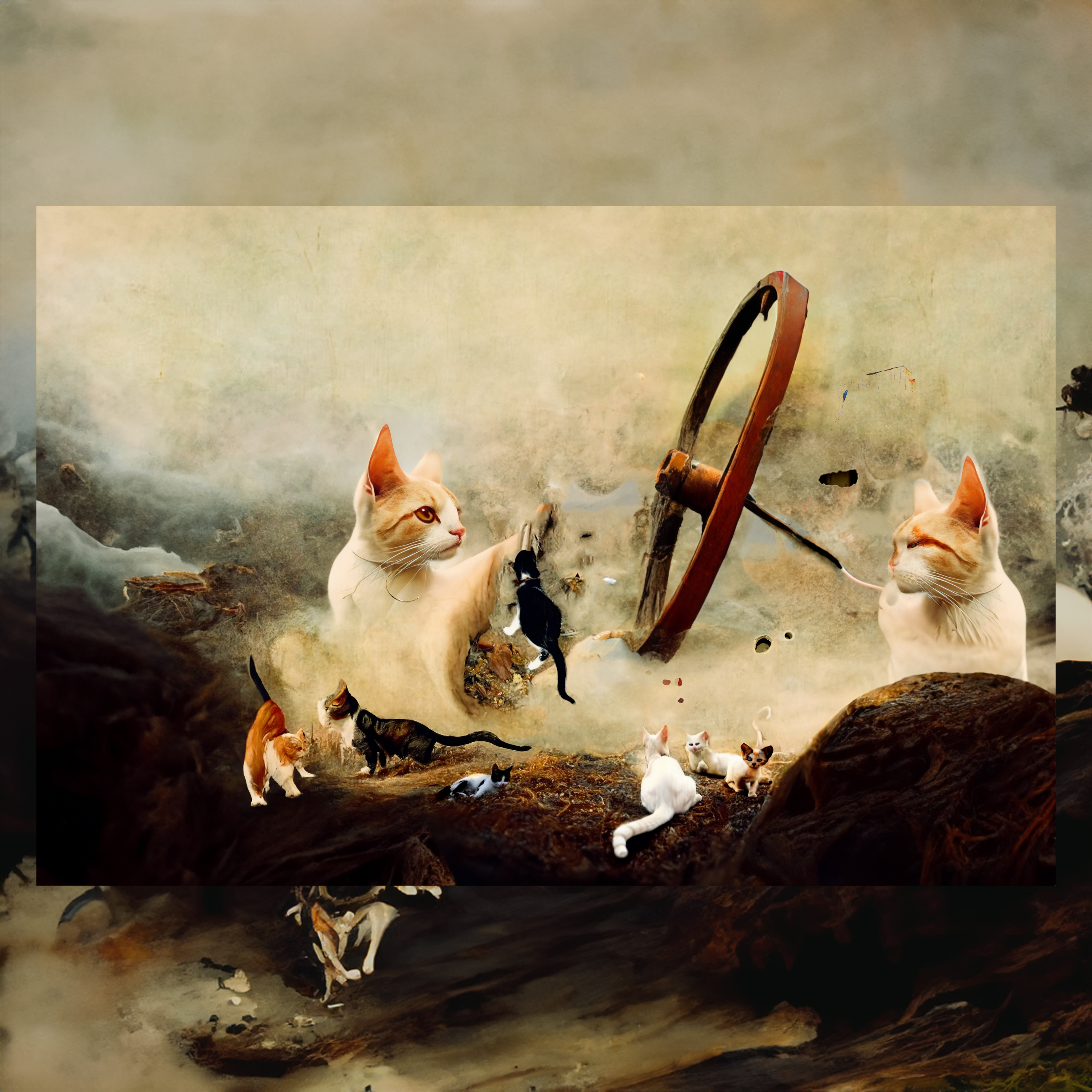
“Hide and seek”
For the Not Found website page. Since the main action is the link to the homepage, the artwork uses a recognizable landing artwork element — a wheel.
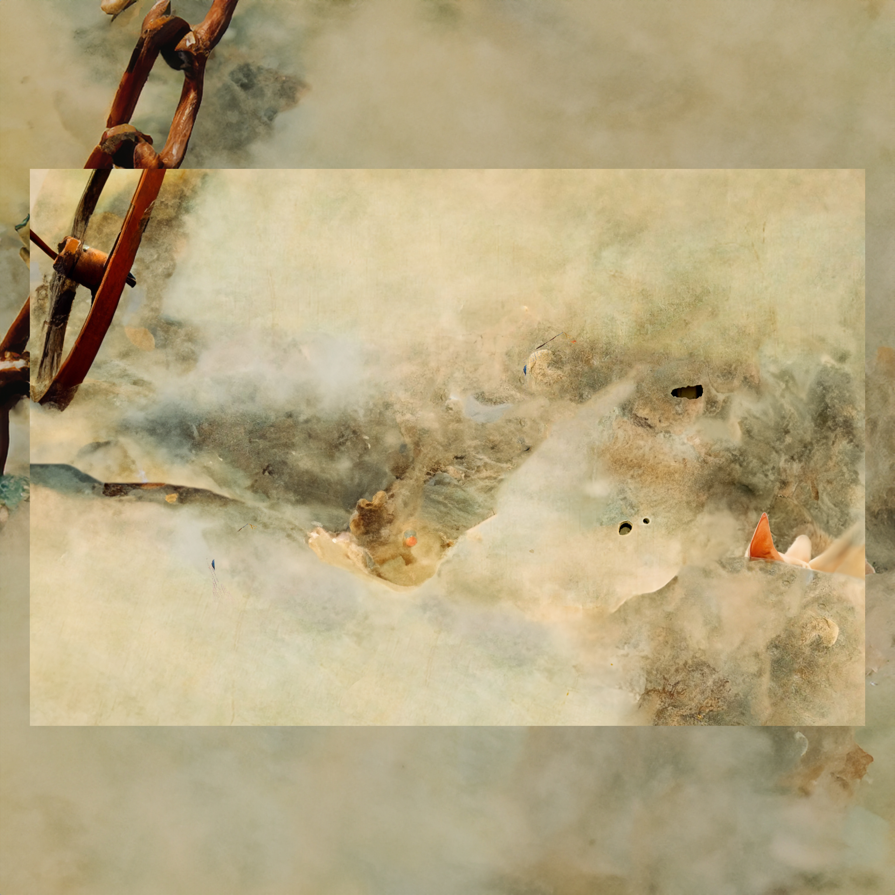
“The keeper”
For the Who We Are website page.
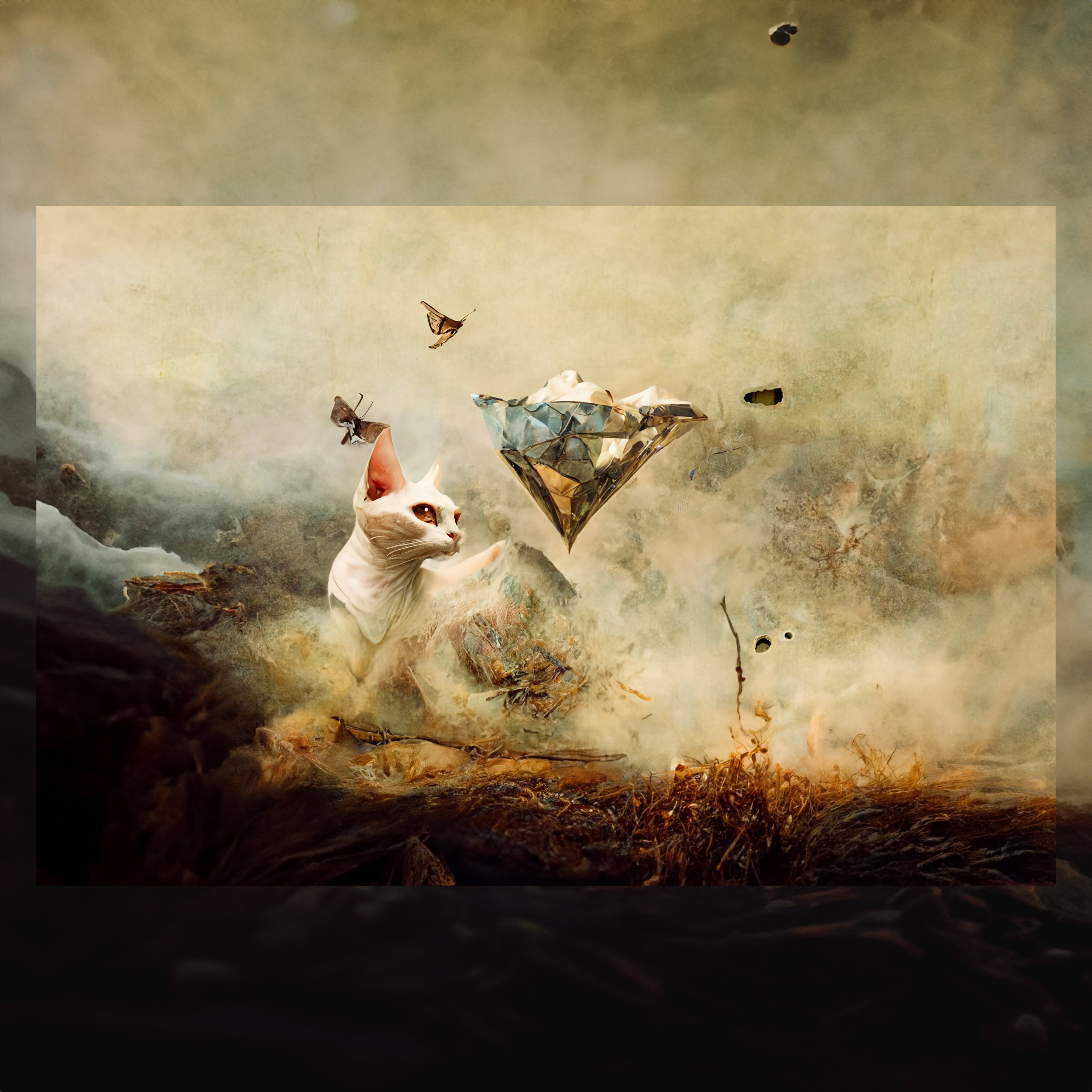
“Escape attempt”
Sometimes you want to run away even from heaven. For the business card presentation.
Professor”. Kirill Ilinski
For the Who We Are website page About Us section.
“The aviator”. Valery Komissarov
For the Who We Are website page About Us section.
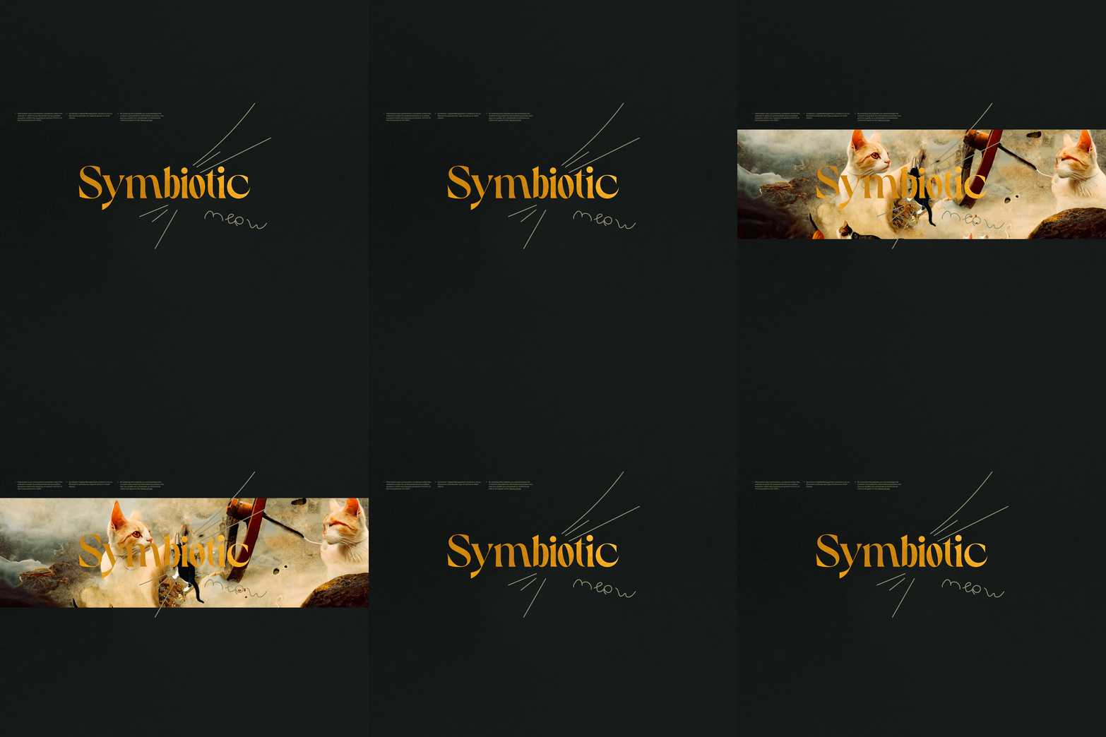
Meow
Used instead of Thank You!

Client feedback
Taras Rybak (Partner, Wealth Management Firm), financial services, United Kingdom.
Arrowww exceeded all my expectations. Their communicative and responsive approach resulted in a smooth partnership. They were creative, attentive, and easy to work with.
Taras Rybak. October 03, 2023
Project summary.
Arrowww designed a dynamic and adaptive website for a wealth management firm. The goal was to create an identity, website design, and all necessary brand components.
Why did you select arrowww over others?
Examples of creative design work.
Describe the scope of work in detail. Please include a summary of key deliverables.
We considered creating an identity, website design, and all necessary brand components. We needed to design a dynamic and adaptive system embracing the idiom of the finance field and design, flexible enough to be carried through all touchpoints digital and print.
What were the measurable outcomes from the project that demonstrate progress or success?
Our project was very challenging. We put together a detailed brief with relevant associations and some ideas, but the main and only goal was that branding and design needed to have a WOW factor. That was very difficult to measure. As a result - we got just that! Arrowww managed to propose an amazing concept that we agreed to as soon as we saw it. We had some minor comments, but almost everything was perfect from the start!
Describe their project management. Did they deliver items on time? How did they respond to your needs?
The project management and the whole communication process were perfect. The work was delivered on time, response was almost immediate (keeping in mind we have a 6-hour time difference). Any comments we had, were addressed promptly and we never had to return to the same thing twice.
What was your primary form of communication with arrowww?
- Virtual Meeting
- Email or Messaging App
What did you find most impressive or unique about this company?
The whole experience was great - work was delivered on time, communication was good, etc. But I was most impressed with the creativity, and the ability to listen to the client and get a feel of the "emotional aspect" of the brief (as often it is very difficult to verbalize what you would like to see). I worked with several designers on different website design projects in the past.
Arrowww definitely exceeded all my expectations by far. We had a very challenging brief and I thought it would be very difficult for me as a client to get it right. But I was wrong! From the first attempt - the proposed design concept was perfect and we had only a few minor comments. The whole work process was a breeze. We'll definitely work again!
Are there any areas for improvement or something arrowww could have done differently?
Everything was perfect, just keep doing what you are doing!