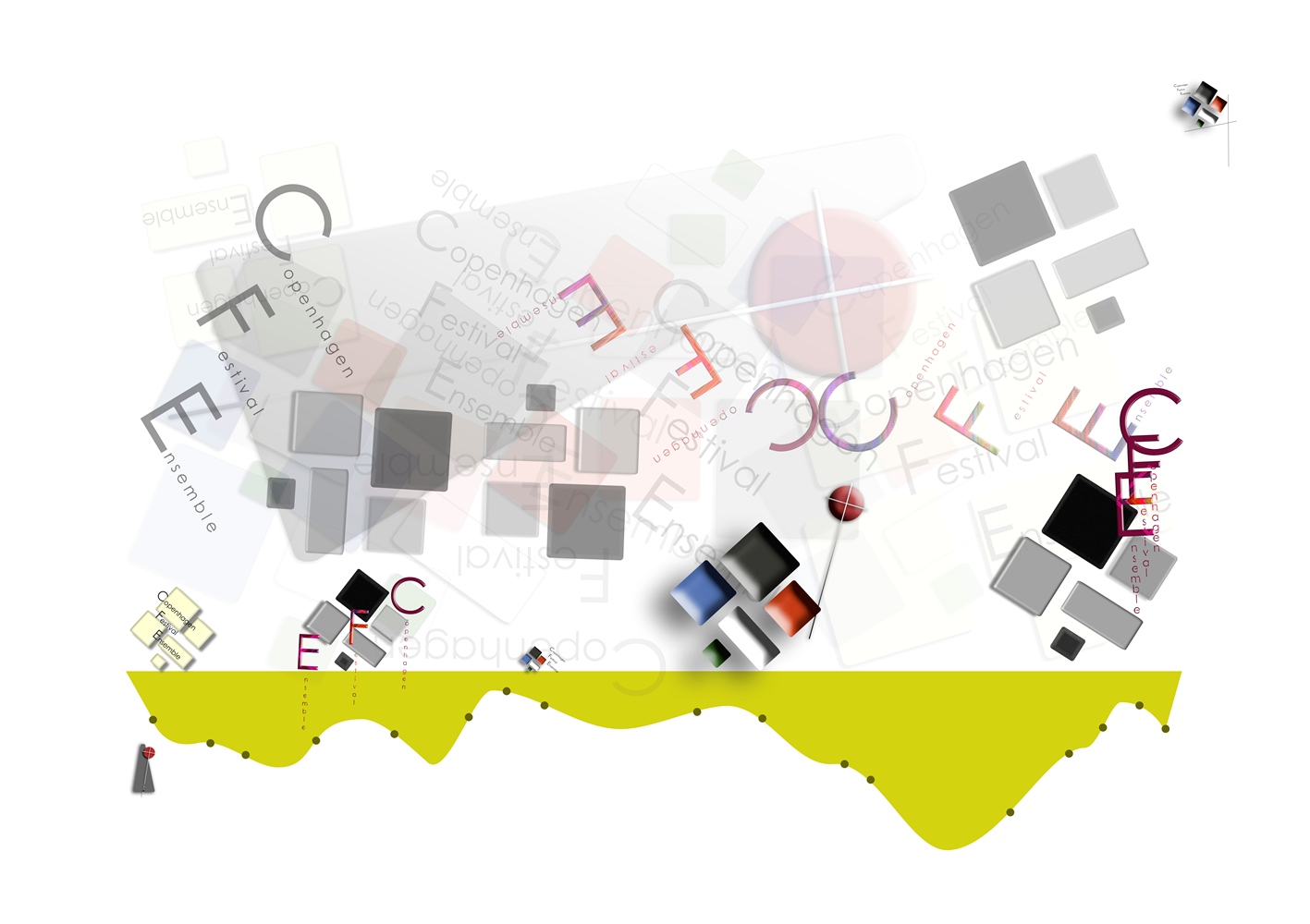
We wish to thank WebTalkTo for their great work they did for us. They created everything from the logo, business cards to the website. Web Talk To created such an interesting concept, full of unusual ideas, and succeed to put it together in a perfect way. Anyone who visits our site is very impressed. The website you have created for us is much better, than we could have hoped for. We are very happy and proud to have our unique website representing our ensemble.
It was a pleasure working with you guys. And we are looking forward to many years of cooperation.
In 2011, I started working on the CFE project. I was invited to create a Visual Identity for an exist ensemble in their beginning.
The work lasted about a year. During this time we have designed and built: Emotional Image of the company and Visual Identity (from the very beginning, it was decided that the Emotional Image and Visual Identity will be combined as opposing entities, for example: day and night, black and white). Based on this concept were created: the logo, website, posters, corporation letter template and business card.
Contents
- Emotional image
- Web design
- Logotype
- Business card
- Corporate letter
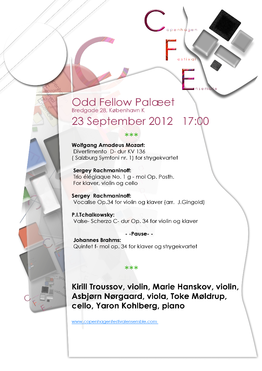
- Concert announcement
- Posters
- Related links
Key words, expressions and images that formed the basis for Emotional Image.
- Metronome counts down the last days of European culture.
- The Cross and the Crucifixion (metronome).
- Decline of the West.
- Bank notes, without which – in the modern reality – impossible to imagine the birth of impulse for the activity.
- Number 5. It was planned that the ensemble team will be composed of five musicians.
- The full moon.
- Mask as a daily and mandatory attribute of human existence.
- The quest for quality.
The image is dark, but real. We tried not to distort the reality of things and base the choice of key elements on the impression of communication with the client in combination with analysis of the environment of the client. I planned that this image combined with the Visual Identity (optimistic, colored, mainly uses the geometric morphogenesis) would cause a feeling of serious, honesty, respect and celebration.
Web design version one
2011
The first version of the website was written in AS3 (Flash animation). Animation is a powerful tool to convey emotion. For several reasons, in 2013, we rewrote the site in html (present version of the site) and to some extent I am sorry for the loss of the Flash animation effects. Click here to view the Flash site version.
This is a front html page of the flash website
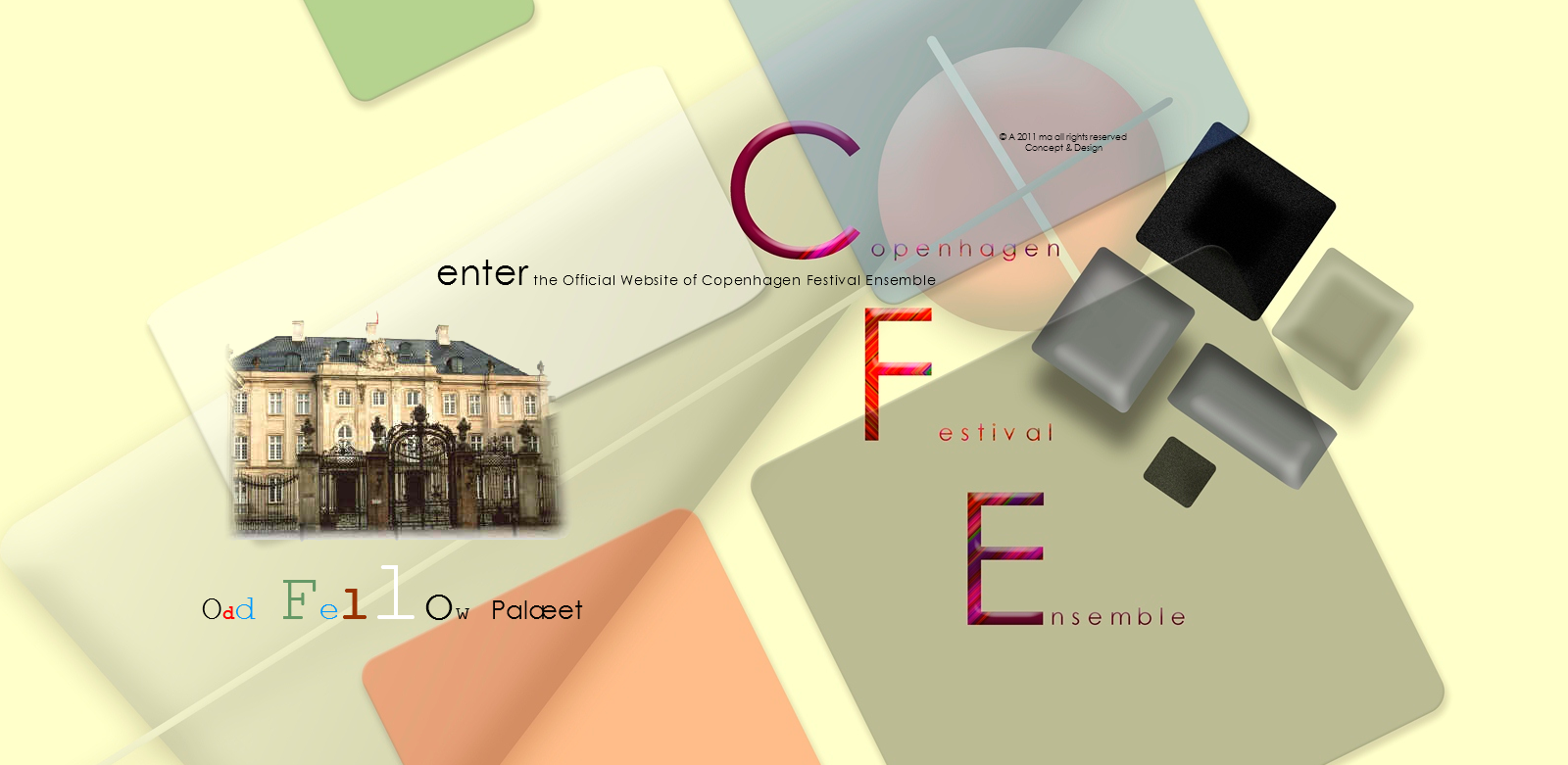
Home page
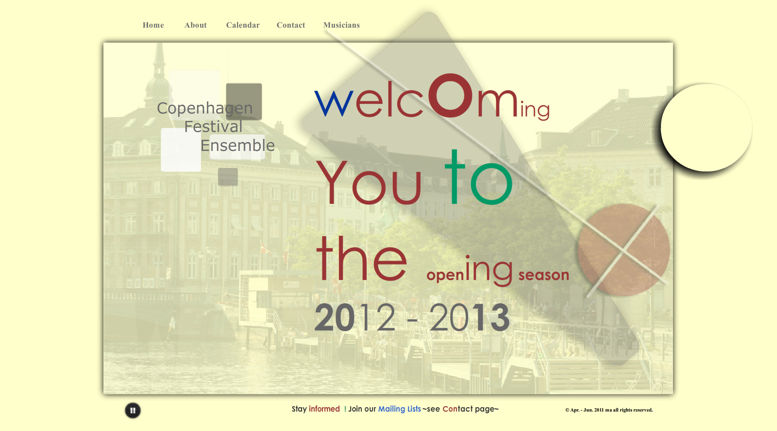
About page
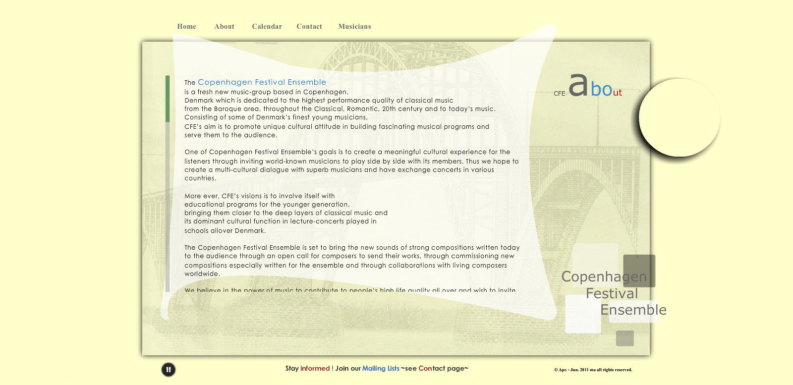
Contact page
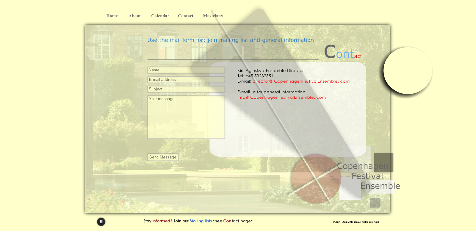
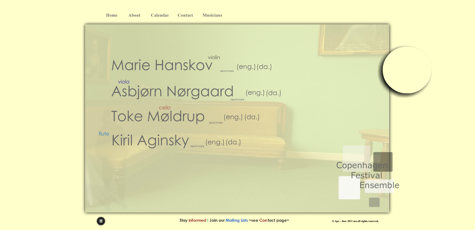
Musician's page
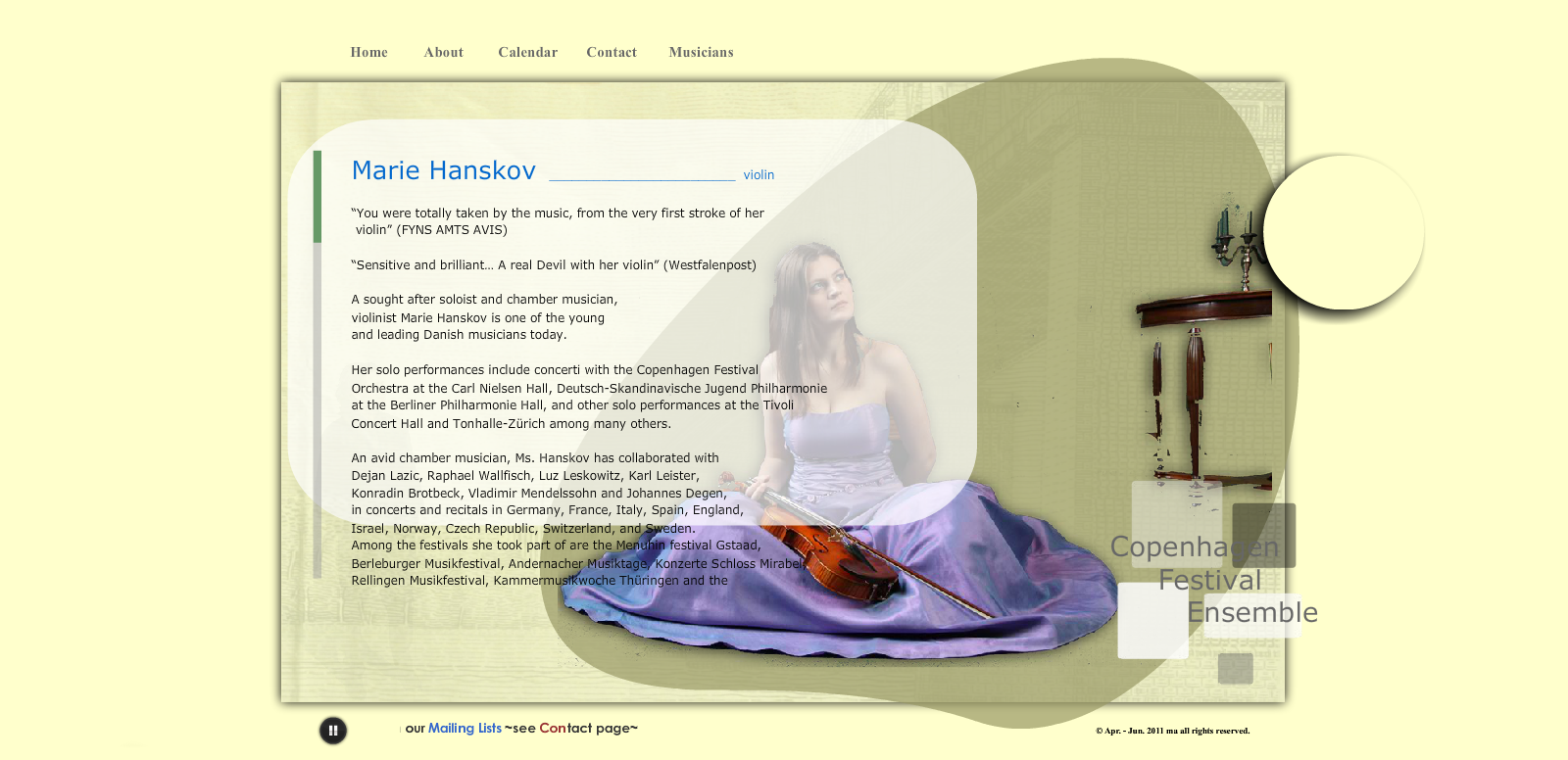
Marie Hanskov page
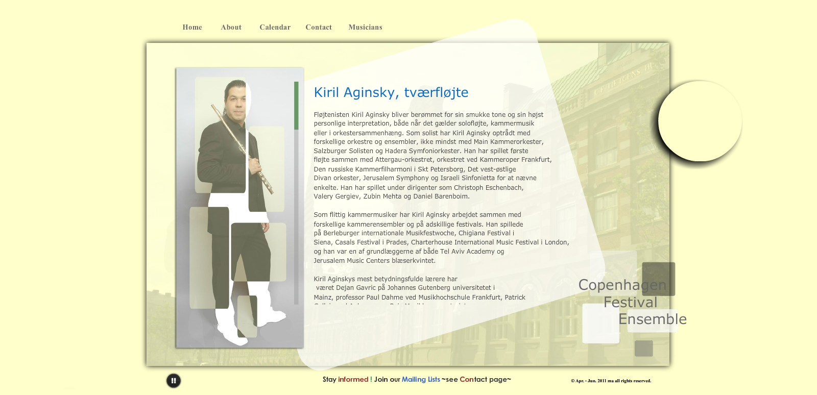
Kiril Aginsky page
Favicon
Logotype
July 2011
November 2011
November 2011
June 2012
Business Card
Creation date: June 2011
Corporate letter template
Creation date: November 2011
Version 1
Version 2
Version 3
Version 4
Version 5
Concert Announcement
Creation date: July 2012
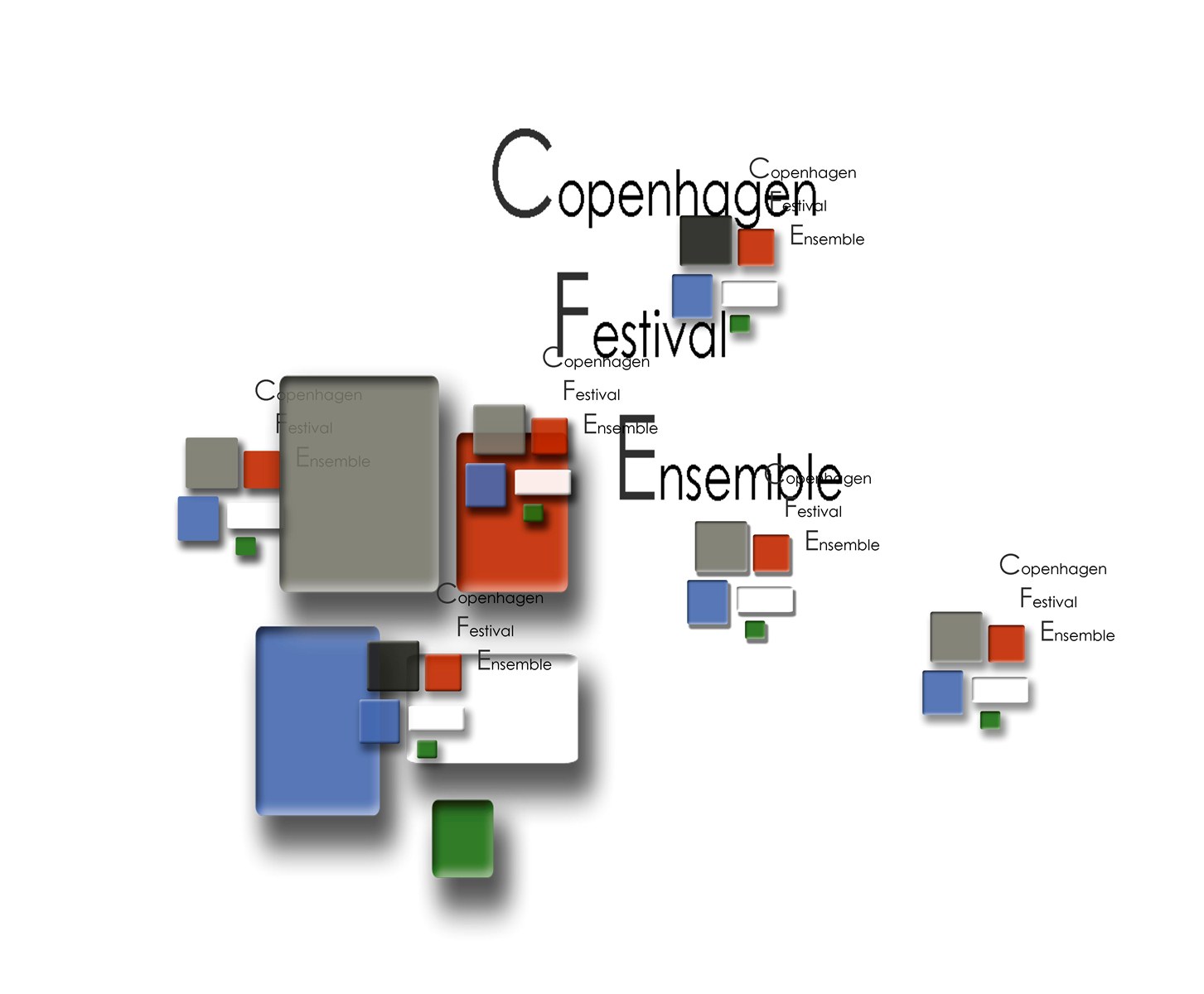
Posters
Creation date: December 2011
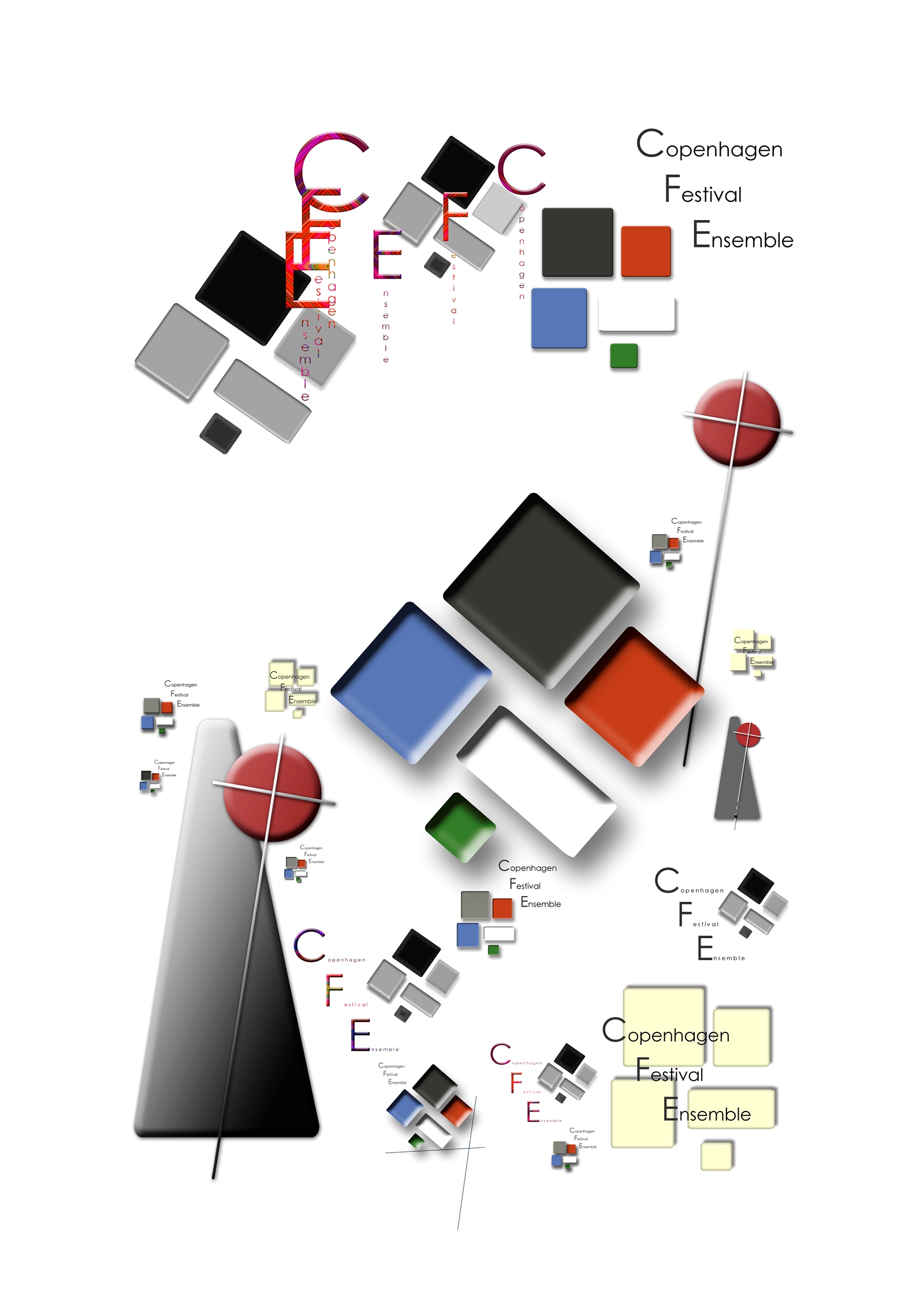
Tree-Cross
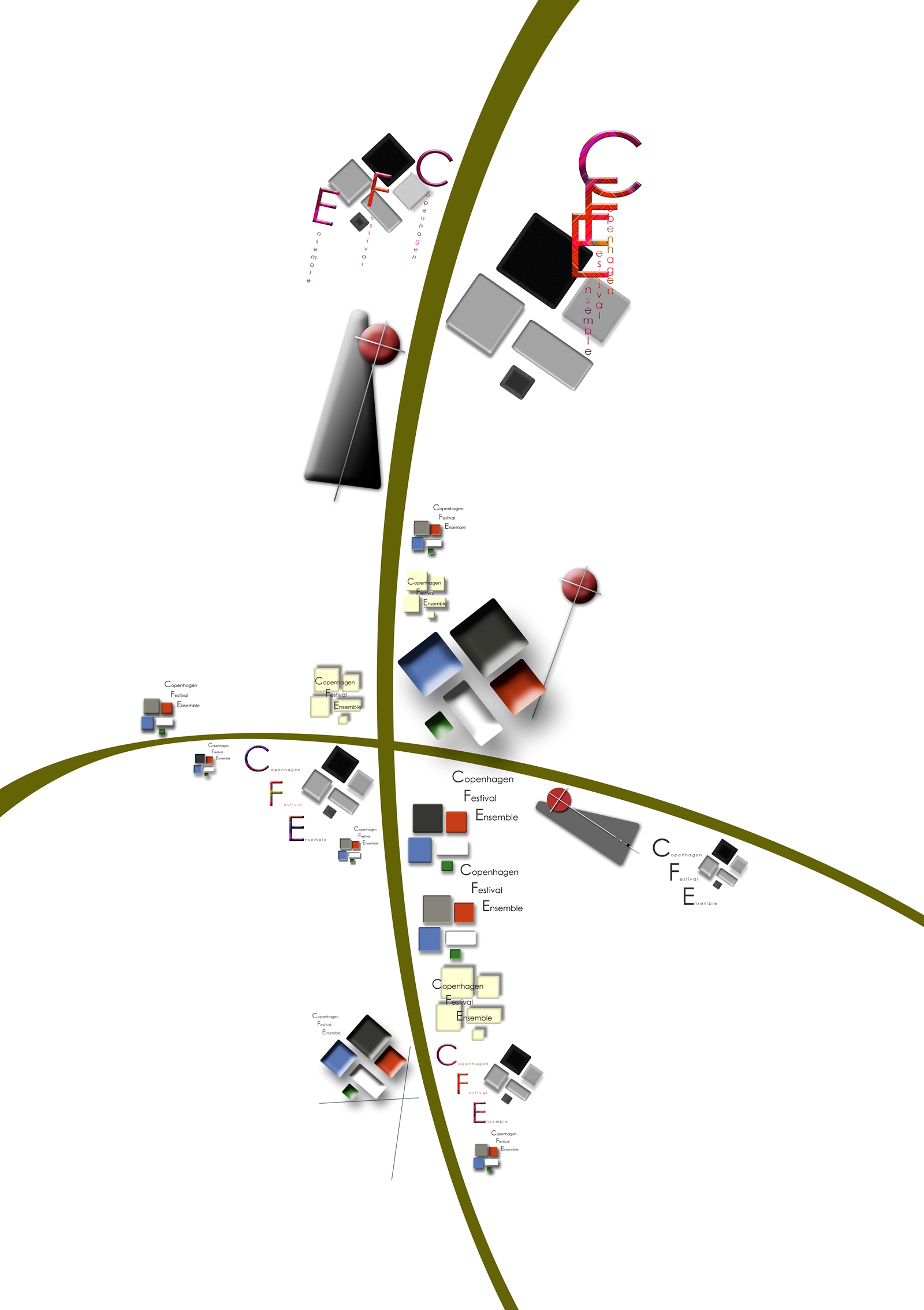
The Almighty
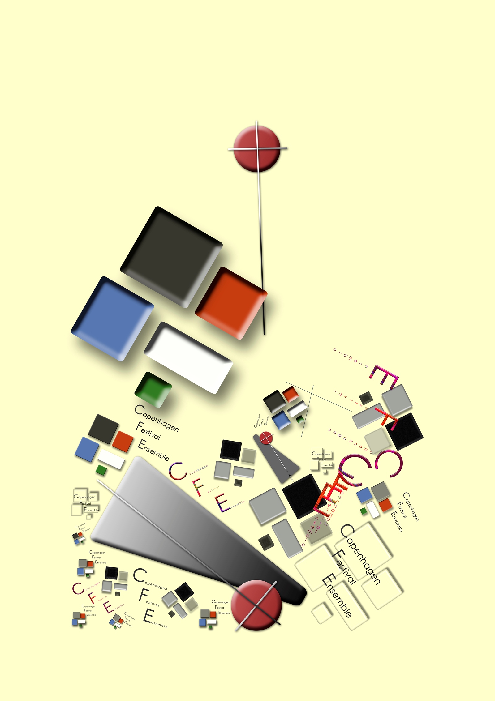
The almighty coming down from the mountain. Under the sun
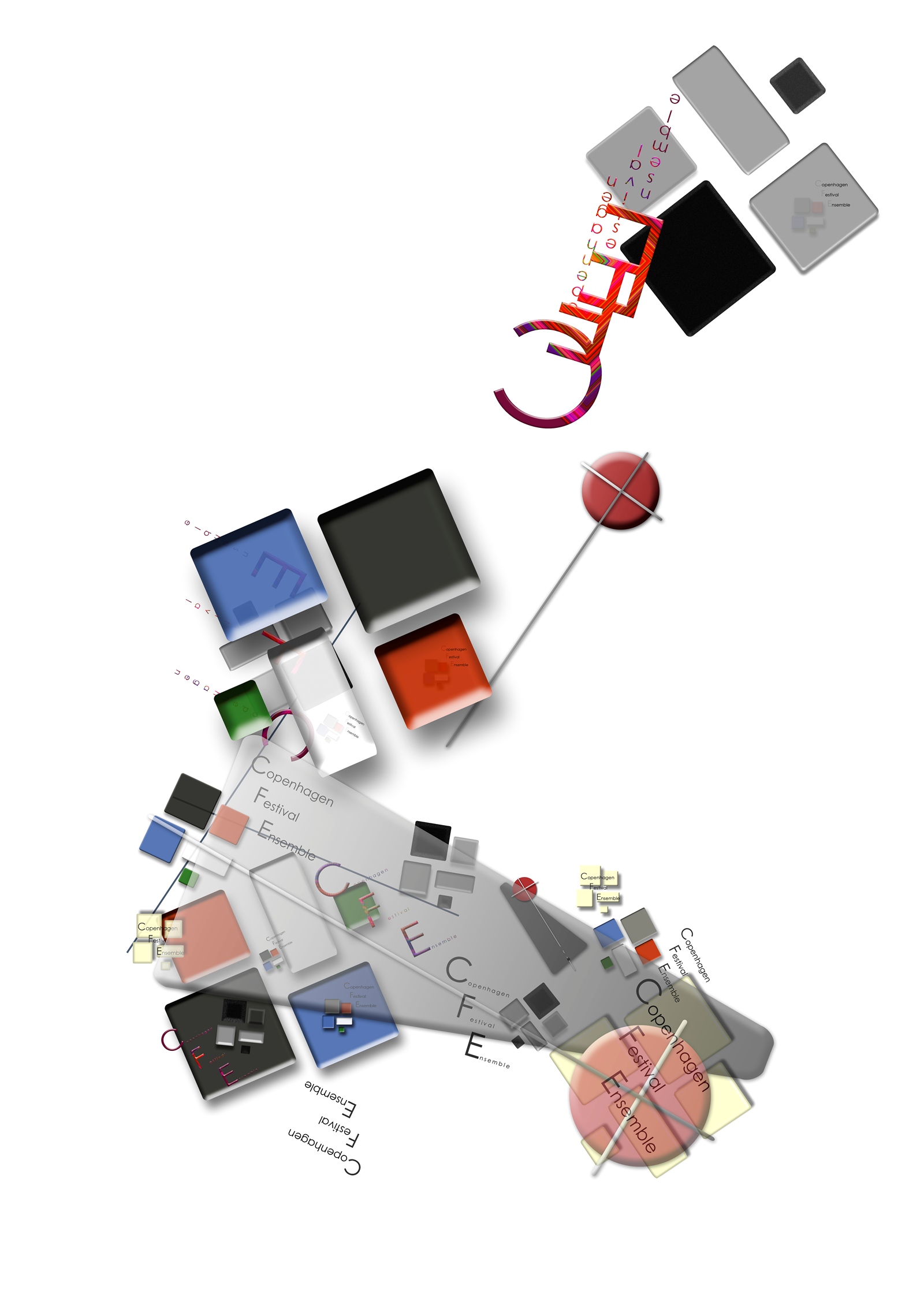
Metronome
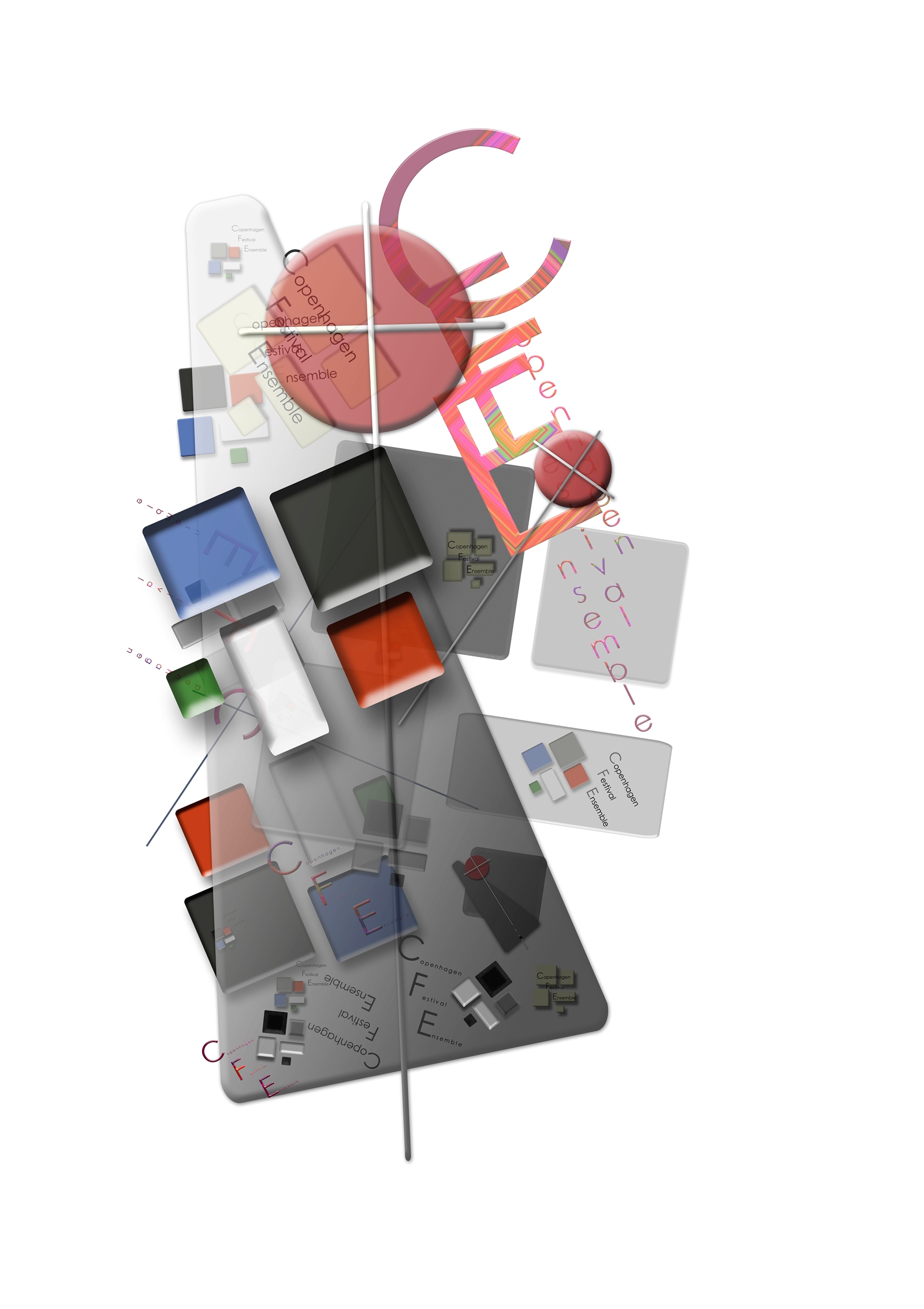
The development
