Detailed analysis of the information design/hierarchy, layout, and styles of the Compa website landing page. The new version uses a low-contrast color theme to enhance information readability.
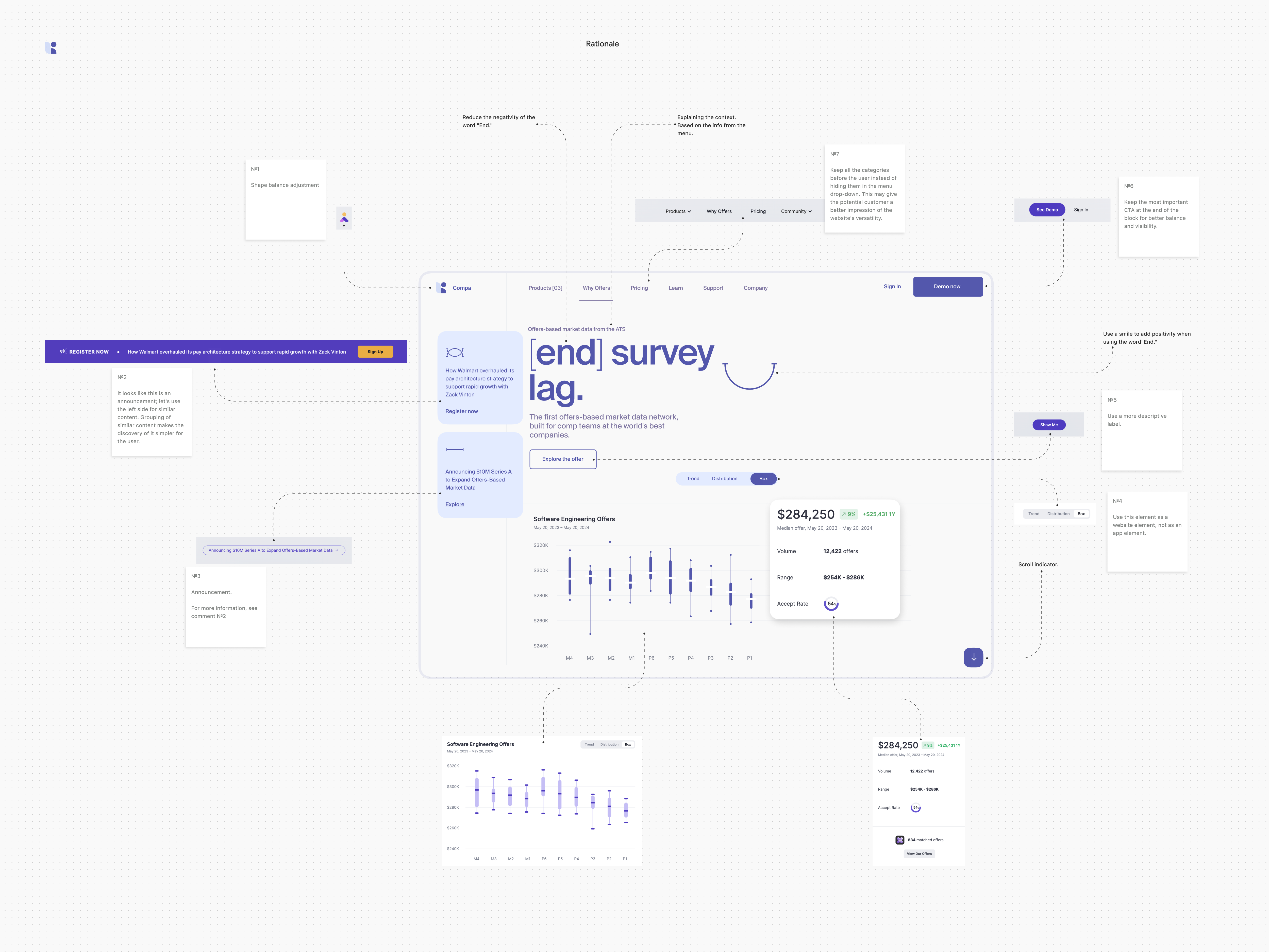
Rationale
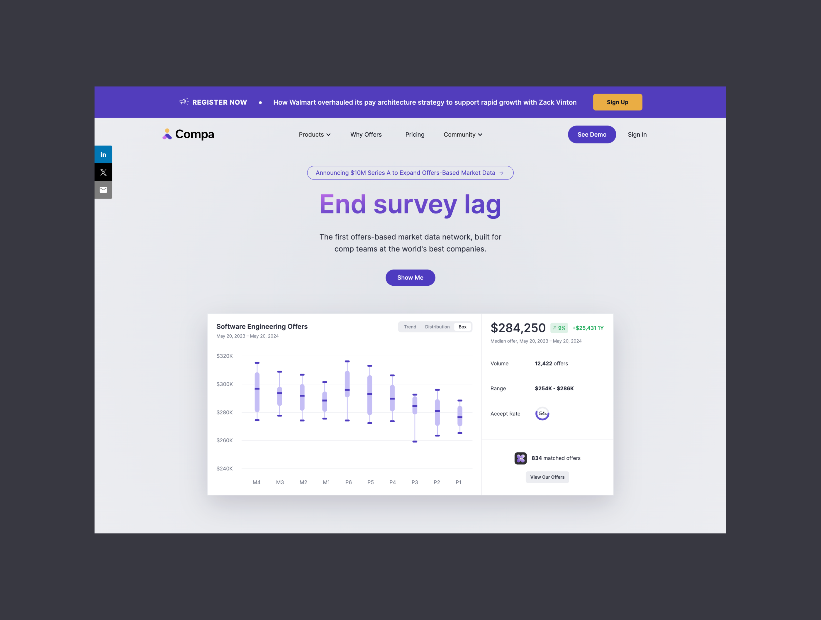
Before
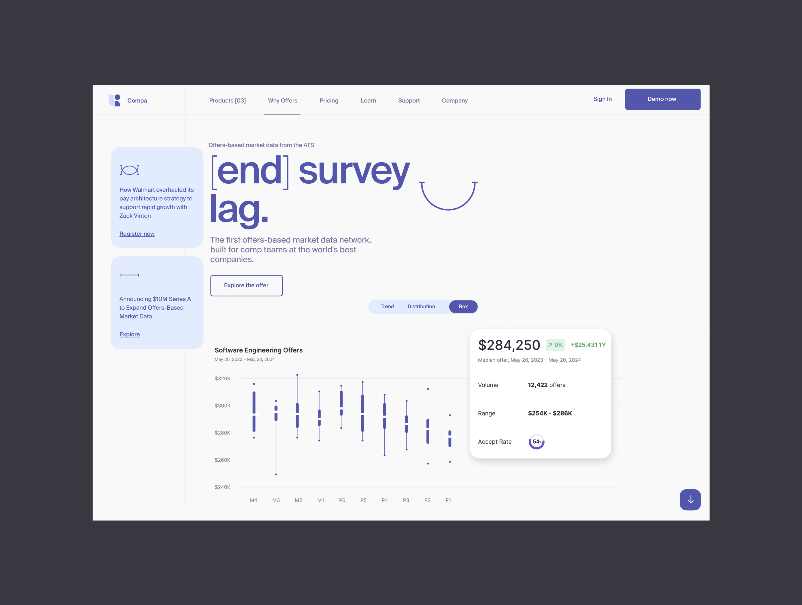
After
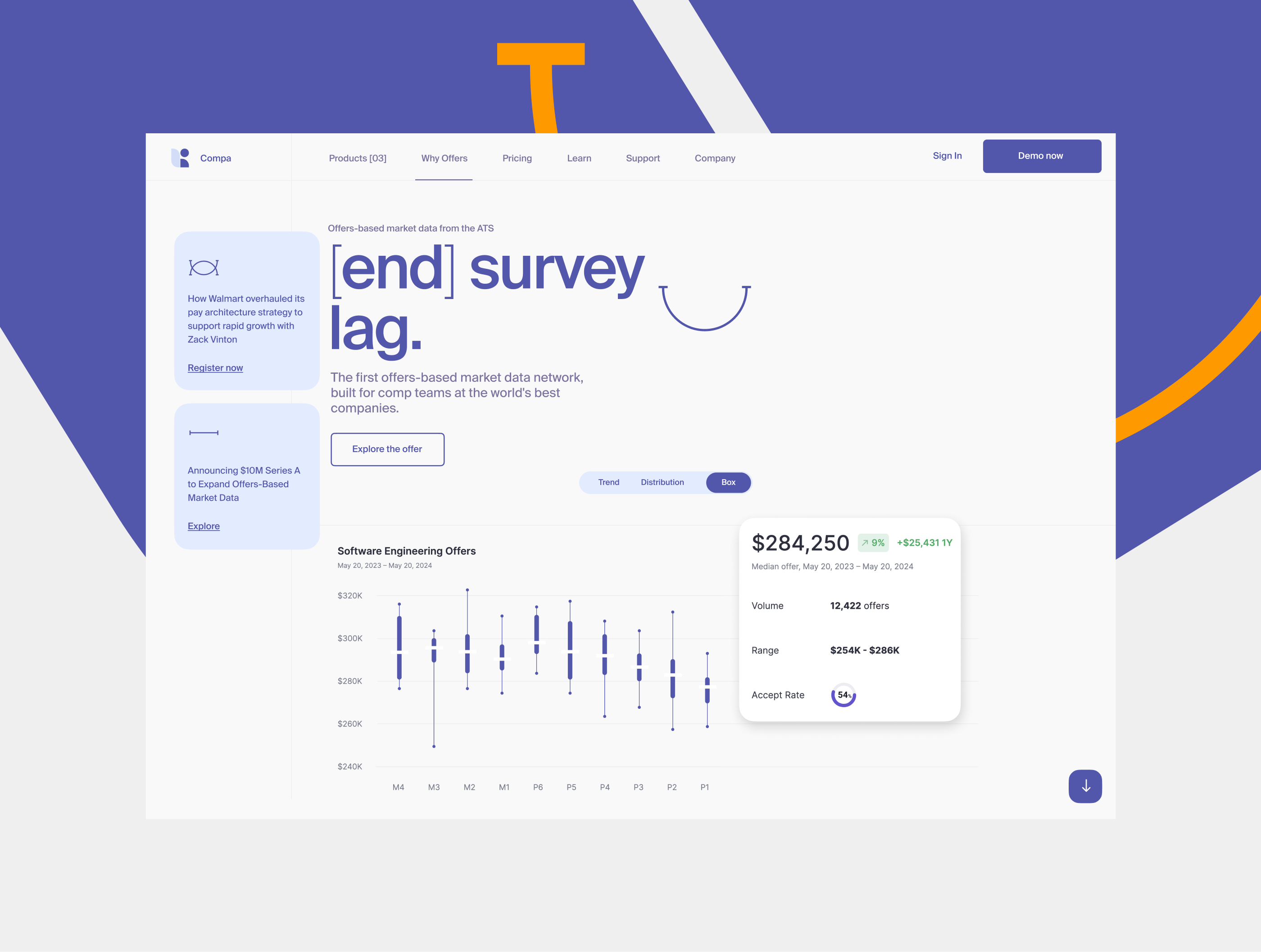
Primary colors test
Logo. Shape balance adjustment